Archive | Uncategorized

A Wonderful Little Scrawny Tree

Not far from my home I noticed this on the side of the road.

A Wonderful Little Ugly Tree. Ellen Lindner, AdventureQuilter.com/blog

You can’t tell what it is?  It’s a scrawny Christmas “tree,” right there on the side of the road.

I drew it onto this next photo, so you can see it more easily.

A Wonderful Little Ugly Tree. Ellen Lindner, AdventureQuilter.com/blog

What on earth?  Why did someone add a tree here, of all places?

Actually, it’s not a tree at all.  Just a couple of leafy branches whose leaves have now died.

A Wonderful Little Ugly Tree. Ellen Lindner, AdventureQuilter.com/blog

But, it has battery operated lights and ornaments.

A Wonderful Little Ugly Tree. Ellen Lindner, AdventureQuilter.com/blog

Who on earth would put a tree here?  I don’t know but I’m delighted by it!  Mostly by the idea of someone anonymously adding this decoration to our community.  And also, by how pathetic this little scraggly thing looks. I’m sure Charlie Brown would love it.

This little scrawny stick has really made an impression on me.  Someone went out of their way to give a smile to those who drive by.  What a wonderful thing to do, especially at Christmas time.

I hope your holiday will also be filled with unexpected surprises and delights.

Merry Christmas!

Ellen Lindner

8

Dressing Downton: Part One

Are you a Downton Abbey fan?  I am, big time!  So, I was very excited to see “Dressing Downton,” an exhibit of many of the outfits worn on the show.  It’s currently on display at the Lightner Museum in St. Augustine, FL, which is a show-stopping setting in its own right.

Dressing Downton. Ellen Lindner, AdventureQuilter.com/blog

It was originally the Alcazar hotel, built by Henry Flagler in 1888. It was a wonderful backdrop for these period costumes.

Dressing Downton. Ellen Lindner, AdventureQuilter.com/blog

Clothing was showcased in vignettes, with wonderful signs explaining each outfit and how it was used in the series.

Dressing Downton. Ellen Lindner, AdventureQuilter.com/blog

As you can see, the lighting was dim (similar to the period, I imagine,) and flash photography was not allowed. The clothing above was worn for the hospital charity ball.

This sign explained several of the wardrobe conventions of the day.

Dressing Downton. Ellen Lindner, AdventureQuilter.com/blog

But, let’s back up to episode 1: the outfit Lady Mary wore to dinner when she met the infamous Turkish diplomat.

Dressing Downton. Ellen Lindner, AdventureQuilter.com/blog

Weren’t you hooked after that episode?  Who could look away?

Also, from season one, check out the dowager’s bustle.

Dressing Downton. Ellen Lindner, AdventureQuilter.com/blog

And a footman’s outfit/livery.

Dressing Downton. Ellen Lindner, AdventureQuilter.com/blog

There was very informative signage explaining not only the fashions of the day, but the customs, as well.  Read more about footmen below.

Dressing Downton. Ellen Lindner, AdventureQuilter.com/blog

Of course, country pursuits were also depicted.  This shows one of Lady Mary’s riding habits.  Check out that side saddle. I wouldn’t want to try it.

Dressing Downton. Ellen Lindner, AdventureQuilter.com/blog

And then there was hunting.  These two garments were from the scene when Richard Carlisle went hunting with the family.  His outfit was on the left and Lord Granthams on the right.

Dressing Downton. Ellen Lindner, AdventureQuilter.com/blog

Weren’t you a little bit happy when Sir Richard over dressed and was too hot in this dapper outfit? Even his boots were dandy!

Speaking of outdoor pursuits, here’s Edith’s farming outfit.

Dressing Downton. Ellen Lindner, AdventureQuilter.com/blog

Of course, she didn’t own an outfit for the purpose of farming, so this sign explains that one was “cobbled together.”

Dressing Downton. Ellen Lindner, AdventureQuilter.com/blog

It was all very interesting.

Ellen Lindner

7

Quilting and Cording

When quilting my latest piece I decided to mimic the swirls/curves in the background.

Quilting and Cording. Ellen Lindner, AdventureQuilter.com/blog

Quilting and Cording. Ellen Lindner, AdventureQuilter.com/blog

In addition to machine quilting, I also added some hand stitching around several of the curved shapes.

Quilting and Cording. Ellen Lindner, AdventureQuilter.com/blog

My main reason for doing so was to add contrast to the white curves in the light areas. I intended to stitch around all the curved shapes, but the effect was so subtle I changed my mind and used it only in the lightest areas.

Next, I turned my attention to the main motif.  I thought it needed to be set off from the background somewhat.  I considered:
– Lightening the background around the motif with colored pencils, chalk, etc.
– Using tulle to add a dark shadow around parts of the motif.
– Adding a dark line around the motif, by adding cording.

I was leaning toward the cording idea, since I had used it previously. I did some auditioning and started in.  I hand stitched a black cord in place.  That is, I used a cording stitch to capture the cord and secure it to the top of the quilt.  I did not pierce the fabric with the cord.

Here you can see the effect before and after the cording.

Quilting and Cording. Ellen Lindner, AdventureQuilter.com/blog

I think it set it off perfectly.

Quilting and Cording. Ellen Lindner, AdventureQuilter.com/blog

Quilting and Cording. Ellen Lindner, AdventureQuilter.com/blog

And here’s the entire quilt, ready for facing.  Almost finished!

Quilting and Cording. Ellen Lindner, AdventureQuilter.com/blog

Have you got any suggestions for a name?  I’ve got one in mind, but am still slightly undecided.

Ellen Lindner
P.S. Here’s what a hard/precise tulle shadow looks like.  It’s very effective in adding definition, but only if you want to show the top element just slightly above the background.  I wanted this motif to float, so it wasn’t appropriate here.

12

Holding My Mouth Just Right

I recently added paint to a quilt!  Gulp!  This is something I’ve only done once or twice, so I definitely had to get my courage up.

It helped that I had done a bunch of painted exercises a few months ago.  So, I did some practice samples, held my mouth just right and gave it a go.

I had started this quilt at Quilting by the Lake, back in July, and had completed the fabric composition.  After putting the quilt away for a few months, this is where I picked it  up.  I wanted to add some sheer swirling elements to the background.  With paint.  Gulp again.

Translating Sketches to Color. Ellen Lindner, AdventureQuilter.com/blog

I had previously done some experimenting about how to best add a sheer layer with monoprinting. From that I knew that a certain scrap of shelf liner worked well.  Like this.  I thought it looked quite good.

Painting on a quilt: GULP. Ellen Lindner, AdventureQuilter.com/blog

But, it pretty much disappeared in the lighter patterned areas.  Clearly, I’d need to beef it up some how.  Back to experimenting.

Painting on a quilt: GULP. Ellen Lindner, AdventureQuilter.com/blog

I figured out I could stencil on another light coat of paint to get my desired effect.  Like this.

Painting on a quilt: GULP. Ellen Lindner, AdventureQuilter.com/blog

I used freezer paper to mask out the quilt areas that I wanted to stay paint free.

Painting on a quilt: GULP. Ellen Lindner, AdventureQuilter.com/blog

And this was the result. I was happy with it.

Painting on fabric. Gulp! Ellen Lindner, AdventureQuilter.com/blog

At this point, it was time to start thinking about the quilting design.  I’ll show you what I did in the next post, plus something a little unexpected.

Ellen Lindner

8

Gingerbread at Grove Park

Grove Park Inn, in Asheville, NC is an historic hotel which opened in 1923. Although it has many dramatic features, the western view is the star of the show.

Gingerbread at Grove Park Inn. Ellen Lindner, AdventureQuilter.com/blog

This view can best be taken in from the terraces on the backside of the inn.  Here, it’s photographed from one of the two side wings.  The stones creating the rugged facade were excavated on site. Note also the droopy roof shape, created with concrete.

Gingerbread at Grove Park Inn. Ellen Lindner, AdventureQuilter.com/blog

Grove Park hosts a big gingerbread house competition every year.  It started as a small local event and has grown to include hundreds of entries.

Gingerbread at Grove Park Inn. Ellen Lindner, AdventureQuilter.com/blog

Like all the other entries, the hats above are COMPLETELY edible, and made from at least 75% gingerbread!

Gingerbread at Grove Park Inn. Ellen Lindner, AdventureQuilter.com/blog

The swan above was one of my favorites. Check out these feathers!

Gingerbread at Grove Park Inn. Ellen Lindner, AdventureQuilter.com/blog

And the lacy decorations on the sleigh.

Gingerbread at Grove Park Inn. Ellen Lindner, AdventureQuilter.com/blog

There were some amazing feats of architecture.

Gingerbread at Grove Park Inn. Ellen Lindner, AdventureQuilter.com/blog

As well as some whimsical ones.

Gingerbread at Grove Park Inn. Ellen Lindner, AdventureQuilter.com/blog

There were categories for children, youth, and adults.  Some of the children’s pieces were my favorites.

Gingerbread at Grove Park Inn. Ellen Lindner, AdventureQuilter.com/blog

I mean, doesn’t that look like FUN?
This brought back memories of when my son and I did this.  (One year there was even dog poop in the back yard snow!)

If these photos have piqued your interest, you can see ALL the gingerbread entries here.  (Click on Gingerbread.)

Making any gingerbread at your house this year?

Ellen Lindner

4

Winter Lights

While in Asheville, NC, my husband and I attended “Winter Lights” at the North Carolina Arboretum.  It was spectacular!

Even from the parking lot, we were mesmerized by the beautiful light-wrapped trees. Tons of them.

Winter Lights. Ellen Lindner, AdventureQuilter.com/blog

And when I say these trees were wrapped, I mean they were REALLY wrapped!

Winter Lights. Ellen Lindner, AdventureQuilter.com/blog

Can you even imagine how many lights are on that one blue tree, above?  I can’t.

The display took good advantage of the many trees, but there were also some very beautiful fake ones.  These slowly changed colors, so  I had to take about six pictures of them.

Winter Lights. Ellen Lindner, AdventureQuilter.com/blog

Trees were also used to show off other items.  Like several beautiful chandeliers.  They changed colors, as well. Very cool, right?

Winter Lights. Ellen Lindner, AdventureQuilter.com/blog

These more subtle colored cones were one of my favorite things.  They were made with translucent plastic wrapped around a single bulb and “planted” in the ground. (I want them in my yard.)

Winter Lights. Ellen Lindner, AdventureQuilter.com/blog

Check out these 4 blue sculptures.  As you  might guess, they also changed colors.

Winter Lights. Ellen Lindner, AdventureQuilter.com/blog

Here’s a detail shot.  Can you tell what they’re made of?

Winter Lights. Ellen Lindner, AdventureQuilter.com/blog

That’s right, bottles of water.  A light in the center illuminates them.

I’ve only shown you a sampling of the many displays that made up this exhibit.  If you’re in the area during winter I encourage you to check it out for yourself.  (But bundle up, as this Floridian did.)

Ellen Lindner

9

Out Darn Spot!

I have a new white blouse.  One that I’ve already hemmed (as I have to do with all my clothes.)  And there it was, lying on my work table waiting to be ironed and worn for the first time.

And then I pulled out the paints.

You can guess the rest: one tiny pale spot that wouldn’t wash out.

I considered several ways of disguising this spot:
– Painting over it,
– Adding more contrasting paint,
– Covering it with dense embroidery,
– Cutting it away and adding a very purposeful fabric detail behind.

I figured it was a long shot, but first I tried painting over it with a white paint pen.

Out Darn Spot. Ellen Lindner, AdventureQuilter.com/blog

No luck.  Next, I auditioned the idea of cutting it away and putting fabric behind it.  My thought was to create a line of texture all the way across the garment.

Out Darn Spot. Ellen Lindner, AdventureQuilter.com/blog

Well, it sorta worked.  But, it was too frayed and the fabric underneath shadowed through. With tightly woven fabrics, this might be viable.  Which was not my case.

FINALLY, it dawned on me that I could add a textured strip by adding fabric, rather than by subtracting it.  Duh!  I could fuse it on, covering the spot and adding a design detail at the same time. And so I did.

Here it is with the fused strip added.

Out Darn Spot. Ellen Lindner, AdventureQuilter.com/blog

Next, I satin stitched the edges.

Out Darn Spot. Ellen Lindner, AdventureQuilter.com/blog

I was very happy with this detail, as well as the overall look.

Out Darn Spot. Ellen Lindner, AdventureQuilter.com/blog

I was pretty proud of myself.  What do you think?

Ellen Lindner


18

Deconstructed Screen Printing: Drawn Designs

Now, THIS is exciting stuff!  After doing deconstructed screen printing with randomly created screens, I decided to draw on my last screen, with a syringe.  This is a technique I learned in a DSP class with Kerr Grabowski.

Deconstructed Screen Printing: drawn design. Ellen Lindner, AdventureQuilter.com/blog

That’s my screen above.  I drew on it with very thick black dye.  In fact, it was actually too thick and it came out in glops and curly-Qs.  None of which mattered for my purposes.

And here’s the first pull with that screen. You can barely see the clear dye paste I used on the far right.

Deconstructed Screen Printing: drawn design. Ellen Lindner, AdventureQuilter.com/blog

Is that cool or what?  Some of the dried dye in the screen has dissolved with the print paste and has given a little gray color. But, the heavy black lines are thick enough to act as resists and they’ve created white lines.  Not what you’d expect, right?

The first few pulls with colorless paste looked somewhat similar.  Here’s a more detailed shot.

Deconstructed Screen Printing: drawn design. Ellen Lindner, AdventureQuilter.com/blog

Before I show you the rest of my results, here’s more of an overview, using Gabriele DiTota’s work as examples.  She was our ring leader for the day and she got some great results.  Here are her first few pulls with her syringe-drawn screen.  (She was smart enough to thin the black dye paste so she avoided the gloppy curly-Qs.)

Deconstructed Screen Printing: drawn design. Ellen Lindner, AdventureQuilter.com/blog

After a few of these colorless pulls, she switched to red dye.

Deconstructed Screen Printing: drawn design. Ellen Lindner, AdventureQuilter.com/blog

The red dye colored the background, but the drawn squeegee lines still created a resist resulting in white lines.  Pretty cool, right?

Deconstructed Screen Printing: drawn design. Ellen Lindner, AdventureQuilter.com/blog

Like Gabriele, I decided to add a background color to my efforts.  I was aiming for blue-green, but I initially got mostly green.  As I slowly added more blue, I pulled screen after screen, resulting in a run of blues and greens.

Below you can see the detail of the first couple of pulls on the left and later colored ones on the right.  As you can see, the drawn design is beginning to break down on the right and the details are fading.  No worries.  It’s just a different design.

Deconstructed Screen Printing: drawn design. Ellen Lindner, AdventureQuilter.com/blog

I got carried away and added a bit too much black to the one on the far right.  The fabric is wet in this photo, so it looks especially vibrant.

Deconstructed Screen Printing: drawn design. Ellen Lindner, AdventureQuilter.com/blog

And here’s the full run, washed and dried.  As you can see, it lost a lot of color in the wash, but I still love it!

Deconstructed Screen Printing: drawn design. Ellen Lindner, AdventureQuilter.com/blog

A super close up.

Deconstructed Screen Printing: drawn design. Ellen Lindner, AdventureQuilter.com/blog

I LOVE these results!  If I ever do DSP again, I think I’ll do this sort of drawing on all my screens!

Now, what will I do with all this luscious fabric?  That shouldn’t be a problem!

Ellen Lindner


6

Deconstructed Screen Printing: Random Design

I recently got to play with deconstructed screen printing again, and I got some pretty cool results.

The process is easy, but it also involves a fair amount of dyes, equipment, and set up.

Deconstructed Screen Printing. Ellen Lindner, AdventureQuilter.com/blog

Here’s a brief video overview.

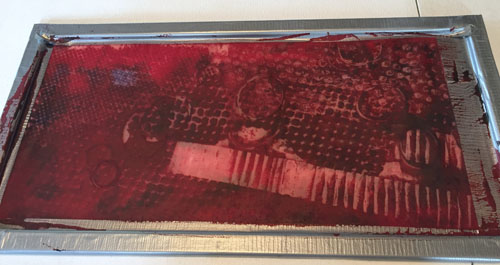
You start by purposely allowing thickened dye to dry in your screen.  A random design is created by putting various textured things under the screen when adding the dye.  The texture creates puddles and such, which hold the colored dye in a pattern.

Here’s my red screen.  When creating it, I put rubber bands, a strip of corrugated cardboard, bubble wrap, and plastic grid underneath the screen. Can you see how the various textures made the dye build up in interesting patterns and thicknesses?
Deconstructed Screen Printing: random design. Ellen Lindner, AdventureQuilter.com/blog

Next, you pull colorless dye paste through the screen.  This causes the dried dyes to break down and to color the fabric in interesting ways.  But, each pull is different, because the dye design is being broken down (deconstructed) each time.

These are the first 3 pulls using the red screen above.  Number 3 has been inverted.

Deconstructed Screen Printing: random design. Ellen Lindner, AdventureQuilter.com/blog

I continued on until there was not much of a pattern left, eventually printing only part of the screen.

Deconstructed Screen Printing: random design. Ellen Lindner, AdventureQuilter.com/blog

All my red fabric.

Deconstructed Screen Printing: random design. Ellen Lindner, AdventureQuilter.com/blog

Here’s my oh-so-boring blue screen.  It was made with a heavy crocheted tablecloth scrap, and a doily (I think.)

Deconstructed Screen Printing: random design. Ellen Lindner, AdventureQuilter.com/blog

Surprisingly, it printed pretty well.

Deconstructed Screen Printing: random design. Ellen Lindner, AdventureQuilter.com/blog

Not happy with the stark contrast of white with one color, I decided to over paint/over dye everything.  I got a little carried away with this one, making the green dye darker than I intended. I was philosophical, though.  I knew I could use green fabric as easily as blue.

Deconstructed Screen Printing: random design. Ellen Lindner, AdventureQuilter.com/blog

I over painted the red with a variety of orange, rust, brown, etc. Not bad, I thought.

Deconstructed Screen Printing: random design. Ellen Lindner, AdventureQuilter.com/blog

A detail shot.

Deconstructed Screen Printing: random design. Ellen Lindner, AdventureQuilter.com/blog

I think these fabrics will be useful.

The red fabric held it’s color well, even when rinsed four times and washed once.  But, look at the blue!

Deconstructed Screen Printing: random design. Ellen Lindner, AdventureQuilter.com/blog

What happened to the blue, you ask?  That’s what I’d like to know.  Clearly, that dye was weak for some reason.  And what about the reds spots above?  Did I accidentally get red dye on it?  Nope.  It appeared during the rinse and wash process.  I’m guessing there was some red in the yellow dye that I used to create green.  So, unexpected results, but a usable piece of fabric, nevertheless.

One other thing.  Dye is harder to remove from skin than paint.  Ask me how I know.

Deconstructed Screen Printing: random design. Ellen Lindner, AdventureQuilter.com/blog

The designs for this screen printing were all random.  In my next post I’ll show you what happened when designs were drawn on the screen.  They all turned out really great!

Ellen Lindner


2

“Shootin’ the Breeze” Finished!

Whoo-boy, the quilt of my brothers ended up taking quite a bit longer than I anticipated, but I’m very happy with the finished result.

Shootin' the Breeze, an art quilt by Ellen Lindner. AdventureQuilter.com
I got to show it to my family in the almost-complete stage, and they LOVED it.  That was very gratifying.

Shootin' the Breeze art quilt in-progress. Ellen Lindner, AdventureQuilter.com/blog

Here are few detail shots.

My brother Ricky.

Shootin' the Breeze - detail, an art quilt by Ellen Lindner. AdventureQuilter.com

My brother Todd.

Shootin' the Breeze - detail, an art quilt by Ellen Lindner. AdventureQuilter.com

Quilting faces was new to me, and rather intimidating.  I studied the work of Hollis Chatelain and am very happy with the end result.  (However, if I ever do faces again, I’ll use clear thread, rather than changing the thread colors throughout.)

As you can see, the quilting added a lot to the 3D aspects of the clothing, too.

Shootin' the Breeze - detail, an art quilt by Ellen Lindner. AdventureQuilter.com

I feel like I haven’t had much to show on my blog for a while, except for this quilt.  So, to all my faithful readers, thanks for your patience!  Now, I can have fun with other things (like mobiles) and share new adventures with you.

Ellen Lindner
P.S. I’ve entered this piece in an exhibit called “Guns: Loaded Conversations.”  If accepted, it will tour for three years.


12