Archive | Uncategorized

Elegant Threads Fashion Show

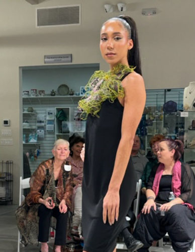
Wow! The Elegant Threads fashion show was pretty amazing! I didn’t get to attend, but a friend sent me photos. Just check these out.

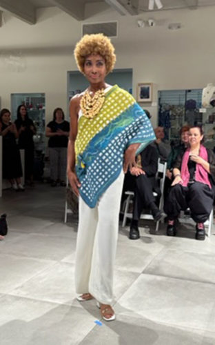
The show included garments, jewelry, and accessories. In this case, the green necklace is the featured item. It is made (crocheted???) from wire.

Elegant Threads Fashion Show. Ellen Lindner, AdventureQuilter.com/blog

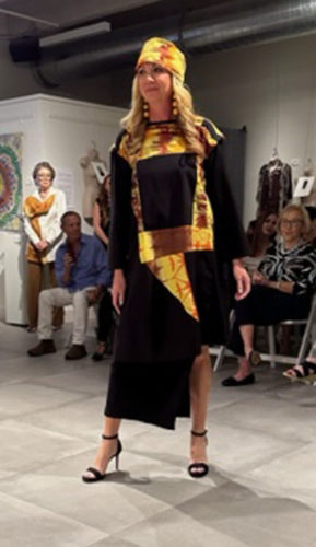
My friend, Perlie Petrillo, made this garment and she was kind enough to provide all these photos. She intended the head wrap to be a sash, but they styled it differently here. A versatile piece.

Elegant Threads Fashion Show. Ellen Lindner, AdventureQuilter.com/blog

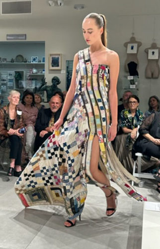
This was the Viewers’ Choice. It was constructed from old quilts purchased at garage sales. The different sections were joined together with zippers. I was surprised to see how well it moved, even with batting.

Elegant Threads Fashion Show. Ellen Lindner, AdventureQuilter.com/blog

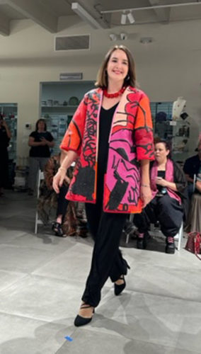
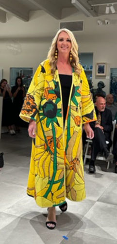
These next two garments were made by Amy Blicher. They’re both very wearable.

Elegant Threads Fashion Show. Ellen Lindner, AdventureQuilter.com/blog

Elegant Threads Fashion Show. Ellen Lindner, AdventureQuilter.com/blog

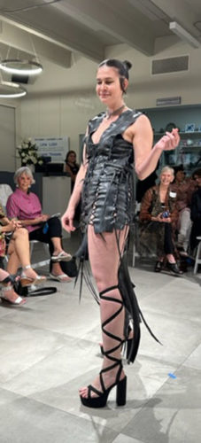
Can you say “goth?” My friend referred to this garment as “the leather dress.” But, I’m thinking it was actually recycled tires. Interesting either way.

Elegant Threads Fashion Show. Ellen Lindner, AdventureQuilter.com/blog

Marjolaine Arsenault was the maker of this lovely felted shawl.

Elegant Threads Fashion Show. Ellen Lindner, AdventureQuilter.com/blog

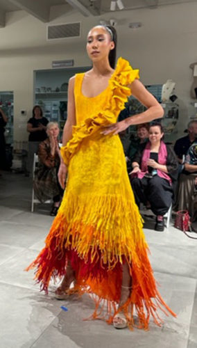
This felted dress was made by Charity Van de Meer Musma.

Elegant Threads Fashion Show. Ellen Lindner, AdventureQuilter.com/blog

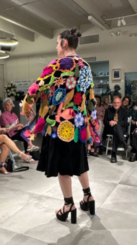
I think this garment was crocheted and felted.

Elegant Threads Fashion Show. Ellen Lindner, AdventureQuilter.com/blog

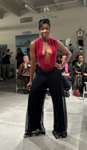
This model could wear anything! I mean, what kind of confidence does it take to wear a top made entirely from strands of beads?!?

Elegant Threads Fashion Show. Ellen Lindner, AdventureQuilter.com/blog

Although the fashion show is now history, the entire exhibit is still on display through December 2nd. I recommend that you hurry to see it at the Lighthouse Gallery, Tequesta, FL.

If you haven’t already, be sure to read my earlier post about the exhibit.

Ellen Lindner


0

Composing an Abstract Composition

In my last post, I showed how I started with a diagonal composition. That was probably a good starting point, but I could very quickly see that it was way to bulky and “regular.”

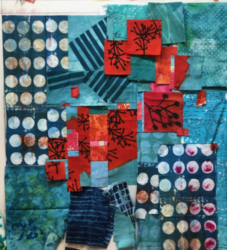
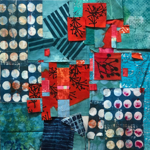
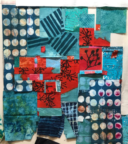
I knew it needed to have some variation and some energy added. So, I started trying new things. First, I got rid of the pink corner and I added a  high contrast print with circles. That helped a lot!

Composing an Abstract Design. Ellen Lindner, AdventureQuilter.com/blog

I pieced together the center section, which had vertical pieces. I was pretty confident with that portion, so I left it in place while I auditioned changes in other areas.

IComposing an Abstract Design. Ellen Lindner, AdventureQuilter.com/blog Composing an Abstract Design. Ellen Lindner, AdventureQuilter.com/blog Composing an Abstract Design. Ellen Lindner, AdventureQuilter.com/blog

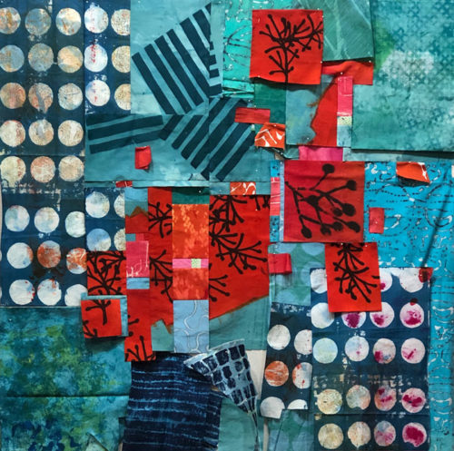
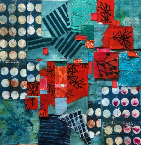
You get the idea. But then, I decided I should turn that center section 90 degrees – just to mix things up.

Composing an Abstract Design. Ellen Lindner, AdventureQuilter.com/blog

It didn’t immediately look better. As a matter of fact, maybe it looked worse. But, since it was DIFFERENT FROM MY EARLIER VISION, it appealed to me and I decided to work with it some more. (After all, I could always turn it back.)

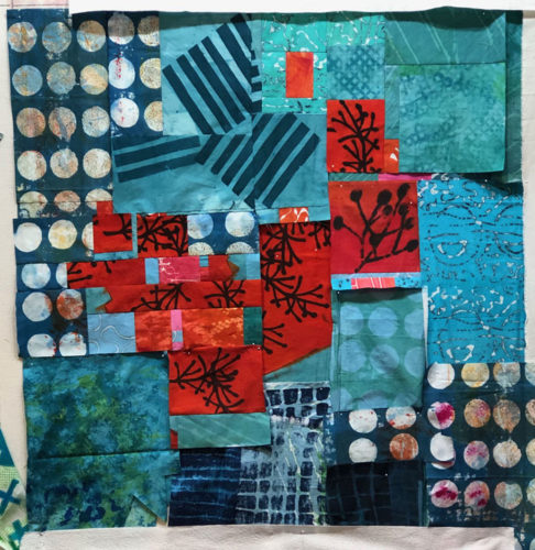
I kept this new center orientation as I continued to work on the placement of the red.

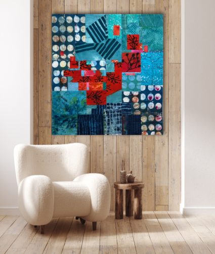
Composing an Abstract Design. Ellen Lindner, AdventureQuilter.com/blog

I’m loving the energy of this piece and I’m having fun working on it.

It needs a title, so I’m writing my thoughts on a list as ideas come to me.

Ellen Lindner
0

Elegant Threads is Worth a Visit

If you’re anywhere near Tequesta/Jupiter, FL you really owe it to yourself to check out the Elegant Threads exhibit at the Lighthouse Art Center. As the name implies, the exhibit includes wearable art, but also 3D fiber art, jewelry, accessories, and some large invitational pieces.

My favorite piece was this quilt by Bisa Butler. Her work is all over the internet, so perhaps you’ve seen it. This was my first time to see one of her pieces in person and it did not disappoint. This piece is called Mighty Gents.

Elegant Threads exhibit in Tequesta, FL. Ellen Lindner, AdventureQuilter.com/blog

Don’t you love their body language?
Here’s a detail shot. (Slightly distorted, since I was standing close and looking up at it.)

Elegant Threads exhibit in Tequesta, FL. Ellen Lindner, AdventureQuilter.com/blog

There were many wonderful wearable garments on display. (Some more wearable than others.) This felted piece was made by Charity Van de Meer Musma, and is called Mysterious Bride.

Elegant Threads exhibit in Tequesta, FL. Ellen Lindner, AdventureQuilter.com/blog

Amy Blicher calls her quilted and painted red coat Migraine.

Elegant Threads exhibit in Tequesta, FL. Ellen Lindner, AdventureQuilter.com/blog

And her yellow coat is called Daisies.

Elegant Threads exhibit in Tequesta, FL. Ellen Lindner, AdventureQuilter.com/blog

The wearables were hung from the ceiling or displayed on mannequins. It was a very nice presentation.

Elegant Threads exhibit in Tequesta, FL. Ellen Lindner, AdventureQuilter.com/blog

These are just a SMALL sampling of what’s on display. See it for yourself, if you can. It will be on display through December 2, 2023. (And, there’s a fashion show in November, if you can handle the $100 ticket price.)

In my next post, I’ll show you another VERY interesting piece on display in this exhibit.

Ellen Lindner
 

5

Twigs of Teal and Red-Orange: Creating a Diagonal

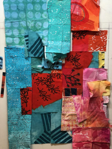
Here’s that featured fabric loosely put into place. Not bad, I think. But what now? I think I’ll probably need to cut into the twiggy fabric some in order to create more energy.

Perhaps a diagonal will work well.

Hmm. It has potential.

Time to fill in the corners. Of course, I could use blue-green in the bottom right, but that seems rather predictable. What would yellow look like?

Not the best choice, I think. What about pink?

I was not at all convinced about the pink, but I left it in place for most of the rest of the design process.

Because I really liked the stripes, I decided to group them all together. Now, THAT I loved! These stripes were printed on the diagonal and I think that really helps.

A better look at those stripes,  not yet pieced. This was exciting me!

LOTS more trial and error lay ahead.

Ellen Lindner
0

Twigs of Teal and Red-Orange: Getting Started

I dyed this fabric last year and it’s one of my favorites.

Teal and Red-Orange Quilt: Getting Started. Ellen Lindner, AdventureQuilter.com/blog

I was really happy with the way I had a viable design without doing anything more to it, but HOW do you design with that? I had a false start last year and am now trying again.

These are the collection of “featured” fabrics I thought I might be able to use. I call them featured fabrics because they have high amounts of contrast in them, which will draw the viewer’s eye. When working with such fabrics, I try to put them in place early on and then fill in with less dramatic fabrics, as needed.

Teal and Red-Orange Quilt: Getting Started. Ellen Lindner, AdventureQuilter.com/blog

Next, I pulled out every fabric I thought might work. As you can see, I like these colors and found that I had quite a collection.

Teal and Red-Orange Quilt: Getting Started. Ellen Lindner, AdventureQuilter.com/blog

But, maybe it needed something unexpected. What about accents of yellow?

Teal and Red-Orange Quilt: Getting Started. Ellen Lindner, AdventureQuilter.com/blog

Hmm. Maybe.

I liked the large twig (center right) on the dull orange print. But, I didn’t like the background fabric. So, I stenciled on a couple more using paint.

TTeal and Red-Orange Quilt: Getting Started. Ellen Lindner, AdventureQuilter.com/blog

These should be usable.

I had my fabric decisions (mostly) made, so it was time to start moving things around on the design wall. (The challenging, but fun, part!)

Ellen Lindner
0

Finishing Up the Red and Yellow Quilt

After finishing up the left 2/3 of my red and yellow “bean” quilt, it was time to tackle the right yellow portion. It came together pretty well. (Still in -progress below.)

Red and Yellow Abstract. Ellen Lindner, AdventureQuilter.com/blog

During these final stages I also considered added some skinny lines, for energy. (See them pinned on at the top in the photo above?) I eventually decided against them, however, because I thought they’d attract too much attention. I wanted the other contrasts to be the attention getters. (And those bean shapes, of course.)

From early in the design phase I thought I’d probably want to applique on another couple yellow beans. (If you look back at the first post, you’ll see that I had one little piece of yellow fabric sitting on the red – near the top – as a place holder.) I auditioned that idea further near the end.

Red and Yellow Abstract. Ellen Lindner, AdventureQuilter.com/blog

I also considered adding some red ones. That’s what the red blobs are for in the photo above. I decided I just needed one. I made it a partial bean, like the other red ones.

And then I cropped both sides. (But, I later added some of the red side back.)

Red and Yellow Abstract. Ellen Lindner, AdventureQuilter.com/blog

Finally, I had it all put together and quilted.  As you can see above, I added some more bean outlines during the quilting process. I really like using a double black line for emphasis.

Then, it was time for photography.

Photographing "Spilling the Beans," and art quilt by Ellen Lindner. AdventureQuilter.com/blog

You can see the full finished quilt here. I’d really appreciate your thoughts about it – especially what you think about these two colors together. Yay or nay?

Ellen Lindner
0

Red and Yellow Abstract

Historically, I haven’t been a fan of red and yellow combinations, but for some reason, I now find myself drawn to them. I still think they’re a little jarring, but it seems that I now like that. As evidence, I recently dyed fabrics with these colors.

I created a variety, hoping I could use them together. As you an see, I repeated a bean shape in several colors. I was happy with how they worked together and was anxious to get started.

Red and Yellow Abstract. Ellen Lindner, AdventureQuilter.com/blog

I realized some of the lightest fabrics wouldn’t fit well into the mix. But, I had some other fabrics I thought I could use. I pinned everything together on the design wall. And I loosely arranged them: a good starting point.

Knowing the contrast of red and yellow, as well as the contrast of different values, would attract attention, I placed them (above) in approximately “sweet spots.” These are considered ideal locations for focal points. They’re easy to identify: picture a tic-tac-toe game overlaying the overall shape. Where the lines cross are sweet spots.

I immediately thought the red fabric with yellow beans was a little too “regular.” (See above) That is, the beans were spaced too evenly. I thought the composition would be stronger if they were “messed up” a little bit. So, in the photo below, you can see that I sliced right through the red bean fabric, and scooted things out of alignment.  Better, I thought.

Next, came A LOT of auditioning as I folded, rearranged, cut (only once I was sure,) and pieced.

Red and Yellow Abstract. Ellen Lindner, AdventureQuilter.com/blog

It was like a giant game of Tetris. Eventually, I had the left portion pieced and began to work on the yellow fabrics on the right.

Red and Yellow Abstract. Ellen Lindner, AdventureQuilter.com/blog

It all went more slowly that I would have liked, but I was definitely having fun!

More next time.

Ellen Lindner


2

New studio Flooring

Check out my new studio flooring!

New studio flooring. Ellen Lindner, AdventureQuilter.com/blog

I just love it!

This photo was taken right after installation, before I moved ALL MY STUFF back in. I had it all piled in the dining room. Moving it in and out was QUITE the job!

I wanted new flooring to accomodate fabric dying and this is going to work great. I can just easily wipe  up dye, even after it dries. (Before, I was covering my carpeted floors with plastic for each dye session.)

Now, I can set up very quickly. I’m thinking I’ll be doing more dying. Can’t wait!

Ellen Lindner
P.S. I may have picked something a little too light. It’s definitely showing threads and such more easily, but so far I’m managing with a little increased  house keeping.

0

Dying and Mono Printing

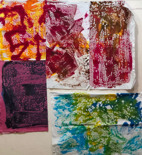
In my recent dye session. I played around with mono printing, which is great fun. This was my first piece. The colors were brushed horizontally, but I left the squirted “eyeball” in tact.

Learning to Monoprint. Ellen Lindner, AdventureQuilter.com

There was a lot of dye left on the plastic, so I printed a “ghost.” As you can see, the brushed on dye was already used up, but the more gloppy eyeball printed fairly nicely.

Learning to Monoprint. Ellen Lindner, AdventureQuilter.com

So, I learned something: if I squirt on generous amounts, I can get a second print. And it will be somewhat different from the first. I tried it again, with these two. Not very ghostly, but the colors have moved and merged. Very interesting.

Learning to Monoprint. Ellen Lindner, AdventureQuilter.com

You can also mono print in a “finger paint” sort of way. These had dye brushed on pretty smoothly. Then, I drew or scraped through them. I’ll definitely be doing more of this!

Learning to Monoprint. Ellen Lindner, AdventureQuilter.com

When I switched to shiny plastic as my surface the dye beaded up. Which actually gave me a wonderful texture. I’ll be doing more of this, too!

Learning to Monoprint. Ellen Lindner, AdventureQuilter.com

I learned a lot. Some of these are  not too usable – yet. But, hey, I know how to over dye, so I’m not worried.

I’ve written a short tutorial about mono printing. The underlined text at left is a direct link, or you can find it in the Articles section of Learn with Ellen. If you give it a try, I’d love to see your results!

Ellen Lindner
0

Dying Again

As usual, I really enjoyed my recent dying session. I was trying out a new color, Tangerine, so I did a lot of swatching to get to know how it worked.

Dying Again. Getting to Know Tangerine. Ellen Lindner, AdventureQuilter.com/blog

The swatches above show what happened when I mixed tangerine with each of my other 7 colors, in 3 ratios, and 3 values. Yes, it takes a while, but the results are worth it. I’ve done this with each color and have them all sorted, and LABELED, in a book.

When dying fabrics, I often repeat colors and motifs, so the pieces will work together well. This time, I did quite a few pieces with large, squarish meandering. Some of them were in high contrast colors and others were more subtle.

Dying Again. Ellen Lindner, AdventureQuilter.com/blog

A few more examples, (with one exception.) Several of these were mono printed, and I’ve written an article about that process.

Learning to Monoprint. Ellen Lindner, AdventureQuilter.com

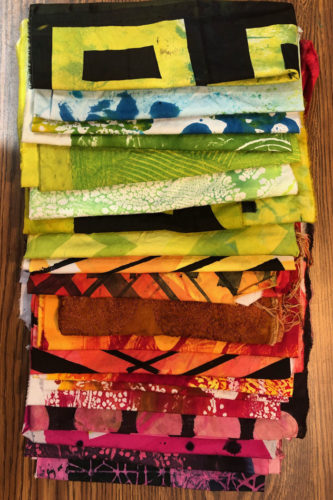
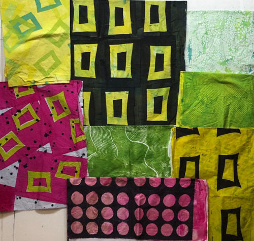
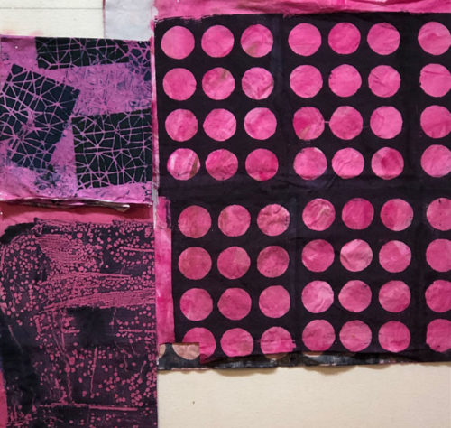
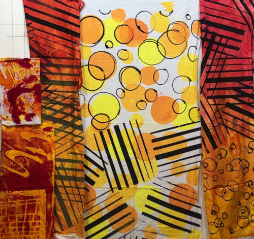
These are fabrics I dyed that will probably go together in the same quilt. As you can see, I also played around with a “bean” shape. I think these will work well together.

Dying Again. Ellen Lindner, AdventureQuilter.com/blog

More dyed fabrics in the next post!

Ellen Lindner
P.S. See the earlier swatching I did with my other colors.
0