My recent dye session was devoted almost exclusively to improving ugly prints. That generally meant over dying with a solid color, or stenciling on a new one.
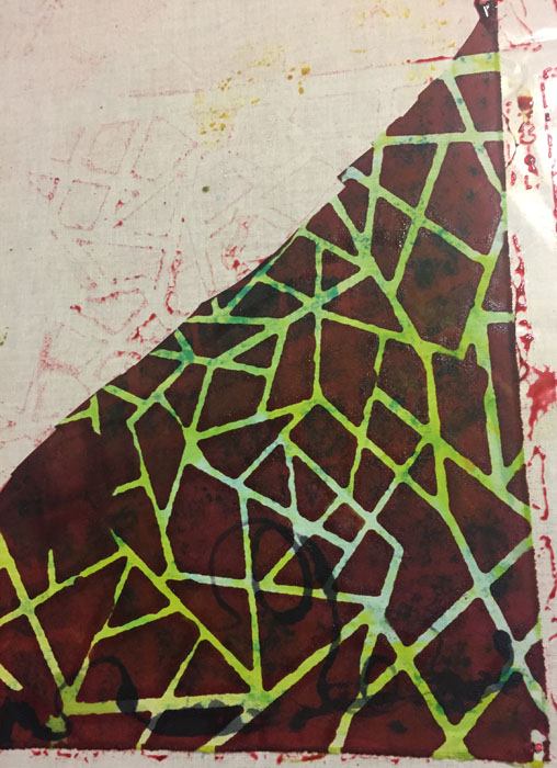
Take this little piece, for instance. It was originally an ugly yellow-green that I didn’t think I’d use. But, I knew that if I mostly obscured that color, leaving only tiny bits of it showing, it would add a nice sparkle to the resulting print.
Since dyes are transparent, I gave a lot of thought to how the underlying color would work with the new one. I thought a dull red (the complement of green) would give a dark, neutral result. And, as you can see, that’s exactly what I got.
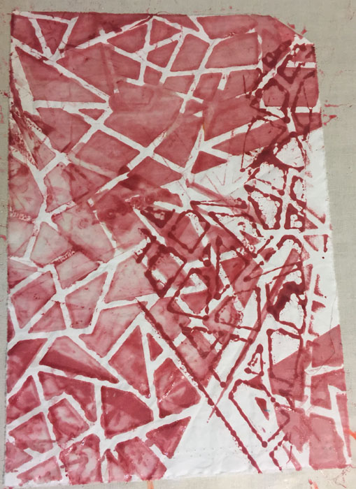
My stencil was larger than the little piece I was printing, so some of the design got printed onto the plastic. No worries. I just laid some white fabric down onto it, and lifted a print. And then I added a couple more.
Next, I used that dirty stencil for what I call “dirty printing.” All you do is pull clear paste through the used stencil. It picks up the dye that was in the nooks and crannies, creating a more delicate version of the same lines. I layered them on top of each other, in various orientations. I love the look!
This is just one of the many techniques I learned in a five day class with Pat Pauly. She’s a wealth of knowledge!
Ellen Lindner
P.S. A broader term for this sort of treatment is “ghost print.” A ghost print is when you take a second print without adding any additional dye/paint/ink.


No comments yet.