When dying fabric there are two types I want to produce: yardage, and specialty. Yardage has a mostly all over pattern and can easily be cut up and used. Specialty looks almost like a whole cloth design, with thought given to composition and such.
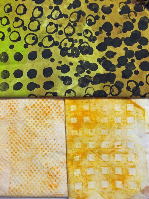
These yellow pieces fall firmly into the yardage camp. The top one had a white background initially. Can you see how such a high contrast fabric might be difficult to use? Changing the background to yellow/yellow-green makes it both more interesting and more usable.
The bottom two fabrics are both “rubbings,” (done with a foam roller.) The left texture was created by a piece of shelf liner and the right one was a plastic sink liner. I’ve discovered that I don’t like rubbings over isolated details, but these all-over ones are easy to do and they have a nice imperfection to them.
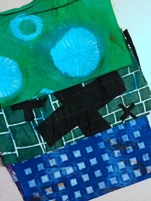
These next 3 fabrics are all re-dos. The top one was an imperfect shibori dyed fabric. The circular images were very subtle, so I played them up by painting green all around them.
The next one was large black crosses on a white background, with a few blue blotches. Again, very hard to use due to the contrast. So, screen printing the background a dark color helped minimize that.
The bottom one, above, was an ugly experiment. I rolled on some texture. Can you tell it’s the same sink liner from the yellow fabric before it? (I think this blue version is a little too perfect. I’ll aim for some sloppiness with future texture rolling.)
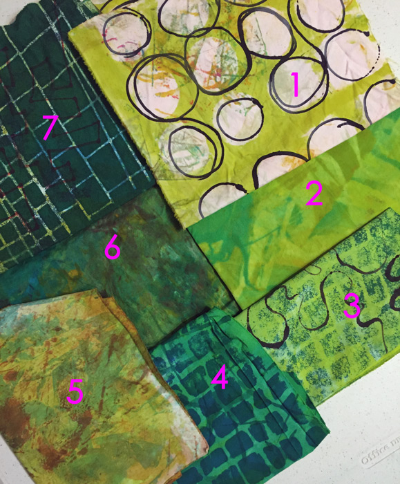
This next photo demonstrates a variety of techniques.
1- It started as a nearly white clean up rag, with some interesting marks. I screened on the yellow-green and then used a squirt bottle to add the black circles.
2-In a moment of laziness I tried to mix colors together directly on the fabric.
3 & 4- Both pieces originally had a white background. Again, too much contrast, so I added yellow-green to #3 and pure green to #4.
5-Some sort of ugly fabric with dull yellow-green added.
6 – A fun way to use up the last of the dye: smear on different colors and sorta smoosh them together with some clear paste.
7-A very ugly fabric was improved by the addition of a very dark screen printed design.
There’s so much to try and to learn!
Ellen Lindner


No comments yet.