Did you notice anything different about my newsletter and blog? Both have new headers, each with a new head shot. Yippee! (It was WAY overdue.)
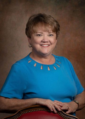
I had the photo taken by Bonnie McCaffery, while in Houston. She took about 100 and I picked this one, (even though I wasn’t sold on the background.)
So, I changed the background to grey and cropped it way in. Better, I think.
Then, for the web headers I cropped it even more.
See the header above. Did I go too far? I’m not sure.
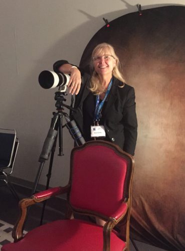
Bonnie was great to work with and I definitely recommend her. She let me turn the tables on her at the end. (My out of focus photo reminded me why I paid a professional.)

All in all, a very good experience.
Ellen Lindner


You are beautiful and Bonnie is awesome!
Thanks so much Lynn!
You went a little too far.. I like showing a bit of your neckline. It softens your appearance. And tHe design is attractive and the light blue fabric lightens your face.
Thanks for the feedback, Howard!