Tag Archives | Abstract

“Heat Wave” Complete

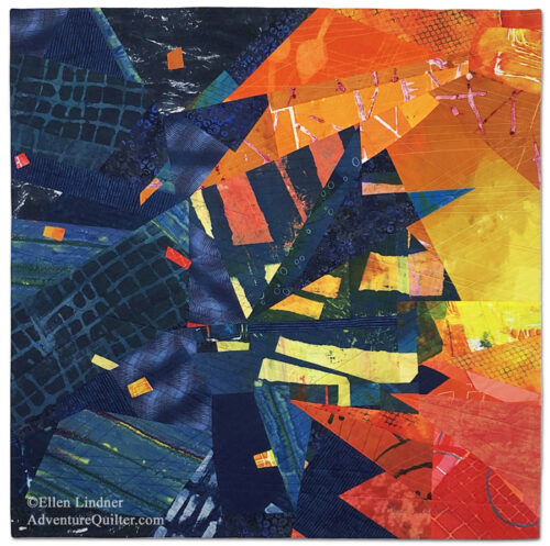
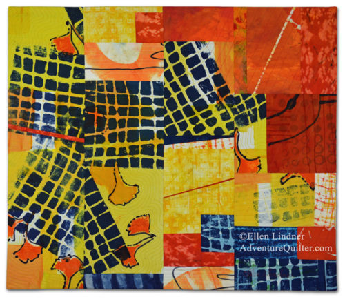
My latest piece, Heat Wave, is now complete.

Heat Wave, an art quilt by Ellen Lindner, AdventureQuilter.com

Heat Wave

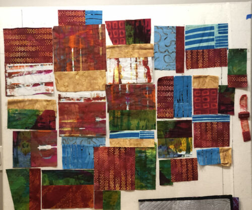
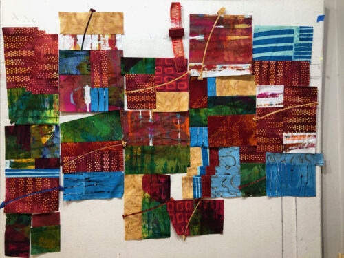
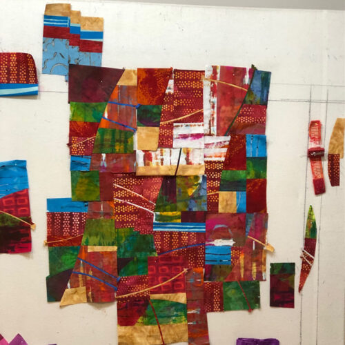
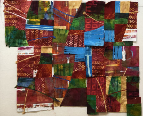
I’m quite happy with it! The design was dictated, in part, by the triangular orange scraps I had on hand. I like the sharp points.

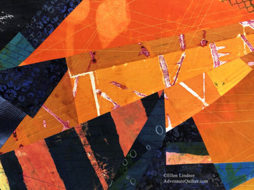
Heat Wave - detail, an art quilt by Ellen Lindner, AdventureQuilter.com

At 35 x 35, this piece is available for $1200. See more photos.

I used ALL of my orange and navy hand dyed fabrics in this piece. I’m looking forward to an upcoming dye session when I can make more.

Ellen Lindner

0

Creative Whimsy Spotlight

As part of my spotlight on Creative Whimsy, I was asked to show several completed quilts.

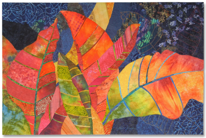
Crotons served as an example of my earlier quilting style. This piece is one of my all time favorites!

Then, I showed some of my more recent abstract pieces, along with these words about my transition to this style.

My first attempts were definitely not great art, but I think they were necessary in order to develop my skills. I don’t regret the time they took or the fabric they required. The PROCESS was valuable! 

This is my mindset in a nutshell. It makes me a little bit fearless because I know the process is valuable, not just the product.

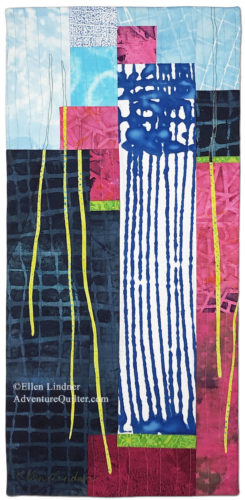
Ripples and Runs is a more recent abstract piece, featuring my own hand dyed fabric.

Ripples and Runs, an art quilt by Ellen Lindner. AdventureQuilter.com

Ripples and Runs

Ditto for Exuberance

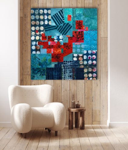
Exhuberance, an art quilt by Ellen Lindner, shown in an intererior. AdventureQuilter.com

A big thank you to Creative Whimsy for featuring me and my art! Their website has many more spotlights of very interesting artists. I hope you’ll investigate.

Ellen Lindner


0

Featured Spotlight on Creative Whimsy

Creative Whimsy, a website about artists and their endeavors has just done a spotlight on me. How nice!

Ellen Lindner Artist Spotlight - Creative Whimsy. Adventure Quilter.com/blog

They sent me a ton of questions and I answered most of them. (I mean, you didn’t want to read PAGES about me, right?)

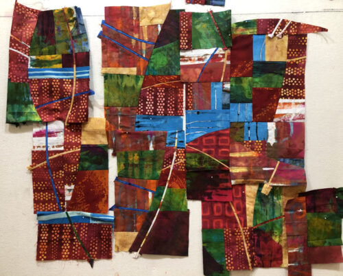
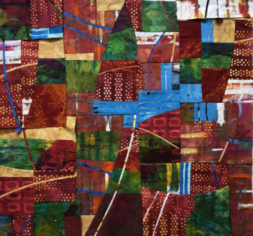
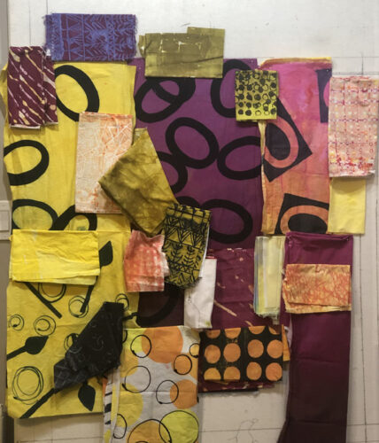
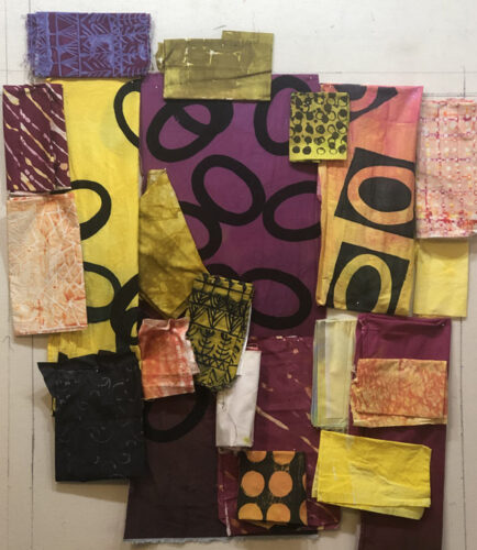
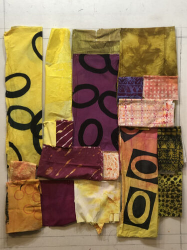
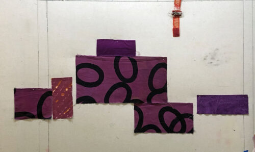
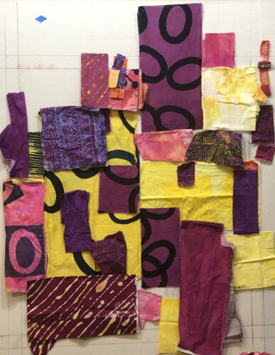
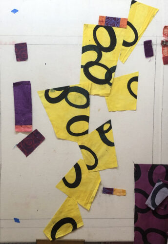
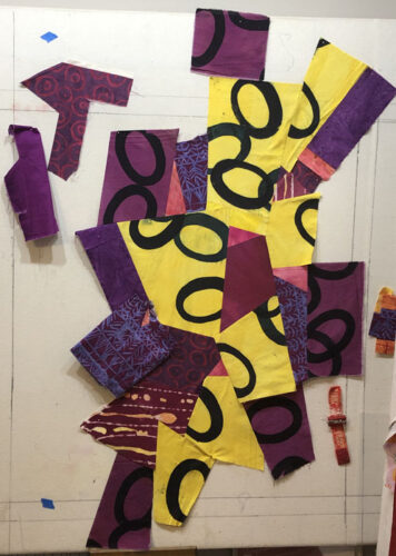
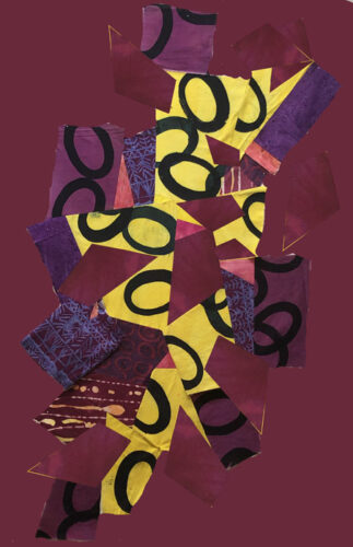
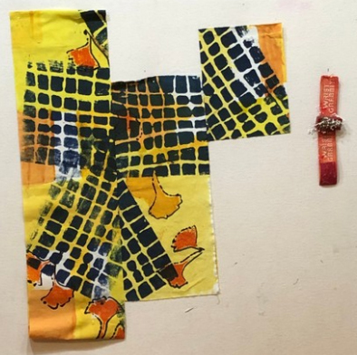
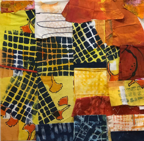
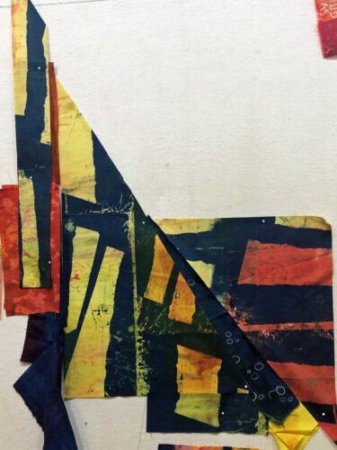
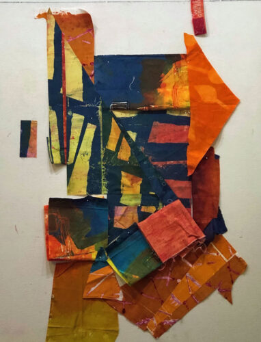
I was glad they asked about my process. I explained how I make decisions at the design wall, since it’s the part of quilt making I really like the most. I showed this series of pictures as an example.

Composing with an Eye Toward Value. Ellen Lindner, AdventureQuilter.com/blog

Composing with Value. Ellen Lindner, AdventureQuilter.com/blog

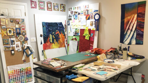
They also asked for a photo of my studio. So, I bravely walked in, LEFT EVERYTHING IN PLACE, and took a photo. This gives you an idea of what it looks like mid-project, although it’s usually much worse!

Ellen Lindner's studio 2024, mid-project. AdventureQuilter.com/blog

I hope you’ll check out the full article (and be willing to scroll past all the ads.)

Ellen Lindner

2

Planning as I Go

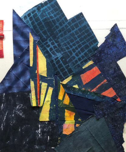
As usual, my current quilt started with a high contrast piece of hand dyed fabric. This is all I had of it.

Planning as I Go. AdventureQuilter.com/blog, Ellen Lindner

What could I do to best show it off?

Planning as I Go. AdventureQuilter.com/blog, Ellen Lindner

The additional fabrics added above provided interest, but the original fabric swatch still seemed rather straight forward.

It was kinda hard to judge against white. I knew I wanted a blue background, so I added some to the design wall to help me judge the overall look.

Planning as I Go. AdventureQuilter.com/blog, Ellen Lindner

I split the featured print and splayed it apart. I thought this added energy, plus some interesting negative blue space.

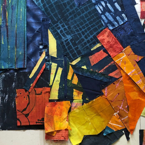
I began to audition additional colors and fabrics. What about a mass of orange on the right and across the bottom? I placed folded fabrics to consider options.

Planning as I Go. AdventureQuilter.com/blog, Ellen Lindner

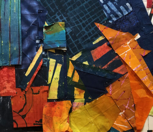
My orange fabric was limited and I knew I’d have to work with the shapes I had: sharp triangles.

Planning as I Go. AdventureQuilter.com/blog, Ellen Lindner

That didn’t seem objectionable. However, I did get rid of the vertical yellow point near the center.

As you might imagine, there was some fiddly stitching on this one. It was actually easier than I expected and I’ll show you some about how I did it in the next post.

My next question: what to do with the lower left.

Ellen Lindner

2

Following the Fabric

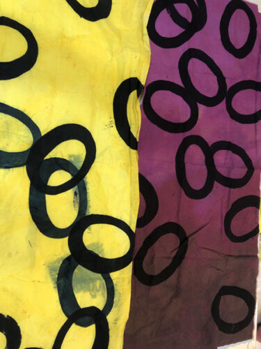
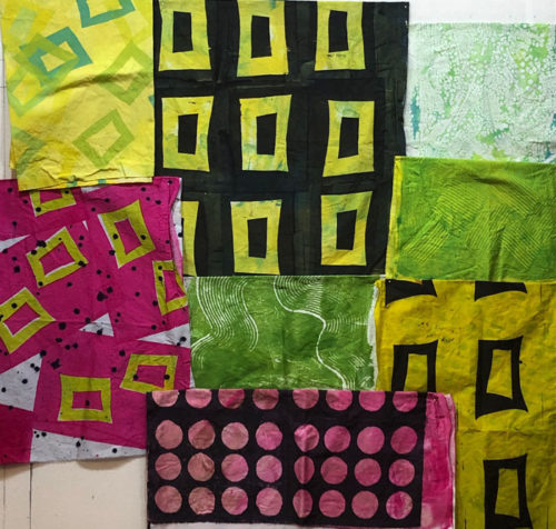
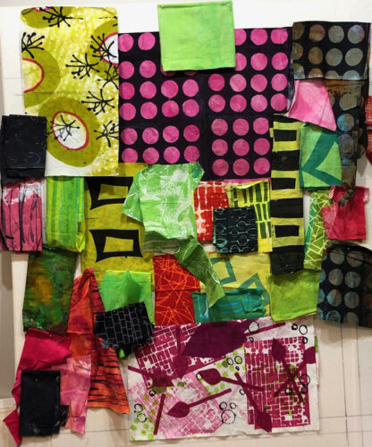
I’ve been working on a new quilt, using fabrics I dye-printed during my last dying session. As you can see, I made them to go together.

Dyeing with Forethought. Ellen Lindner's fabric dyeing results. AdventureQuilter.com/blog

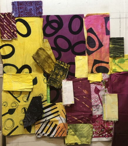
To get started, I pulled these out, along with every fabric I thought MIGHT go with them. As usual, this stage was a rather ugly mess.   (I was toying with the idea of using some pure red bits along with the pink.)

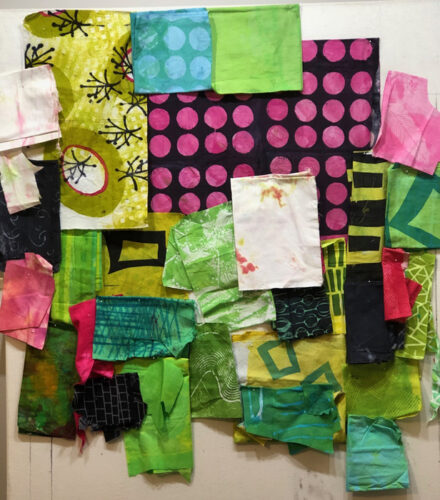
That seemed like overkill. I removed some busy high-contrast fabrics, most of the red, and tried out a little blue-green.

Following the Fabric. Ellen Lindner, AdventureQuilter.com/blog

Much better. I was ready to move ahead.

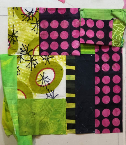
There was a fabric combo in this collection that was really exciting me: the pink and black polka dots and the yellow-green print top left, with the little twiggy shapes. I liked the way the sharp little twigs contrasted with the round dots. Unfortunately, the photo above shows ALL the twiggy fabric that I had. I knew I would have to use it very purposefully and that it’s limited size would also dictate the overall size of the quilt.

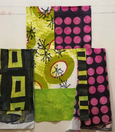
Here’s the entire piece of twiggy fabric plus what I thought was an appropriate amount of the polka-dot. I quickly committed to the central composition and stitched two primary seams. Everything else is shown in audition stage and is only folded and pinned.

I really liked the vertical strip of black and yellow-green stripe just right of center (above.) I made it by carefully cutting a strip from the fabric with the large yellow-green rectangles. I was very happy with that result

Below, I added more fabric on the right. The black spacer between the stripe and the dots was needed as a calming note.

Following the Fabric. An art quilt in progress. Ellen Lindner, AdventureQuilter.com/blog

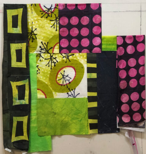
I wasn’t sure about the large rectangles on the left, shown above. They seemed to be sorta taking over. I removed them and concentrated on the right side for a bit. This corner combination seemed about right.

Following the Fabric. An art quilt in progress. Ellen Lindner, AdventureQuilter.com/blog

The left side was definitely going to need some attention. At this point it needed some weight (black) and some pink.

In the next post I’ll show you my progress.

Ellen Lindner

2

Adding Interest to a Background

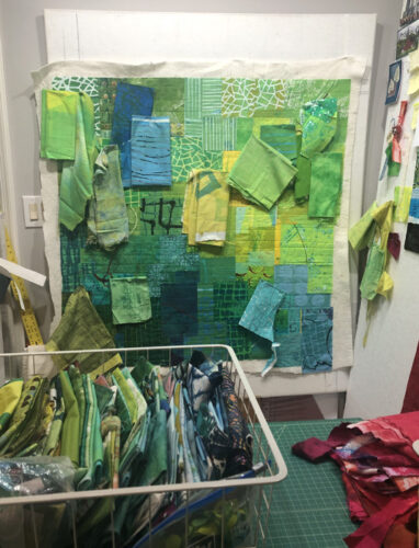
My current quilt is progressing along nicely, (but slowly.) I spent a LOT of time piecing the background and was quite happy with it. But, I wanted to tie the background of angular shapes into the design more. Since I planned to use large circular shapes in the foreground I thought skinny circles in the background would add interest and unity.

First, I auditioned fabrics for the background circles. I wanted them to be fairly subtle. Maybe about 5 or 6 of them. I thought these would be pretty close. But is that darkest blue too dark? We’ll see.

Adding interest to a background. Ellen Lindner, AdventureQuilter.com/blog

I drew the circles on my computer sketch and used that as a loose guide. I spent a good bit of time cutting the fused fabrics and arranging the circles. Here, 3 of my planned 6 are in place. But not attached yet! I pinned everything and studied it before fusing the circles in place.

Adding interest to a background. Ellen Lindner, AdventureQuilter.com/blog

What do you think about the dark blue circle, top left? I think it stands out a little, but I think it will work.

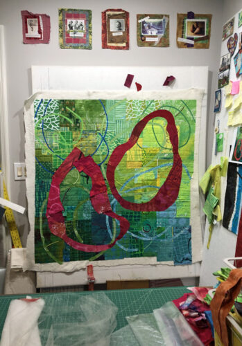
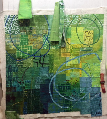
And this is where I am now. The background circles have been fused on and I’m working on the two foreground circles. (The colors are actually much brighter and I’m in love with them!)

Adding interest to a background. Ellen Lindner, AdventureQuilter.com/blog

OK, what about that skinny blue circle now? I think it’s okay, since the strong red foreground elements will attract more attention.

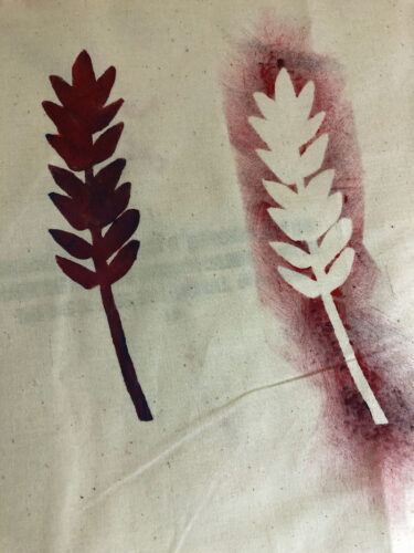
One thing that didn’t work: a wheat stencil. Actually, the stencil itself worked fine. But, it was just too large and too different from everything else. I’ll save it for something else.

Piecing a Green Background. Ellen Lindner, AdventureQuilter.com/blog

I’ve been thinking about the title. This piece is about my parents. My working title was “Daddy Was a Farmer, Mama was a Southern Belle.” While that’s a great title, I don’t think it goes with the narrative of this story. I’ll simplify it and am still thinking about. Maybe I’ll use their names, the number of years they were married, or something along those lines. I can still reference farming and southern hospitality in the artist statement.

I’m getting close!

Ellen Lindner

0

Planning a Foreground Design

I’ve been wanting to do a series of quilts about my family. I made the first one, Happy Family, which used circles to represent people.

"Happy Family" complete. An art quilt by Ellen Lindner. AdventureQuilter.com/blog

Happy Family

With that one the circles were an 11th hour addition. For the next one I wanted to be much more intentional.

After selecting green for the background of my current quilt it immediately got me thinking about my dad, a farmer. I decided to make a quilt about both my mom and my dad. My mom is a very gracious southern woman, who excels at entertaining, gardening, and cooking. I think of her as a Southern Belle, because she’s a beauty, as well. Thus, my working title became “Daddy was a Farmer, Mama was a Southern Belle.” (Note: my mom is still alive and she’s given her blessing to this title.)

Piecing a Green Background. Ellen Lindner, AdventureQuilter.com/blog

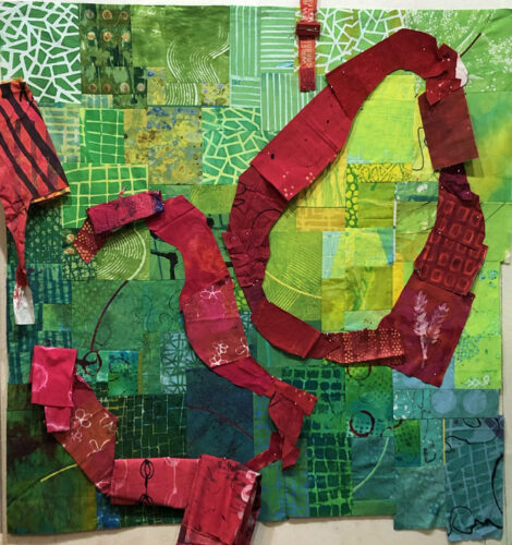
So, how to depict these two with circles??? I knew I wanted to use red to contrast with the green. And it had a sort of farm feel to me, since farm equipment is often red.

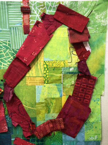
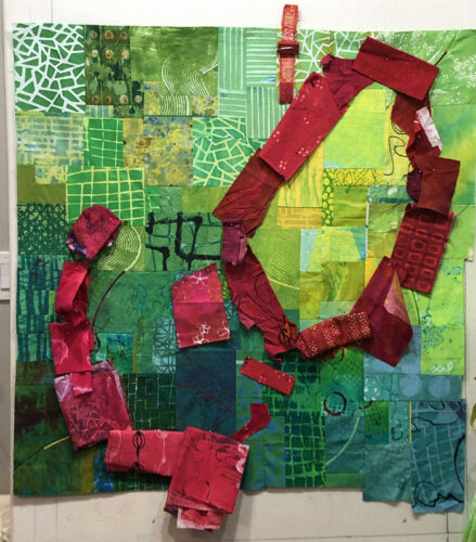
I drew a sketch on the computer and began to audition my ideas on the design wall. I thought Dad (or Daddy as I often addressed him,) needed a big red sort of tear shaped oval.

Planning a Foreground Design Ellen Lindner, AdventureQuilter.com/blog

But, Mom needed to be more curvy.

Planning a Foreground Design Ellen Lindner, AdventureQuilter.com/blog

And slightly pinker.

Planning a Foreground Design Ellen Lindner, AdventureQuilter.com/blog

I managed to find enough red fabrics for my purposes and I’m loving these colors together!

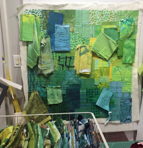
I was REALLY tempted to complete these two shapes, but I began to think about how much easier it would be to quilt the background before adding the circles, especially since I intended to add quilt a few more blue and green ones. So, I quilted the background and started auditioning fabrics for background circles.

Planning a Foreground Design Ellen Lindner, AdventureQuilter.com/blog

The background circles will be MUCH skinnier than the foreground ones. Maybe pinky width.  And they’ll have much lower contrast, serving as a background of ancestors.

The pace on this piece has finally quickened and I’m really enjoying it!

Ellen Lindner

0

Piecing a Green Background

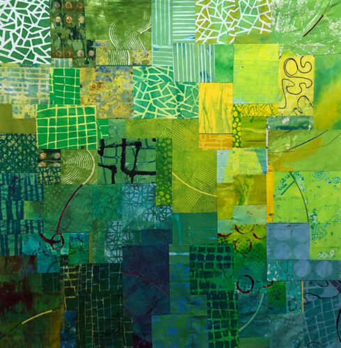
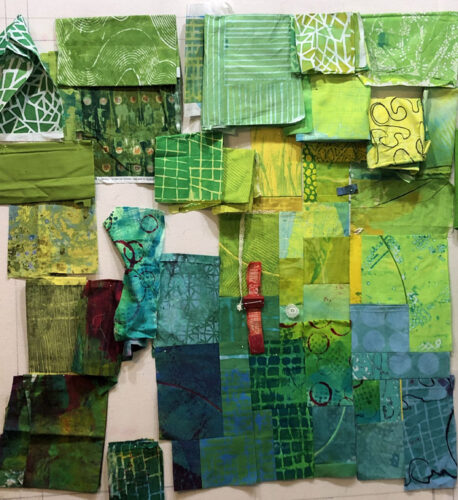
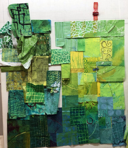
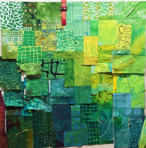
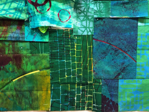
For my latest quilt I envisioned an interesting green background with vibrantly colored circles in the foreground. I got to work on the background with my usual technique of auditioning fabrics and designing as I went along. I chose green, because I had A LOT of green fabric. Plus, I had a theme idea that would work well with green.

Piecing a Green Background. Ellen Lindner, AdventureQuilter.com/blog

It was SLOW!

Piecing a Green Background. Ellen Lindner, AdventureQuilter.com/blog

I would piece a section, audition a section, and repeat.

Piecing a Green Background. Ellen Lindner, AdventureQuilter.com/blog

Thankfully, my efforts paid off and I was quite happy with the way it was developing.

To add interest in the less patterned areas I added several little skinny arcs.

Piecing a Green Background. Ellen Lindner, AdventureQuilter.com/blog

I used red here and there to go with the fabrics and to support the red fabrics I planned to use in the foreground.

Here it is finished and I’m very happy with it. I think it has enough pattern to be interesting, but not so much that it will compete with the foreground.

Piecing a Green Background. Ellen Lindner, AdventureQuilter.com/blog

I think there’s one commercial fabric in there, but otherwise I dyed all of them. I love using my own dyed fabric!

During the time  it took to piece the background I had plenty of time to think about the foreground. I knew I wanted to use red in some very curvy/circular shapes. Auditioning red fabrics was next on my list.

Ellen LIndner


0

Prepping for a Show

I’ve been busy cutting slats, packing and shipping quilts, making lists, and marking things off. Such are the activities needed when preparing for a solo show.

I’ve got my promo/ad all ready to go.

Now I’m working on a press release for the local papers. (When was the last time I wrote one of those???)

After some thought I switched out some quilts. I removed three from the selection and added these two.

Exhuberance, an art quilt by Ellen Lindner. AdventureQuilter.com

Exuberance

Ripples and Runs, an art quilt by Ellen Lindner. AdventureQuilter.com

Ripples and Runs

Now I’m much happier with the overall look. (But, of course, I had to find two more slats.)

I’m getting excited! If you’re in the vicinity of Orange, VA I  hope you’ll check out the show: May 1 – June 29.

Ellen Lindner

8

Solo Exhibit Coming to Orange, VA

I grew up on a dairy farm, about 15 miles from the little town of Orange, VA. It didn’t even have a stop light at the time! Now, although the population is still around 5000, Orange has several stop lights, a couple of fast food joints, and even an art center!

I’m delighted to have a solo show coming up at The Arts Center in Orange, opening May 1st. A reception will be on the evening of the 2nd.

Of course, any solo show is exciting, but I think it will be especially fun to have one in the town where I grew up. I still have quite a few family members and friends in the area, so I’ll definitely get to do some socializing.

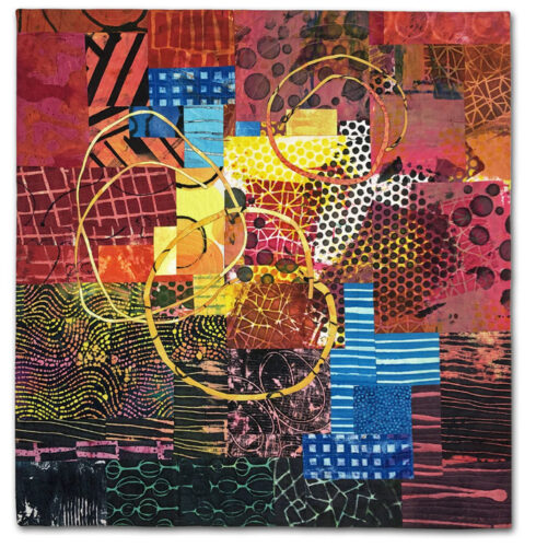
I’ll have 22 pieces in the show, in a variety of sizes, styles, and prices. Here are a couple of the abstract pieces.


These two pieces are sorta sisters, both 36h x 24w.

I’ll be showing some other pieces in coming posts, and you can more sneak peeks here.
If you’re in the area, I’d love to have you stop by the opening reception or the show!

Ellen Lindner

0