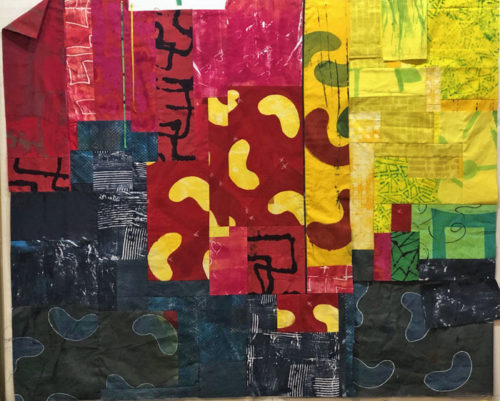
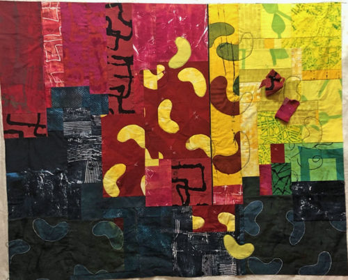
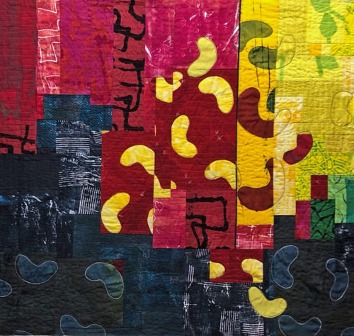
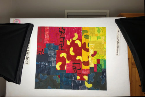
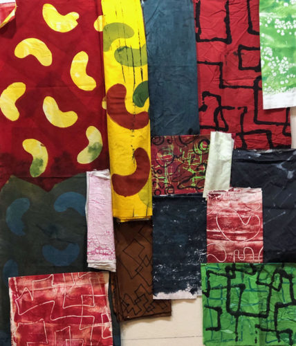
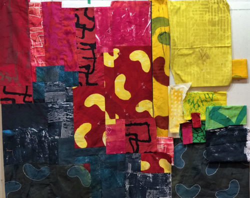
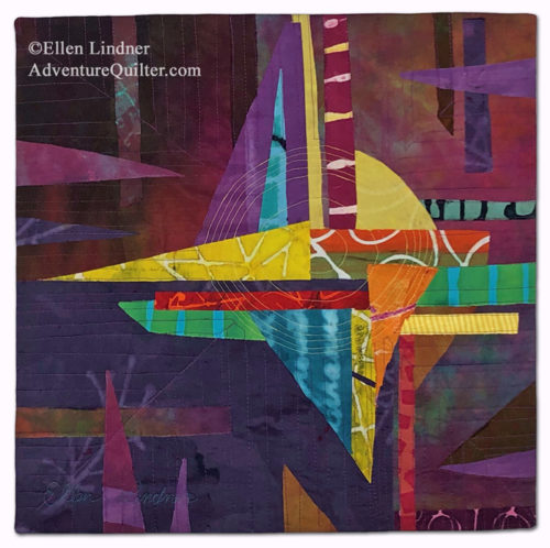
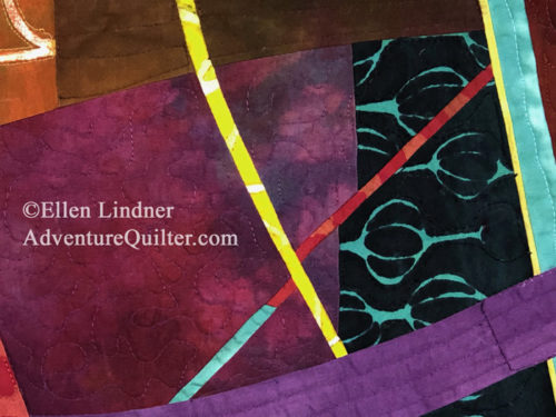
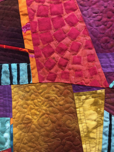
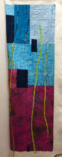
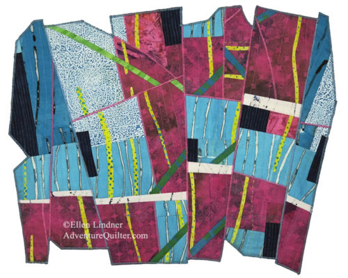
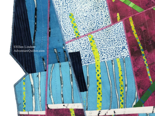
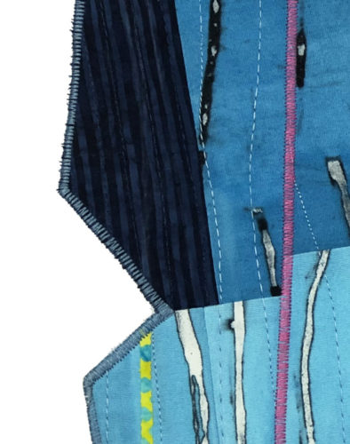
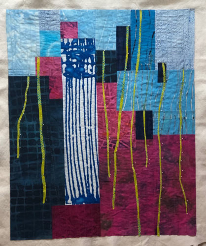
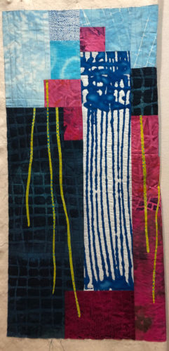
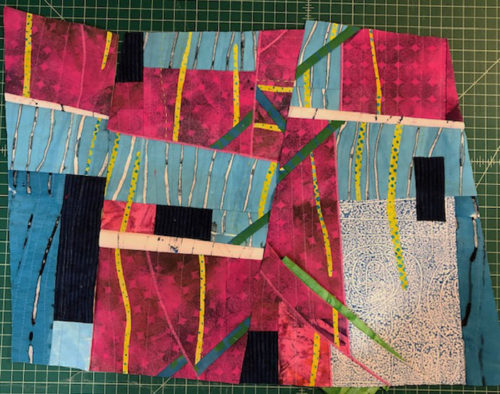
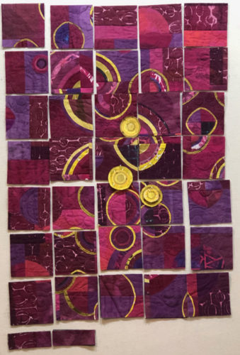
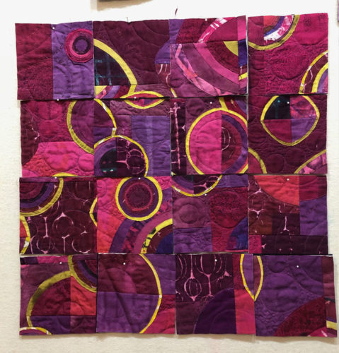
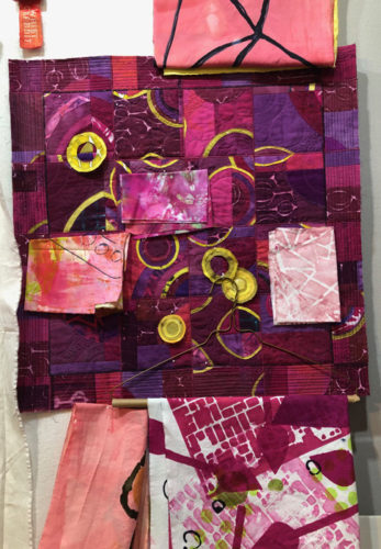
I dyed this fabric last year and it’s one of my favorites.
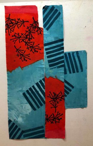
I was really happy with the way I had a viable design without doing anything more to it, but HOW do you design with that? I had a false start last year and am now trying again.
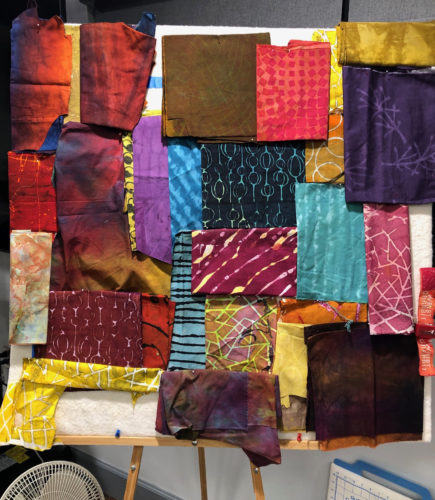
These are the collection of “featured” fabrics I thought I might be able to use. I call them featured fabrics because they have high amounts of contrast in them, which will draw the viewer’s eye. When working with such fabrics, I try to put them in place early on and then fill in with less dramatic fabrics, as needed.
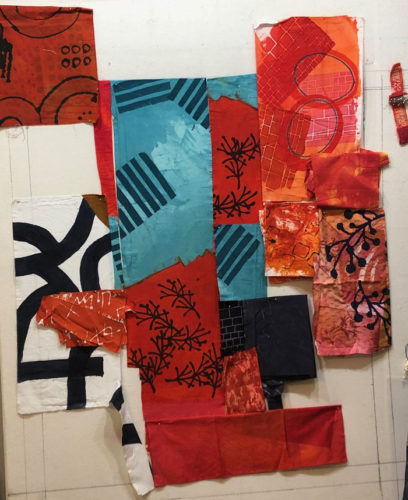
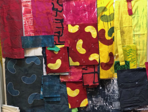
Next, I pulled out every fabric I thought might work. As you can see, I like these colors and found that I had quite a collection.
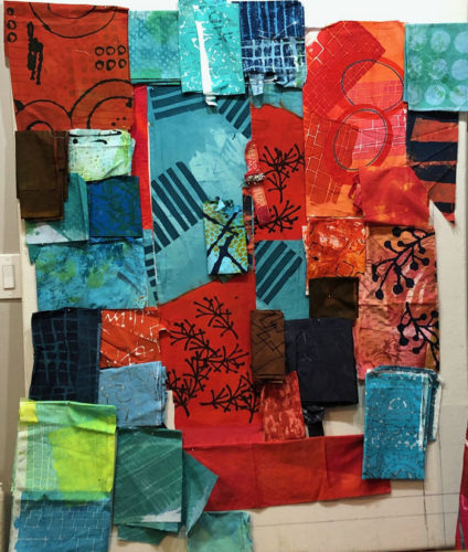
But, maybe it needed something unexpected. What about accents of yellow?
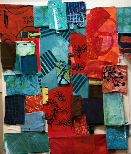
Hmm. Maybe.
I liked the large twig (center right) on the dull orange print. But, I didn’t like the background fabric. So, I stenciled on a couple more using paint.
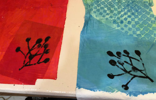
These should be usable.
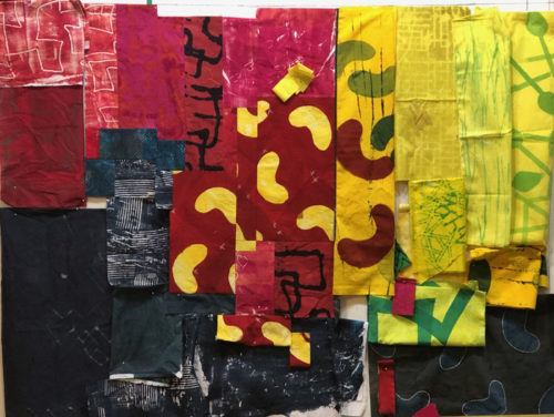
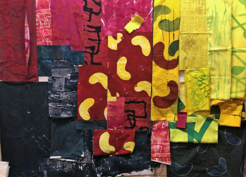
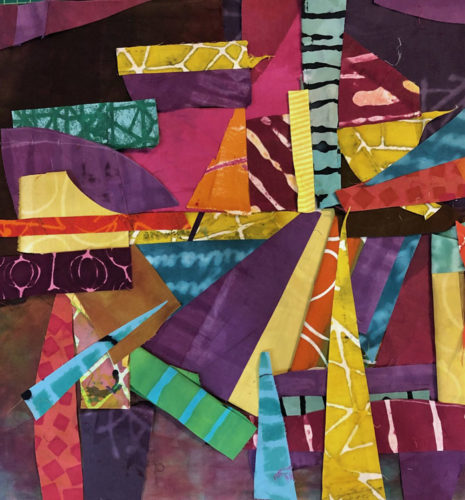
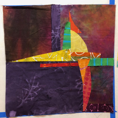
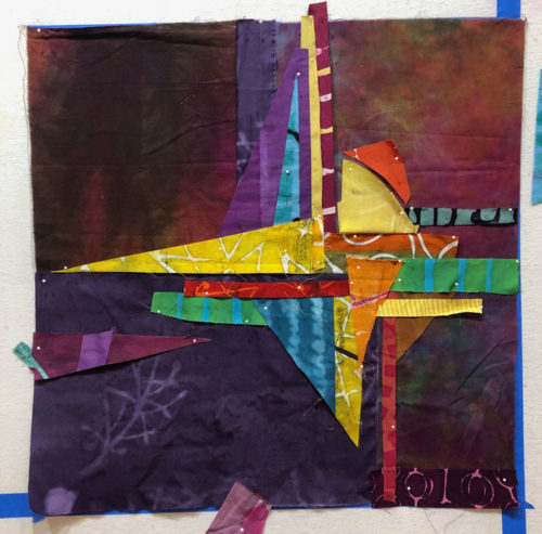
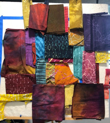
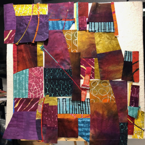
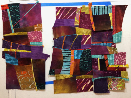
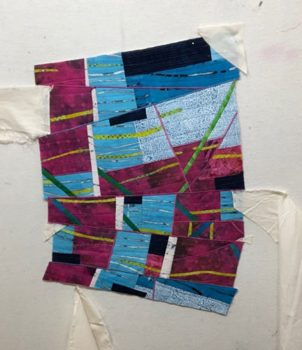
I had my fabric decisions (mostly) made, so it was time to start moving things around on the design wall. (The challenging, but fun, part!)
Ellen Lindner

