Tag Archives | Collage

A “Sour Dough” Quilt

I’ve never made sour dough bread, but I know that it requires a starter. And also that some of the ingredients are reserved for a future loaf. With this in mind, I think my current project is a “sour dough” quilt.

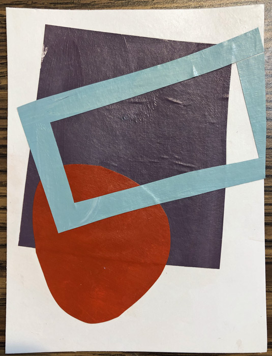
It all started with these blocks that were leftover from an earlier project. These were the starter. (Each mini composition is held together with glue.)

A Fabric-Inspired Quilt. Ellen Lindner, AdventureQuilter.com/blog

I didn’t really have a plan, but I put a piece of muslin up on my design wall and started slowly adding the blocks.

A "Sour Dough" Quilt. Elen Lindner, AdventureQuilter.com/blog

I immediately liked the colors and the energy of the oddball shapes. However, it was clear to me that I wouldn’t want to butt the pieces right up next to each other. Doing so would make all the shapes merge together. Instead, I’d need a dark or light fabric separating the colorful shapes.

That made me think of Susan Lapham’s quilts. She often uses white between here blocks and connects them with skinny black strips. I decided to emulate her style for this one.

A "Sour Dough" Quilt. Elen Lindner, AdventureQuilter.com/blog

Initially, I added white blocks as I was creating the composition. But, I realized it would be easier to add the white at the end. The white fabrics are also starters, since they were torn for an earlier project, but never used.

A "Sour Dough" Quilt. Elen Lindner, AdventureQuilter.com/blog

I switched to dark teal strips pretty earlier on. (And I fused the back of that fabric: very unusual for me.)

A "Sour Dough" Quilt. Elen Lindner, AdventureQuilter.com/blog

At this stage, I can see that I need some smaller pieces. Maybe I’ll cut some of my blocks or maybe I’ll add some fresh cut little squares. And what about adding an accent of a new color? It’s all up for consideration.

I’ve really been enjoying this little project. What fun things have you been working on lately?

Ellen Lindner

4

Variety of Scale

Lately, I’ve been really concentrating on using a “variety of scale” in the patterns and compositions I’ve been using. First,  in a collage course  I took  with  Jane  Davies.  After  making  and  cropping  small  collages  she  directed  us  to  add  details  with  markers.  (I never  asked  for  her  feedback  on  these,  so  they’re  MY  interpretation  of  what  might  work.)

With each one I asked, “Where is there a big spot that needs some interest?” I thought this first one looked pretty good without any additions, but I thought a tiny line would add interest. And it did!

Variety of Scale. Ellen Lindner, AdventureQuilter.com/blog

Next question, “Should the additions emphasize what’s already there, or should I add an entirely new shape or color?” You can see that I’ve used both.

Variety of Scale. Ellen Lindner, AdventureQuilter.com/blog

I often let my new elements extend over two different pieces. This worked visually, since the small scale of the new items didn’t obliterate the larger pieces.

Variety of Scale. Ellen Lindner, AdventureQuilter.com/blog

Sometimes I followed Jane’s example of changing marker colors as the background color changed.

Variety of Scale. Ellen Lindner, AdventureQuilter.com/blog

Some compositions needed very little added. But, it does make a difference, don’t you think?

Variety of Scale. Ellen Lindner, AdventureQuilter.com/blog

I’ve also been thinking about variety of scale as I’ve been trying to use several favorite fabrics together in the same piece. Most of them were large in scale, so I found myself matching them up with near solids and quieter neutrals. Early progress is shown below.

Using Large Scale Prints. Ellen Lindner, AdventureQuilter.com/blog

I was liking these together. They were a challenging, but fun, mix.

Ellen Lindner

0

Cropping and Negative Space

After making small collages our online instructor, Jane Davies, asked us to visually crop them and to pay attention to negative space. Well, I’m sort of “known” for cropping things, so I was right in my comfort zone!

Before:

Cropping and Negative Space. Ellen Lindner, AdventureQuilter.com/blog

After:

Cropping and Negative Space. Ellen Lindner, AdventureQuilter.com/blog

As expected, everything looked better when cropped. There were several reasons for this:
– Due to the sizes of the backgrounds and the added shapes, there was just too much blank background in some of these.
– When an element runs off the edge of a composition, it engages the viewer more. The viewer subconsciously realizes that the shape continues and this holds their interest.
– *The background (negative) space becomes more interesting. Look at the example above. Initially the background was one large sort of doughnut-shaped piece of white. After cropping, it became 4 different, and more interesting shapes.

Here are some more examples:

Cropping and Negative Space. Ellen Lindner, AdventureQuilter.com/blog

Cropping and Negative Space. Ellen Lindner, AdventureQuilter.com/blog

Cropping and Negative Space. Ellen Lindner, AdventureQuilter.com/blog

Cropping and Negative Space. Ellen Lindner, AdventureQuilter.com/blog

Cropping and Negative Space. Ellen Lindner, AdventureQuilter.com/blog

Cropping and Negative Space. Ellen Lindner, AdventureQuilter.com/blog

They’re all better after cropping, right?

As a painter, Jane advised us NOT to physically crop our work, but to get comfortable with filling the size of the canvas, instead. As a fabric artist, I think I can safely ignore that advice. (Let’s hope so, because I’ve been cropping for years!)

Have you ever considered cropping your work? I find it to be a very useful design tool.

Ellen Lindner
P.S. See my most dramatic crop.
P.P.S. If you liked that article, you may be interested in others.

0

Playing with Colored Pieces of Paper

You can’t work with a bunch of pieces of colored paper without seeing some design possibilities!

As part of my online class with Jane Davies, I was arranging, and rearranging, and rearranging again a wide array of colors and shapes.

Playing with Colored Pieces of Paper. Ellen Lindner, AdventureQuilter.com

Our first assignment was to make a largish collage with multiple pieces. Mine missed the mark (although I had fun doing it.)

Playing with Colored Pieces of Paper. Ellen Lindner, AdventureQuilter.com

Along the way, I was seduced by all the colors and I just HAD to play with them outside the scope of the class exercises. I played with monochromatic greys. Look how nicely they set off soft colors. Could I use enough restraint to create with these colors in fabric? I’m not sure.

Playing with Colored Pieces of Paper. Ellen Lindner, AdventureQuilter.com

Then, I saw a photo of a red beet and a gold beet. So, I had to play with those colors a little. A little sharp, perhaps, but still something I may want to explore in the future.

Playing with Colored Pieces of Paper. Ellen Lindner, AdventureQuilter.com

Eventually, we got to make collages with just three pieces and I was swimming back in more comfortable waters. Quite a few of these were successful, but I know Jane will have us alter them in the next step. I’m very interested to see what we’ll do with them.

Playing with Colored Pieces of Paper. Ellen Lindner, AdventureQuilter.com

When was the last time you took a class that didn’t involve fabric? I think it’s a really good way to explore new ideas and I feel confident some of these will find their way into my fabric  collages.

Ellen Lindner

0

Painting Sophisticated Colors

I’m currently enrolled in a mini-collage class with Jane Davies. For week one, she had us paint A LOT of swatches. Surprisingly, I didn’t need to buy any paint. I guess I’ve done more of this over the years than I realized.

Painting Sophisticated Colors. Ellen Lindner, AdventureQuilter.com/blog
I’m pretty good at mixing colors, but I still gets streaks sometimes.

Jane asked us to paint only what she calls sophisticated colors. These are colors with both some black and white in them. In other words, they’re somewhat subdued. More like the colors you might paint your home than the bright colors children like. Of course, I like the bright colors, so their omission has already piqued my interest. After quite a few swatches, I checked my collection for light, medium, and dark. I thought I was on track.

Painting Sophisticated Colors. Ellen Lindner, AdventureQuilter.com/blog

After about 80 swatches over all this is what I had. Not bad, I thought.

Painting Sophisticated Colors. Ellen Lindner, AdventureQuilter.com/blog

But, Jane, asked for more lights and neutrals, so I painted up another 20 or so.

She also encouraged us to paint Chromatic Grays. I’d never heard this term a couple of months ago, but now it seems that I can’t get away from it. As the name implies, these are grays that have a significant undertone of a particular color. These are the colors I initially identified as being chromatic grays.

Painting Sophisticated Colors. Ellen Lindner, AdventureQuilter.com/blog

Now I can see that at least two of these are too colorful. I guess I’m learning.

Again, the idea of using these duller colors is piquing my interest. Since I plan  to eventually do some of the class exercises in fabric, I pulled out a few drawers to see if I even owned any chromatic grays.

Painting Sophisticated Colors. Ellen Lindner, AdventureQuilter.com/blog

Hmm. I think probably not. Maybe this will be a future fabric dyeing project for me.

How about you? Do you ever dabble in other media? I think it’s a good creative exercise and I’m excited about it.

Ellen Lindner

0

Christmas Cactus Abstracted

Inspired by a Christmas cactus. Ellen Lindner, AdventureQuilter.com
After studying my photo of a Christmas cactus, I decided to try abstracting it with one repeated shape. Maybe something like these “spike” shapes. Christmas Cactus Abstraction. Ellen Lindner, AdventureQuilter.com
Yes, I thought they worked well.

My original idea was to fill the entire space with this shape, just changing the color for background grass, brick, etc. But, when I tried that for grass I didn’t like it at all. Especially since just a few shapes were so effective.

Christmas Cactus Abstraction. Ellen Lindner, AdventureQuilter.com

So, I decided to depict the actual plant only.

Here it’s shown as a square. I thought it would probably be better if I cropped off some of the left area.

Christmas Cactus Abstraction. Ellen Lindner, AdventureQuilter.com

From there things fell together easily. Here it is, well under way.

Christmas Cactus Abstraction. Ellen Lindner, AdventureQuilter.com

I was loving how it was coming together and I didn’t want to over work it. Audition. Edit. Repeat.

I think I’ll have this one finished quickly. Stay tuned.

Ellen Lindner
P.S. I’m not sure how to quilt the background. I’ll have to give that a good bit of thought.

6

“She Has a Great Personality” Complete

I finally got around to properly photographing my latest quilt, She Has a Great Personality. It’s meant to be a self-portrait in the style of a favorite artist. In this case, that artist is abstract painter Jane Davies.

"She Has a Great Personality" Complete. Ellen Lindner, AdventureQuilter.com/blog

I thought working abstractly would be difficult, but it wasn’t too bad. I had more trouble deciding on some of the details.

I added hand stitching in several areas to help tie it all together.

"She Has a Great Personality" Complete. Ellen Lindner, AdventureQuilter.com/blog

I’m very happy with it, and I think it represents me pretty well.

Ellen Lindner

2

I Almost Forgot

My raw edge collage techniques involves lots of layering. Sometimes perfectly wonderful fabrics get covered by something else later. However, I don’t typically rescue those underneath fabrics. Instead, I tell myself that I bought the fabric to use and if it’s function is to support later fabrics, and to give me flexibility then it has served me in a useful way.

But, on my current quilt, there’s a large shape that landed on top of the background. See what I mean?

So, I decided to rescue the red section underneath the largest turquoise shape. Both the red and turquoise sections were built on – and glued to – muslin, so I knew I could easily separate them.

But then I forgot.

Meanwhile, I started quilting the background, even though there were still foreground elements to be added. This was a logistical decision, since it will help me avoid all the starting and stopping that would otherwise be necessary to dodge all the things I intend to add.

About halfway through I remembered my earlier plans. So, I pulled up the batting as best I could on the lower portion. Some of it was already stitched down.

I Almost Forgot. Ellen Lindner, AdventureQuilter.com/blog

As you can see, I cut away the red portion, where able.

And I found two pins still stuck into that fabric! Good thing I did. I’ve had to cut them out a few times in the past.

But, since I was cutting from the back, I didn’t judge well and I actually cut into the background in the area I wanted to keep. Gulp!

I Almost Forgot. Ellen Lindner, AdventureQuilter.com/blog

But, since I work in raw edge collage, and quick patch took care of that.

I Almost Forgot. Ellen Lindner, AdventureQuilter.com/blog

Back to quilting!

Ellen Lindner

0

An Abstract Self-Portrait?

I like challenges. As a result, I’m currently working on an abstract self-portrait. It all came about when my art group, Dirty Dozen Fiber Artists, came up with (another) self-portrait challenge. This one was to be inspired by another artist.

After some online searching and thought I decided on one of my favorite contemporary artists, Jane Davies.  She’s a painter and collage artist who does extraordinary abstract work.

Pattern Study 1 by Jane Davies. AdventuareQuilter.com/blog

Stripes and Dips 1 by Jane Davies. AdventuareQuilter.com/blog

Pattern Study 3 by Jane Davies. AdventuareQuilter.com/blog

Great, aren’t they? But, how do I make an abstract person? I remembered seeing one of her pieces (which I couldn’t find again,) that had a figure-like shape and I thought I could emulate that.

After creating an orange and red background, I auditioned the shape and placement of the figure with parchment paper.

An Abstract Self-Portrait? Ellen Lindner, AdventureQuilter.com/blog

And then, the fabrics.

An Abstract Self-Portrait? Ellen Lindner, AdventureQuilter.com/blog

I think it works pretty well. What do you think?

I’ll be adding a squiggly black line to this – again in the style of Jane Davies. I’m really enjoying working on this!

Ellen Lindner
P.S. Jane Davies has some excellent free tutorials and a great book about painting abstracts.

0