Tag Archives | Design

That Fabric Again

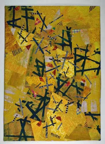
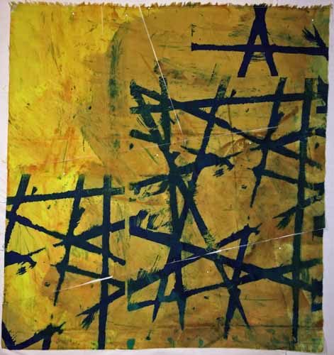
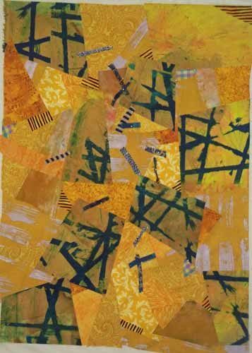
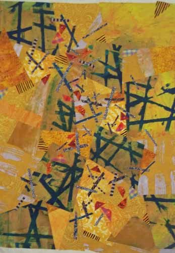
Remember the great fabric I used in my quilt Initial Response? I still had half of it, ready to use on the next project. This portion made me think of fall leaves, with the twigs and branches of trees peeking through.  Can you see it?

That Fabric Again. Ellen Lindner, AdventureQuilter.com/blog

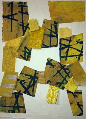
That was enough to get me started.  From there I cut it into 9 pieces.  (Not square, of course.) If you look closely, you can see the cuts, above.

I decided the feature fabric should be about 1/4 of the quilt design, which helped me determine the size.

That Fabric Again. Ellen Lindner, AdventureQuilter.com/blog

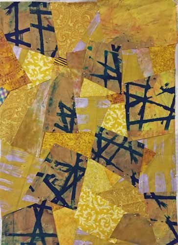
I put 4 of my 9 pieces in the corners and scattered the others throughout.  Then I started filling in with fabrics from my stash, both commercial and hand dyed.

Soon, I had this.  “Not bad,” I thought.

That Fabric Again. Ellen Lindner, AdventureQuilter.com/blog

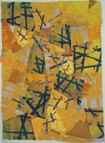
I added a little more interest with some small snippets of plaids and stripes.  And then began to audition twig fabrics and widths.  I decided most of them would need to be pretty skinny.

That Fabric Again. Ellen Lindner, AdventureQuilter.com/blog

I added QUITE A FEW twigs and was happy with the results.

That Fabric Again. Ellen Lindner, AdventureQuilter.com/blog

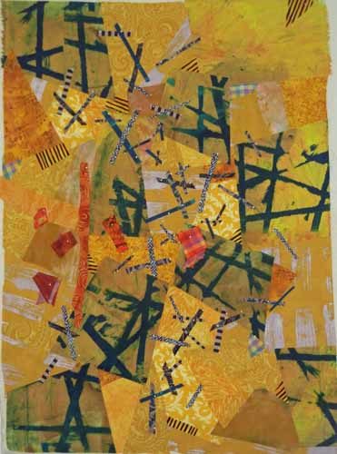
As I thought more about fall leaves I realized I should probably add some color variations.  I tried several fabrics in the orange family. Some were very bright and sort of took over.  Maybe I could still use them in small pieces.  Others were too dull and were removed from consideration.

In the next post I’ll show you what I did with these fabrics.

Ellen Lindner

3

Two Days with Pat Pauly

I was lucky enough to take a two day class with Pat Pauly. Fabric was flying and Adrenalin was flowing as she challenged us to work without a lot of planning.

Two Days with Pat Pauly. Ellen Lindner, AdventureQuilter.com/blog

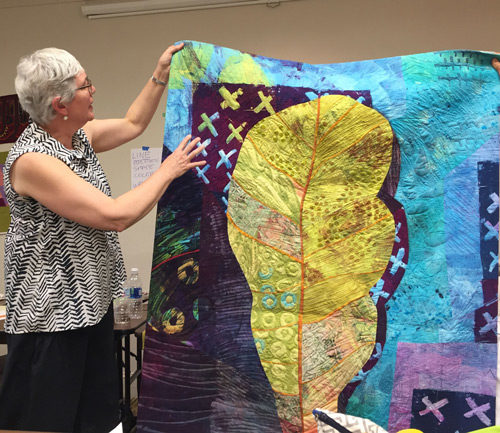
Pat talking about the inspiration for this quilt.

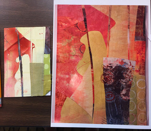
The purpose of the class was to teach us various ways to jump start an abstract design.  One way Pat does that is by making small collaged “postcards.”  These can later serve as quilt sketches.

Like this, with the sketch on the left and the quilt on the right.

Two Days with Pat Pauly. Ellen Lindner, AdventureQuilter.com/blog

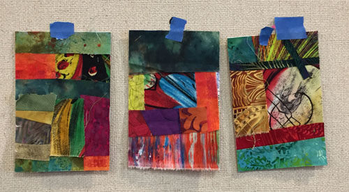
And then the students tried it. Anita Krug had especially good results. Wouldn’t these make great quilt designs?

Two Days with Pat Pauly. Ellen Lindner, AdventureQuilter.com/blog

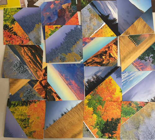
And Karol Kusmaul made a very interesting composition by cutting up and rearranging calendar pages.

Two Days with Pat Pauly. Ellen Lindner, AdventureQuilter.com/blog

Doesn’t this look like fun?

I’d say everyone in the room pushed well beyond their comfort zone.  And we learned a lot!

If you ever get a chance to take a class with Pat Pauly, I highly recommend it.

Ellen Lindner

4

Two Steps Back

Well, I just wasn’t happy with the in-progress quilt I showed you last time. It seemed a little static.

Three Steps Forward. Ellen Lindner, AdventureQuilter.com/blog

I tried to analyze what needed to change and I referenced my original black and white sketch.

Two Steps Back. Ellen Lindner, AdventurQuilter.com/blog

Wait a second.  It was different from the working sketch I’d been using:

It all Started with a Beautiful Fabric. Ellen Lindner, AdventureQuilter.com/blog

At some point I had switched the values of the two loosely horizontal lines.  I had worked with the one showing the lower line dark and the top one very light.  But now, looking at what was currently in my sketch book, I thought the other (top) version was definitely better.  Could such a subtle thing make that much difference?  Well, in my mind it clearly did.

So, I decided to make some changes.  In addition to the value shift I wanted to really play up the red as the primary motif color and to make the lines fatter and more irregular.  (Again, more like the sketch.) I took all the motif pieces off and started again on the plain background. (Two steps back.)

My redo was much easier than my first attempt, probably because I had a clearer idea of what I wanted to achieve.  “Play up the red” was my first priority.

Two Steps Back. Ellen Lindner, AdventurQuilter.com/blog

Bam!  As soon as I put this up I liked it SO much better!  There was the drama I had been missing!  After auditioning some red fabrics, I came up with this.

Two Steps Back. Ellen Lindner, AdventurQuilter.com/blog

Yes!  A definite improvement.  From here my goal was to add interest without detracting from these strong red lines.  Which meant that most of the lines would be low contrast. Like the aqua lines I was adding below.

Two Steps Back. Ellen Lindner, AdventurQuilter.com/blog

Auditioning green for the lower line: I was liking it better than the previous yellow. Of course, it needs to tuck under at least some of those lines to avoid getting too much attention.  Did you notice that I tweaked the red “horizontal” line?

Two Steps Back. Ellen Lindner, AdventurQuilter.com/blog

But, should I add some yellow somewhere?  I was still fiddling at this point, but getting very close to finalizing everything.

There you have it: 3 steps forward in my previous post and 2 steps backward in this one.  But, I don’t let that bother me, especially since I eventually moved forward  I figured out what was wrong and corrected it.  There’s often some trial and error in art making and I don’t let it discourage me.  In fact, sometimes I think I just have to get that wrong thing out of my head before I can properly entertain something better.  Does anyone else have that experience?

Ellen Lindner
4

Three Steps Forward

After completing the background of my abstract quilt, I was ready to tackle the primary motif.  I used my sketch as the idea.

It all Started with a Beautiful Fabric. Ellen Lindner, AdventureQuilter.com/blog

Next, I had to choose colors.  I thought some red might be dynamic.

Taking Inspiration from the Starting Fabric. Ellen Lindner, AdventureQuilter.com/blog

 I used photo editing software to audition several different color options.

Three Steps Forward. Ellen Lindner, AdventurQuilter.com/blog

I wanted to play up the red (above) but the yellow provided so much contrast that I decided I needed to work with it in my planned focal point.  Maybe this:

Three Steps Forward. Ellen Lindner, AdventurQuilter.com/blog

Or maybe I should drop the red altogether.

Three Steps Forward. Ellen Lindner, AdventurQuilter.com/blog

I decided to forge ahead with this arrangement.

Three Steps Forward. Ellen Lindner, AdventurQuilter.com/blog

Which meant auditioning red and yellow fabrics.

And eventually I got this.

Three Steps Forward. Ellen Lindner, AdventureQuilter.com/blog

Hmm.  I liked it but it didn’t have the drama I expected.  Did the shapes need to be wider? More experimentation would be needed.

Ellen Lindner

4

It all Started with Beautiful Fabric

Back in July I bought this beautiful painted piece of fabric from Pat Pauly.

It all Started with a Beautiful Fabric. Ellen Lindner, AdventureQuilter.com/blog

Isn’t it gorgeous?  I knew it could be the start of something wonderful.  The only problem is that the scale of this fabric is much larger than I normally use. Which meant that I didn’t have other similarly scaled fabrics to work with.  Still, I thought I could feature this inspiration fabric and add simpler fabrics to it.

First, I had to figure out how much of this fabric to use and a rough idea of the size of the quilt.  I decided to use half of the fabric.

It all Started with a Beautiful Fabric. Ellen Lindner, AdventureQuilter.com/blog

Then, I auditioned how I might cut it and reassemble it.  Folding helped me visualize the new shape of the fabric.

It all Started with a Beautiful Fabric. Ellen Lindner, AdventureQuilter.com/blog

So, I did this. The piece on the right has been turned 180 degrees.

It all Started with a Beautiful Fabric. Ellen Lindner, AdventureQuilter.com/blog

Next, I began to audition other fabrics.  I thought these looked pretty good.

It all Started with a Beautiful Fabric. Ellen Lindner, AdventureQuilter.com/blog

At every turn, I used the starting fabric to help me make decisions.  Such as the angles for the side pieces.  I wanted them to enhance the angular nature of the starting fabric’s pattern. See what I mean?

It all Started with a Beautiful Fabric. Ellen Lindner, AdventureQuilter.com/blog

Here’s the left side completed. (That is, pinned.)

It all Started with a Beautiful Fabric. Ellen Lindner, AdventureQuilter.com/blog

And here’s the entire background when I THOUGHT it was finished.

It all Started with a Beautiful Fabric. Ellen Lindner, AdventureQuilter.com/blog

I decided that one of the yellow fabrics on the right showed up too much, so I had to address that.  Trial and error!

Thus far, I’ve shown you only the background.  But I was also working on an idea for a foreground motif.  I’ll show you that next time.

What would you do?

Ellen Lindner


6

My Brothers: Clothing

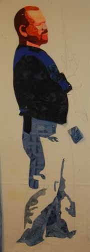
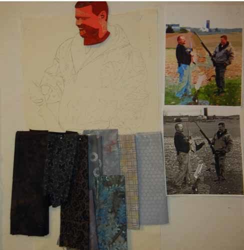
I’m happy with the way the quilt featuring my two brothers is developing.  Here’s my brother Ricky almost complete.

Clothing in-progress. Ellen Lindner, AdventureQuilter.com/blog

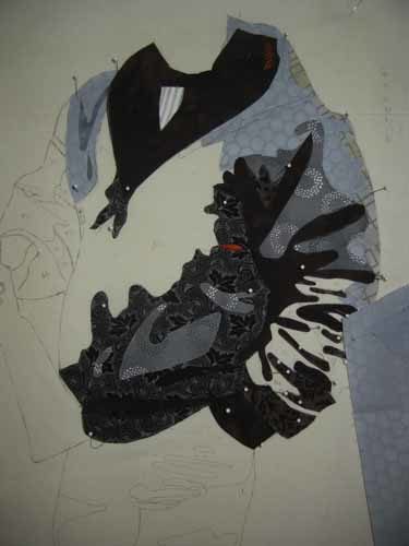
After making the face of my other brother, Todd, it was time to work on his jacket.  First, auditioning fabric.

Clothing in-progress. Ellen Lindner, AdventureQuilter.com/blog

Here it is, in-progress.

Clothing in-progress. Ellen Lindner, AdventureQuilter.com/blog

All these little pieces were eventually glued to the muslin base and to each other.

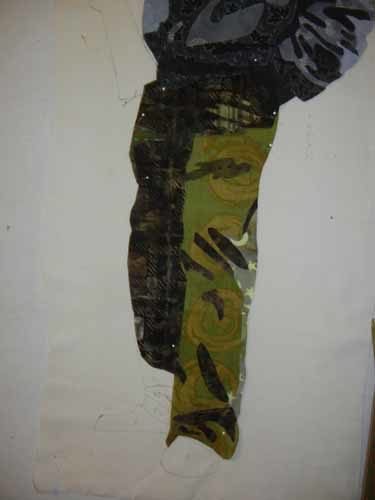
Selecting fabrics for Todd’s pants was more challenging. They were sort of Army green; not a color I tend to stock.  My first attempt:

Clothing in-progress. Ellen Lindner, AdventureQuilter.com/blog

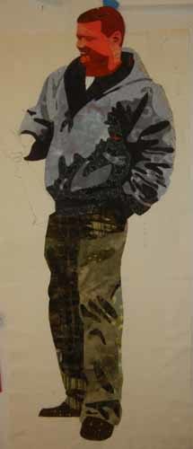
No.  I decided the color was too bright.  This was my solution.  Much better, I think.

Clothing in-progress. Ellen Lindner, AdventureQuilter.com/blog

Now that I’ve completed the two men I’m just getting started on the background.  I’ll make it much looser, which I’m looking forward to.

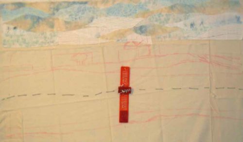
So far, I’ve just worked on the sky. Some of it looks a little strong to me, but I’ve learned not to cast judgement until I can see everything together.

Clothing in-progress. Ellen Lindner, AdventureQuilter.com/blog

As you can see in the photo above, I’ve drawn the background fields and barns onto the muslin base.  I’ll reference these as I continue.

Ellen Lindner

11

Abstract Exercises: Line and Composition

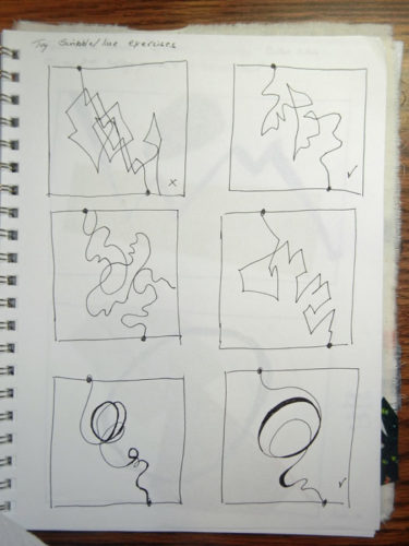
Continuing with my abstract exercises, I focused next on line.  (Although I’d been using it since the very first exercise.)

What kind of line(s) did I like?  What came naturally?

Line and Composition. Ellen Lindner, AventureQuilter.com/blog

I’m still trying to figure that out.  On the grid above, my favorite line is the one top right.

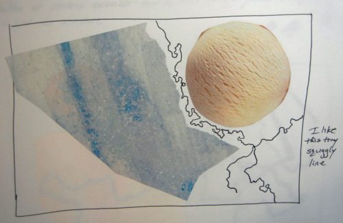
The next assignment was to use two shapes and add a line.

Line and Composition. Ellen Lindner, AventureQuilter.com/blog

I love that little squiggly line above!

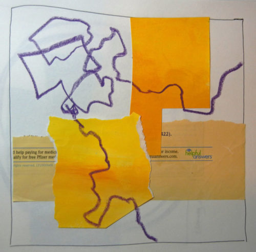
The next exercise required multiple shapes, arranged in a grid format, with line added. By now I found myself leaving space for the future line.

Line and Composition. Ellen Lindner, AventureQuilter.com/blog

I was beginning to smile more and cringe less at my results.  It was beginning to gel in my brain, I think.

Line and Composition. Ellen Lindner, AventureQuilter.com/blog

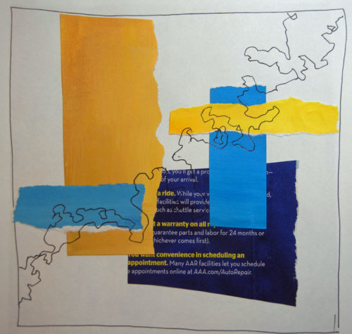
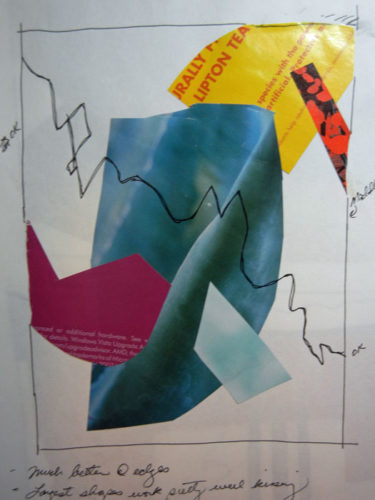
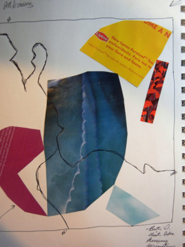
Finally, I read (or saw?) something in the book that surprised me.  First, some background: I’ve often heard that elements in a composition shouldn’t “kiss.” That is, they shouldn’t just barely touch.  They should either clearly miss one another, or clearly overlap.  Same for elements in relationship to the edge of the composition.

However, Jane’s work often has elements kissing.  So, I decided to test the kissing, non-kissing concept.  I cut out similar elements and made two different compositions.  The first one had no kissing.

Line and Composition. Ellen Lindner, AventureQuilter.com/blog

And I was pretty happy with it.

Next, came full on kissing!

Line and Composition. Ellen Lindner, AventureQuilter.com/blog

Hmm, to my surprise that wasn’t too bad.  It had a certain edginess to it.  I decided I might occasionally ignore the “no kissing” rule.  But not at the edges.  I didn’t care for that.

How about you: kissing or not?

Ellen Lindner

10

Abstract Exercises: Pattern and Scale

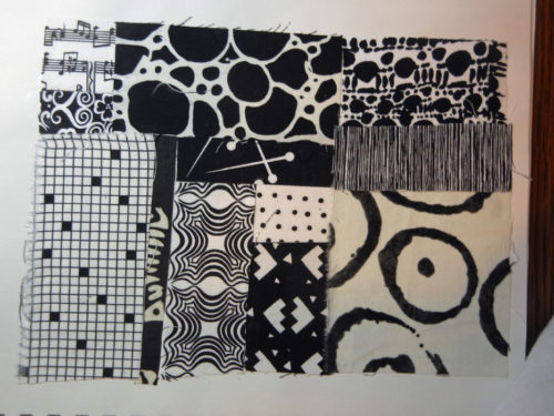
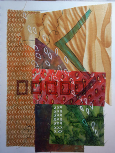
While working through Jane Davies’ book, Abstract Painting: The Elements of Visual Language,” my next exercises had to do with pattern.  This assignment was to find a variety of pattern scales, which I did with fabric.

Abstract Exercises: Pattern and Scale. Ellen Lindner, AdventurQuilter.com/blog

She talked about how a variety of patterns, in a variety of scales, can really enhance a piece.  This was my first exercise adding patterns to a basic background.

Abstract Exercises: Pattern and Scale. Ellen Lindner, AdventurQuilter.com/blog

I started with four fabrics and one magazine image of a strawberry.  It was pretty boring.  I added patterns, with markers, and that added TONS of interest!  I’m a believer.  And perhaps you can tell that some of the patterns I added mimicked those that were already there, only in different sizes.

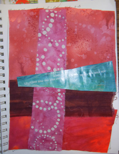
Here’s another one, before.

Abstract Exercises: Pattern and Scale. Ellen Lindner, AdventurQuilter.com/blog

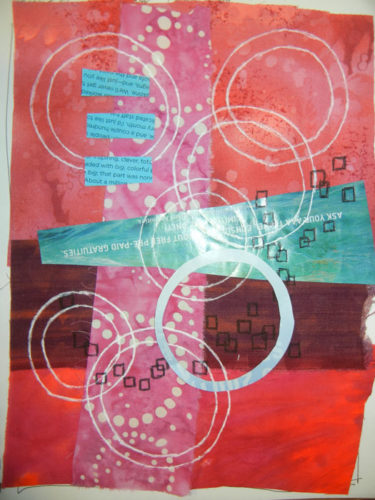
And after.

Abstract Exercises: Pattern and Scale. Ellen Lindner, AdventurQuilter.com/blog

Once again, the patterns added a lot to the composition.  (Although I think I may have over done it with the circles.)

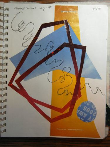
Jane said if you’re going to vary the sizes of patterns or shapes you should do it in a big, noticeable way.  This was my interpretation of that.

Abstract Exercises: Pattern and Scale. Ellen Lindner, AdventurQuilter.com/blog

As you can see, I wasn’t trying to make great art here.  Generally, I just used whatever I picked up first.  But, I was really learning a lot!  Each exercise confirmed one of the book’s concepts.  I was gluing things down and writing notes.  Very exhilarating!

What great books have you learned from?

Ellen Lindner


4

More Black and White Exercises

One of the great things about taking a class is that you get to learn from everyone around you.  In my class with Rosalie Dace, she was very good about going around the room and coaching everyone.  And she didn’t mind eavesdropping, so I overheard quite a few good tips.

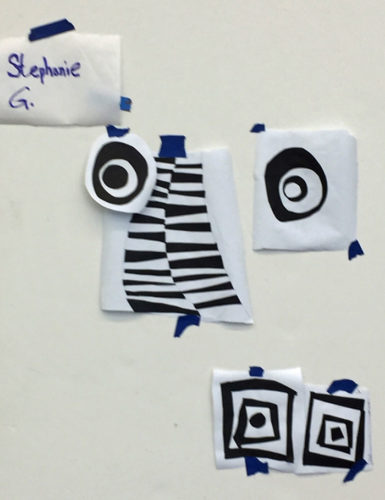
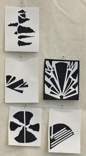
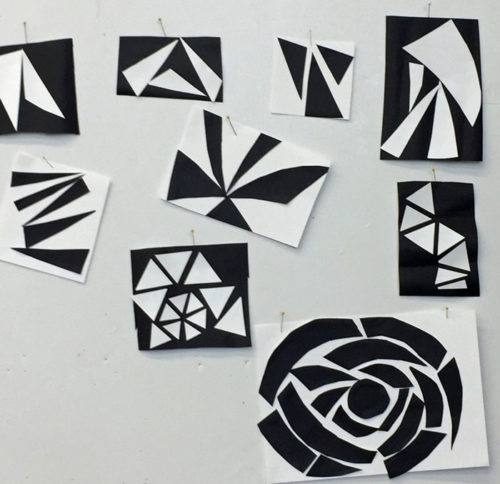
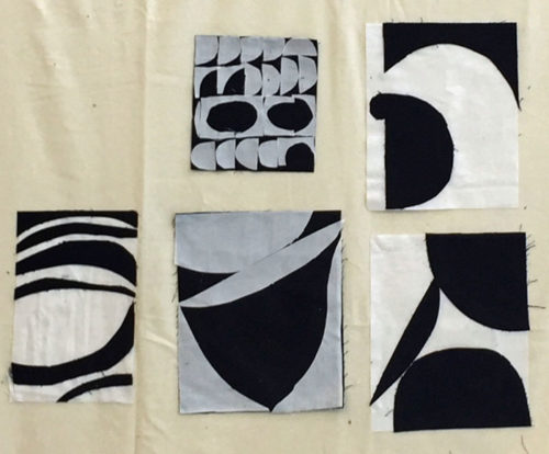
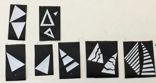
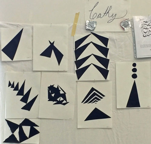
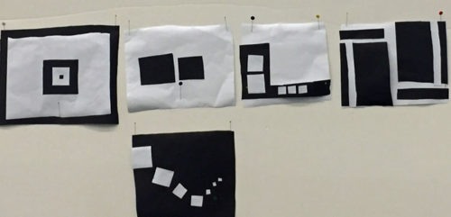
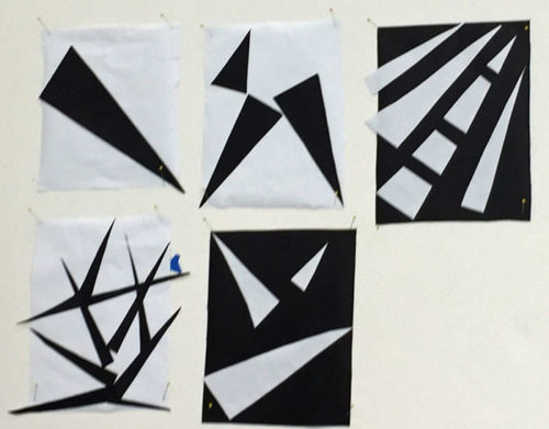
I thought you’d enjoy seeing how some of my classmates tackled their black and white exercises.  Each one started with a single shape that was then altered, multiplied (maybe) and explored at least three more times.

When Stephanie alternated the values in her shapes she got something that looked almost like a rib cage.

A Class with Rosalie Dace: Black and white exercises. Ellen Lindner, AdventureQuilter.com/blog

Olan cut his very exact shapes with an exacto knife.

A Class with Rosalie Dace: Black and white exercises. Ellen Lindner, AdventureQuilter.com/blog

Mary’s sharp triangles morphed into a large flower.

A Class with Rosalie Dace: Black and white exercises. Ellen Lindner, AdventureQuilter.com/blog

Lisa used her engagement ring as a jumping off point.  Thus, the curves, which emulated her oval stone.

A Class with Rosalie Dace: Black and white exercises. Ellen Lindner, AdventureQuilter.com/blog

Kenna did an awful lot with a basic triangle.

A Class with Rosalie Dace: Black and white exercises. Ellen Lindner, AdventureQuilter.com/blog

And look what Cathy did with the same shape.

A Class with Rosalie Dace: Black and white exercises. Ellen Lindner, AdventureQuilter.com/blog

Annemarie’s composition seemed pretty basic at first, but wait until you see what she did with it.

A Class with Rosalie Dace: Black and white exercises. Ellen Lindner, AdventureQuilter.com/blog

More triangles.  Betsy used very sharp ones.  Almost like thorns.

A Class with Rosalie Dace: Black and white exercises. Ellen Lindner, AdventureQuilter.com/blog

What a lot of diversity!  These little sketches turned into some really awesome quilts.

Ellen Lindner

2

A Class with Rosalie Dace: Black and White Exercises

Are you familiar with the work of Rosalie Dace?  She’s a fabulous art quilter from South Africa and a highly sought-after art quilt teacher.  I’ve been wanting to take a class with her for quite some time and I finally got to at Quilting by the Lake a couple of weeks ago.  It was very good – although somewhat different than I expected.

She gave us some very useful tips, concepts, and pep talks each morning.  Our first assignment was to use black and white paper to create some “sketches.”  We were to choose one shape and then explore it over and over at least five times.

I chose the humble rectangle.

A Class with Rosalie Dace: Black and white exercises. Ellen Lindner, AdventureQuilter.com/blog

These are shown in the order in which I created them.  This was actually quite a stretch because it was sometimes difficult to come up with one more variation. I noticed that I was somewhat enamored with the idea of line.

For our second shape, Rosalie suggested that we choose something special to us or familiar to us.  I chose a palm frond.

A Class with Rosalie Dace: Black and white exercises. Ellen Lindner, AdventureQuilter.com/blog

As usual, I had to make a literal depiction in order to get that out of my head.  In doing so, I was able to focus on the long skinny tapered shape within the frond and I started playing with it.

A Class with Rosalie Dace: Black and white exercises. Ellen Lindner, AdventureQuilter.com/blog

Soon, things got interesting.  I really liked the last 3 above. Rosalie wanted me to make more, so I began to search my favorite two for tiny compositions.

A Class with Rosalie Dace: Black and White Exercises. Ellen Lindner, AdventureQuilter.com/blog

There were many that I liked.

A Class with Rosalie Dace: Black and White Exercises. Ellen Lindner, AdventureQuilter.com/blog

A Class with Rosalie Dace: Black and White Exercises. Ellen Lindner, AdventureQuilter.com/blog

A Class with Rosalie Dace: Black and White Exercises. Ellen Lindner, AdventureQuilter.com/blog

A Class with Rosalie Dace: Black and White Exercises. Ellen Lindner, AdventureQuilter.com/blog

A Class with Rosalie Dace: Black and White Exercises. Ellen Lindner, AdventureQuilter.com/blog

A Class with Rosalie Dace: Black and White Exercises. Ellen Lindner, AdventureQuilter.com/blog

A Class with Rosalie Dace: Black and White Exercises. Ellen Lindner, AdventureQuilter.com/blog

A Class with Rosalie Dace: Black and White Exercises. Ellen Lindner, AdventureQuilter.com/blog

Can you believe so many viable compositions came from those little sketches?

The fact that these designs no longer say “palm frond” is not a problem.  As a matter of fact, it’s actually the point.  The idea is to play with shape only and to see where it takes you.

I found these black and white exercises to be fun, enlightening, and useful.  Why not give it a try?

Ellen Lindner

8