Like I said, painting fabric is more challenging than it looks. Especially if you use sort of thick paint to get hard edges, as I did. I wanted to create two coordinating fabrics: one with an allover pattern of sorts, and the other with large scale high contrast patterning. It was this second one that really humbled me.
I started out with some large sweeps of my brush and I liked them pretty well.
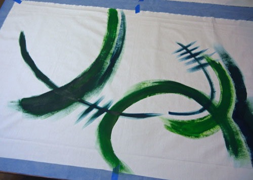
But, I wanted to add color to the background. And that’s where I went wrong.
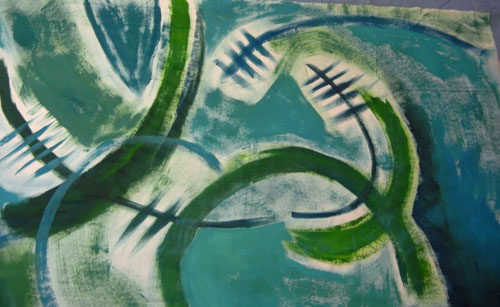
Can you say “ugly” boys and girls? I wasn’t sure if I could salvage this and I allowed myself a few hours of discouragement.
Clearly, it needed some unifying elements, so I started adding stuff.
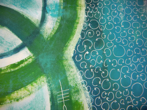
That helped. But, do you know how long it took to draw all those little shapes? Enough to dissuade me from using it all over. I did like that one area, however.
In the photo below you can see both fabrics. For the one on the right, I added large aqua circles, which also helped. I certainly didn’t love that fabric at this point, but I felt like I could judiciously use selected parts.
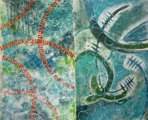
Then, I tried again with my desire for a high contrast, large scale pattern.
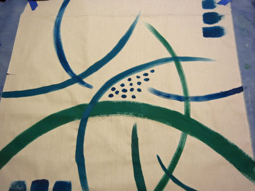
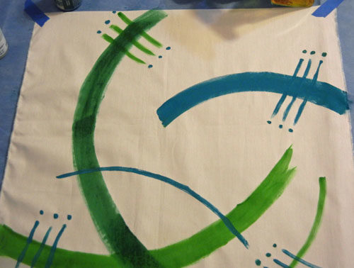
This time I left it alone! This was my final collection of fabrics, some of which are folded in this photo.
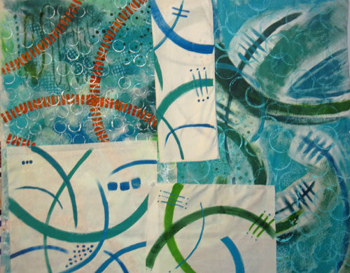
I can’t say I was elated with this menagerie, but I felt like I could do something with them. What, I wasn’t sure! Maybe I’ll figure it out by the next post.
Ellen Lindner
