I’ve been really anxious to use my recently dyed fabrics. In a very uncharacteristic move I actually started on a quilt using them BEFORE completing the last thing. Shocking!
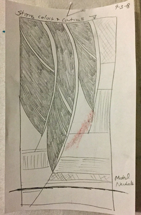
I started with some sketches, and picked this one to use. Because I’ve been doing a few quilts sized 36″ x 24″, I decided to alter the sketch accordingly.
My dyed fabrics would determine the color palette. I pinned up those that seemed to go together, especially ones with green or organic colors.
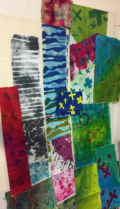
I had quite a collection of compatible pieces, with a lovely yellow-green and fuchsia theme.
But wait. Was this TOO pretty and predictable? Did it need a shot of “ugly?” Something unexpected? What about something yellow-orange or orange?
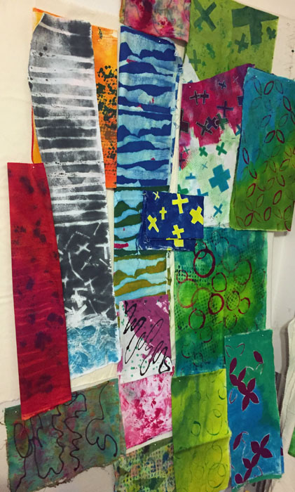
YES! That little jolt of contrast is just what the palette needed! (But, maybe the blue with yellow crosses wouldn’t make the cut.)
After pinning a piece of muslin on the design wall, I drew in the major lines and began to audition what should go where. It was great fun to use large pieces of MY OWN fabrics, and things went quickly.
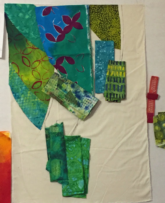
The leaves, before veins, are shown below.
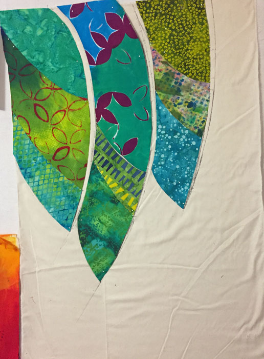
Next came vertical veins. These were easy to add since I had already left space for them. As a result, the veins could be larger-than-needed strips of fabric that slipped underneath the earlier fabrics.
I use that “slip under technique” a lot. It’s a good way to avoid working with tiny little strips of fabric.
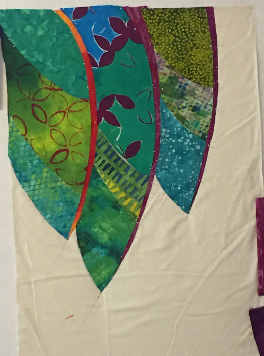
Then, I trimmed the remaining leaf pieces a little in order to add the diagonal veins in a similar fashion.
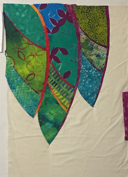
Don’t you love that yellow-orange?
On to the background.
Ellen Lindner

Lots of great info in this post Ellen but my fav is your phrase “a shot of ugly.” Gotta keep that thought handy!
Thanks, Cindy. I got that idea from fiber artist Sally Sellers. She said, “It doesn’t take a lot of ugly, just enough to make the other colors sing.” That blew me away! The idea that adding something UGLY would make the overall image better? But, I’ve tried it several times and it definitely works. Amazing!