Archive | April, 2021
Fabric-Led Design
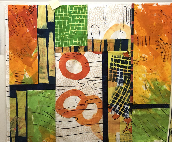
My latest quilt has been coming together nicely, even though the fabrics are a little bit diverse. The colors, patterns, and values of the fabrics have dictated what looks good where and the fabric sizes have determined what will actually fit where.
Things evolved on the design wall as I folded and auditioned fabrics in different locations. I didn’t cut them until I was pretty sure about what I was doing!
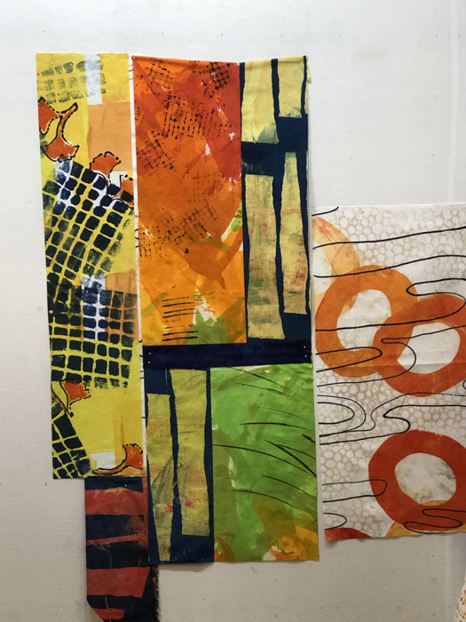
As you can see, I was trying to move the colors and patterns throughout. I was getting close, but I thought the two yellow fabrics on the right, below, needed a darker spot between them. This is one of the fabrics I auditioned as a solution.
You can see that I decided to use it, but in a much more narrow piece.
And the big surprise: I decided I liked the quieter parts of the quilt the best, so I removed the busy patterned piece that was on the far left.
This is the final version, before quilting.
BTW, the construction time on this quilt was very short, due to the large pieces of fabric. But, it’s taking me quite a while to quilt it!
Ellen Lindner
Variety of Scale
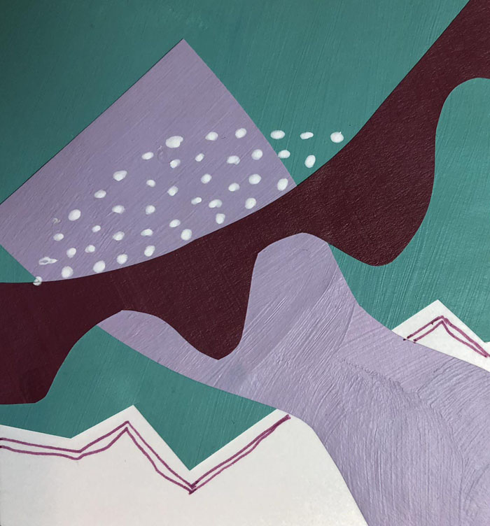
Lately, I’ve been really concentrating on using a “variety of scale” in the patterns and compositions I’ve been using. First, in a collage course I took with Jane Davies. After making and cropping small collages she directed us to add details with markers. (I never asked for her feedback on these, so they’re MY interpretation of what might work.)
With each one I asked, “Where is there a big spot that needs some interest?” I thought this first one looked pretty good without any additions, but I thought a tiny line would add interest. And it did!
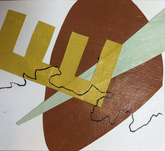
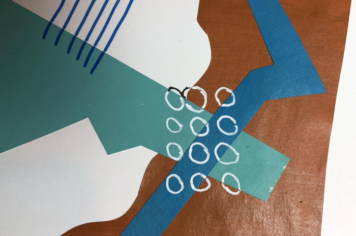
Next question, “Should the additions emphasize what’s already there, or should I add an entirely new shape or color?” You can see that I’ve used both.
I often let my new elements extend over two different pieces. This worked visually, since the small scale of the new items didn’t obliterate the larger pieces.
Sometimes I followed Jane’s example of changing marker colors as the background color changed.
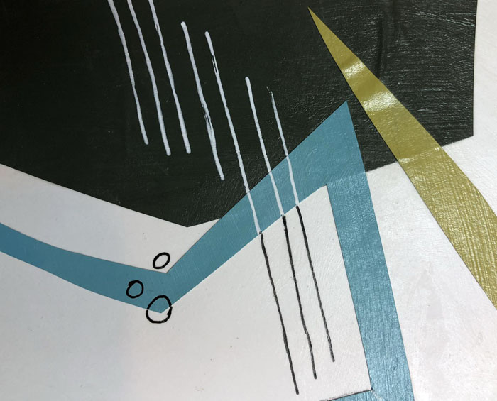
Some compositions needed very little added. But, it does make a difference, don’t you think?
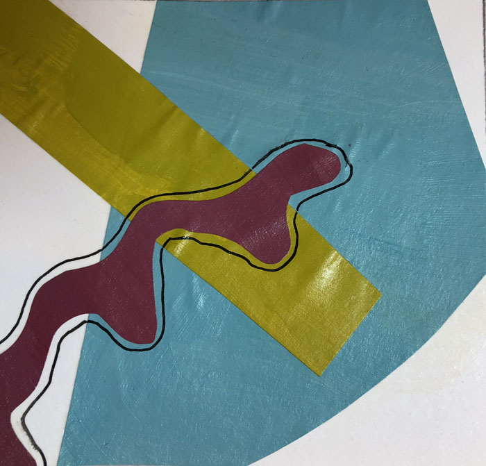
I’ve also been thinking about variety of scale as I’ve been trying to use several favorite fabrics together in the same piece. Most of them were large in scale, so I found myself matching them up with near solids and quieter neutrals. Early progress is shown below.
I was liking these together. They were a challenging, but fun, mix.
Ellen Lindner
Using Large Scale Fabrics
I’ve finally done it: I’ve cut into some of my favorite fabrics.
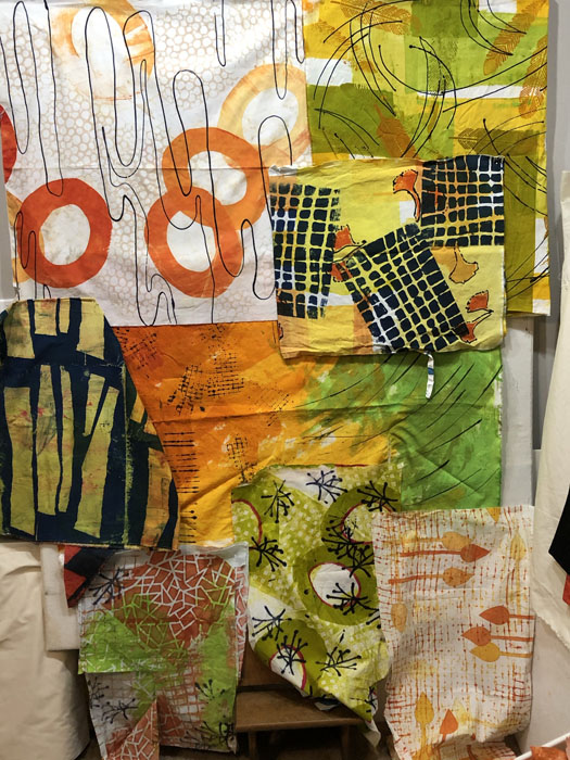
This is where it all started. I wondered if I could successfully use some/all of these hand-dyed fabrics together.
The one with the large orange circles is my favorites. Because of it’s scale I knew it would have to be used very purposefully. I looked for other fabrics with the same colors and threw them up on the design wall. I could see that the top fabrics provided nice “clean” lines and could probably add the needed contrast. I was less sure about the busy ones a the bottom.
(These fabrics are mostly 44″ long, larger than I’m used to working with. As you can see, they pretty well took over my 5′ x 4′ design wall.)
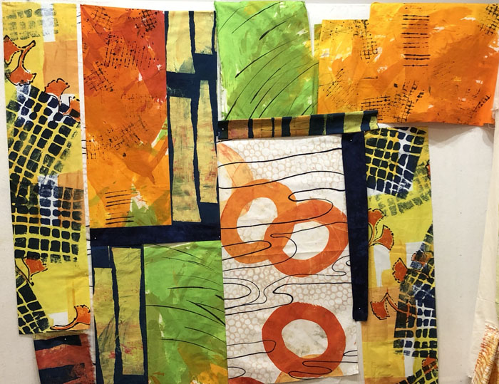
At any rate, I was confident enough to make the first few cuts, and to begin arranging things on the design wall.
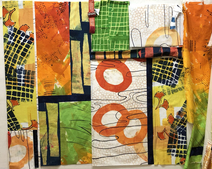
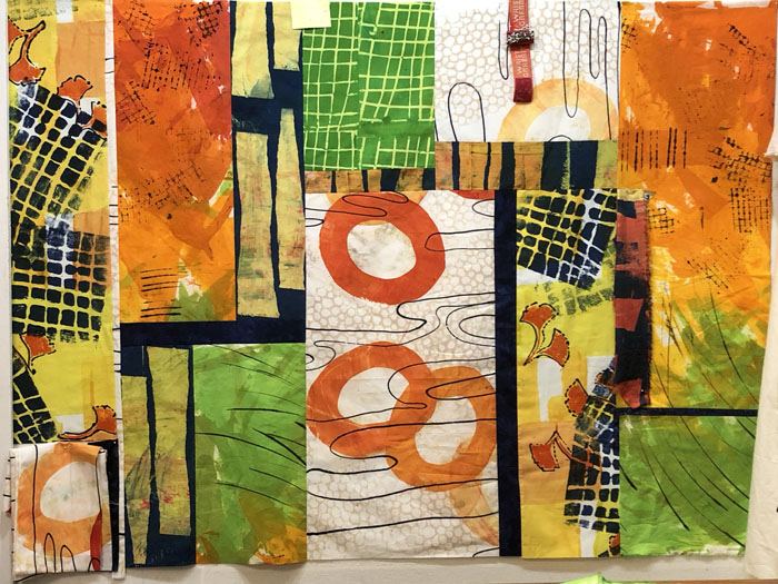
Ooh, I was immediately loving it! The central fabric with the navy (by Pat Pauly) added needed value contrast. I knew I’d need more of that, but I didn’t have any other dyed navy. No worries: I own A LOT of commercial fabric!
Gee, I’ve been having fun with this. Stumped on what the name might be, though. Any ideas?
Ellen Lindner

