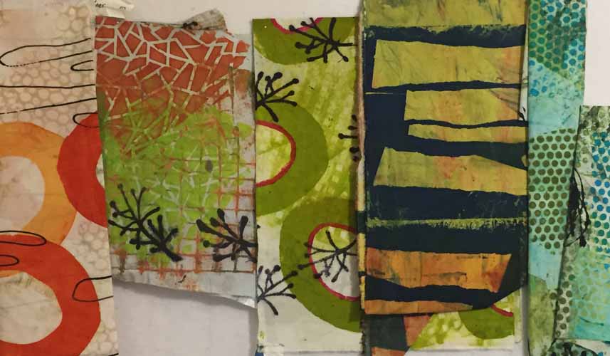
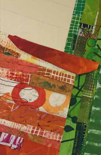
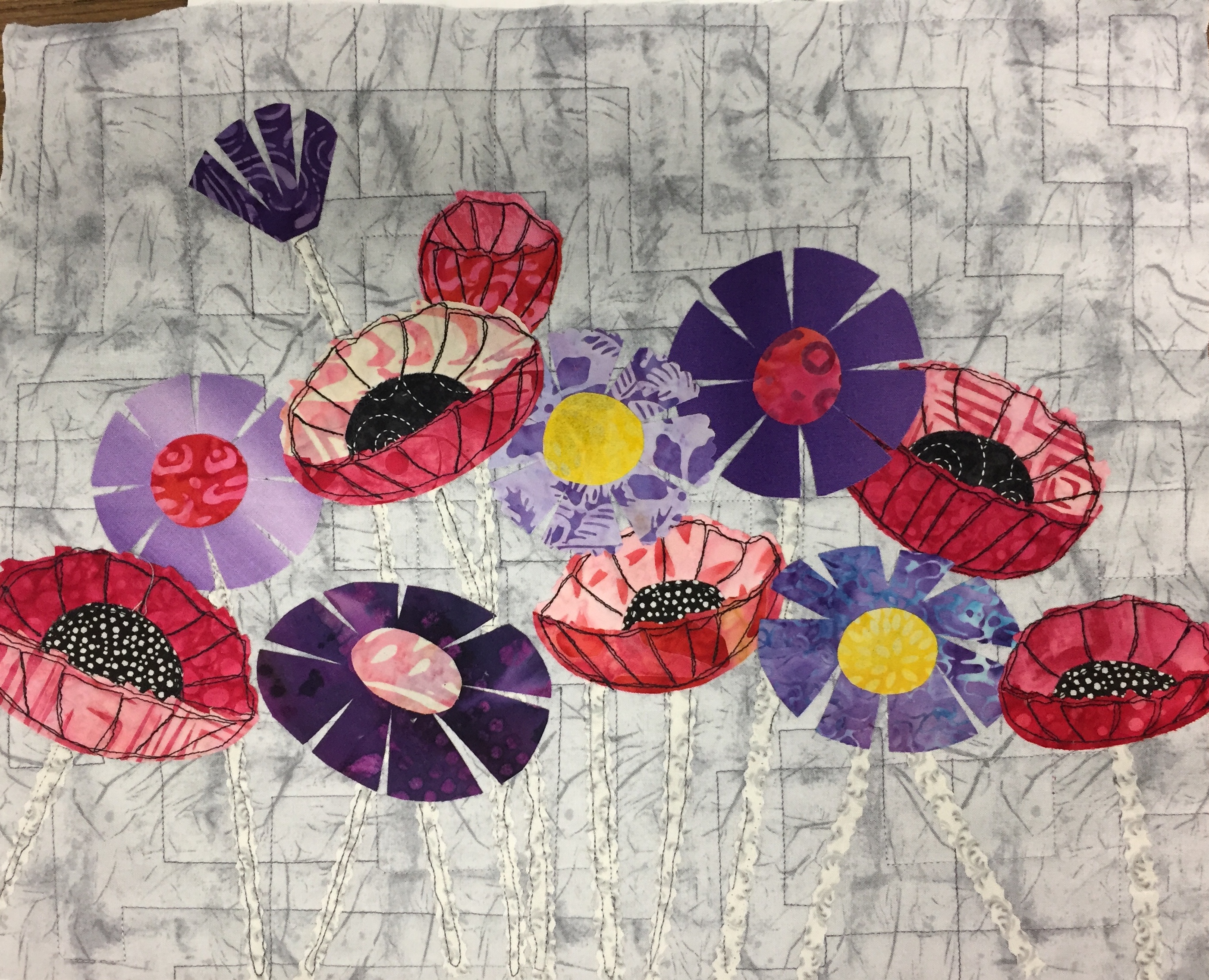
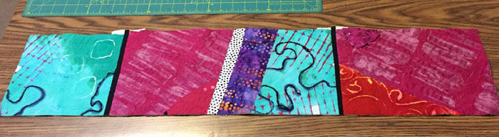
“Deconstructed Screen Printing.” That’s a mouth full isn’t it? Perhaps the alternate term is a little more self-explanatory: “Breakdown Printing.” This technique uses thickened dyes applied with screen printing and it often yields extraordinary results.
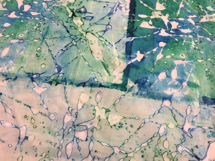
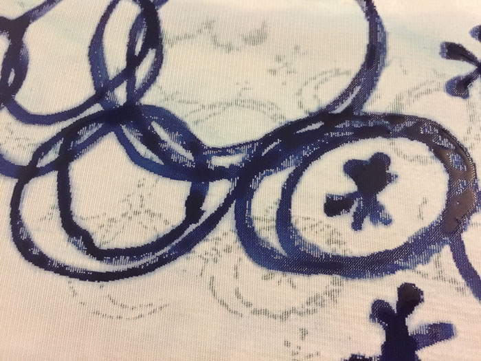
Like this (detail shot.) Don’t you love the squiggly irregular shapes and “halos?”

You probably know about screen printing using a stencil. The solid parts of the stencil act as a barrier, or “resist”, to the dye and it only goes through the open parts, creating a pattern or motif. With Deconstructed Screen Printing (DSP) thickened dye is applied directly to a screen and allowed to dry. This dried dye acts like a resist to the wet thickened dye applied later.
*** I’ll be adding to this blog post as I try new things. ***
Entry #1
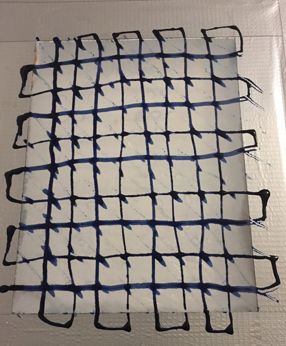
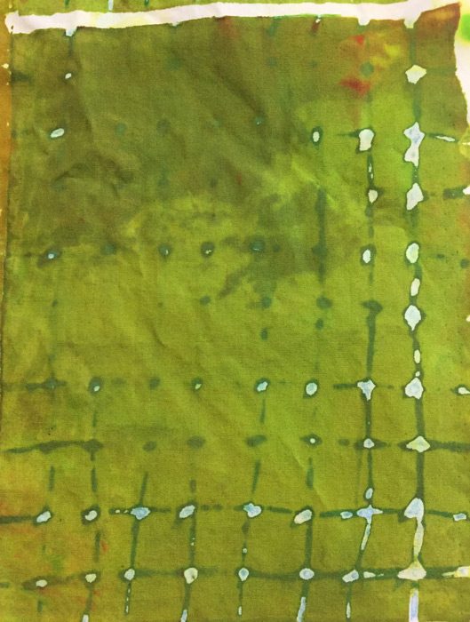
Here is the first screen I prepped. The color is a dark blue-green. I drew a grid and then pulled the tail end of a paint brush through it diagonally. That last part didn’t work too well. Maybe I needed thinner paint? Or thicker lines?
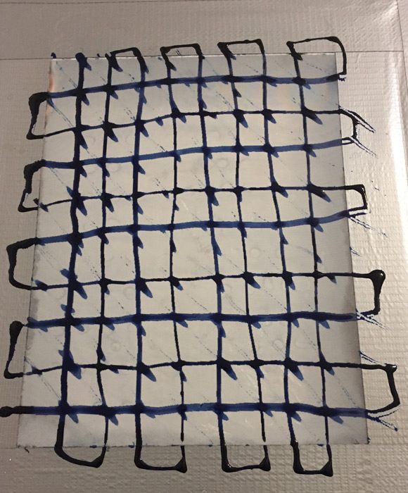
This took the better part of a day to dry here in Florida.
There’s one big difference between printing through a stencil and printing through a design made with dried dye. The latter will slowly dissolve as dye is repeatedly pulled through it. This is a lot of the charm of DSP, but it requires a little planning. The lines of the dried dye will erode and create little halos around each shape. This is lovely, but it also means that the color of the dried dye design will mix with the color of the wet dye. So, you have to plan ahead a little.
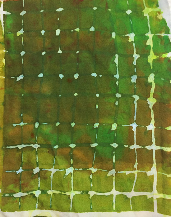
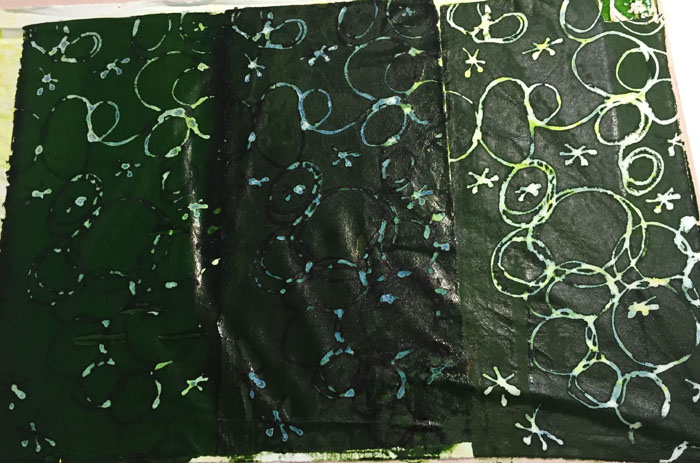
I chose a darkish green and got this with my first pull. It worked pretty well, although the grid didn’t show up very well. Again, did I need thicker lines? I think so.

However, I immediately realized I hadn’t mixed enough dye so I had to mix more, and ended up with a variety of greens as I proceeded. (Because I learned this lesson slowly and I kept having to mix more.)
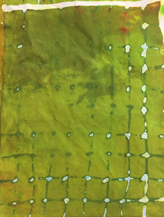
Here’s the second pull.
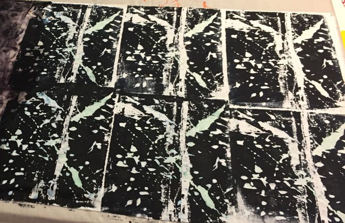
Can you see how the design has already altered? There’s less white because the design lines have eroded. I did two more pulls, but then stopped because I could see I’d gotten all I could from this screen. Rather disappointing.
Here you can see how the design dissolved throughout the 4 pulls.
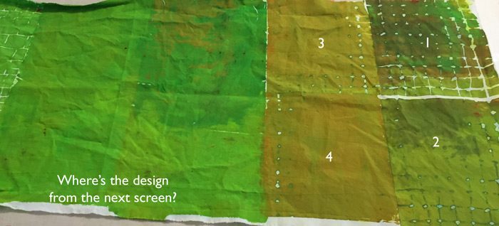
But that wasn’t as bad as my next screen. I forgot to take pictures of it, but it used the same dye in a squiggly swirly design. I printed it with green. Right there. In that big SOLID green spot. It didn’t show at all! I had no idea what was wrong. I’ve since had a clue so I’ll experiment more to see if I’m right.
Fortunately, I got much better results pretty quickly, so check back on this post for updates. Regardless of the results I’m having fun!
*** I’ll be adding to this blog post as I try new things. ***
Entry #2
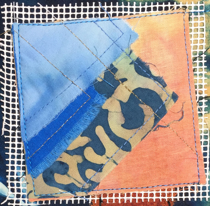
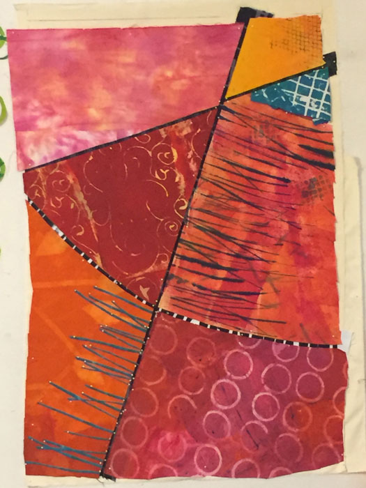
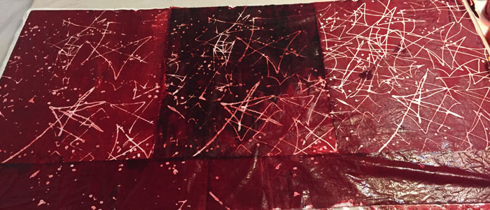
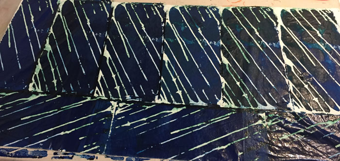
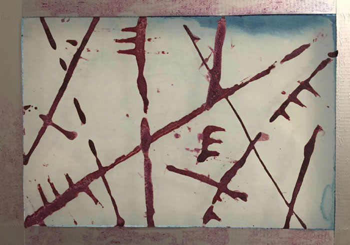
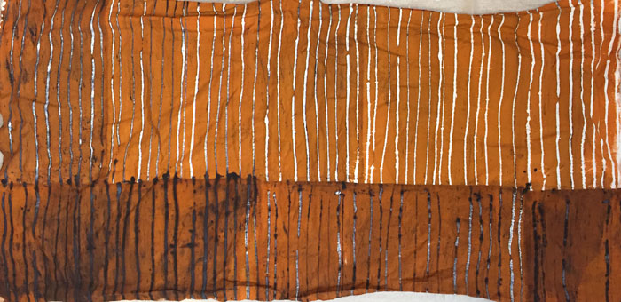
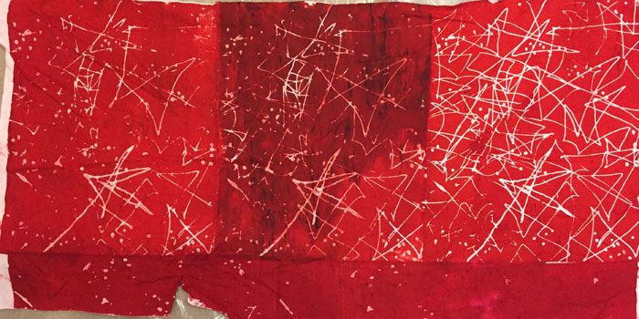
This was the next screen I prepared, using a dark red color. This screen is my largest and that ended up being a plus, since I didn’t have to move it and realign it so many times.
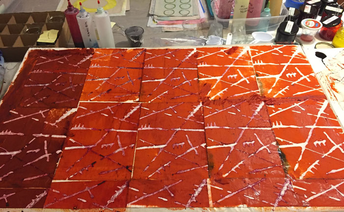
And this is what I got when I screened on what I hoped would be a dark red-orange. (Shown still wet.) I was pretty happy with this, aside from the big dark spot (more on that later.) You can probably tell that I started on the right and went left. I was very happy with the way the design broke down. I printed along the bottom edge 3 more times and it was printing almost solid red by the end.
About that dark spot: I mix my colors directly on plastic, with various dye colored puddles here and there. At one point I got distracted and accidentally swiped some black which ended up on the fabric. I wasn’t too worried about it.
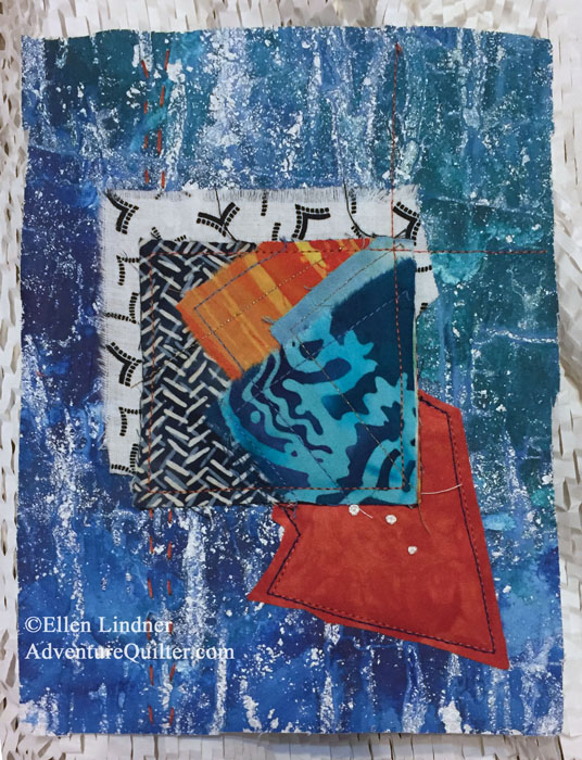
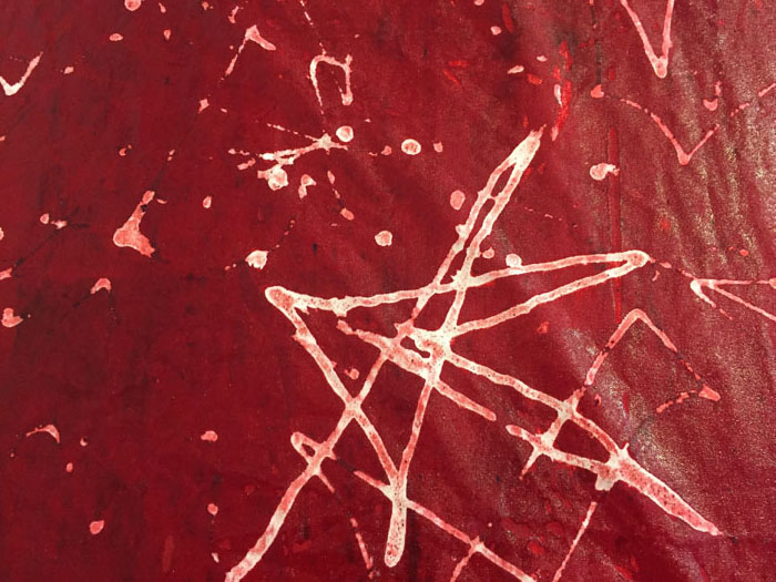
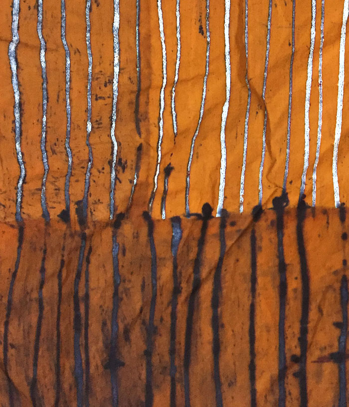
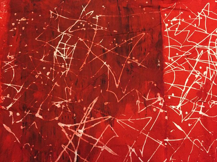
Now, check out a detail shot, still wet.

I missed an opportunity on this one. My dried dye design and my wet printing dye were too close in color, so I didn’t get the cool merging effect of the two. Something to work on.
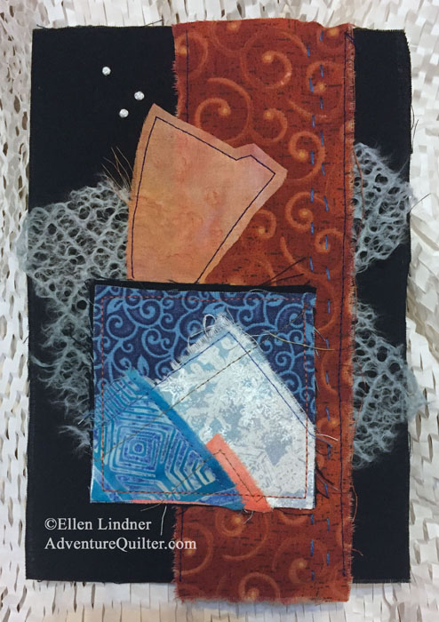
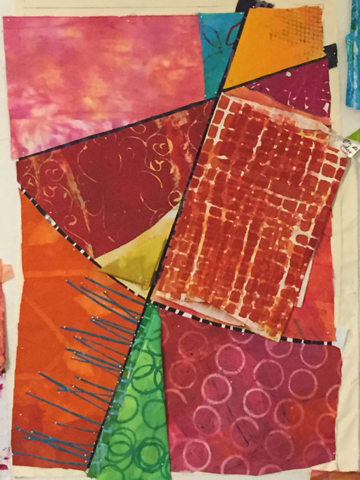
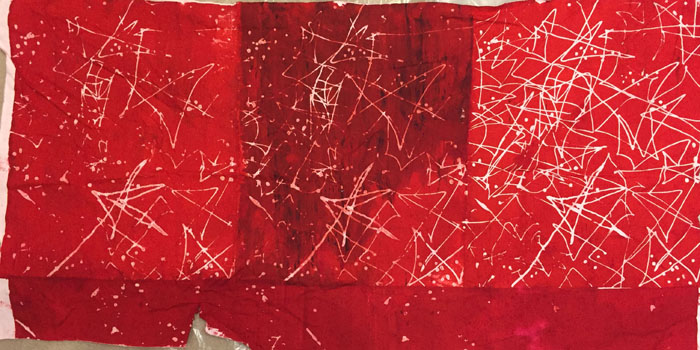
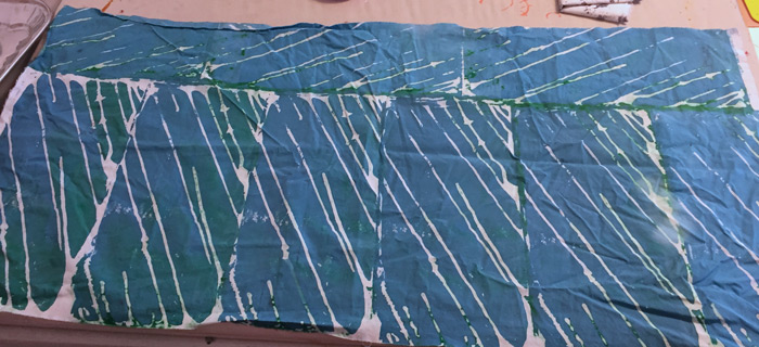
This is what it looks like dry. Much brighter than I anticipated, but definitely usable. As a comparison, look at the detail shot above (wet) and then find in on the left side of the full piece to see the change in color. This is not uncommon with dying. Colors always dry lighter and it’s rather tricky trying to get them just right. Something else to work on.
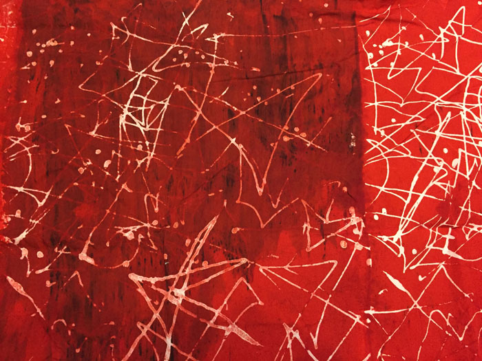
Once dry, my error with the black dye shows up more. See the streaks below. Oh well, it’s still usable and I’m learning!
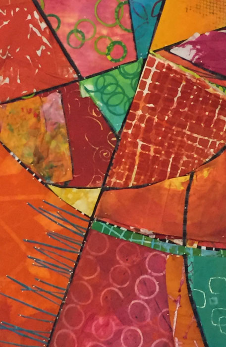
You know, I’m pretty delighted with this patterning. I’ll want to revisit it.
*** I’ll be adding to this blog post as I try new things. ***
Entry #3
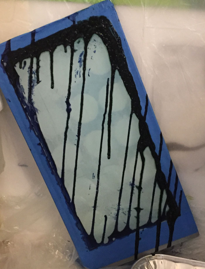
This time I let my screen dry while propped on an angle, thus giving me drippy diagonal lines. (Dark blue-green again.)
It produced an interesting pattern. I used cerulean blue with some black to make it duller and some print paste to make it lighter.

I thought it looked quite good, even though the breakdown effect wasn’t too evident.
But, of course, when I washed and dried it the color lightened significantly. Still usable, of course, but not nearly as dramatic. Predicting color = another thing to work on.

Do you see the blue-green lines above where the screen patterns meet? I did that intentionally, trying to fill gaps in the printing. As you can see, the color mix I used didn’t quite match. Darn. Something else to work on.
*** I’ll be adding to this blog post as I try new things. ***
Entry #4
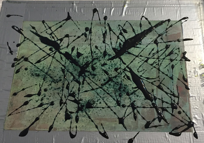
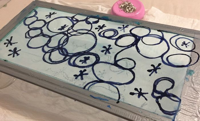
For this screen I squirted dark blue-green dye onto it. I really like the random look of it. (The pale green look of this screen is just staining due to its age.)
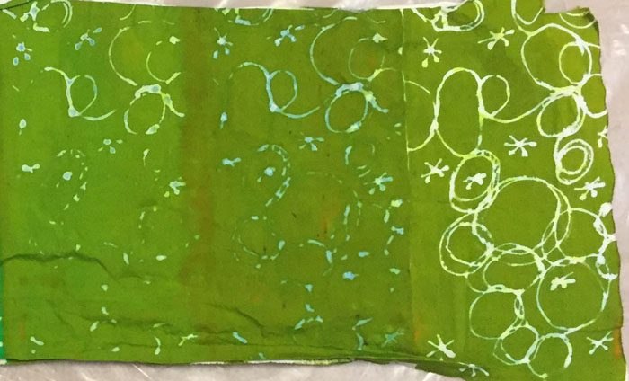
Because I needed some black fabric, I printed this one with black. The pattern resisted the dye very well and I got nice white sharp shapes.
But, where are those vertical white lines coming from? I had no idea. When printing, I did notice that the dye seemed to puddle in the center like that, so I expected to possibly have extra dye there. Instead, that spot resisted the dye. Maybe I hadn’t cleaned it properly? I never figured it out.
As you can see the blue-green did spread into the white areas a little. I’ve now realized that the bleeding/halo effect works best with dark dried dye and medium wet dye. I’m learning!
And I think I’ve solved the mystery of the missing pattern from my earlier screen (entry #1.) For that screen I used a homemade one. I did so again as I prepped this next screen. I could immediately see the problem as the dye dripped through pretty significantly.
To deal with this, I went over the pattern one more time. Like this.

But, can you see how speckled the drawn line is? Not solid at all. I thought I had found the culprit.
Sure enough, when I printed it the design broke down almost right away (starting at right and moving left.) I just printed it these 3 times.

This is what it looked like dry.
Can you believe the change in color? This is my nemesis! I predicted well this time, but it’s a continual challenge.
*** I’ll be adding to this blog post as I try new things. ***
Entry #5
Finally, I got something that was exactly what I wanted. Progress!
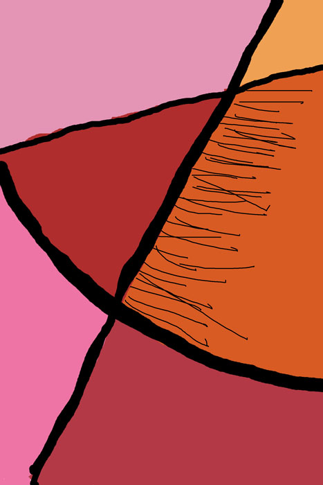
This is the screen I prepared, using a dark red dye.

I printed it with a pretty strong orange, getting darker and redder as I moved to the left. I was loving it!

And here it is dry. Yes! This time, the colors were pretty much exactly what I’d hoped for.
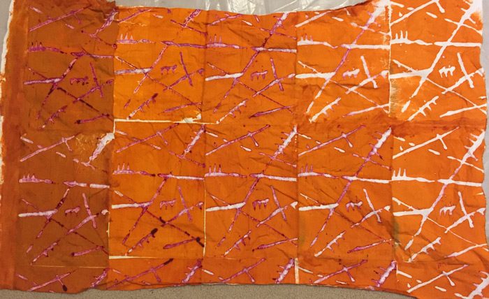
Of course, there were areas where the dried dye acted as a resist, leaving white spots showing. But the red dye also broke down giving little red marks too. Nice!

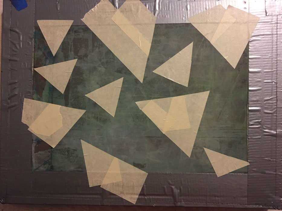
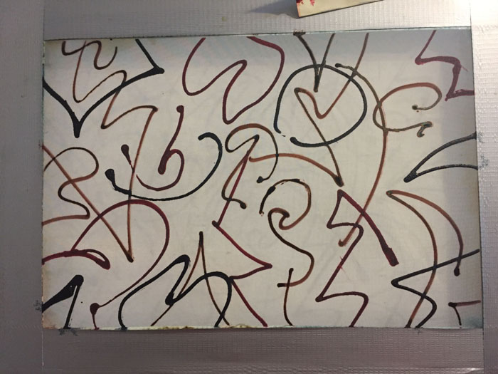
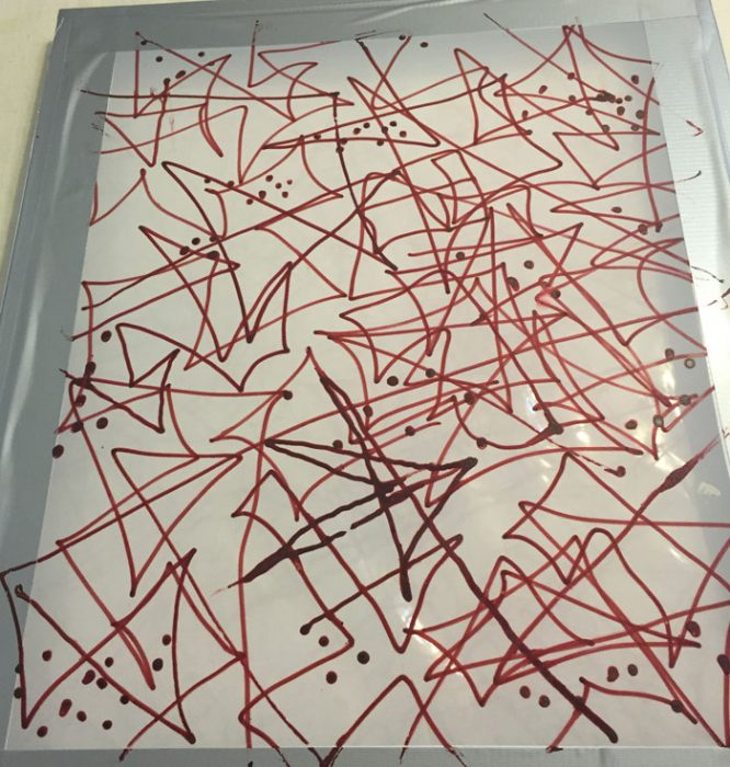
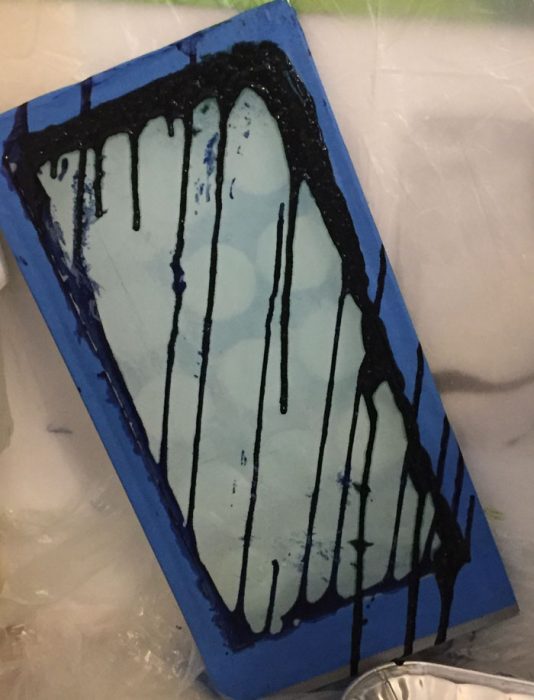
For the next screen I masked out triangles with masking tape (on my old stained screen.)
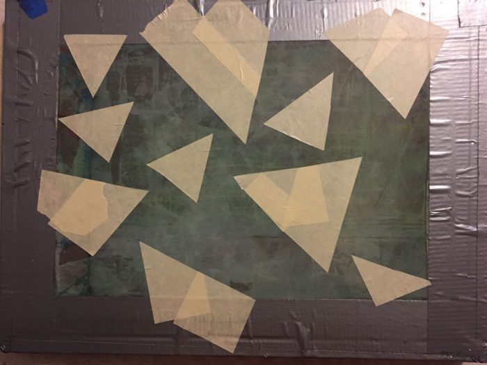
Then, I drew angled lines with black.
The lines will be broken by the masking tape shapes, so it should be interesting.
*** Final Entry ***
Entry #6
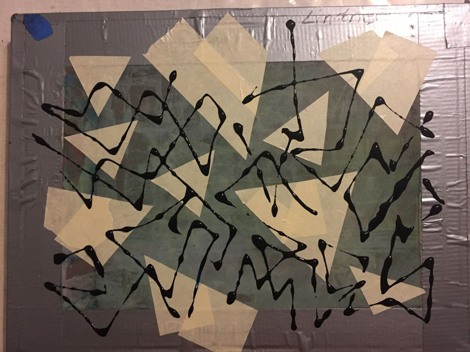
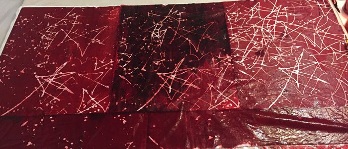
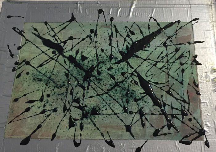
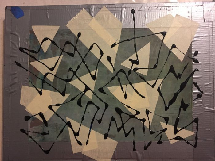
After the screen above was dry I removed the masking tape triangle, which gave me this. A nice fractured look, I thought.

And this is what I got when printing with it.
I like the pattern a lot. But, why didn’t the black dissolve? (I worked from left to right.) A mystery for me to solve.
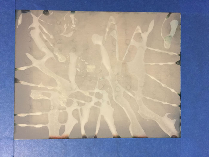
Next, I made a screen with clear resist. I just squirted it on and I really liked the pattern.

But, it broke down almost immediately!
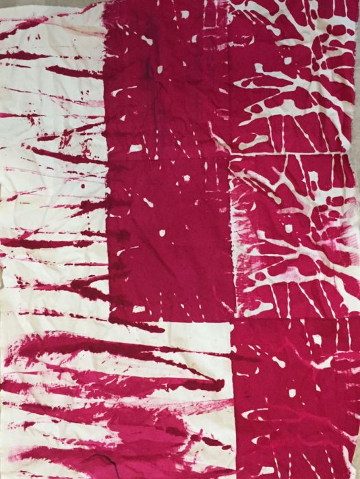
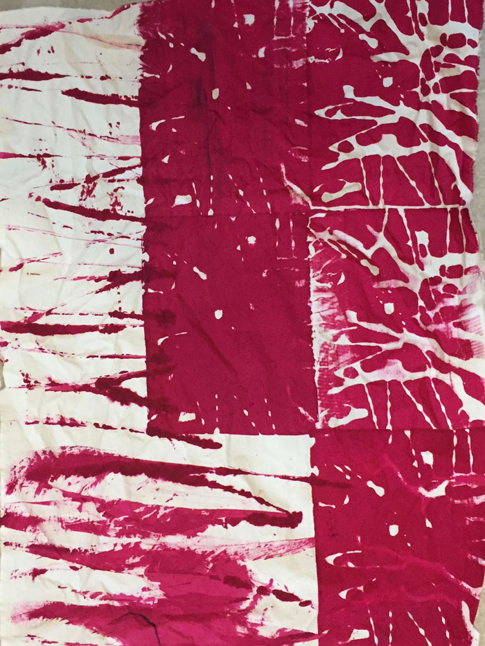
I started in the top right corner and made my first 2 pulls in a vertical line. As you can see, the third pull had lost all of its design. I did a couple more pulls and then quit. Since I had prepared fabric in front of me, I sort of scraped/smeared some fucshia lines on. I liked them quite a bit.
I was really excited to try the next screen prep: multi-colors. I used black, brown, and deep red.

In the book “Breakdwon Your Pallette,” the author gets wonderful results with this technique. Me, not so much.

Is it worth trying again? I’m not sure.
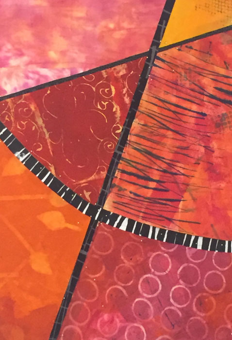
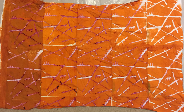
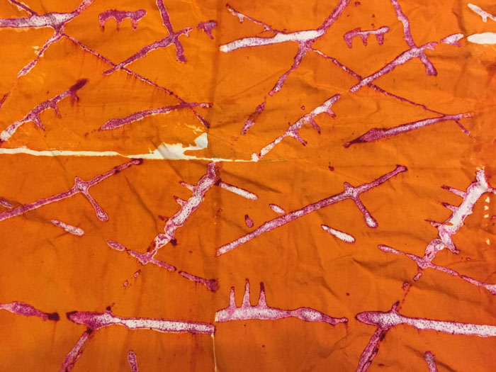
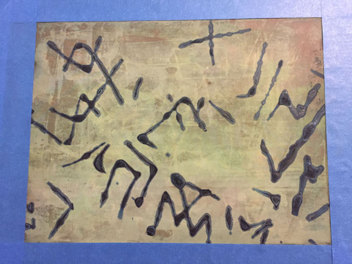
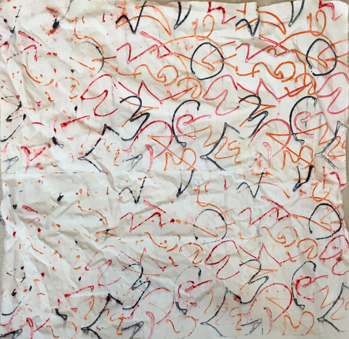
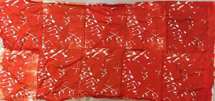
And now, drum roll please, my favorite DSP fabric. I drew black lines on the screen. Nothing special, but they bled just the right amount.
Don’t you love it? It’s actually a stronger color in person.
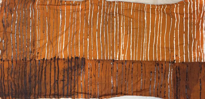
Here’s a detail shot. I love the irregular lines and black bleed. (Note, this was the same exact black dye I used in the first Entry 6 fabric. That one didn’t bleed at all, so the consistency of the wet/pulled dye must be a factor.)

I’ll definitely do more DSP in the future. A few things I’ll keep in mind:
– Use my largest screens. They require the least amount of lining up and the lowest number of pulls.
– Use only high quality screen with fine mesh.
– Don’t bother with clear paste as a resist.
Thanks for following along!
Ellen Lindner
P.S. Several people have asked about what resource I’m using to learn about DSP. My primary reference is a book by Leah Higgins, called “Breakdown Your Palette.” I highly recommend it. Also useful are the books by Claire Benn and Leslie Morgan. I have the one on screen printing and they now have one on breakdown printing, as well. You can also find several videos of their processes on YouTube.