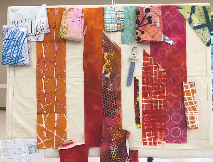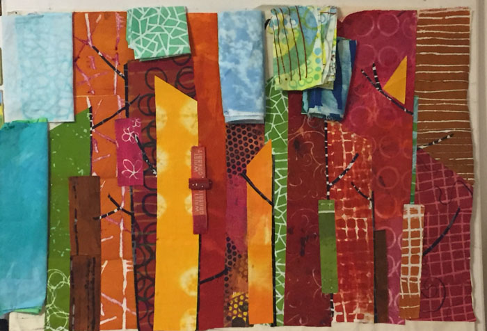
After trying a pastel blue sky on my piece inspired by fall trees, I tried it with dark blue instead.
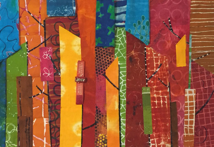
I actually liked it pretty well, but I didn’t have enough bright blue to do it justice. So, I tried white. And also auditioned the idea of more twigs.
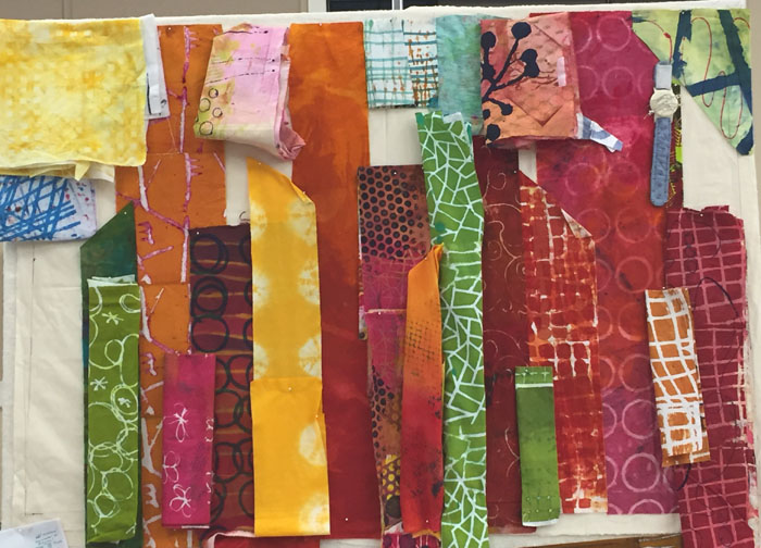
The verdict: YES to the white sky, NO to the chunky twigs.
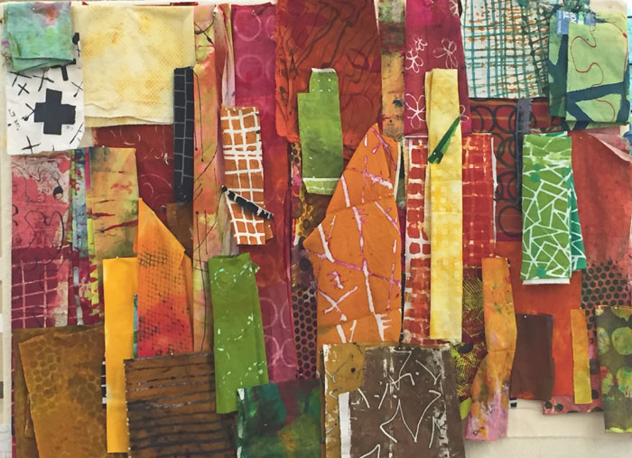
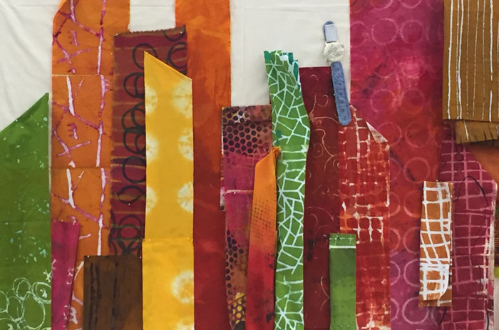
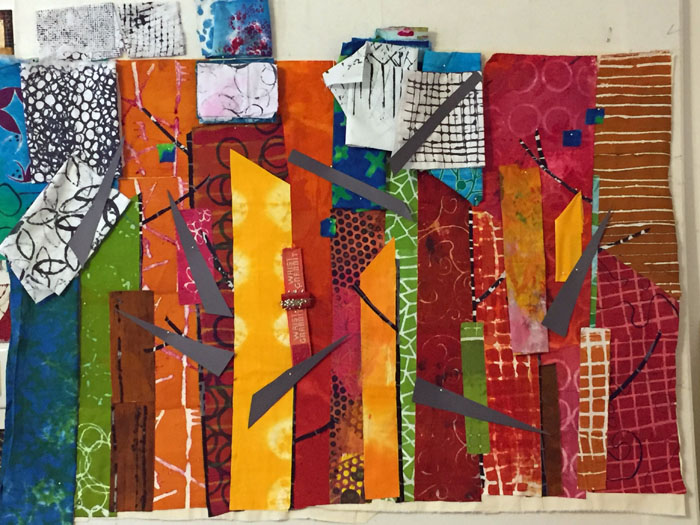
But, what about those vertical shapes? Were they starting to imply skyscrapers, rather than trees? Yes, clearly they were. Well, that’s not really what I wanted, but I decided it could be trees in an urban setting. (Plus, I didn’t really care if the shapes read like trees, skyscrapers, or anything real.) I added a few twigs to add contrast and play up the tree idea.
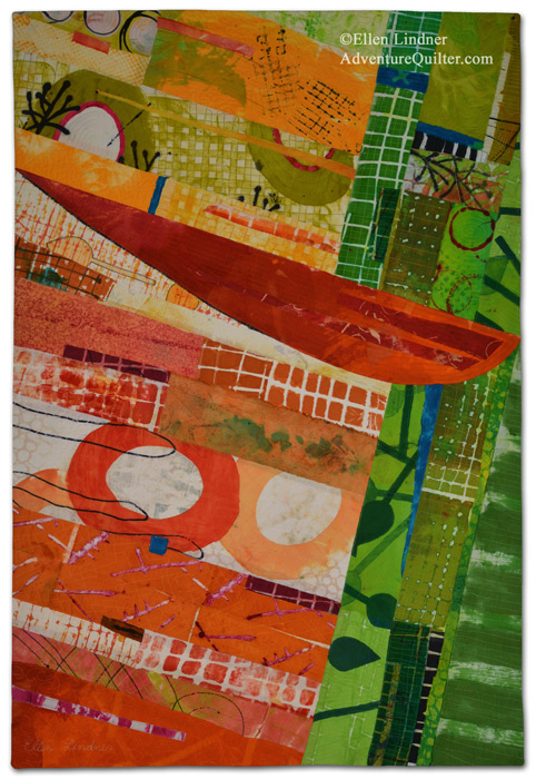
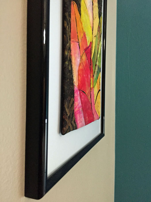
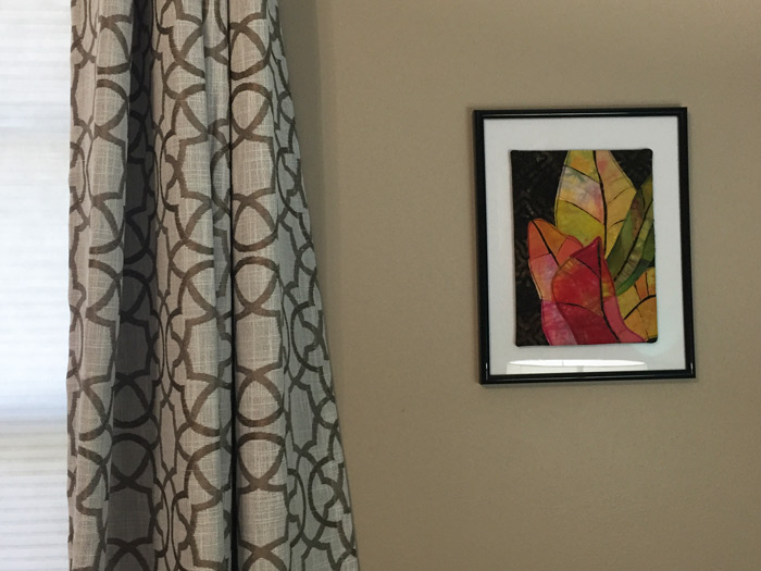
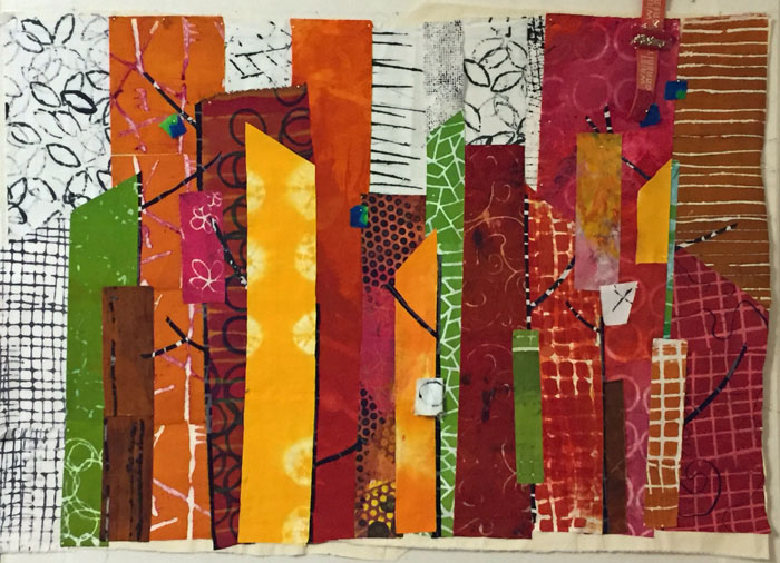
After much quilting I was ready to photograph this piece.
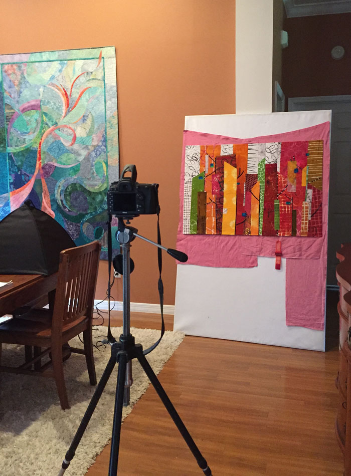
Why use a pink backdrop, you ask? It has to do with the digital editing I’ll be doing later. I’ll “pick” the quilt away from the background and it’s easier for the computer to do that if there’s a contrast between the two. Can you see how the left side would blend into the backdrop if I left it white?
Finished photos coming soon.
Ellen Lindner