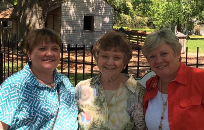
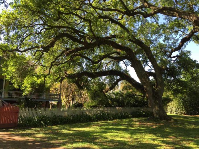
Our favorite thing in New Orleans was a visit to Laura Plantation, about 1 hour west of the city.
Our tour guide was EXCELLENT! She made the distinction between a Creole plantation and a French one, saying that this land was a plantation before it was part of the United States. That is, before the Louisiana Purchase of 1803. Once this area became part of the US, president Thomas Jefferson “granted” the land to the first family owner.
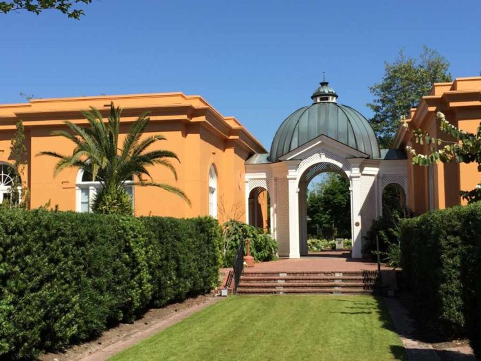
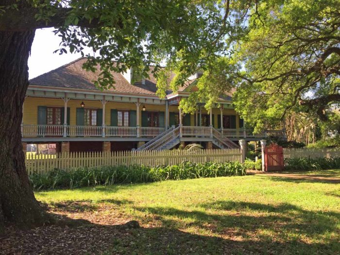
As you can see above, the Creole homes were painted lively colors, rather than the white or cream typically seen on other southern plantations. The crop was (and is) sugar cane and the matriarchs of the family often ran the business – from the bedrooms of this home.
My photos didn’t turn out that well, but really, it was the STORIES that were so intriguing. The plantation is now named Laura after a young girl who lived here in the late 1800’s, when she spoke only French. Much later in life, she wrote her memoirs (in English) and these stories provide much of what’s known about this family and their lives here. It was very interesting!
Our tour included slave quarters and our guide did a wonderful job of painting a picture of the hardship they endured. Plus, we heard some touching stories about the relationship between the family and these slaves (who were later their servants.)
We all agreed this was the best historical tour we’d ever been on. (When was the last time a tour guide gave you goose bumps and had you tearing up?) I HIGHLY recommend this tour, especially if you get Rose (Rosie?) as your guide!
Now, for the educational part of this post. Do you know what this next picture shows? I didn’t.
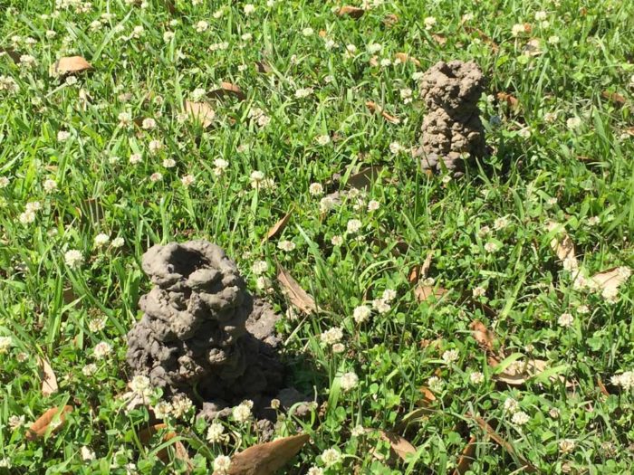
They’re crawfish holes. The water table is so high in this area that the crawfish dig down to hatch their eggs (?) in water, throwing mud up as they go. Who knew?
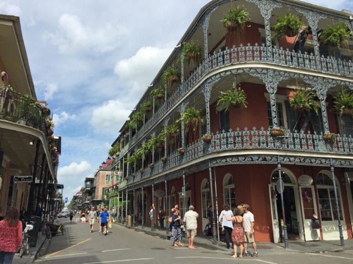
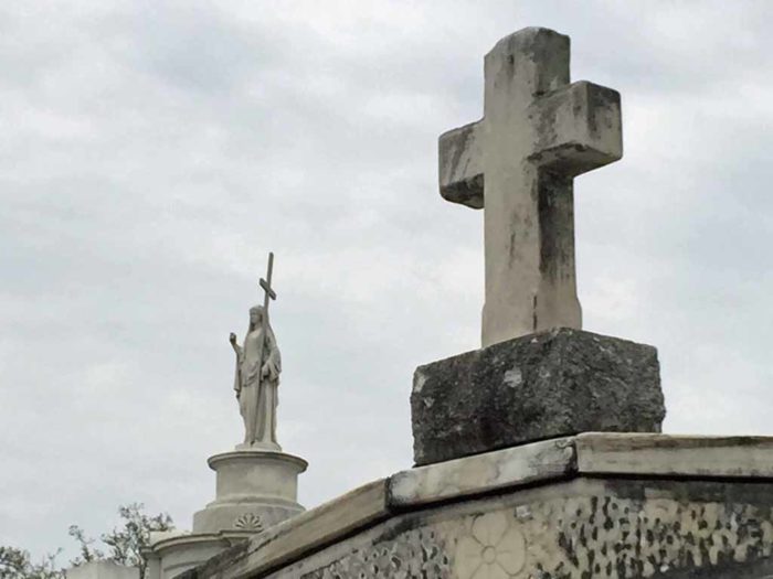
Of course, if you visit New Orleans you need to learn about the above ground cemeteries. We met in the French Quarater and went on a walking tour.
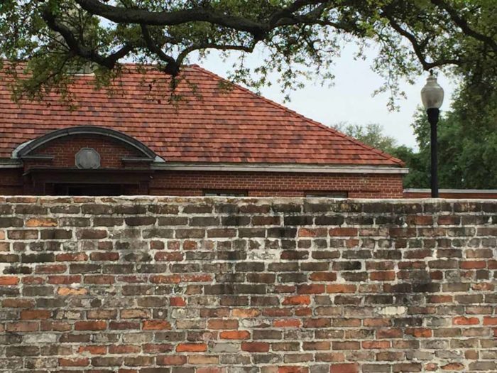
Because the land settles quite a bit in this area, the builders of yesteryear had to get creative when leveling things. Like the liberties taken with the top row of this cemtery wall.
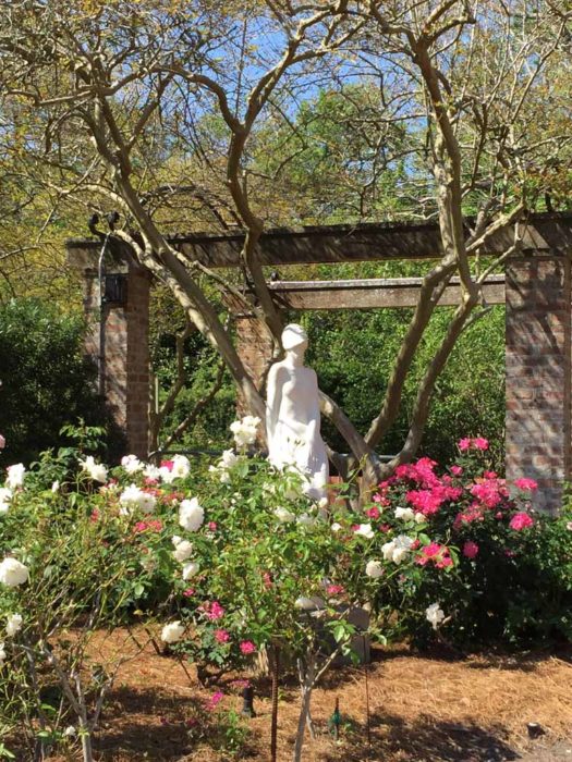
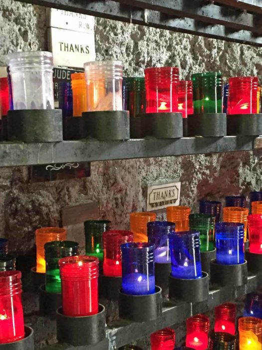
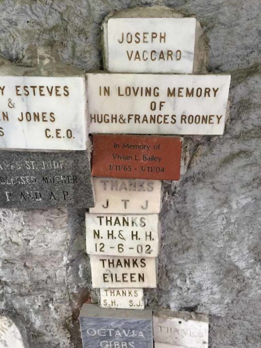
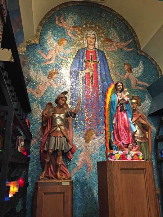
The grotto and interior of the nearby church were also very interesting.
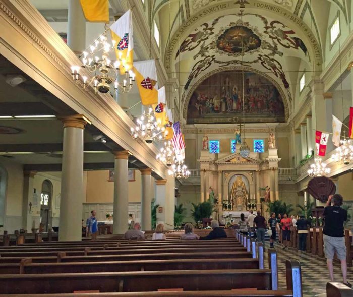
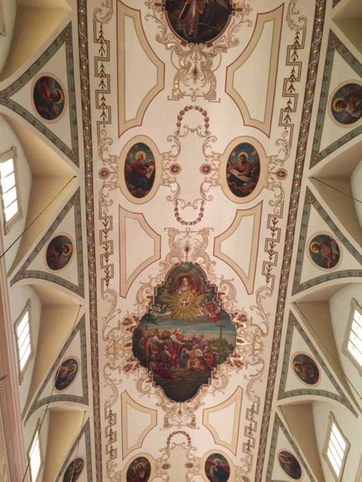
Later, we visited the St. Louis Cathedral, in Jackson Square. It was very beautiful.
AND THEN THERE WAS THE FOOD. A local saying goes like this:
There are two times of day in Louisiana – mealtime and in between
Oh my! Everything we ate was absolutely delicious. New Orleans has many dishes it’s known for and we were sure to try those: barbeque shrimp, bread pudding, shrimp po-boys, and more!
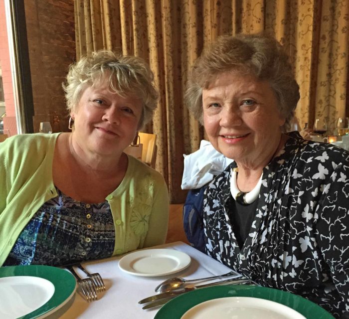
We even went to Emeril’s for dinner! It was fantastic. Both the food and the service were top-knotch. I’d go again in a heartbeat.
New Orleans is a very unique city. If you haven’t had a chance to visit, I hope you’ll get to do so.
Ellen Lindner
P.S. No, we didn’t eat beignets because the line was too long.
P.P.S. And we DIDN’T party on Bourbon Street!