In my last post, I showed how I started with a diagonal composition. That was probably a good starting point, but I could very quickly see that it was way to bulky and “regular.”
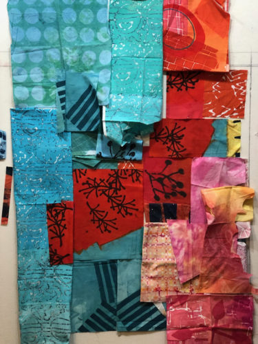
I knew it needed to have some variation and some energy added. So, I started trying new things. First, I got rid of the pink corner and I added a high contrast print with circles. That helped a lot!
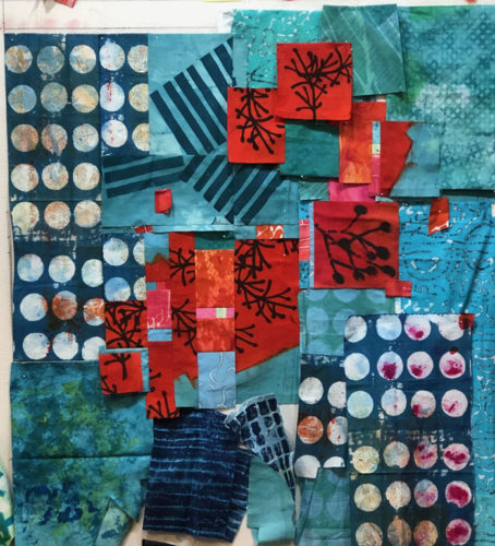
I pieced together the center section, which had vertical pieces. I was pretty confident with that portion, so I left it in place while I auditioned changes in other areas.
I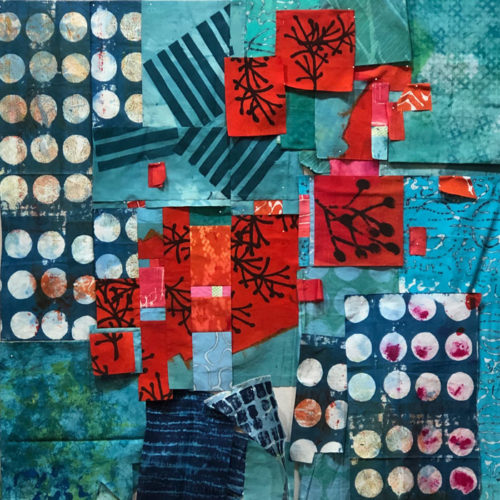
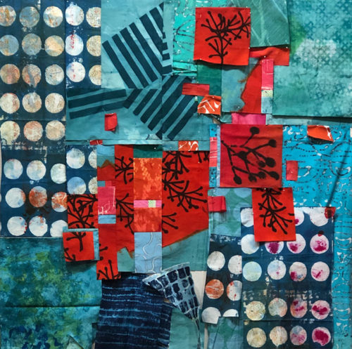
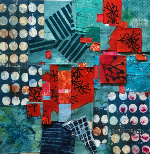
You get the idea. But then, I decided I should turn that center section 90 degrees – just to mix things up.
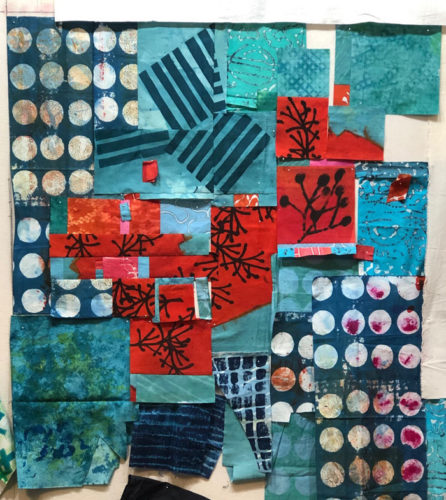
It didn’t immediately look better. As a matter of fact, maybe it looked worse. But, since it was DIFFERENT FROM MY EARLIER VISION, it appealed to me and I decided to work with it some more. (After all, I could always turn it back.)
I kept this new center orientation as I continued to work on the placement of the red.
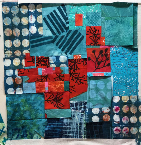
I’m loving the energy of this piece and I’m having fun working on it.
It needs a title, so I’m writing my thoughts on a list as ideas come to me.
Ellen Lindner


No comments yet.