Most of my designs start with something visual. I’m inspired by a combination of colors, a particular photo, or the pattern of some fabric. I’m not particularly good at (or comfortable with) designing for a particular theme or idea. Yet that is exactly where I found myself a short time ago.
I wanted to create a piece for a regional exhibit called “Perspectives.” My idea was to do something that played up the idea of conflicting points of view. This came to me as I was creating my latest quilt and working with this fabric.
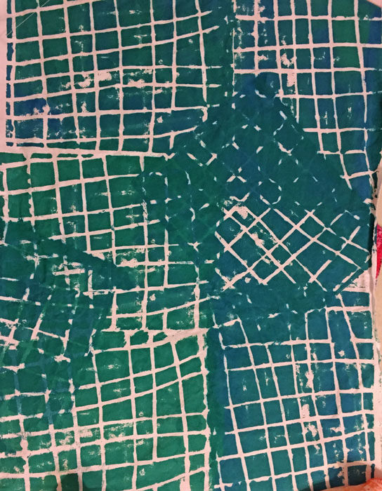
Don’t you think it could represent crossed lines of communication? That was my idea, so I started sketching.
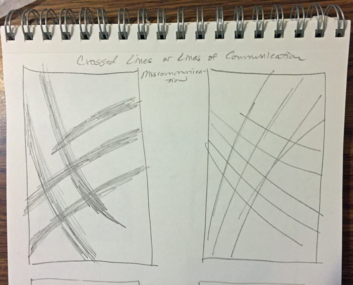
Hmm. It turns out that crossed lines aren’t that great a composition.
What about lines that cross wildly?
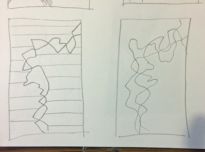
Yes, that’s much more interesting. And those squiggly lines reminded me of some of the exercises I had done while reading Jane Davies’ book. Some included large bulky shapes overlaid with interesting scribbled lines.
I sketched several ideas.
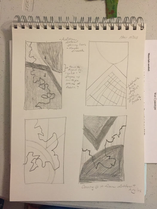
And decided on this one.
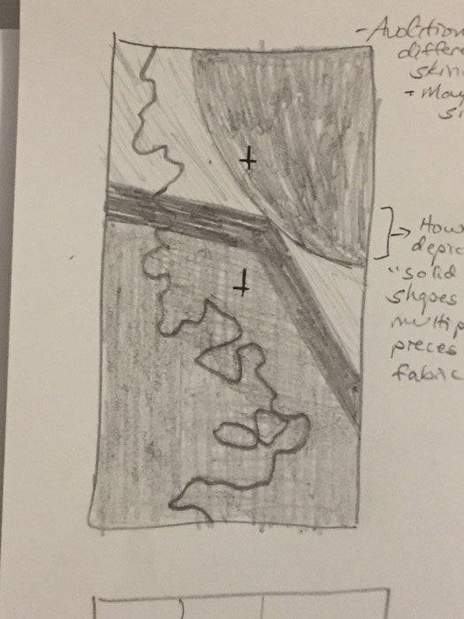
Yes, that had promise. And since it was basically just 3 large elements, I had it composed in no time (without the scribble.)
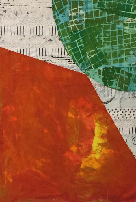
Next, I quilted it. I knew that would make adding the black squiggle much easier.
I was off and running and enjoying the Adrenalin ride!
Ellen Lindner
P.S. The orange fabric I used is the one I “ruined” with too much bright orange. I toned it down with an overdye and I love it here. Most other fabrics are also my hand dyes.


No comments yet.