Tag Archives | Abstract

Abstract Design from Scratch

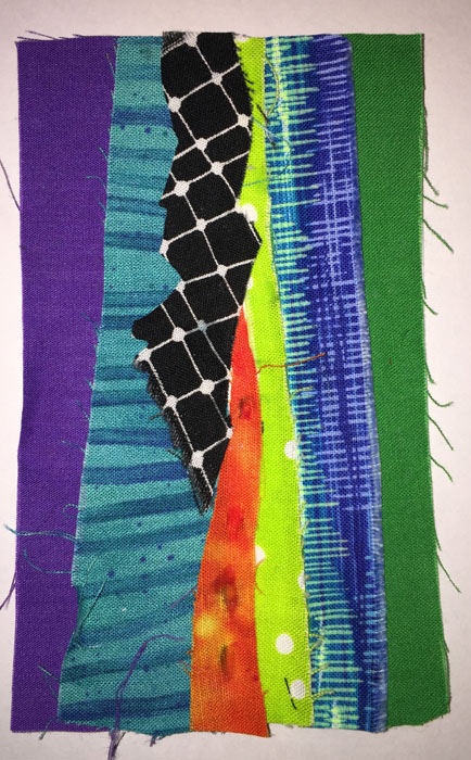
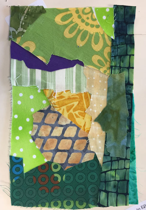
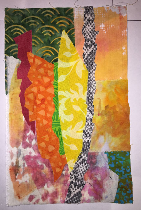
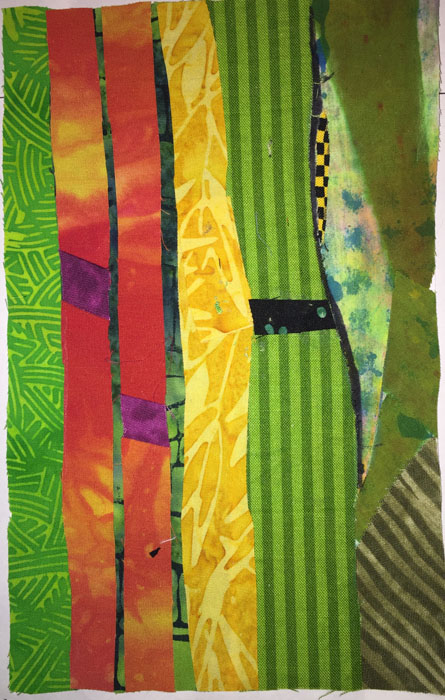
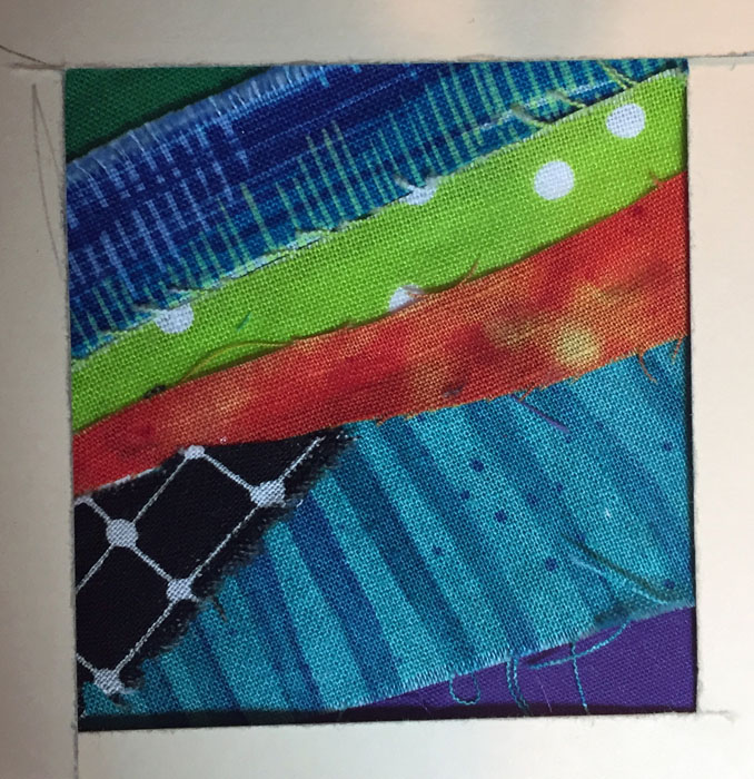
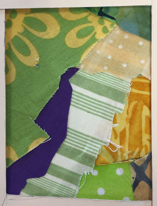
Have you done any abstract work? I have and I often find it difficult to come up with the original design. One exercise that’s been floating around via Pat Pauly and others it to randomly cover an index card with fabric scraps and let that become your design. So I tried a few.

Abstract Design from Scratch. Ellen Lindner, AdventureQuilter.com/blog

Abstract Design from Scratch. Ellen Lindner, AdventureQuilter.com/blog

Abstract Design from Scratch. Ellen Lindner, AdventureQuilter.com/blog

Some of these (like that last one) were real dogs, so I tried a more deliberate one.

Abstract Design from Scratch. Ellen Lindner, AdventureQuilter.com/blog

It was only slightly better.

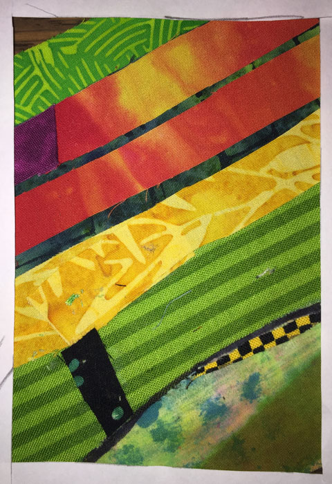
But wait, there’s more! If a composition isn’t appealing try visually cropping it to see if you can find a more pleasing design. Like this.

Abstract Design from Scratch. Ellen Lindner, AdventureQuilter.com/blog

I do this with paper or cardboard L shapes. With them you can easily crop the image much smaller.  It’s important to rotate it, too, as this often helps the design quite a bit.

Here are a few more crops.

Abstract Design from Scratch. Ellen Lindner, AdventureQuilter.com/blog

Abstract Design from Scratch. Ellen Lindner, AdventureQuilter.com/blog

I think these are much more dramatic than the originals (although they may still require some editing!)

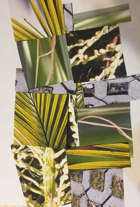
You can also do the same exercise with printed photos. I had several vegetation photos which I stacked and cut into mostly squarish pieces. This was my first arrangement.

Abstract Design from Scratch. Ellen Lindner, AdventureQuilter.com/blog

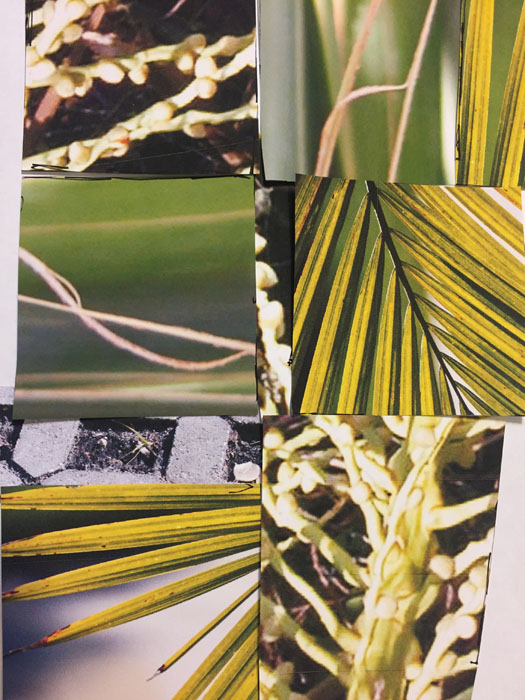
It already had good contrast and interest, but there was a lot going on.  I rearranged a bit more, now confident in the results I knew I could eventually get. This was that second arrangement slightly cropped.

Abstract Design from Scratch. Ellen Lindner, AdventureQuilter.com/blog

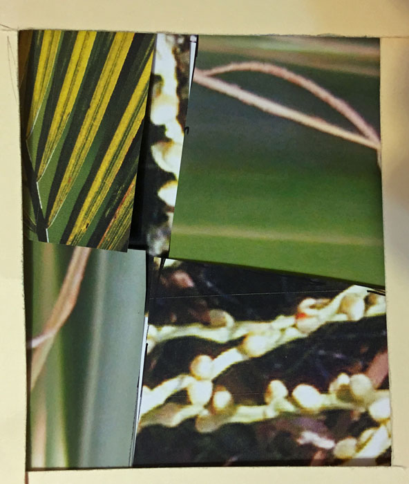
But, I took it even further.

Abstract Design from Scratch. Ellen Lindner, AdventureQuilter.com/blog

That would make a pretty great quilt, don’t you think?

I’ve found this technique to be useful and have just finished an abstract quilt designed in this way.  I’ll get it photographed and show it to you soon.

What tips do you have for designing abstractly?

Ellen Lindner
P.S. This is one of the tools Pat teaches in her “A Dozen Ways: Design for Art Quilts,” a class which I recommend.

2

A Splash of Orange

You readers are really great!  When I posted my quilt at this stage several of you had good suggestions about how I might improve it.

A Splash of Orange. Ellen Lindner, AdventureQuilter.com/blog

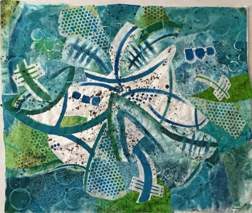
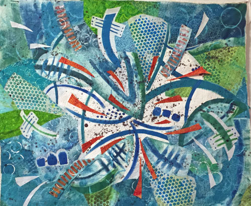
The most common suggestion was to add some orange back in.  Something I had considered but rejected.  Another tip was to break up the white and to extend the “splashing” out toward the edges more. Since I had mentally given this quilt a “7,” I knew it needed something and I decided to give these ideas a try.

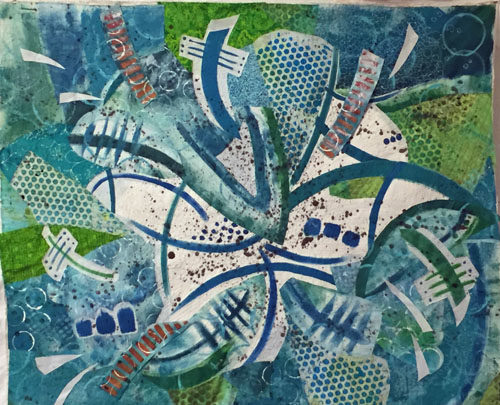
First, I added some white “splashes” closer to the edges and put some of the orange stripes back.  I also tapered the ends of many of the motifs.

A Splash of Orange. Ellen Lindner, AdventureQuilter.com/blog

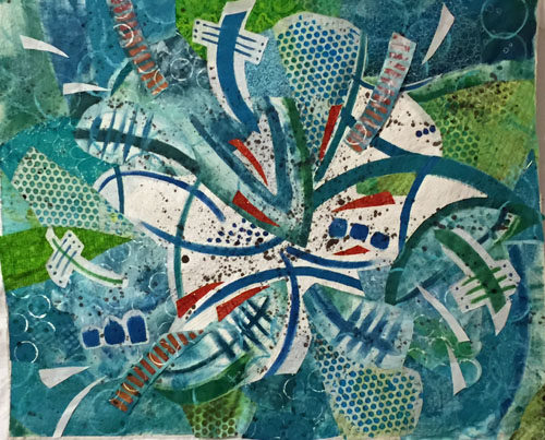
Clearly, the orange needed to be more dramatic.  So, I tried a few little splashes, (which look red in this photo.)  Yes!  I could see that this would add the drama the quilt needed.

A Splash of Orange. Ellen Lindner, AdventureQuilter.com/blog

I added more.

A Splash of Orange. Ellen Lindner, AdventureQuilter.com/blog

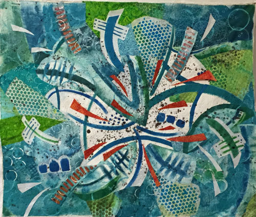
Yeah, that was working pretty well.  My brain said, “Let’s add more!”  And I obliged.

A Splash of Orange. Ellen Lindner, AdventureQuilter.com/blog

But, wait a second.  This was beginning to look like I had added the kitchen sink!  Some editing was needed. I removed the white splashes and auditioned changes to the orange stripes.  (Below, those fabrics are folded, rather than cut, for audition purposes.)

A Splash of Orange. Ellen Lindner, AdventureQuilter.com/blog

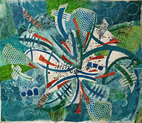
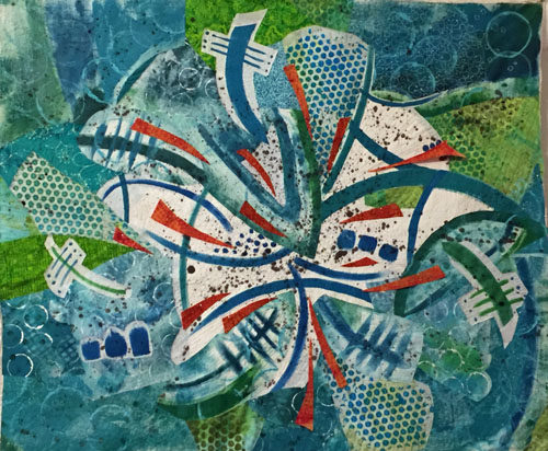
And this is where I ended up. As you can see I completely removed the orange stripes.

A Splash of Orange. Ellen Lindner, AdventureQuilter.com/blog

Have you heard the saying that goes, “If your composition is not working, remove your favorite thing?”  I think that sort of applied here.  At this point, I thought it was a solid 8.5 and I was quite happy with it.  On to quilting.

(Did you remember that this piece is composed of painted fabric, some of which is stiff?  That may be an issue for the quilting.)

Ellen Lindner

20

A Wacky Composition

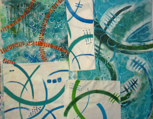
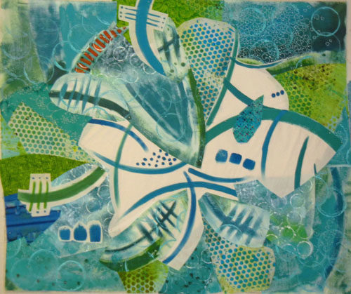
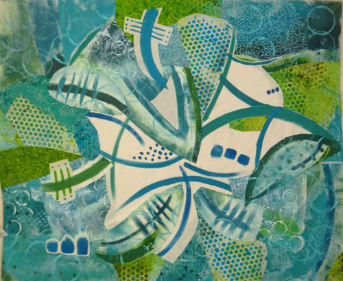
Well, after painting those (challenging) fabrics I had to figure out what to do with them.

Challenging Fabric Painting. Ellen Lindner, AdventureQuilter.com/blog

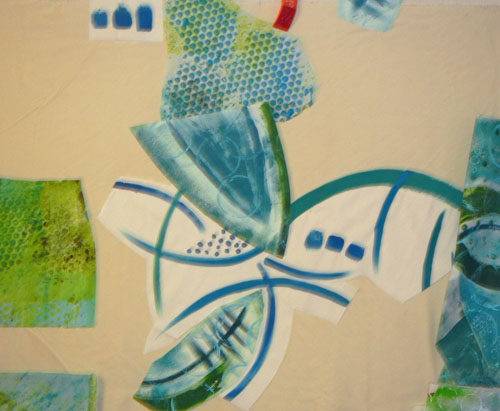
Since I wasn’t crazy about some of them, I knew I’d need to cut isolated portions and motifs for use. I had NO IDEA what my composition might look like, but I started cutting out sections and MINDLESSLY sticking them up on my design wall.

Apparently my brain likes order because I soon found myself adding each piece so that it filled the space left by previous pieces. Soon, a design was emerging.

A Wacky Composition. Ellen Lindner, AdventureQuilter.com/blog

I did make one very conscious decision at this point: I decided to place the pieces with the white background near center, since I knew these high contrast pieces would attract attention.

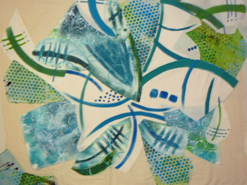
And so it went. I had found a dotted piece of blue and green and added it to the mix.  It worked well and expanded the color palette.

A Wacky Composition. Ellen Lindner, AdventureQuilter.com/blog

I threw in a little of the orange, too, of course.  It was looking wild and I was trying hard not to over think it!

A Wacky Composition. Ellen Lindner, AdventureQuilter.com/blog

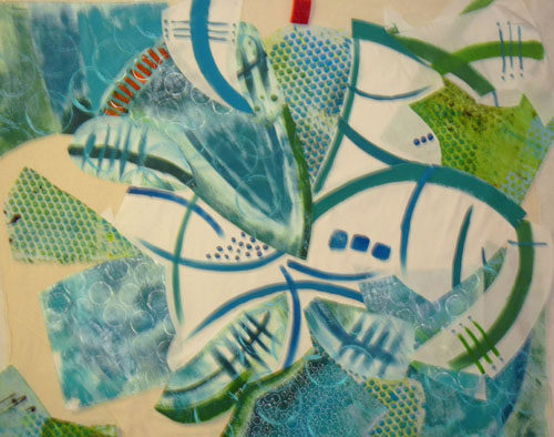
I had some gaps and auditioned commercial fabrics to fill in.

A Wacky Composition. Ellen Lindner, AdventureQuilter.com/blog

Before long I had the base muslin fabric covered.  Now, it was time to examine what I had with a very critical eye.  Was this wacky combination heading in a usable direction?  Should I start all over with something calmer?  If I continued,  I knew some editing/deleting would be in order.

A Wacky Composition. Ellen Lindner, AdventureQuilter.com/blog

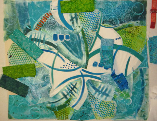
I removed (temporarily???) the orange, replaced the too bright blue lower left, and moved things a little. I felt like I was getting close.

A Wacky Composition. Ellen Lindner, AdventureQuilter.com/blog

Future questions:
– The white areas seem so blank.  Should I add something small scale in that area?
– Does it need something lower right?
– I’d like to add the orange back, but how can I best do that?
– Does it need something darker?  Black, even?

About this time I decided on a tentative name, “Splash.”  That would certainly affect some  future decisions.

Thanks for joining me on this wild ride!

Ellen Lindner

16

MORE Trial and Error

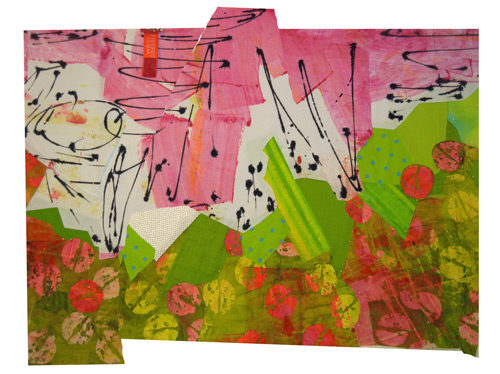
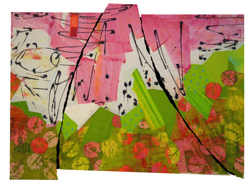
After doing LOTS of trial and error on my current quilt, I finally decided to cut it into pieces and to reassemble it.  My goal was to add some skinny or small pieces of black, to move the black around the piece more, and to add interest to the composition.

Of course, I could cut the piece into equal panels, but I decided to audition more radical solutions first.  (As you may have guessed, my experimentation was done on the computer.)

What if I cut it into curved shapes and then rejoined them?MORE Trial and Error. Ellen Lindner, AdventureQuilter.com/blog

And added black between the pieces.MORE Trial and Error. Ellen Lindner, AdventureQuilter.com/blog

Interesting, but sorta…hmm, awkward.

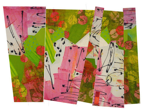
What if I cut it into angled shapes and reassembled them?MORE Trial and Error. Ellen Lindner, AdventureQuilter.com/blog

This time (above) I also rotated some of the pieces 180 degrees and I rearranged the position of the panels.  That added a lot of energy, I thought.

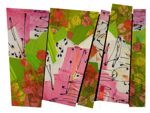
Next, I added black between.MORE Trial and Error. Ellen Lindner, AdventureQuilter.com/blog

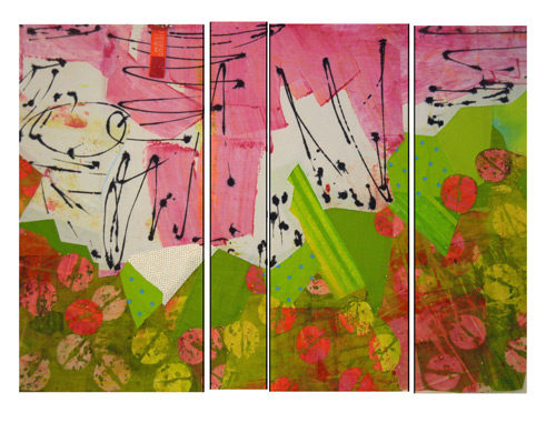
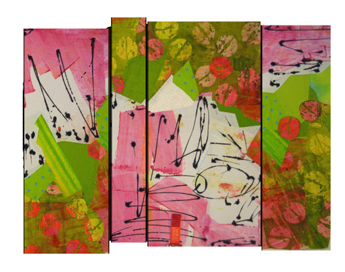
I was pretty happy with this. But, it was time to also consider more predictable arrangements.  Here, I’ve “cut” my composition into 4 panels.MORE Trial and Error. Ellen Lindner, AdventureQuilter.com/blogIt looked a little boring after some of the earlier arrangements.  What if I flipped some of the panels?

MORE Trial and Error. Ellen Lindner, AdventureQuilter.com/blog

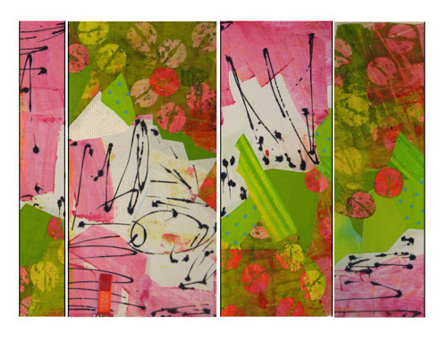
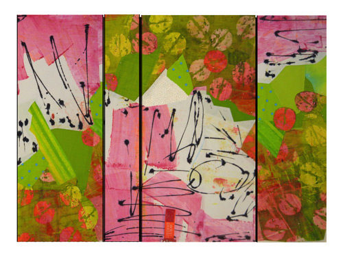
Ah, yes.  This has much more energy. Should I move the panels around?  And maybe scoot things out of alignment a bit?

MORE Trial and Error. Ellen Lindner, AdventureQuilter.com/blog

That’s pretty cool.  But, I eventually decided the irregular shape didn’t really add to the composition.

So, here it is: my final plan.

MORE Trial and Error. Ellen Lindner, AdventureQuilter.com/blog

I’m kinda in love with it.  To me, it has the right amount of energy and the black lines help pull it all together.  Time to quilt!

Oh yeah, have you got any ideas about a title for this piece?  I’d love to hear your suggestions.

Ellen Lindner
P.S. THANKS to so many readers who offered their thoughts and suggestions on my earlier post. I had more comments than almost any other post.  I hope you’ll also chime in on this one!

18

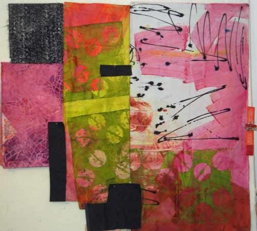
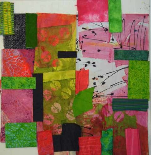
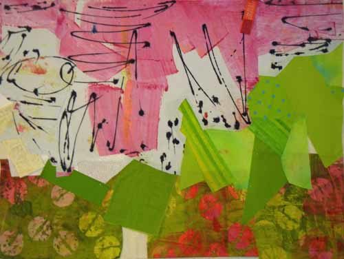
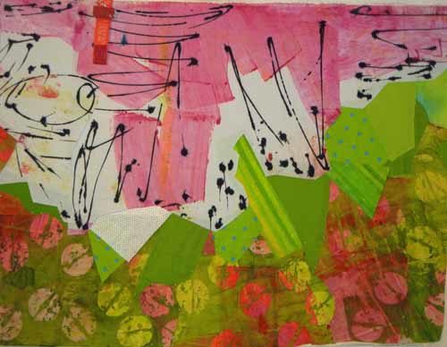
LOTS of Trial and Error

Good grief.  I’ve about worn out my brain cells trying out different ways to proceed with my current project.

I was really thrilled with the background composition but felt like it needed to have some more black added.

To Start: Fabulous Fabrics. Ellen Lindner, AdventureQuilter.com/blog

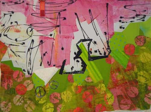
But nothing that would detract from the black already there.  Maybe something loose and organic that would play up the chunky diagonal line between the white and green?  With that idea in mind I began to experiment.

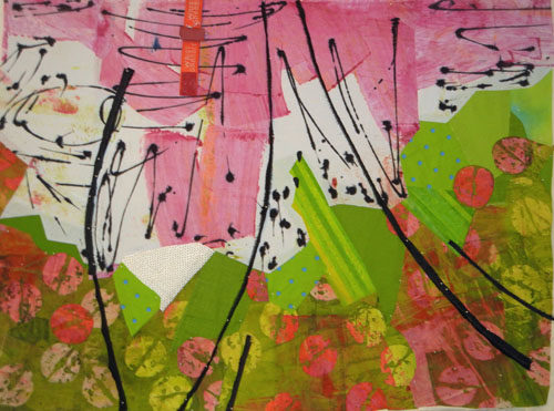
Maybe a wild heavy line?

Or maybe little jagged black pieces to create the line.

Or a thinner more controlled black line?

Or maybe the line should be created with the same shapes showing in the green and pink fabric at the bottom.

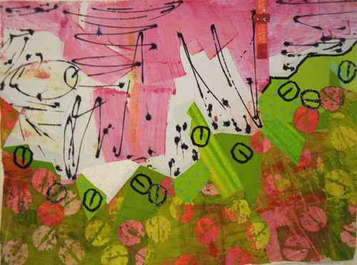
You can’t say I didn’t try! Finally I gave up on the idea of playing up the diagonal line and looked for other ways to add black.  Something like this, maybe?

Well, I liked that better, but felt like I was till far away from the right solution.

At about this time one of my readers. Eleanor Levie, suggested adding black vertical strips. That got me thinking.  I began to consider the idea of cutting the piece into sections and reassembling it, along with the addition of black. But, should the sections be vertical?  Or maybe slanted?  Or even curved?  And should I put them back in their original locations or mix them up a bit?  If the latter, what kind of shape might I create?  And what about inverting or rotating some of the sections?

Well, as you can tell, that took me down quite another rabbit hole.  I’ll show you those experiments next time.

Ellen Lindner


25

To Start: Some Fabulous Fabrics

I’m working on a new project, inspired by some great new fabrics. The bulk of these were painted by Pat Pauly. I purchased them to use together and they make my mouth water!

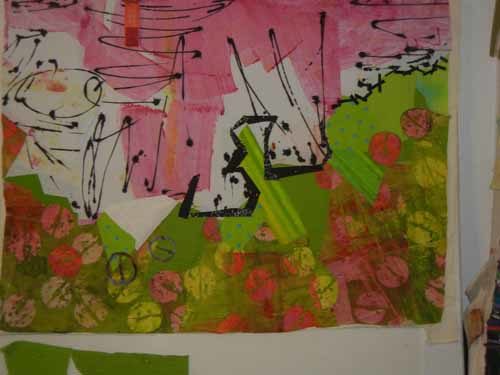
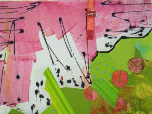
To Start: Fabulous Fabrics. Ellen Lindner, AdventureQuilter.com/blog

In the photo above I’ve folded each one to reveal the parts I intend to work with. I think a good dose of black will also be needed.

And maybe some other fabrics.  Yellow-green, orange-red, blue-green?

To Start: Fabulous Fabrics. Ellen Lindner, AdventureQuilter.com/blog

Uh, no.

The hand drawn lines in the pink and white fabric got me thinking about lines so I spent some time doodling.  One of my sketches resulted in a very irregular diagonal line.  I thought that would be a good starting point for what would basically be a two-color quilt.  I cut out my favorite parts and began to place things on the design wall.

To Start: Fabulous Fabrics. Ellen Lindner, AdventureQuilter.com/blog

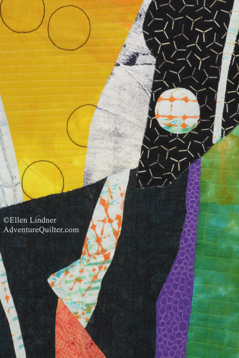
Because the pink fabric is painted in broad chunky shapes, I thought I could use a chunky composition elsewhere. Eventually, I got this:

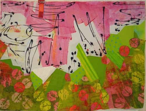
To Start: Fabulous Fabrics. Ellen Lindner, AdventureQuilter.com/blog

My scraps  yielded a few of the painted circles, so I added them back in judiciously.

To Start: Fabulous Fabrics. Ellen Lindner, AdventureQuilter.com/blog

I was pretty happy with this.  Still, I knew I needed to add some black.  Just how should I do that without competing with the wonderful black lines already there?  A quandary. (Hopefully, I’ll have a solution for the next post.)

Ellen Lindner

4

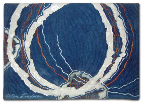
“Circling Back,” a Tiny Little Thing

You’ve heard of trunk shows, right? When a group of quilts travels in order to be shown at various quilt guilds, shows, meetings, etc.?  Here in Florida, my SAQA co-rep, Karol Kusmaul, had the brilliant idea of doing something like this on a statewide level.  We’re calling it a “Roaming Gallery.”  (Her idea, which I love.)

The idea is to make tiny quilts, only 7″ x 10″, mounting them very professionally, and then sending them around the state for various purposes.

So, I got to thinking about my contribution.  As is typical for me when doing something this small, I used scraps from a recent project.  You know, the stuff that’s still out on my table and not yet put away.  In this case I used a small scrap of indigo, left over from Indigo Hug.
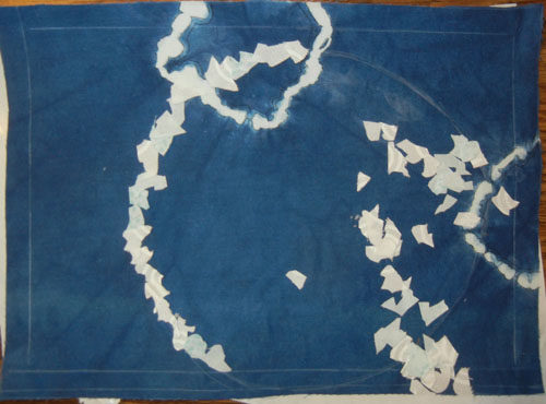
Circling Back, a tiny little quilt by Ellen Lindner. AdventureQuilter.com/blog

The two small circles above were created as part of the dying process. Small rocks were caught up in the fabric and secured with rubber bands.  These acted as a resist, preventing the dye from penetrating in that area.  Cool, right? Since the fabric already had partial circles on it, continuing with more seemed like a logical idea.  Above, I auditioned the idea of adding a very irregular circle with tiny little pieces of fabric. But, I didn’t care for it.

Next, I added fatter circles cut from white fabric.
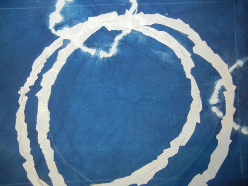
Circling Back, a tiny little quilt by Ellen Lindner. AdventureQuilter.com/blog

I liked that but thought it needed more.  What about another circle?
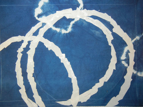
Circling Back, a tiny little quilt by Ellen Lindner. AdventureQuilter.com/blog

Yes and no.  This 3rd circle is too much.  Yes, it adds interest, but it throws the balance off.  I decided to add circles in a much smaller scale. But, would that mean smaller fat circles or just skinny circles?  More trial and error was needed.

This is where I took it: squiggly lines drawn with a permanent pen, squiggly satin stitching, squiggly straight stitching, and crosshatch stitching.  And, of course, I had to add some complementary (opposite) orange. Here, you’re looking at a detail of the finished left side.
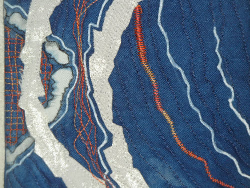
Circling Back, a tiny little quilt by Ellen Lindner. AdventureQuilter.com/blog

And here’s a similar treatment given to the bottom.
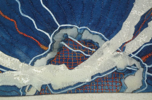
Circling Back, a tiny little quilt by Ellen Lindner. AdventureQuilter.com/blog

And the full piece, Circling Back. 

Circling Back, a tiny little quilt by Ellen Lindner. AdventureQuilter.com/blog

I’m quite happy with it. Working this small is pretty challenging since each little detail carries a lot of weight. Everything has to be “just so.”

A couple of other points:

– Did you notice the white perimeter lines in the earlier photos? Those represent the dimensions of the finished quilt.  When working at this scale I find them to be very important.  Several times I folded the fabric back on these lines so I could check the composition as it would be when complete.  At this scale that little seam allowance variation makes a huge difference.

– We’ll use these quilts to educate others about art quilts and SAQA, our organization.  But, they might also come in handy when we’re trying to secure exhibit venues.  If you were a curator unfamiliar with quilts as art wouldn’t you love to be able to see these tiny examples?

Ellen Lindner
P.S. See another small auction quilt.
 

12

“Mid-October” Complete

Well, here it is, version two now complete: Mid-October.

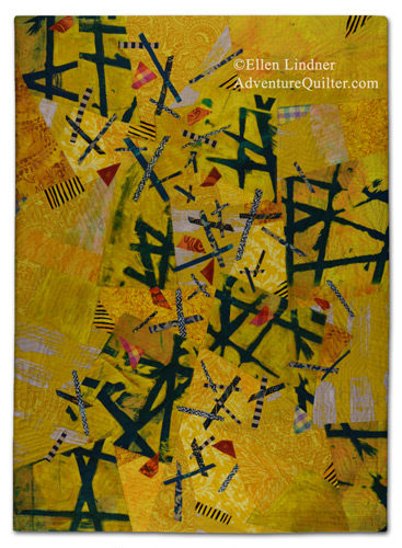
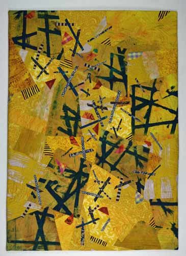
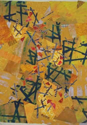
"Mid-October" complete. Ellen Lindner, AdventureQuilter.com/blog

"Mid-October" complete. Ellen Lindner, AdventureQuilter.com/blog

After completely finishing AND photographing version one, I began to think it was too dark.  It just didn’t remind me of the bright fall colors I was going for.

See what I mean?  (Actually, the two quilts photographed slightly differently, but I think you can see the duller patches throughout.)

Leaf Quilt Complete - Maybe. Ellen Lindner, AdventureQuilter.com

What do do at this stage?  I “painted” over several spots with Inktense color blocks.  (See the detail shot.) To my eye it’s much better.

Have you ever painted over a completed quilt?  This is not my first time around that particular block.

Ellen Lindner

7

Leaf Quilt Complete – Maybe

Working on this quilt inspired by fall foliage, I added many more little orange bits.

Leaf Quilt Complete - Maybe. Ellen Lindner, AdventureQuilter.com

Hmm, maybe I got carried away there. I removed a few and it looked better.

And here it is finished, called Mid-October.

Leaf Quilt Complete - Maybe. Ellen Lindner, AdventureQuilter.com

I liked it.  But something was bothering me.

Ellen Lindner
P.S. Have you ever had that nagging feeling that something isn’t quite right?

5

That Fabric Again

Remember the great fabric I used in my quilt Initial Response? I still had half of it, ready to use on the next project. This portion made me think of fall leaves, with the twigs and branches of trees peeking through.  Can you see it?

That Fabric Again. Ellen Lindner, AdventureQuilter.com/blog

That was enough to get me started.  From there I cut it into 9 pieces.  (Not square, of course.) If you look closely, you can see the cuts, above.

I decided the feature fabric should be about 1/4 of the quilt design, which helped me determine the size.

That Fabric Again. Ellen Lindner, AdventureQuilter.com/blog

I put 4 of my 9 pieces in the corners and scattered the others throughout.  Then I started filling in with fabrics from my stash, both commercial and hand dyed.

Soon, I had this.  “Not bad,” I thought.

That Fabric Again. Ellen Lindner, AdventureQuilter.com/blog

I added a little more interest with some small snippets of plaids and stripes.  And then began to audition twig fabrics and widths.  I decided most of them would need to be pretty skinny.

That Fabric Again. Ellen Lindner, AdventureQuilter.com/blog

I added QUITE A FEW twigs and was happy with the results.

That Fabric Again. Ellen Lindner, AdventureQuilter.com/blog

As I thought more about fall leaves I realized I should probably add some color variations.  I tried several fabrics in the orange family. Some were very bright and sort of took over.  Maybe I could still use them in small pieces.  Others were too dull and were removed from consideration.

In the next post I’ll show you what I did with these fabrics.

Ellen Lindner

3