Tag Archives | Abstract

“Initial Response” Complete

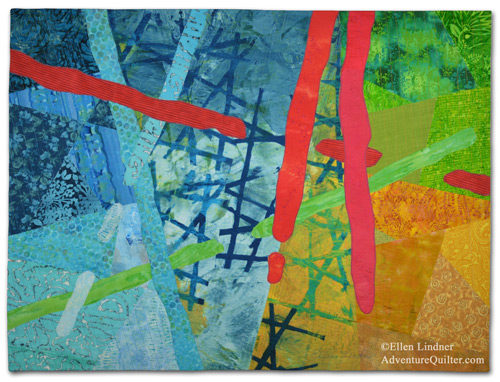
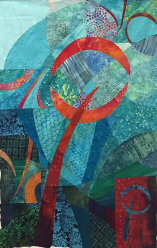
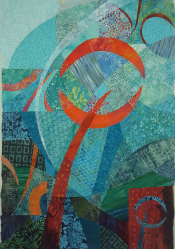
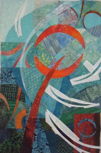
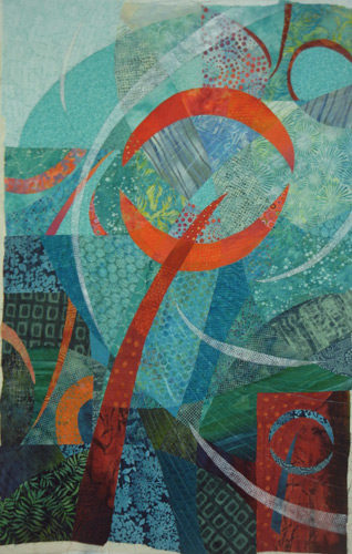
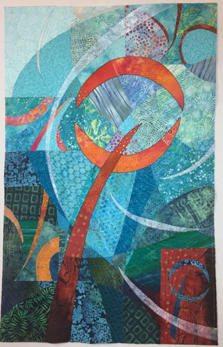
My latest quilt, Initial Response, is now complete.

Initial Response, an art quilt by Ellen Lindner. AdventureQuilter.com

Initial Response

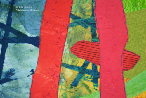
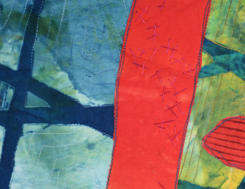
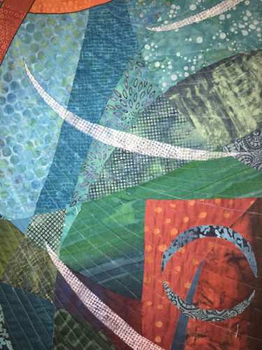
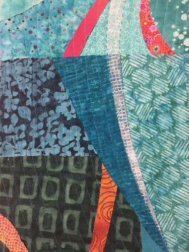
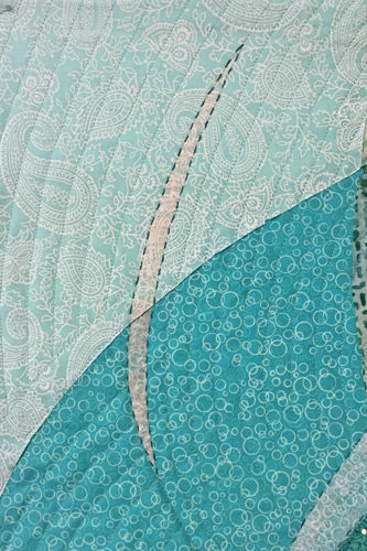
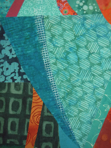
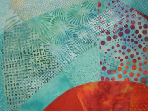
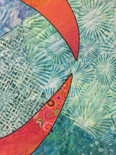
Initial Response - detail, an art quilt by Ellen Lindner. AdventureQuilter.com

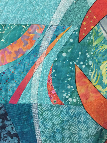
Initial Response - detail, an art quilt by Ellen Lindner. AdventureQuilter.com

Find more information here.

I’m REALLY happy with this quilt!  Especially the color scheme, which was new to me.  And, it went together easily, since I let the initial hand dyed fabric (center) give me lots of cues.  I selected the name, Initial Response, mostly because I liked the sound of it and the idea of it.  Then, I realized that it eluded to my process, as well.  I like that.

I’ve written lots about my process in making this quilt. If you scroll back to January 14th, 2018 you’ll see the first post and you can read forward for the full story.

I’m looking forward to using the rest of that special fabric.  Hmm, what shall I do with it?

Ellen Lindner

Audition this art in your home

6

Two Steps Back

Well, I just wasn’t happy with the in-progress quilt I showed you last time. It seemed a little static.

Three Steps Forward. Ellen Lindner, AdventureQuilter.com/blog

I tried to analyze what needed to change and I referenced my original black and white sketch.

Two Steps Back. Ellen Lindner, AdventurQuilter.com/blog

Wait a second.  It was different from the working sketch I’d been using:

It all Started with a Beautiful Fabric. Ellen Lindner, AdventureQuilter.com/blog

At some point I had switched the values of the two loosely horizontal lines.  I had worked with the one showing the lower line dark and the top one very light.  But now, looking at what was currently in my sketch book, I thought the other (top) version was definitely better.  Could such a subtle thing make that much difference?  Well, in my mind it clearly did.

So, I decided to make some changes.  In addition to the value shift I wanted to really play up the red as the primary motif color and to make the lines fatter and more irregular.  (Again, more like the sketch.) I took all the motif pieces off and started again on the plain background. (Two steps back.)

My redo was much easier than my first attempt, probably because I had a clearer idea of what I wanted to achieve.  “Play up the red” was my first priority.

Two Steps Back. Ellen Lindner, AdventurQuilter.com/blog

Bam!  As soon as I put this up I liked it SO much better!  There was the drama I had been missing!  After auditioning some red fabrics, I came up with this.

Two Steps Back. Ellen Lindner, AdventurQuilter.com/blog

Yes!  A definite improvement.  From here my goal was to add interest without detracting from these strong red lines.  Which meant that most of the lines would be low contrast. Like the aqua lines I was adding below.

Two Steps Back. Ellen Lindner, AdventurQuilter.com/blog

Auditioning green for the lower line: I was liking it better than the previous yellow. Of course, it needs to tuck under at least some of those lines to avoid getting too much attention.  Did you notice that I tweaked the red “horizontal” line?

Two Steps Back. Ellen Lindner, AdventurQuilter.com/blog

But, should I add some yellow somewhere?  I was still fiddling at this point, but getting very close to finalizing everything.

There you have it: 3 steps forward in my previous post and 2 steps backward in this one.  But, I don’t let that bother me, especially since I eventually moved forward  I figured out what was wrong and corrected it.  There’s often some trial and error in art making and I don’t let it discourage me.  In fact, sometimes I think I just have to get that wrong thing out of my head before I can properly entertain something better.  Does anyone else have that experience?

Ellen Lindner

4

Quilting and Cording

When quilting my latest piece I decided to mimic the swirls/curves in the background.

Quilting and Cording. Ellen Lindner, AdventureQuilter.com/blog

Quilting and Cording. Ellen Lindner, AdventureQuilter.com/blog

In addition to machine quilting, I also added some hand stitching around several of the curved shapes.

Quilting and Cording. Ellen Lindner, AdventureQuilter.com/blog

My main reason for doing so was to add contrast to the white curves in the light areas. I intended to stitch around all the curved shapes, but the effect was so subtle I changed my mind and used it only in the lightest areas.

Next, I turned my attention to the main motif.  I thought it needed to be set off from the background somewhat.  I considered:
– Lightening the background around the motif with colored pencils, chalk, etc.
– Using tulle to add a dark shadow around parts of the motif.
– Adding a dark line around the motif, by adding cording.

I was leaning toward the cording idea, since I had used it previously. I did some auditioning and started in.  I hand stitched a black cord in place.  That is, I used a cording stitch to capture the cord and secure it to the top of the quilt.  I did not pierce the fabric with the cord.

Here you can see the effect before and after the cording.

Quilting and Cording. Ellen Lindner, AdventureQuilter.com/blog

I think it set it off perfectly.

Quilting and Cording. Ellen Lindner, AdventureQuilter.com/blog

Quilting and Cording. Ellen Lindner, AdventureQuilter.com/blog

And here’s the entire quilt, ready for facing.  Almost finished!

Quilting and Cording. Ellen Lindner, AdventureQuilter.com/blog

Have you got any suggestions for a name?  I’ve got one in mind, but am still slightly undecided.

Ellen Lindner
P.S. Here’s what a hard/precise tulle shadow looks like.  It’s very effective in adding definition, but only if you want to show the top element just slightly above the background.  I wanted this motif to float, so it wasn’t appropriate here.

12

Holding My Mouth Just Right

I recently added paint to a quilt!  Gulp!  This is something I’ve only done once or twice, so I definitely had to get my courage up.

It helped that I had done a bunch of painted exercises a few months ago.  So, I did some practice samples, held my mouth just right and gave it a go.

I had started this quilt at Quilting by the Lake, back in July, and had completed the fabric composition.  After putting the quilt away for a few months, this is where I picked it  up.  I wanted to add some sheer swirling elements to the background.  With paint.  Gulp again.

Translating Sketches to Color. Ellen Lindner, AdventureQuilter.com/blog

I had previously done some experimenting about how to best add a sheer layer with monoprinting. From that I knew that a certain scrap of shelf liner worked well.  Like this.  I thought it looked quite good.

Painting on a quilt: GULP. Ellen Lindner, AdventureQuilter.com/blog

But, it pretty much disappeared in the lighter patterned areas.  Clearly, I’d need to beef it up some how.  Back to experimenting.

Painting on a quilt: GULP. Ellen Lindner, AdventureQuilter.com/blog

I figured out I could stencil on another light coat of paint to get my desired effect.  Like this.

Painting on a quilt: GULP. Ellen Lindner, AdventureQuilter.com/blog

I used freezer paper to mask out the quilt areas that I wanted to stay paint free.

Painting on a quilt: GULP. Ellen Lindner, AdventureQuilter.com/blog

And this was the result. I was happy with it.

Painting on fabric. Gulp! Ellen Lindner, AdventureQuilter.com/blog

At this point, it was time to start thinking about the quilting design.  I’ll show you what I did in the next post, plus something a little unexpected.

Ellen Lindner

8

Online Class with Jane Davies

After getting so much out of Jane Davies’ book about abstract elements I decided to take an online “class” with her.  I put class in quotes, because this was not interactive.  You just download the content and do the exercises on your own.  More like a book – although she does have interactive classes, too.

This was MUCH more challenging, primarily because it involved a lot of – to me – tricky painting techniques I wasn’t familiar with.

The first exercise was easy enough, however: paint a lot of paper in a monochromatic colorway, then combine it in a gridded collage.
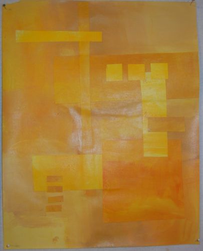
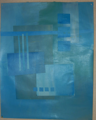
An online class with Jane Davies. Ellen Lindner, AdventureQuilter.com/blog

I made two.

An online class with Jane Davies. Ellen Lindner, AdventureQuilter.com/blog

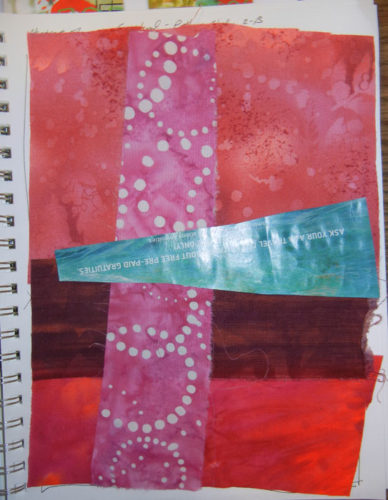
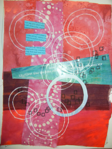
The ease stopped there.  The next assignment was to make a horizontal collage with different background colors top and bottom.  That part was fine.  But then, I was supposed to sort of merge the background and foreground.  This is what Jane does so brilliantly that is completely foreign to me!
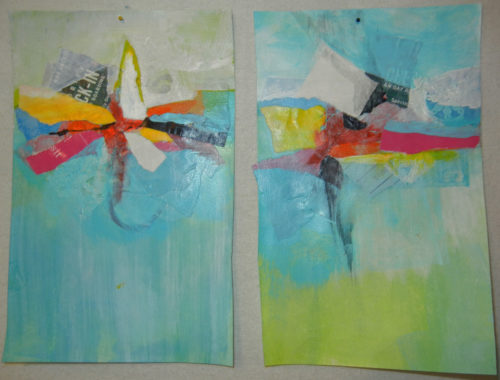
An online class with Jane Davies. Ellen Lindner, AdventureQuilter.com/blog

I did 4 of these, with my most successful 2 shown above.  In places, I pulled the color of the collage into the background and in other places I painted a background color onto the collage.  I had no idea what I was doing!  But, it WAS interesting.

Next came an assignment that started with a cruciform composition.  That part was okay, but the quadrants were each supposed to be different, and again, the two were supposed to be merged with paint.  Again, lots of completely random attempts on my part.
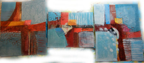
An online class with Jane Davies. Ellen Lindner, AdventureQuilter.com/blog

This next 3 examples are so hideous I hesitate to show them to you.  Ugh!
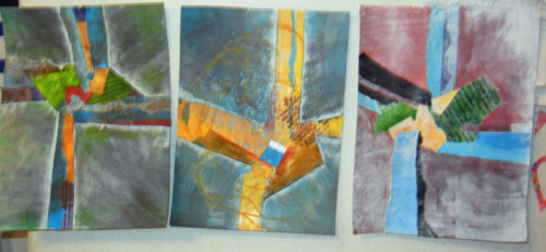
An online class with Jane Davies. Ellen Lindner, AdventureQuilter.com/blog

Again, these were cruciforms, with paint added everywhere and then wiped off.  I completely overworked these three!

Finally, it was time to put it all together.  After watching her video twice I was ready to start.  First, I referenced my earlier sample papers showing a variety of ways to make marks with paint.
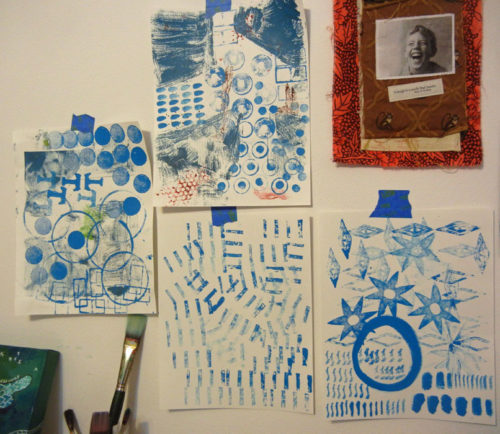
An online class with Jane Davies. Ellen Lindner, AdventureQuilter.com/blog

For this assignment I followed Jane’s example of painting over every single layer, (until I got to the last few elements.)  Here, the orange circle and the black lines are not painted over.  Everything else is.
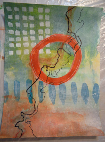
An online class with Jane Davies. Ellen Lindner, AdventureQuilter.com/blog

Finally, I had a little bit of success I think.

Things I learned:
– I  love the look of partially veiled paint, but I don’t know how to do it.
– I love the idea of foreground and background merging, but I don’t know how to do that with paint either.  Maybe with fabric?
– I continue to be entranced with skinny wild lines, inspired by some of Jane’s work.

Questions going forward:
– Can I get a veiled look with fabric?  Maybe with sheers or overprinting with paint?
– What’s the best way to add those skinny lines to my fabric art?
– Can I successfully  merge both fabric and paint in my art???

You know me: I’ll HAVE to do some more experimenting as I try to answer these questions.  Stay tuned.

Ellen Lindner
8

Abstract Exercises: Line and Composition

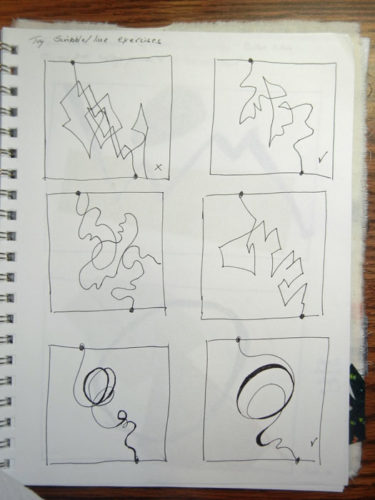
Continuing with my abstract exercises, I focused next on line.  (Although I’d been using it since the very first exercise.)

What kind of line(s) did I like?  What came naturally?

Line and Composition. Ellen Lindner, AventureQuilter.com/blog

I’m still trying to figure that out.  On the grid above, my favorite line is the one top right.

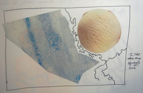
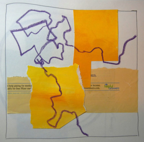
The next assignment was to use two shapes and add a line.

Line and Composition. Ellen Lindner, AventureQuilter.com/blog

I love that little squiggly line above!

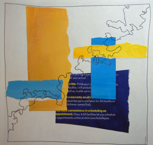
The next exercise required multiple shapes, arranged in a grid format, with line added. By now I found myself leaving space for the future line.

Line and Composition. Ellen Lindner, AventureQuilter.com/blog

I was beginning to smile more and cringe less at my results.  It was beginning to gel in my brain, I think.

Line and Composition. Ellen Lindner, AventureQuilter.com/blog

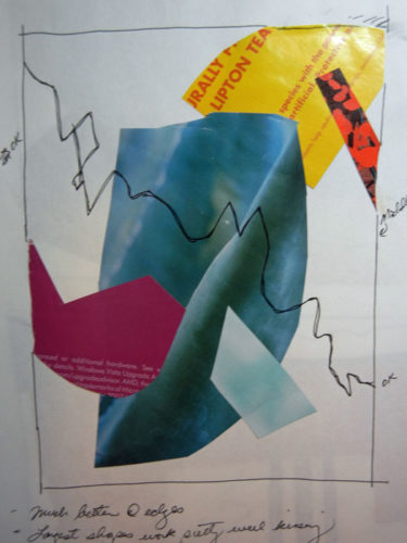
Finally, I read (or saw?) something in the book that surprised me.  First, some background: I’ve often heard that elements in a composition shouldn’t “kiss.” That is, they shouldn’t just barely touch.  They should either clearly miss one another, or clearly overlap.  Same for elements in relationship to the edge of the composition.

However, Jane’s work often has elements kissing.  So, I decided to test the kissing, non-kissing concept.  I cut out similar elements and made two different compositions.  The first one had no kissing.

Line and Composition. Ellen Lindner, AventureQuilter.com/blog

And I was pretty happy with it.

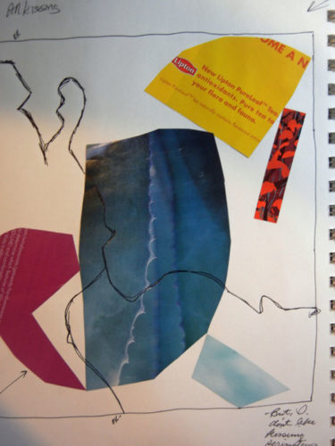
Next, came full on kissing!

Line and Composition. Ellen Lindner, AventureQuilter.com/blog

Hmm, to my surprise that wasn’t too bad.  It had a certain edginess to it.  I decided I might occasionally ignore the “no kissing” rule.  But not at the edges.  I didn’t care for that.

How about you: kissing or not?

Ellen Lindner

10

“Spring Forth” Complete

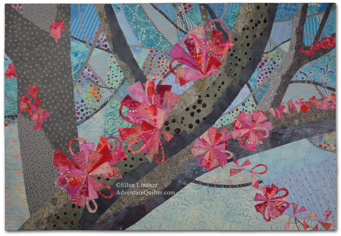
After many distractions, I finally got back to working on my Red Bud quilt.  I decided to name it “Spring Forth,” because I was captivated by the way the Red Bud blossoms pop right up out of the trunks.

Spring Forth, an art quilt by Ellen Lindner. AdventureQuilter.com/blog

Spring Forth


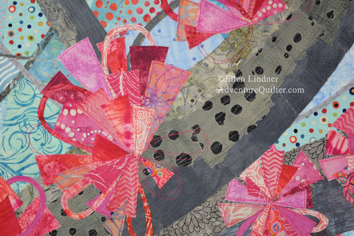
I got lucky with the background fabrics.  Many of them had colorful dots which worked well for implying more blossoms.  I love it when the fabric does the work!

Spring Forth - detail, an art quilt by Ellen Lindner. AdventureQuilter.com/blog

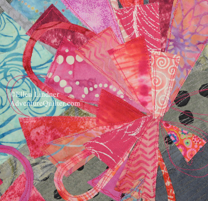
As you can see, I abstracted the flowers quite a bit.  That was fun!

Spring Forth - detail, an art quilt by Ellen Lindner. AdventureQuilter.com/blog

Find more details, dimensions, and purchase information on the Spring Forth web page.

Ellen Lindner
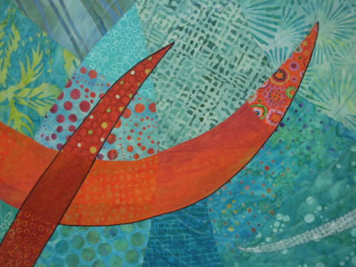
P.S.  I’m the queen of cropping.  It VERY frequently improves the composition.  Which I sorta noticed in the second image.  I really like that composition, too.

19

Abstract Exercises: Pattern and Scale

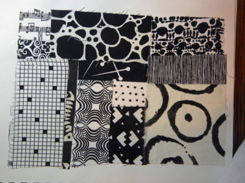
While working through Jane Davies’ book, Abstract Painting: The Elements of Visual Language,” my next exercises had to do with pattern.  This assignment was to find a variety of pattern scales, which I did with fabric.

Abstract Exercises: Pattern and Scale. Ellen Lindner, AdventurQuilter.com/blog

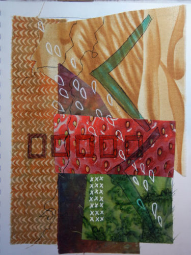
She talked about how a variety of patterns, in a variety of scales, can really enhance a piece.  This was my first exercise adding patterns to a basic background.

Abstract Exercises: Pattern and Scale. Ellen Lindner, AdventurQuilter.com/blog

I started with four fabrics and one magazine image of a strawberry.  It was pretty boring.  I added patterns, with markers, and that added TONS of interest!  I’m a believer.  And perhaps you can tell that some of the patterns I added mimicked those that were already there, only in different sizes.

Here’s another one, before.

Abstract Exercises: Pattern and Scale. Ellen Lindner, AdventurQuilter.com/blog

And after.

Abstract Exercises: Pattern and Scale. Ellen Lindner, AdventurQuilter.com/blog

Once again, the patterns added a lot to the composition.  (Although I think I may have over done it with the circles.)

Jane said if you’re going to vary the sizes of patterns or shapes you should do it in a big, noticeable way.  This was my interpretation of that.

Abstract Exercises: Pattern and Scale. Ellen Lindner, AdventurQuilter.com/blog

As you can see, I wasn’t trying to make great art here.  Generally, I just used whatever I picked up first.  But, I was really learning a lot!  Each exercise confirmed one of the book’s concepts.  I was gluing things down and writing notes.  Very exhilarating!

What great books have you learned from?

Ellen Lindner
 

4

Now I’ve Done It

Well, now I’ve done it.  I’ve dipped my toes into learning more about abstract design and have become – what is it the Borg say? – ASSIMILATED!  At least for now.

I “blame” Jane Davies.  She wrote an excellent book, which got me going. It’s called “Abstract Painting, The Elements of Visual Language.”  It was that last part that attracted me.  I didn’t want to do any painting, but I DID want to learn Jane’s way of approaching design, because her pieces are wonderful.

Learning about abstract design. Ellen Lindner, AdventureQuilter.com/blog

So, I started STUDYING her book, doing every exercise multiple times and creating a few more of my own.  (Like I said, “assimilated.”)  My plan was to do my own exercises in fabric and thread, rather than paint.

The first was to experiment with mark making.  Not only in the shape/line/thickness of the mark, but also in the technical materials and processes with which the mark was made.  I did this.

Learning about abstract design. Ellen Lindner, AdventureQuilter.com/blog

It was a good reminder of ways to add marks that I don’t use very often.  Like that sketchy stitched multi-line near the top.  That’s pretty cool, right?

Jane is brilliant with line and after reading her approach and looking at her examples I was ANXIOUS to use more of it.

Next, I did collage exercises with various prompts.  This one was meant to be shapes I don’t use that often.  I used primarily scraps and altered their shapes very little.

Learning about abstract design. Ellen Lindner, AdventureQuilter.com/blog

Note: I was NOT trying to make great art here.  The emphasis was on learning, so I purposely ignored balance, etc.  I just played and it was exhilarating!

Next, I shifted to magazine pages as my collage material of choice.  This one was my response to a high contrast assignment.

Learning about abstract design. Ellen Lindner, AdventureQuilter.com/blog

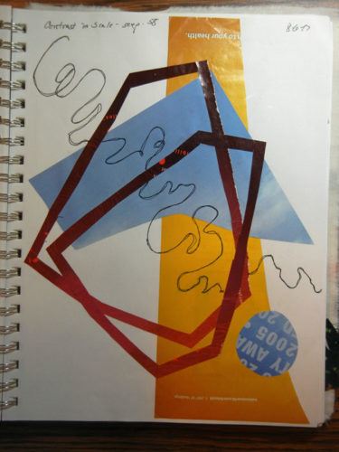
This was great fun.  I used shapes that were not in my usual wheel house, with a variety of edges.  And by now I was getting enamored with the idea of line, so I found myself adding it even when it wasn’t requested.

Here’s the low contrast result.  (See that low contrast line again?)

Learning about abstract design. Ellen Lindner, AdventureQuilter.com/blog

The next assignment was to create a composition with lots of negative (background) space.  No problem.

Learning about abstract design. Ellen Lindner, AdventureQuilter.com/blog

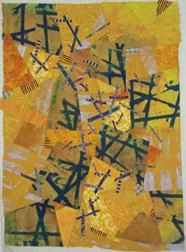
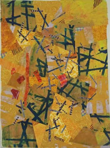
But then I got myself in trouble.  I decided to emulate Jane’s example of painting over elements, adding new ones, and completely altering the piece.  I did NOT have the skill set for that!  Here’s my result.

Learning about abstract design. Ellen Lindner, AdventureQuilter.com/blog

Oh my gosh!  Can you say “hideous?”  Not wanting all this effort to go to waste, I decided to look for viable small compositions within this larger one.  I used white paper to isolate small sections and found many wonderful options.  I photographed each one.

Learning about abstract design. Ellen Lindner, AdventureQuilter.com/blog

Okay, so all those little compositions made me feel better about this piece.  Not that I really felt bad to begin with.  I KNEW I was experimenting and learning, so I wasn’t expecting awesome results.

This is just the beginning of what I’ve been up to.  I’ve got lots more to show you.

Ellen Lindner
 

6

QBL Classmates at Work

My classmates at Quilting by the Lake worked hard and did some amazing work.  I somehow missed final images for most of them, but these few will give you an idea.

Rosalie Dace, our teacher, circulated around the room almost non-stop.  She gave one-on-one advice to each student.

QBL Classmates at Work. Ellen Lindner, AdventureQuilter.com/blog

Barb worked late each night and almost completely assembled her piece by the end of the week. (Here it is still in-progess.)  It was inspired by a stone wall, but she took a lot of liberties with her color choices.  I loved it.

QBL Classmates at Work. Ellen Lindner, AdventureQuilter.com/blog

Peg started with rectangles and turned them into house shapes.

QBL Classmates at Work. Ellen Lindner, AdventureQuilter.com/blog

This is Lisa’s piece very early on.  Hers is the one inspired by her engagement ring.  She quickly mastered curved piecing and it’s a good thing.  As you can see, she has quite a few yet to do.

QBL Classmates at Work. Ellen Lindner, AdventureQuilter.com/blog

I wish I had a photo of Lisa’s work further along.  She used some wonderful hand dyed fabric and many bright colors.  It was really singing at the end of the week.

Olan was the only man in our class (or at QBL for that matter,) but it didn’t seem to phase him in the least.  He pieced these intricate feathers as part of a very large stylized piece.

QBL Classmates at Work. Ellen Lindner, AdventureQuilter.com/blog

Emily went for a minimalist look and for good reason.  When she began to play with these fabrics, they interacted so well she didn’t want to break up the composition.  She hand appliqued them in place and her top is finished!

QBL Classmates at Work. Ellen Lindner, AdventureQuilter.com/blog

My neighbor in class was Annemarie and she brought these vibrant colors.  I knew I’d like her piece when I saw them.

QBL Classmates at Work. Ellen Lindner, AdventureQuilter.com/blog

Sure enough, here it is.  I love the composition and contrast!  It was my favorite.  This is it at the very end of the week.  She just had a few more seams to stitch.

QBL Classmates at Work. Ellen Lindner, AdventureQuilter.com/blog

One of the great things about taking a class is learning from your classmates.  I definitely did that!

Ellen Lindner
P.S.  If any of my classmates read this, I’d love to receive photos of your finished pieces.  With your permission, I’ll add them to this post.


2