Tag Archives | Color

Improv Complete: “Fruit Salad”

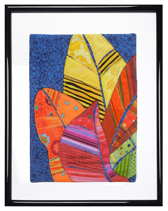
I’m really loving my latest quilt, Fruit Salad. 

When I was a kid, at least once per summer my parents would get a watermelon, chill it, and then make a big to-do about eating it outside as part of an evening picnic. We ate it outside because my 3 siblings and I made a MESS with that watermelon! We had juice dripping down our chins and, of course, we had to have contests to see who could spit the seeds the farthest.

As this quilt developed that’s what it made me think of.  Thus, the name. Fruit Salad, an art quilt by Ellen Lindner, AdventureQuilter.com

A detail shot:

Fruit Salad - detail, an art quilt by Ellen Lindner, AdventureQuilter.com

This quilt was originally inspired by a photo of lillies. As it evolved, the stronger colors became dominant, and I was disappointed. But, I reminded myself that the inspiration photo was just that – inspiration. If it got me motivated to try something it had served its purpose. With that in mind, I looked at the quilt with new eyes and fell in love with it. I hope you like it too.

Purchase details and more info.

Ellen Lindner
P.S. A design note: can you see how important the neutral white and grey are? Can you imagine the quilt without them?

2

Lily Improv

Are you familiar with Linda and Laura Kemshall? They’re a mother-daughter duo who make fabulous art – in fabric and paper, and who have a weekly newsletter. Recently, they featured this photo. Isn’t it lovely?

Lily Improv. Ellen Lindner, AdventureQuilter.com/blog

I was enamored with the colors of the lilies and wrote to ask if I could use it for a quilt’s inspiration. Linda had taken the photo and she gave me permission to use it.

I pulled out pretty much all of my pink and green fabrics and began to make selections. I knew I’d also want to add in some grey, too.

Lily Improv. Ellen Lindner, AdventureQuilter.com/blog

(Yes, I have a lot of fat quarters!)

Have you ever made an improv quilt? The critical thing is to get the colors and their proportions the way you want them at the start. Then, you can sew and slash and piece to your heart’s content. (It turns out that I missed the mark, but more on that later.)

To start, I cut a bunch of fabric rectangles. For the critical pinks I cut them about the size of a piece of typing paper. The whites, greys, and greens were only about 1/4 that size. I also sorted through my scraps and pulled out the pieces that would work. Then, everything got stacked into contrasting pairs and taken to the sewing machine.

The scraps had wonky shapes, but I just trimmed them to straight lines.

Lily Improv. Ellen Lindner, AdventureQuilter.com/blog

Lily Improv. Ellen Lindner, AdventureQuilter.com/blog

Now that I think of it, I guess that’s the crux of this improv method: sew things together and then trim them.

Lily Improv. Ellen Lindner, AdventureQuilter.com/blog

This is what my blocks looked like, above, after that first round of piecing. Everything is large and chunky. But, I knew I’d be GREATLY modifying them so I was pretty happy with them. (Maybe too much peach, though.) Then, the fun began.

Sometimes I sliced across seams and rejoined them with mismatched alignment.

Lily Improv. Ellen Lindner, AdventureQuilter.com/blog

And I began to add grey to some of the oddly shaped blocks.

Lily Improv. Ellen Lindner, AdventureQuilter.com/blog

Lily Improv. Ellen Lindner, AdventureQuilter.com/blog

This was just the beginning of the fun. Watch my next post to see how things progress.

Ellen Lindner
P.S. You’ll definitely want to check in on the Kemshall’s website, Design Matters TV, and sign up for their mailing list.
P.P.S. You can see some of my other improv quilts in the links below.


2

Great First Class

Whenever I plan a new class I try it out on a group of “guinea pigs.” Such was the case this past Saturday. Twenty students showed up to take my “Love It and Leaf It” class, via Zoom. How exciting! They got the class for free, but in return had to give me feedback on both the class content and the Zoom experience. VERY valuable!

And just look at the great work they did!
This was a 3 hour class. Most of this was accomplished in that time, but the facings and frames were done after class.

"Love It and Leaf It" student work. Ellen Lindner, AdventureQuilter.com/blog

Mary Ann Shupe finished her quilt and then later framed it digitally. As you can see, she had fun with patterns.


"Love It and Leaf It" student work. Ellen Lindner, AdventureQuilter.com/blog

Deon Donovan sent me an in-progress photo of hers. Isn’t it going to be striking?


"Love It and Leaf It" student work. Ellen Lindner, AdventureQuilter.com/blog

Rebecca Chianese framed hers right away. The quilting adds a lot to it!


"Love It and Leaf It" student work. Ellen Lindner, AdventureQuilter.com/blog

Jo-Ann Jensen did a great job, (as always.)


"Love It and Leaf It" student work. Ellen Lindner, AdventureQuilter.com/blog

Kat Campau did her own thing and it works. (I can tell she likes batiks.)


"Love It and Leaf It" student work. Ellen Lindner, AdventureQuilter.com/blog

Polly Dombroski’s quilt is completely finished, just waiting for it’s frame. Nice!


"Love It and Leaf It" student work. Ellen Lindner, AdventureQuilter.com/blog

Don’t these little quilts look great when framed? Annette Moore’s is another fabulous example.

Are you wondering what I learned from this experience?
– The Zoom (virtual) platform works really well! We had no technical issues of any sort, and we were able to chat and interact the entire time. It was fun!
– My pattern was too complicated for the time frame. I wanted the students to finish the piece, AND face it, AND frame it in the 3 hours. Since that didn’t happen, I’m working on simplifying the pattern and the process.
– My guinea pigs were super helpful! BTW, one was from France, and one was from Canada. Isn’t that cool?

This short class would be a great one for introducing your guild to the virtual learning world of  Zoom. (And, of course, I have other virtual presentations available, too.)

After months of not teaching it is SO exciting to be back at it!!!

Ellen Lindner

2

New Class: “Love It and Leaf It”

I’m really tickled with the project for my newest class, “Love It and Leaf It.”

Love It and Leaf It #2. Easy class with Ellen Lindner. AdventureQuilter.com

Isn’t it cute? In the 3 hour class, students will completely finish a small quilt like this AND frame it. I’m excited!

Love It and Leaf It #3. Easy class with Ellen Lindner. AdventureQuilter.com

I’m ready to teach this virtually, (via Zoom)
Love It and Leaf It #1. Easy class with Ellen Lindner. AdventureQuilter.com
Soon, I’ll also offer it as an on-demand online class. I think it’s going to be fun!
(And, after so many months of not teaching, I’m ITCHING to get back to it!)

If your guild is interested in scheduling this class or any of my others, you’ll find full information here. Of course, I’m doing virtual lectures, too.

Maybe I’ll see you online before too long! Gee, I’d love that.

Ellen Lindner

4

A Self-Portrait in Red

My art quilt group, the Dirty Dozen Fiber Artists, have a really interesting challenge going on. We’re all making self-portraits, each the height of the maker. Isn’t that a cool idea? They also have to be skinny: no more than 12″ wide.

I wanted to include a lot of text in mine, stating my characteristics or attributes.  I decided  a composition with horizontal lines would lend itself to this. But, I also wanted to add my own head. That was surprisingly difficult, but I finally got it.


A Self-Portrait in Red. Ellen Lindner, AdventureQuilter.com/blog

Working on my design wall, the horizontal RED stripes became my body. I used my hand dyed fabrics, paying attention to scattering in a variety of patterns and scales. But, I also aimed for a lot of quiet (near solid) areas that would show off text.

A Self-Portrait in Red. Ellen Lindner, AdventureQuilter.com/blog

My primary design wall is only 4′ tall, so I had to work on my alternate one, above. It’s 7′ tall and I’m only 5′ so it provided plenty of room. (BTW, the bump on the top of my head will be lost in the trimming and seam allowance. I always want the design to extend into the seam allowance, so the bump acheives that.)

I initially planned to use orange in the background around my head. But, I worried that it didn’t provide enough contrast. A quick audition confirmed the problem.

A Self-Portrait in Red. Ellen Lindner, AdventureQuilter.com/blog

I tried again with blue-green. Much better.

A Self-Portrait in Red. Ellen Lindner, AdventureQuilter.com/blog

The height of this piece meant that I was frequently working above my head. S-T-R-E-T-C-H.

A Self-Portrait in Red. Ellen Lindner, AdventureQuilter.com/blog

This is what it looked like with the composition complete. No stitching or text yet. I was very happy with it!

A Self-Portrait in Red. Ellen Lindner, AdventureQuilter.com/blog

When selecting the text for my self-portrait I switched from attributes to actions. I selected some cute and complimentary things, but also some not-so-flattering confessions. I printed out everything in a variety of fonts and began to audition placement.

A Self-Portrait in Red. Ellen Lindner, AdventureQuilter.com/blog

I transferred the text to the unquilted quilt. Then, I quilted it with horizontal lines. And finally, I started hand stitching the text.

A Self-Portrait in Red. Ellen Lindner, AdventureQuilter.com/blog

Oh my, that took a LONG time!!! (I think I’ll use marker next time.)

Now it’s almost complete and you’ll find it on my website soon.

Ellen Lindner

8

Bedroom Redo

I recently redecorated my bedroom and I’m LOVING the results!

Here’s the bed wall, with my quilt Rhythm of the City prominently displayed.

Ellen Lindner's Bedroom Redo. AdventureQuilter.com/blog
More of my work moving across the window wall. This is Croton Leaves 3.

Ellen Lindner's Bedroom Redo. AdventureQuilter.com/blog

Continuing to look left, a corner featuring my paper collage Three Cherries.

Ellen Lindner's Bedroom Redo. AdventureQuilter.com/blog

And, to complete the artwork roundup, at the foot of the bed I have Brainstorm.

Ellen Lindner's Bedroom Redo. AdventureQuilter.com/blog

My tilt mirror was originally painted gold but I switched it up to “dark steel.” Although my technique was lacking it still looks good at first glance.

Ellen Lindner's Bedroom Redo. AdventureQuilter.com/blog

I wanted a taupe bed skirt, but I couldn’t find one to fit my tall bed. White was the only color available in that length. So, my friend suggested combining the two and I think it works.

It was fun to use a variety of surfaces and textures. Shiny and dull, smooth and rough, modern and vintage. I love the tufted look of the bedspread.

Ellen Lindner's Bedroom Redo. AdventureQuilter.com/blog

And these fuzzy white pom-pom flowers are the perfect contrast to my grandmother’s vintage water pitcher.

Ellen Lindner's Bedroom Redo. AdventureQuilter.com/blog

It sure was fun to put this all together and I’m SO delighted with the vibrant colors throughout!

Ellen Lindner
P.S. How do you like the way I’ve presented Croton Leaves 3, above? (2nd photo.) I bought a frame with glass and a white mat and I mounted the little quilt right on to the FRONT of the glass. I love presenting small pieces this way. They need something to give them more substance, but I don’t want to cover the texture of the piece. Lots of double-sided tape does the trick.

23

Learning to Like Vinegar

I don’t like the flavor of vinegar but I know that it adds a needed tartness to a variety of dishes.

However I’m starting to like the idea of “vinegar” colors. That is, those colors that are jarring in combination with others, but which also add an interesting bit of “sour.”

My interest began several years ago when I read a quote from art quilter Sally Sellers. She said “It only takes a little ugly to make the other colors sing.” Wow! The idea of using something you considered ugly was very shocking to me. But, somehow it sounded legit.

So I worked up my courage and challenged myself to use a hideous color in my next quilt. The hideous color? Lime green. At the time I HATED it!!!

This is the result, Solar Tide.

Solar Tide, an art quilt by Ellen Lindner. AdventureQuilter.com/blog

Solar Tide

Surprisingly, I really like the results. And even back in the day of still hating lime green I could see the quilt was better because of its inclusion. Shocking!

More recently, I sought out a little ugly for this quilt, Palm Fronds.

Palm Fronds, an art quilt by Ellen Lindner. AdventureQuilter.com

Palm Fronds

In this case yellow-orange serves the purpose. What do you think? It adds some pop, right?

Then I took a class with Pat Pauly and saw through her examples that she fully embraces this concept.

Dying with Pat Pauly. Ellen Lindner, AdventureQuilter.com/blog
Since then I’ve been trying to use it more. I find it somewhat challenging, but very exhilarating. This piece is almost finished, Segue into Summer.

And this yet un-named piece is currently in-progress.


I would GREATLY appreciate your feedback on this concept. Although I’m enjoying adding this vinegar, I know that many people may not care for it. What’s your preference? I truly want to know (and I won’t be offended!)

But, for the record, you still won’t get me to eat a pickle! A girl’s gotta have standards, after all.

Ellen Lindner

8

Lessons Learned: Dying and Designing

Pat Pauly is a WEALTH of knowledge, so I really learned a lot when I took a 5 day dyeing/printing class with her.

First up: colors look different when wet vs. dry. Leslie’s samples served as examples.

Lessons Learned: Dyeing and Designing. Ellen Lindner, AdventuereQuilter.com/blog

Bigger can be better. This piece, below, is about 31″ x 45″. So, Pat finally got me to work larger. And I have to say I love it.  I’ll be buying a big screen.

Dyeing with Pat Pauly. Ellen Lindner, AdventureQuilter.com/blog

Leftover dyes work well when just smeared on. Who knew? (This is Pat’s example, below.)

Dyeing with Pat Pauly. Ellen Lindner, AdventureQuilter.com/blog

Everything goes with everything. These are my words, not Pat’s, but it seems to apply to the way she combined things. UH-mazing! To my eye, she seemed to purposely pick the most jarring fabrics to use together and then they looked good. What?

She demonstrated this over and over by folding fabrics so their disparate parts ended up playing together nicely. THIS is what I want to be able to do!

Dyeing with Pat Pauly. Ellen Lindner, AdventureQuilter.com/blog

This detail shot of one of her quilts shows what I mean. I would have never used burgundy and fuchsia together, but with a little bright yellow (again, unexpected) mixed it in all works. The other thing I want to learn.

Dyeing with Pat Pauly. Ellen Lindner, AdventureQuilter.com/blog

As much as knowledge as I gained in this class it was also humbling as I realized how much I still need to explore and work on. I’m invigorated and excited to try it all!

Ellen Lindner
P.S. Pat also got me to wear long gloves, but not an apron!

0

Creating a Background

My idea for this quilt was to more or less mimic the background of Palm Fronds.

Click any image for a larger view

Palm Fronds, an art quilt by Ellen Lindner. AdventureQuilter.com
Palm Fronds

I cut strips of white-with-black fabrics and began laying them in a horizontal arrangement.

Creating a background. Ellen Lindner, AdventureQuilter.com/blog

As you can see, I also began to play with the idea of adding contrasting strips between some of the leaves. White strips added the definition needed, but they weren’t too exciting.

Back to the background.

Creating a background. Ellen Lindner, AdventureQuilter.com/blog

I was happy with the background, but thought that it, too, might need some more definition between sections. Should I define the background sections with more skinny strips? To be determined.

Meanwhile, I tried black strips for contrast. I liked this much better.

Creating a background. Ellen Lindner, AdventureQuilter.com/blog

At one point, I used the computer to loosely audition a black strip between every leaf. And also grey stripes in the background sections.

Hmm, I think the black strips are taking over. But, the grey has potential. More experimenting required.

Ellen Lindner

0

Starting a New “Grassy” Quilt

When I drew the sketch for Palm Fronds, I drew several others in a similar format and size. This is the sketch for Tall Grasses, (working title.)

Click any image for a larger view

Starting a new "Grassy" Quilt.  Ellen Lindner, AdventureQuilter.com/blog

I envisioned green for the grasses and fuchsia for the tips. I had several fabrics from my first dyeing session and I dyed several more long, skinny green pieces to round out the selection. First, I drew my design onto muslin, and then I began to audition fabrics.

Starting a new "Grassy" Quilt. Ellen Lindner, AdventureQuilter.com/blog

I liked these fabrics but I could see that I would have to be careful with them. The colors and values are very similar, so I knew I’d have to arrange them in such a way as to play up contrasts.

Here are the first few pieces in place.

Starting a new "Grassy" Quilt. Ellen Lindner, AdventureQuilter.com/blog

And most of the green pieces. Hmm, as suspected they sort of merge together. I’ll have to work on that.

Starting a new "Grassy" Quilt. Ellen Lindner, AdventureQuilter.com/blog

But first, I went ahead with something I was confident about: fuchsia tips. First, audition time.

Starting a new "Grassy" Quilt. Ellen Lindner, AdventureQuilter.com/blog

And here they all are in place.

Starting a new "Grassy" Quilt. Ellen Lindner, AdventureQuilter.com/blog

I’m happy with the colors and the composition, but I think I’ll need to either switch out some green fabrics or add fabric strips for contrast. But, I’ll probably do the background first.

Ellen Lindner

2