Tag Archives | Design

Empty Spools: Carol, Larsja, and Barb

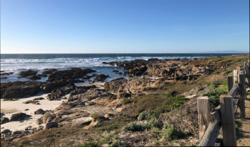
I’m just back from teaching Design Your Own Nature Quilt at Empty Spools Seminar, in Pacific Grove, CA. It was fabulous!!! The beach side setting was lovely, complete with historical architecture, wind-swept trees, and the sound of the surf.

Empty Spools Seminar. Ellen Lindner, AdventureQuilter.com/blog

But, of course, the real excitement was occurring in the classrooms. I had nine fantastic students who followed the supply list and packed their artistic courage. They worked outside their comfort zones and created very dynamic quilts. Each student brought one or more inspiration photos from which she designed her quilt. We often reminded one another of the class motto, “Be inspired by your photo, not controlled by it.” Wait till you see what they did.

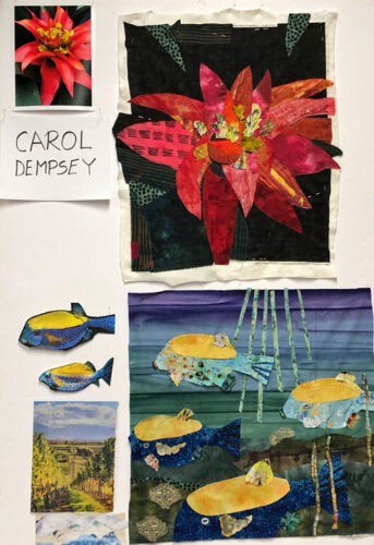
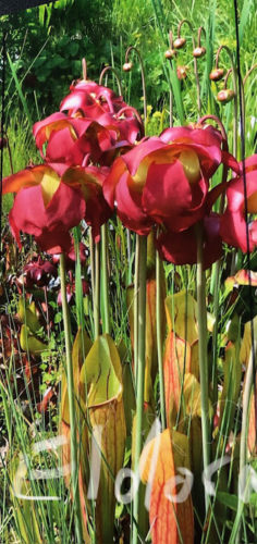
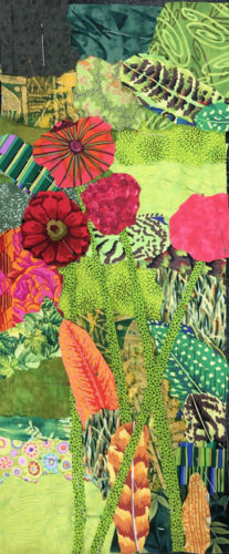
Carol had a dramatic photo of a red flower. Single color flowers are often tricky, but Carol was able to work loosely, which helped immensely.

Empty Spools: Carol, Larjsa, and Barb. Ellen Lindner, AdventureQuilter.com/blog

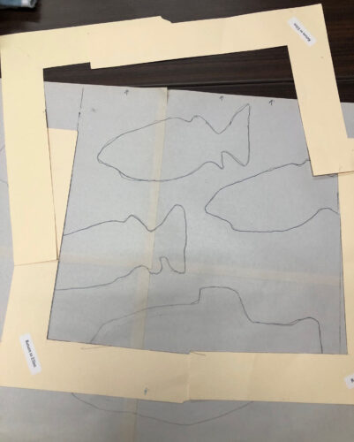
For her second quilt, (yes, several students made TWO,) Carol chose an image of what we think are box fish. In her inspiration photo the two fish were on a black background. As you can see, she improved upon that quite dramatically, and energized the composition with more fish.

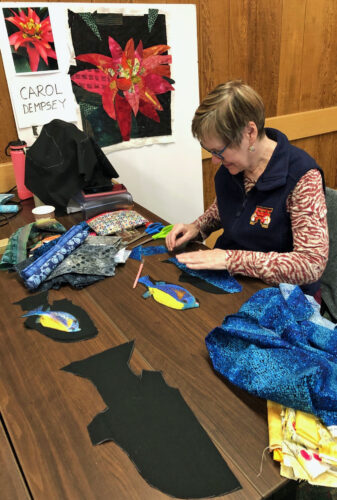
Scaling up from the sketch to the quilt is a little bit of a hurdle at first. Carol spent time making mock up fish shapes to help her get it right.

Empty Spools: Carol, Larjsa, and Barb. Ellen Lindner, AdventureQuilter.com/blog

Students used cardboard L shapes to help them decide on cropping.

Empty Spools: Carol, Larjsa, and Barb. Ellen Lindner, AdventureQuilter.com/blog

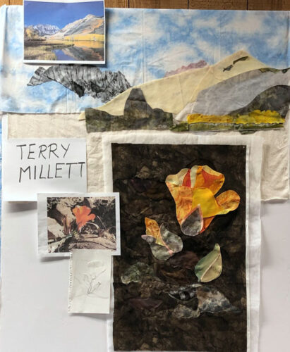
One day the students toured around the classrooms to see the various projects. Most of my photos will be the display boards from that event.

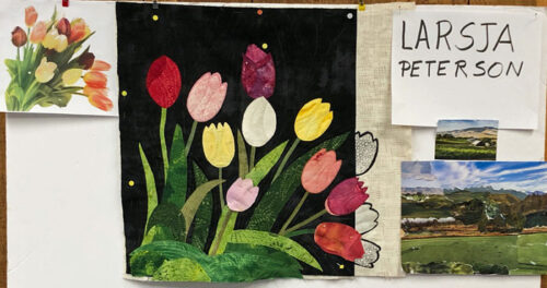
Larsja had a great tulip photo to start with. She wisely omitted several flowers and leaves to better show off the remaining ones. And to make the background (negative space) more interesting. And then check out that border! Don’t you love the “drawn” black tulips?

Empty Spools: Carol, Larjsa, and Barb. Ellen Lindner, AdventureQuilter.com/blog

Larsja really wanted to make just one quilt so she could get is mostly done. Sure enough, it’s almost completely quilted.

Like Carol, Larsja did a collage exercise with magazine pages. I’ll show you those images more clearly in a later post.

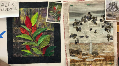
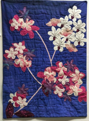
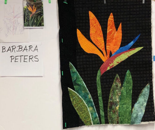
Barb used a photo of a Bird of Paradise blossom as her starting point. It was actually a double blossom, which made the distinction between petals hard to make out. Like Larsja, she omitted quite a few blossoms and did the same with the leaves. (She just scribbled over them on her photo.) She also cropped her inspiration photo quite a bit. (It’s folded on her board.)

Empty Spools: Carol, Larjsa, and Barb. Ellen Lindner, AdventureQuilter.com/blog

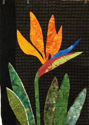
She finished quilting it in class. Isn’t it striking?

Empty Spools: Carol, Larjsa, and Barb. Ellen Lindner, AdventureQuilter.com/blog

It was all very exciting! More photos in the next few posts.

Ellen Lindner

0

“Happy Family” Complete

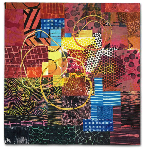
Here’s my latest quilt, Happy Family

"Happy Family" complete. An art quilt by Ellen Lindner. AdventureQuilter.com/blog

I’m REALLY happy with it and I hope you like it, too.

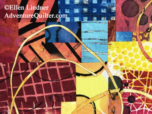
As you can see, I added three loose circles, to add interest. Since there are three members of my immediate family, and because the colors are so upbeat, I decided to name it Happy Family.

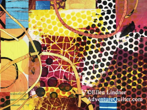
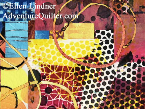
I got carried away when taking detail shots. Again, because I just love what happens when these busy prints interact with one another.

."Happy Family" complete. An art quilt by Ellen Lindner. AdventureQuilter.com/blog

"Happy Family" complete. An art quilt by Ellen Lindner. AdventureQuilter.com/blog
As usual, I printed 99% of these fabrics myself (with dye.)

"Happy Family" complete. An art quilt by Ellen Lindner. AdventureQuilter.com/blog

"Happy Family" complete. An art quilt by Ellen Lindner. AdventureQuilter.com/blog

This quilt is 32″h x 35″ w.

"Happy Family" complete. An art quilt by Ellen Lindner. AdventureQuilter.com/blog

It’s available for purchase, at a price of $1100. If you’re interested in buying it contact me via email with the link at the bottom of the page.

Ellen Lindner
P.S. I really like the loose circles. I think I’ll use them in a future quilt.
P.P.S. I can’t wait to get started on the next quilt!

0

Abstract Design

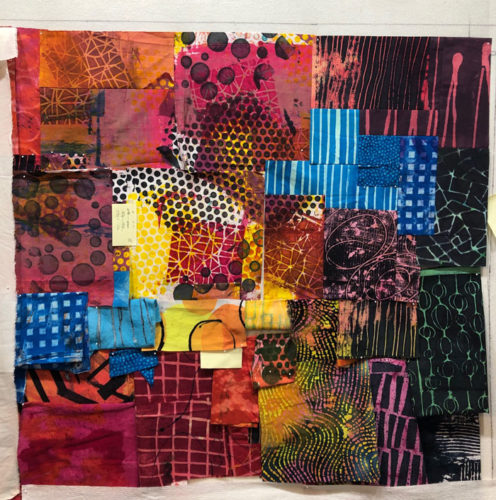
I continued working on my latest quilt, using lots of trial and error. This is where I left off in the last blog post. I decided against the strong stripes in the lower left.

Ellen Lindner's design process: moving fabrics around, trying to create sparkle and energy. AdventureQuilter.com/blog

This closer shot shows how I first, fold the fabrics to audition placement and size. I cut into them when I get confidant with my plan, but I don’t do the piecing until near the end.

Ellen Lindner's design process: moving fabrics around, trying to create sparkle and energy. AdventureQuilter.com/blog

Compare this next photo to the one at the top of the page. I decided I needed some more blue. And I also wanted to enlarge the yellow area near the center. (And to do so with an irregular shape.)

Ellen Lindner's design process: moving fabrics around, trying to create sparkle and energy. AdventureQuilter.com/blog

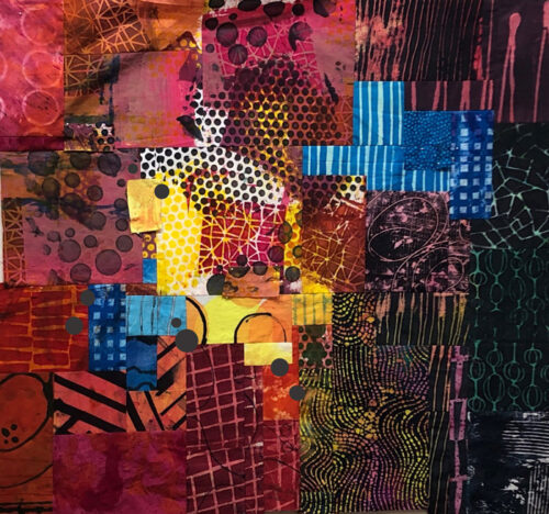
Here, the background is completely pieced, although I’m auditioning a few little spots of color which I intend to fuse on.

Abstract Design. Ellen Lindner, AdventureQuilter.com/blog

Time to assess what I’ve got. Is it interesting enough? Does it have enough energy? Does it need something else?

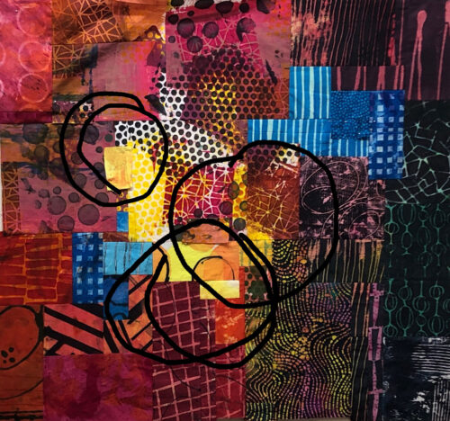
What about some skinny and loose black circles? I auditioned the idea on my computer.

Abstract Design. Ellen Lindner, AdventureQuilter.com/blog

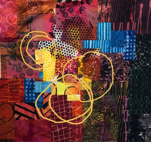
Well, I liked the circles, but not the black. What about yellow?

Abstract Design. Ellen Lindner, AdventureQuilter.com/blog

Yes, I think that will do!

I should have this finished soon and I’m looking forward to showing you the finished project.

Ellen Lindner


0

Maybe a Grid This Time?

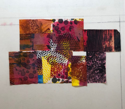
If you’re familiar with my design process you know that I often end up with a challenging “Tetris”-type assembly at the construction stage. To get around this, I decided I’d work in a grid this time. My plan was to cut my selected fabrics into squares of the same size and then to move them into an easy-to-assemble composition.

This was my very early start. You’ll notice the black and white polka-dots in the center. They all came from the same starting fabric, but have been cut – into squares – and rearranged. I thought that was rather promising. I liked the way they interacted in a new pattern.

Ellen Lindner's design process: moving fabrics around, trying to create sparkle and energy. AdventureQuilter.com/blog

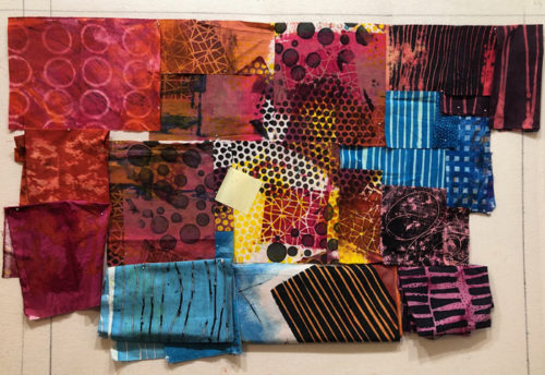
But, I quickly deviated from plan. See that gap, above? I shifted that piece down because it was JUST TOO ENTICING to line up the dark/light diagonal section with the similar one to the left. Do you see that I mean?

I tried to piece things together into squares of my selected size, but then I encountered some great blue fabrics. I DID slice into the stripe one near the right, but why would I mess up the pattern of the blue grid one just to adhere to the square sizing rule? That’s when I pretty much abandoned the grid idea. I left the blue fabric intact.

Ellen Lindner's design process: moving fabrics around, trying to create sparkle and energy. AdventureQuilter.com/blog

I was happy with the center and was slowly auditioning new fabrics around it.

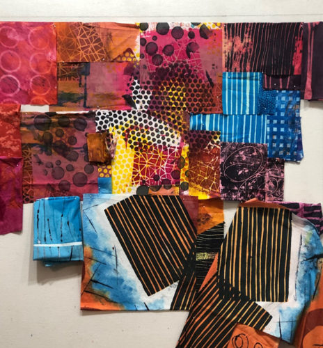
Above and below, I was sort of enamored with the way the big stripey black/orange piece interacted with the piece above it. Mostly because of the diagonal line between the dark stripy-ness and the white edge next to it. I could see that additional sections of dark stripes would add a lot of energy and interest.

Ellen Lindner's design process: moving fabrics around, trying to create sparkle and energy. AdventureQuilter.com/blog

But, I could see that the dark stripes were drawing attention away from those little black dots. Could I put up with that? I decided no, and tried different fabrics. This one certainly had potential.

Ellen Lindner's design process: moving fabrics around, trying to create sparkle and energy. AdventureQuilter.com/blog

Not bad. Lots more consideration needed!

Can you say “trial and error?” I must be the poster queen, but I do so enjoy it!

Ellen Lindner
P.S. Those dark stripes have a lot of energy and you’ll definitely see them again!

0

I Think I Learned Something

After making each art piece I  like to study it to see if I can figure out what works and/or what does not.

I was particularly happy with this recent quilt, Exuberance, so I studied it a bit. My question: “what makes it successful?”

Exhuberance, an art quilt by Ellen Lindner. AdventureQuilter.com

Exuberance

I think it has a strong composition, good use of colors, and effective use of value variations. What about the white circles in two corners? How critical are they? They certainly add interest, but is there something more?

To help me figure it out I also looked at this quilt, Raking Season. It has rust and black circles made with same stencil as the blue and white above. While I think this quilt is very successful, it doesn’t have the sparkle of the first one. I think maybe it has to do with the color of the circles. The light ones add sparkle.

Raking Season, an art quilt by Ellen Lindner. AdventureQuilter.comRaking Season

Hmm, something to think about. Maybe all my quilts need some light spots to add that sparkle.

To test my theory, I made sure to select some light fabrics for the quilt I’m currently work on. These were my “definite” fabrics when I first started moving them around. As you can see I’ve got some white and black areas in several places. I know they’ll attract attention, so I’ve got my eye on them as I add more fabrics and move things around.

Ellen Lindner's design process: moving fabrics around, trying to create sparkle and energy. AdventureQuilter.com/blog

Slowly creating and enjoying it.

Ellen Lindner

0

Twigs of Teal and Red-Orange: Getting Started

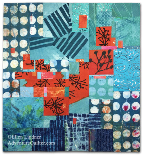
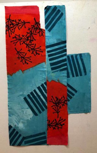
I dyed this fabric last year and it’s one of my favorites.

Teal and Red-Orange Quilt: Getting Started. Ellen Lindner, AdventureQuilter.com/blog

I was really happy with the way I had a viable design without doing anything more to it, but HOW do you design with that? I had a false start last year and am now trying again.

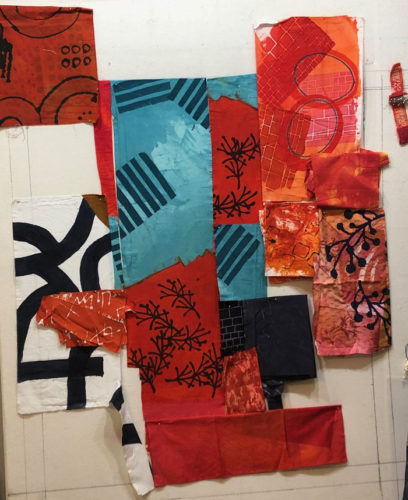
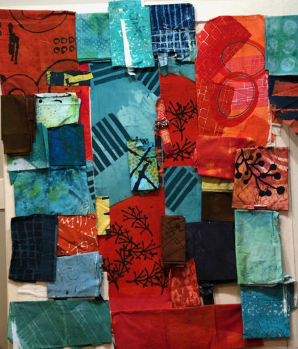
These are the collection of “featured” fabrics I thought I might be able to use. I call them featured fabrics because they have high amounts of contrast in them, which will draw the viewer’s eye. When working with such fabrics, I try to put them in place early on and then fill in with less dramatic fabrics, as needed.

Teal and Red-Orange Quilt: Getting Started. Ellen Lindner, AdventureQuilter.com/blog

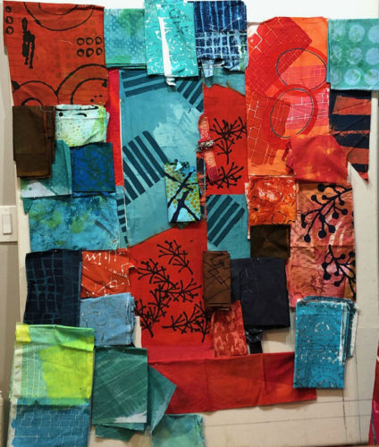
Next, I pulled out every fabric I thought might work. As you can see, I like these colors and found that I had quite a collection.

Teal and Red-Orange Quilt: Getting Started. Ellen Lindner, AdventureQuilter.com/blog

But, maybe it needed something unexpected. What about accents of yellow?

Teal and Red-Orange Quilt: Getting Started. Ellen Lindner, AdventureQuilter.com/blog

Hmm. Maybe.

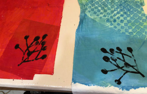
I liked the large twig (center right) on the dull orange print. But, I didn’t like the background fabric. So, I stenciled on a couple more using paint.

TTeal and Red-Orange Quilt: Getting Started. Ellen Lindner, AdventureQuilter.com/blog

These should be usable.

I had my fabric decisions (mostly) made, so it was time to start moving things around on the design wall. (The challenging, but fun, part!)

Ellen Lindner

0

Finishing Up the Red and Yellow Quilt

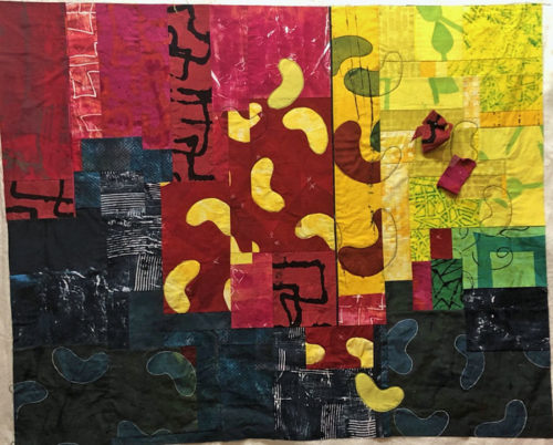
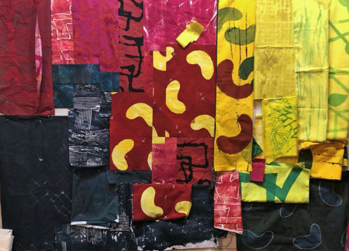
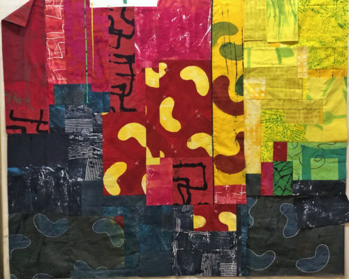
After finishing up the left 2/3 of my red and yellow “bean” quilt, it was time to tackle the right yellow portion. It came together pretty well. (Still in -progress below.)

Red and Yellow Abstract. Ellen Lindner, AdventureQuilter.com/blog

During these final stages I also considered added some skinny lines, for energy. (See them pinned on at the top in the photo above?) I eventually decided against them, however, because I thought they’d attract too much attention. I wanted the other contrasts to be the attention getters. (And those bean shapes, of course.)

From early in the design phase I thought I’d probably want to applique on another couple yellow beans. (If you look back at the first post, you’ll see that I had one little piece of yellow fabric sitting on the red – near the top – as a place holder.) I auditioned that idea further near the end.

Red and Yellow Abstract. Ellen Lindner, AdventureQuilter.com/blog

I also considered adding some red ones. That’s what the red blobs are for in the photo above. I decided I just needed one. I made it a partial bean, like the other red ones.

And then I cropped both sides. (But, I later added some of the red side back.)

Red and Yellow Abstract. Ellen Lindner, AdventureQuilter.com/blog

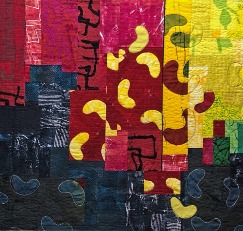
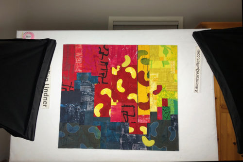
Finally, I had it all put together and quilted.  As you can see above, I added some more bean outlines during the quilting process. I really like using a double black line for emphasis.

Then, it was time for photography.

Photographing "Spilling the Beans," and art quilt by Ellen Lindner. AdventureQuilter.com/blog

You can see the full finished quilt here. I’d really appreciate your thoughts about it – especially what you think about these two colors together. Yay or nay?

Ellen Lindner

0

Red and Yellow Abstract

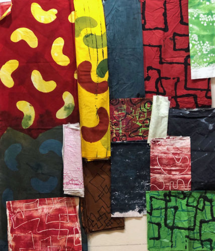
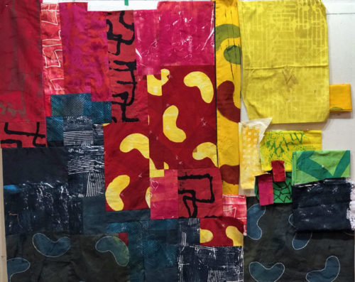
Historically, I haven’t been a fan of red and yellow combinations, but for some reason, I now find myself drawn to them. I still think they’re a little jarring, but it seems that I now like that. As evidence, I recently dyed fabrics with these colors.

I created a variety, hoping I could use them together. As you an see, I repeated a bean shape in several colors. I was happy with how they worked together and was anxious to get started.

Red and Yellow Abstract. Ellen Lindner, AdventureQuilter.com/blog

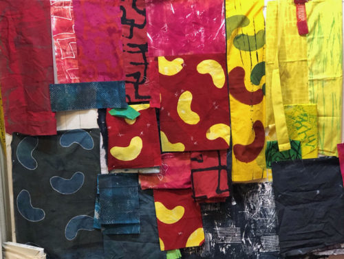
I realized some of the lightest fabrics wouldn’t fit well into the mix. But, I had some other fabrics I thought I could use. I pinned everything together on the design wall. And I loosely arranged them: a good starting point.

Knowing the contrast of red and yellow, as well as the contrast of different values, would attract attention, I placed them (above) in approximately “sweet spots.” These are considered ideal locations for focal points. They’re easy to identify: picture a tic-tac-toe game overlaying the overall shape. Where the lines cross are sweet spots.

I immediately thought the red fabric with yellow beans was a little too “regular.” (See above) That is, the beans were spaced too evenly. I thought the composition would be stronger if they were “messed up” a little bit. So, in the photo below, you can see that I sliced right through the red bean fabric, and scooted things out of alignment.  Better, I thought.

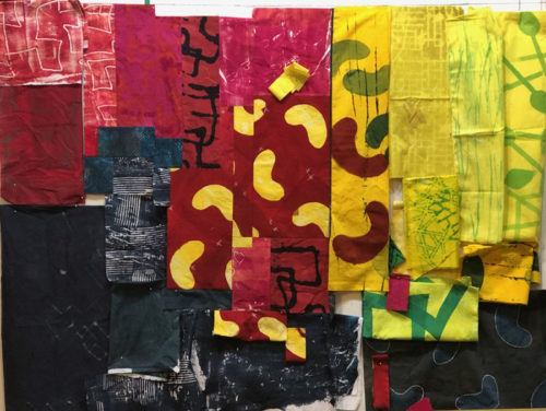
Next, came A LOT of auditioning as I folded, rearranged, cut (only once I was sure,) and pieced.

Red and Yellow Abstract. Ellen Lindner, AdventureQuilter.com/blog

It was like a giant game of Tetris. Eventually, I had the left portion pieced and began to work on the yellow fabrics on the right.

Red and Yellow Abstract. Ellen Lindner, AdventureQuilter.com/blog

It all went more slowly that I would have liked, but I was definitely having fun!

More next time.

Ellen Lindner


2

Designing in Maine, Part Two

The students in my “Design Your Own Nature Quilt” class did really excellent work. Their task was to be INSPIRED by their photos, but not to actually copy them.
Eldora had a beautiful photo showing a ton of beautiful flowers, so she wisely cropped it way down.

Design in Maine, Part Two. Ellen Lindner. AdventureQuilter.com/blog

 She did a great job depicting the foliage and the flowers loosely. This is going to be great!

Design in Maine, Part Two. Ellen Lindner. AdventureQuilter.com/blog

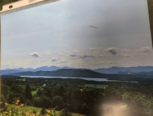
Patricia started with a lovely mountain vista.

Design in Maine, Part Two. Ellen Lindner. AdventureQuilter.com/blog

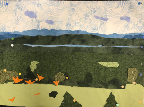
She kept the composition the same and made great progress. She’ll add lots of orange triangle and V-shapes for the lilies in the foreground. They’ll really pop against the green.

Design in Maine, Part Two. Ellen Lindner. AdventureQuilter.com/blog

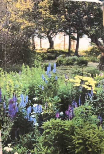
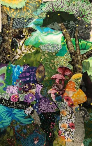
Karyn had a very interesting photo, with wonderful shadows and colors. The things she liked the most were the dark tree trunks creating contrast in the background and the busy, colorful plants in the foreground.

Design in Maine, Part Two. Ellen Lindner. AdventureQuilter.com/blog

She easily worked loosely and very closely emulated the feel of the photo, capturing her favorite things in the process. Isn’t it great?

Design in Maine, Part Two. Ellen Lindner. AdventureQuilter.com/blog

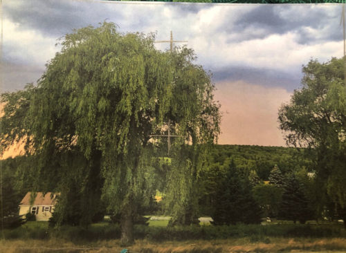
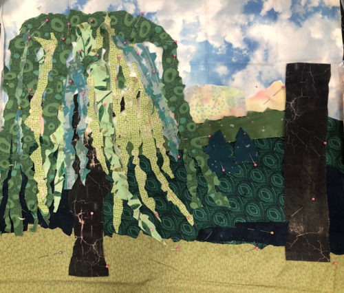
Ann’s photo showed two weeping willows. She cropped most of the right one, which greatly improved the composition.

Design in Maine, Part Two. Ellen Lindner. AdventureQuilter.com/blog

Then, she had a blast creating a “hairy” weeping willow. It really conveys the type of tree well. The dark shape on the right is the place holder for the second tree. This one is fun!

Design in Maine, Part Two. Ellen Lindner. AdventureQuilter.com/blog

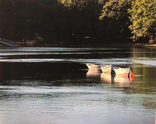
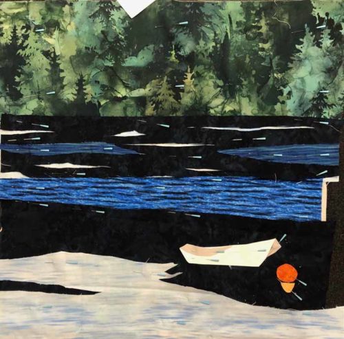
Sue’s photo had wonderful light and dark spots in the water and intriguing reflections. She noticed these areas and brought a very good selection of fabrics.

Design in Maine, Part Two. Ellen Lindner. AdventureQuilter.com/blog

See what I mean? Her trees and water really came together nicely.

Design in Maine, Part Two. Ellen Lindner. AdventureQuilter.com/blog

Construction tip: when you need little tiny pieces, like the white part of the water, don’t cut them to size. Instead, cut them larger and then tuck them under a larger piece. Let the shape of the larger piece cover and define the shape of the one below. In this case the dark water fabric has tiny cuts in it with a larger piece of white below showing through.

Wow, these ladies did extraordinary work! In one day they learned some useful design principles, created a sketch for their quilt, and made excellent progress with the collage of their quilts. They really pulled out their artistic courage! And we had fun to boot!

See other student work in the Part One post.

This class can be in person or via Zoom, as a 2 day class.  More info.

Ellen Lindner

3

Designing in Maine, Part One

I recently taught two classes. One was “Design Your Own Nature Quilt,” and the ladies did a great job. The supply list includes artistic courage and they did not disappoint.

After a morning learning about design and preparing a sketch, the students start creating their fabric collages in the afternoon. It can be a little intimidating because it requires INTERPRETING their inspiration photos, rather than just COPYING them.

With only a few hours to work with fabric, they still made excellent progress on their quilts. Each student worked from her own inspiration photo, so each quilt was different and each student had her own issues to contend with.

Michelle’s photo was taken while canoeing on a very calm lake. I cautioned her about the subtleties of merging water colors, but she came with the right fabrics and was willing the spend the time needed to create her effects.

And this is where she left off. I think it’s very successful. Can you see all the time she spent shredding fabrics in order to give a feel of the water reflection? She’ll add French knots to emulate rivets on the point on the canoe.

Heather’s photo featured a favorite tree.

She cropped it to improve the composition and made excellent progress on her quilt.

Sharon chose a beautiful sunset.

She had to leave class early, but still made a good start on her piece.

Susan’s photo included two different types of flowers, with a foliage background.

She simplified shapes and made a good start on her quilt.

Jenn used a wonderful photo featuring lupines.

She knew she couldn’t easily replicate the entire image, so she cropped it down and simplified. She’ll be able to cut her flower petal/shapes more irregularly, which will speed things up.

Charlene selected a VERY complex photo of lily pads and flowers. She knew she’d have to simplify and crop, so she got to work.
She still had her work cut out for her, but had no qualms about cutting many lily pads. As  you can see, it began to take shape nicely right away.
Won’t these be great? I’ll show you more quilts in-progress in the next post.

Ellen Lindner

4