Tag Archives | Paints and Markers

Twigs of Teal and Red-Orange: Getting Started

I dyed this fabric last year and it’s one of my favorites.

Teal and Red-Orange Quilt: Getting Started. Ellen Lindner, AdventureQuilter.com/blog

I was really happy with the way I had a viable design without doing anything more to it, but HOW do you design with that? I had a false start last year and am now trying again.

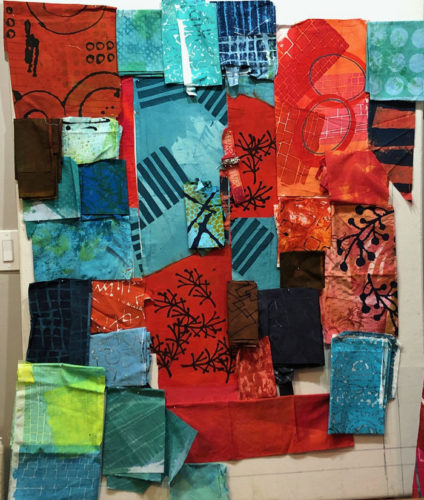
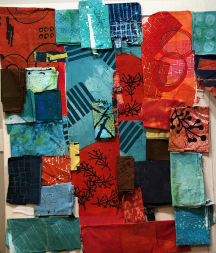
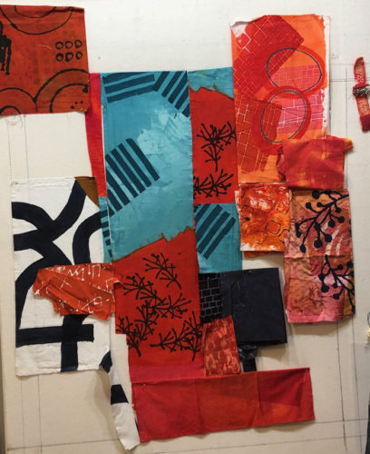
These are the collection of “featured” fabrics I thought I might be able to use. I call them featured fabrics because they have high amounts of contrast in them, which will draw the viewer’s eye. When working with such fabrics, I try to put them in place early on and then fill in with less dramatic fabrics, as needed.

Teal and Red-Orange Quilt: Getting Started. Ellen Lindner, AdventureQuilter.com/blog

Next, I pulled out every fabric I thought might work. As you can see, I like these colors and found that I had quite a collection.

Teal and Red-Orange Quilt: Getting Started. Ellen Lindner, AdventureQuilter.com/blog

But, maybe it needed something unexpected. What about accents of yellow?

Teal and Red-Orange Quilt: Getting Started. Ellen Lindner, AdventureQuilter.com/blog

Hmm. Maybe.

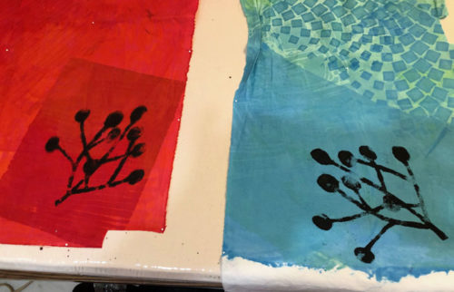
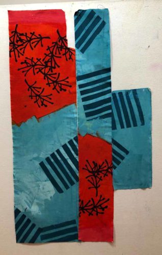
I liked the large twig (center right) on the dull orange print. But, I didn’t like the background fabric. So, I stenciled on a couple more using paint.

TTeal and Red-Orange Quilt: Getting Started. Ellen Lindner, AdventureQuilter.com/blog

These should be usable.

I had my fabric decisions (mostly) made, so it was time to start moving things around on the design wall. (The challenging, but fun, part!)

Ellen Lindner

0

Painting Sophisticated Colors

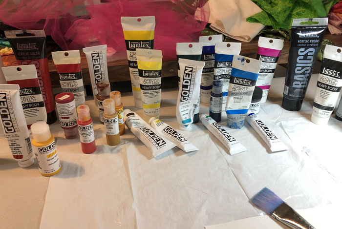
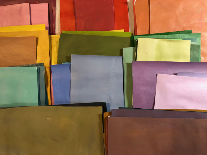
I’m currently enrolled in a mini-collage class with Jane Davies. For week one, she had us paint A LOT of swatches. Surprisingly, I didn’t need to buy any paint. I guess I’ve done more of this over the years than I realized.

Painting Sophisticated Colors. Ellen Lindner, AdventureQuilter.com/blog
I’m pretty good at mixing colors, but I still gets streaks sometimes.

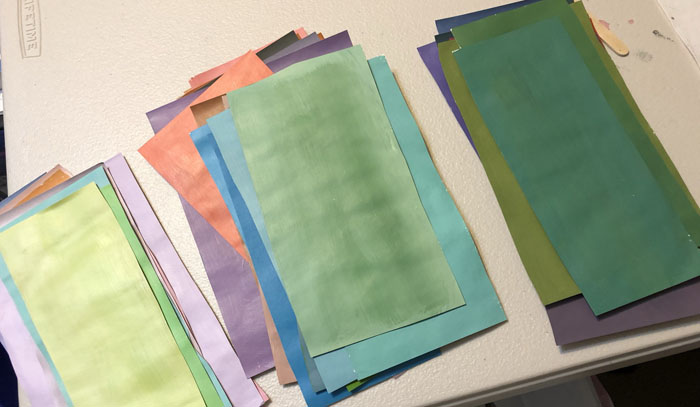
Jane asked us to paint only what she calls sophisticated colors. These are colors with both some black and white in them. In other words, they’re somewhat subdued. More like the colors you might paint your home than the bright colors children like. Of course, I like the bright colors, so their omission has already piqued my interest. After quite a few swatches, I checked my collection for light, medium, and dark. I thought I was on track.

Painting Sophisticated Colors. Ellen Lindner, AdventureQuilter.com/blog

After about 80 swatches over all this is what I had. Not bad, I thought.

Painting Sophisticated Colors. Ellen Lindner, AdventureQuilter.com/blog

But, Jane, asked for more lights and neutrals, so I painted up another 20 or so.

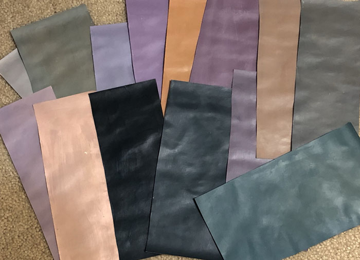
She also encouraged us to paint Chromatic Grays. I’d never heard this term a couple of months ago, but now it seems that I can’t get away from it. As the name implies, these are grays that have a significant undertone of a particular color. These are the colors I initially identified as being chromatic grays.

Painting Sophisticated Colors. Ellen Lindner, AdventureQuilter.com/blog

Now I can see that at least two of these are too colorful. I guess I’m learning.

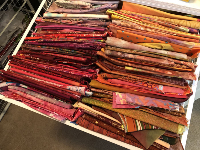
Again, the idea of using these duller colors is piquing my interest. Since I plan  to eventually do some of the class exercises in fabric, I pulled out a few drawers to see if I even owned any chromatic grays.

Painting Sophisticated Colors. Ellen Lindner, AdventureQuilter.com/blog

Hmm. I think probably not. Maybe this will be a future fabric dyeing project for me.

How about you? Do you ever dabble in other media? I think it’s a good creative exercise and I’m excited about it.

Ellen Lindner

0

And Then I Threw Paint on It

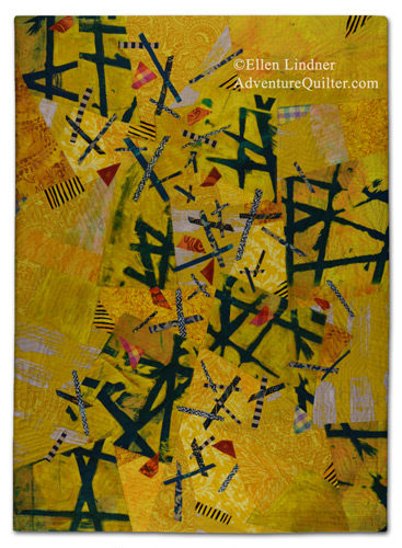
I got this far on my current quilt, before I knew it needed something more.

A Wacky Composition. Ellen Lindner, AdventureQuilter.com/blog

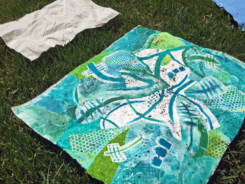
Clearly, the white needed some texture.  So, I decided to fling some paint onto it!

I practiced first on a piece of muslin, then I just went for it.

And Then I Threw Paint on It. Ellen Lindner, AdventureQuilter.com/blog

Amazingly, I did this without any fear!  I was READY to break things up and to add some interest.

Doesn’t it look better?

And Then I Threw Paint on It. Ellen Lindner, AdventureQuilter.com/blog

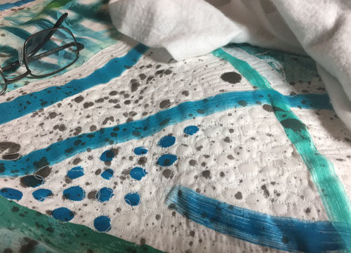
After that I considered it finished and began quilting it.  My initial idea was to stitch around each little drop of black paint.  And I actually stuck with it until I got to the very edges.

And Then I Threw Paint on It. Ellen Lindner, AdventureQuilter.com/blog

But, wait.  Is it really finished it?  After my post on August 4th, I got some very good comments and suggestions from you readers. I decided to reconsider a few things and to audition some changes.  I’ll show you those in the next post.

Ellen Lindner

4

Painting Fabric: Not as Easy as I Thought

After working with some beautiful hand-painted fabrics recently, I decided to try my hand at creating some of my own.  Although I had painted fabric before, I had never done so with a really specific purpose. This time I wanted to:
– Paint at least 2 large pieces of fabric that would coordinate,
– Paint at least one of them with large scale high contrast designs.
That second one turned out to be the most difficult, so I’ll show you the easier one first.

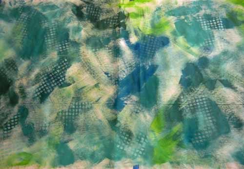
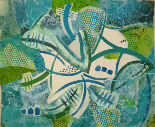
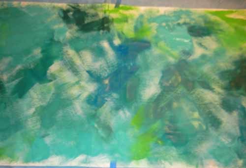
I was working with a variety of blue-greens, greens, and blues and wet this piece of fabric before painting it very loosely.
Painting Fabric: Not as Easy as I Thought. Ellen Lindner, AdventureQuilter.com/blog

I hoped the wetness would cause the colors to move and shift a little and I think maybe it did.

Next, I wanted to add some low contrast texture.  I did so by stenciling soft blue-green paint through a scrap of gridding.
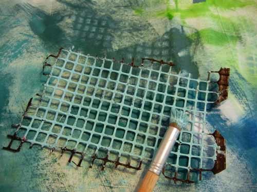
Painting Fabric: Not as Easy as I Thought. Ellen Lindner, AdventureQuilter.com/blog

I really liked the effect.

Painting Fabric: Not as Easy as I Thought. Ellen Lindner, AdventureQuilter.com/blog

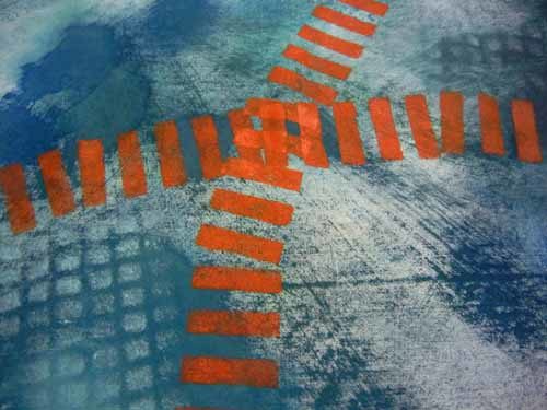
I also wanted to add a contrasting color and selected a dull orange.  The complement of blue, I thought this would work well.  Again, I stenciled it on; this time with a commercial stencil left over from my scrapbooking days.
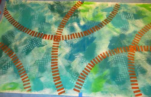
Painting Fabric: Not as Easy as I Thought. Ellen Lindner, AdventureQuilter.com/blog

Not bad, I thought.

Painting Fabric: Not as Easy as I Thought. Ellen Lindner, AdventureQuilter.com/blog

But, as the orange paint dried it turned much darker, to more of a rust color. I decided to overpaint with brighter oranges, which helped.

I tried 3 more things that I forgot to photograph:
– Drawing with a syringe.  A big fail!  I wet it down and wiped it nearly all the way off.
– Adding small dots.  Okay, but not exciting.
– Smearing on white paint over everything.  This was pretty interesting, but heavier than I wanted.  Again, I sprayed it down and wiped much of it off.  That left a faint film which was unifying.  I liked it.

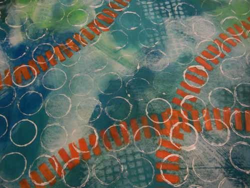
Finally, I added white rings stamped with a nearby roll of painters tape.
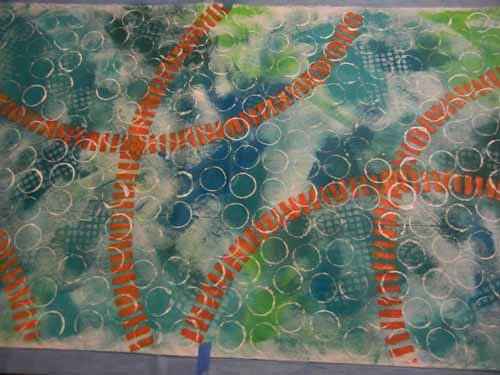
Painting Fabric: Not as Easy as I Thought. Ellen Lindner, AdventureQuilter.com/blog

Painting Fabric: Not as Easy as I Thought. Ellen Lindner, AdventureQuilter.com/blog

I think that was pretty successful.

A few observations and lessons learned:
– This takes a lot longer than I had imagined.  It’s worth the purchase price of gorgeous fabric created by OTHER people, when I can find it.
– I’ll definitely do more of this.
– I have a lot to learn.  Chief among my questions is how to get saturated colors without making the fabric stiff and without using lots of paint.  I’ll need to do some research.

The bottom line is that I can definitely use this fabric and I met my goals with it. Yippee!

Ellen Lindner
P.S. I used mostly Pebeo Setacolor Transparent, along with some artists acrylic paints.


10

“Mid-October” Complete

Well, here it is, version two now complete: Mid-October.

"Mid-October" complete. Ellen Lindner, AdventureQuilter.com/blog

"Mid-October" complete. Ellen Lindner, AdventureQuilter.com/blog

After completely finishing AND photographing version one, I began to think it was too dark.  It just didn’t remind me of the bright fall colors I was going for.

See what I mean?  (Actually, the two quilts photographed slightly differently, but I think you can see the duller patches throughout.)

Leaf Quilt Complete - Maybe. Ellen Lindner, AdventureQuilter.com

What do do at this stage?  I “painted” over several spots with Inktense color blocks.  (See the detail shot.) To my eye it’s much better.

Have you ever painted over a completed quilt?  This is not my first time around that particular block.

Ellen Lindner

7

Dying with Sharpies and Alcohol: Part Two

In Part One I showed you how to mark large irregular circle shapes.  Now, let’s learn how to make smaller flowers.

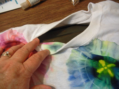
I did this sample on a t-shirt and I wanted the design to be on the front only.  Therefore, I put a baking sheet inside the shirt.

Dying with Sharpies and Alcohol Part One. Ellen Lindner, AdventureQuilter.com/blog

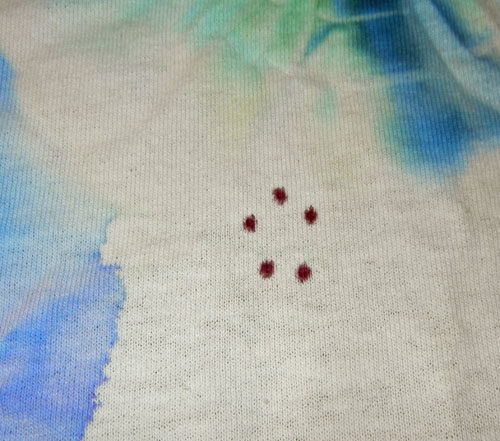
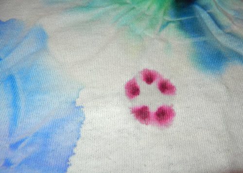
Draw 5 small dots with a Sharpie.

Dying with Sharpies and Alcohol Part One. Ellen Lindner, AdventureQuilter.com/blog

Add a few drops of alcohol in the center of the dots. It will wick outward, taking the pigment with it.

Dying with Sharpies and Alcohol Part One. Ellen Lindner, AdventureQuilter.com/blog

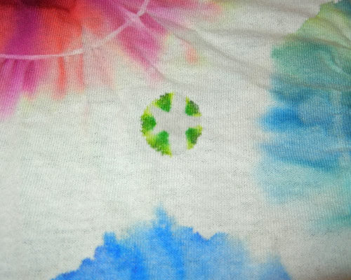
Add more if additional bleeding is desired, but be sure to add it only in the center. Eventually, the color will travel far enough to create a petal effect. Some colors change as they become diluted.

Dying with Sharpies and Alcohol Part One. Ellen Lindner, AdventureQuilter.com/blog

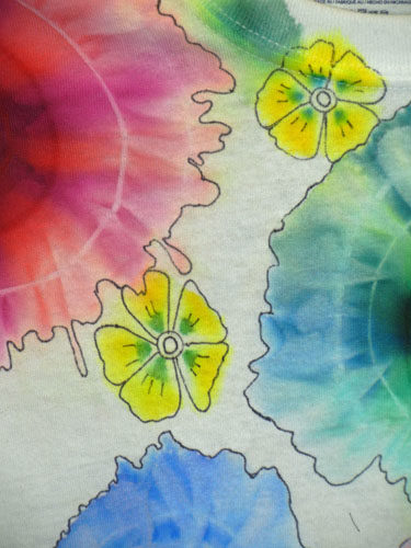
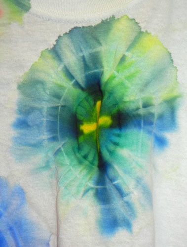
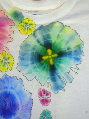
These yellow-green dots turned into the yellow flowers you see below.

Dying with Sharpies and Alcohol. Ellen Lindner, AdventureQuilter.com

Once dry, details can be added with a thin Sharpie, if desired.

Dying with Sharpies and Alcohol. Ellen Lindner, AdventureQuilter.com

When dry, heat set in the dryer for 20 minutes and you’re done!

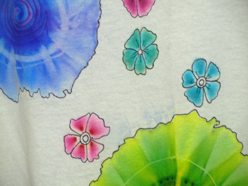
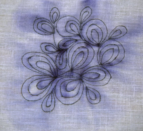
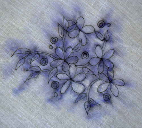
You can also make all-over delicate designs. The examples below were done with a black marker (yes, black) which turned purple and bled when lightly sprayed.  It’s an interesting effect.

Dying with Sharpies and Alcohol Part One. Ellen Lindner, AdventureQuilter.com/blog

Dying with Sharpies and Alcohol Part One. Ellen Lindner, AdventureQuilter.com/blog

I’ve shown you these methods done on cotton fabric.  They can also be used on silk, but the color will bleed MUCH more, giving a lovely water color effect.

I’m sure there are many more things that can be done with this concept.  The basic principle is this: alcohol will wick into dry areas, taking the color with it.  You can use this knowledge to control the movement of color: add alcohol on the left of the pigment if you want the color to move right, and vice versa. Or, of course,  you can spray the entire design for overall bleeding.

Have fun playing!

Ellen Lindner


11

Dying with Sharpies and Alcohol: Part One

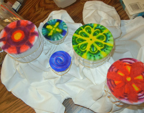
While at the retreat, I attended a demo about dying fabric with Sharpies (permanent markers) and rubbing alcohol (isopropyl.) I already knew alcohol would make Sharpies bleed, but I’d never seen this particular application.

This is the sort of result you can expect. Cool, right?

Dying with Sharpies and Alcohol Part One. Ellen Lindner, AdventureQuilter.com/blog

And this is how you do it:
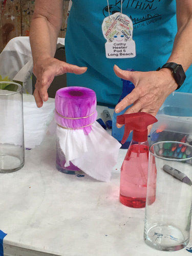
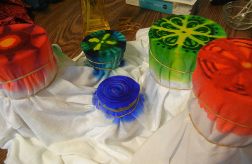
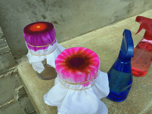
– Stretch fabric over a drinking glass or vase.
– Secure fabric with two rubber bands.
– Color the top of the fabric with Sharpies.  (The colors will bleed so choose ones that will look good together.)
– Spray the top of the fabric, generously, with alcohol.
– You’re done!  The alcohol will quickly wick down the sides, taking the Sharpie color with it.  Because it’s alcohol it will evaporate quickly and you’ll be done in no time.

Here are a couple of in-progress examples from our retreat.

Dying with Sharpies and Alcohol Part One. Ellen Lindner, AdventureQuilter.com/blog

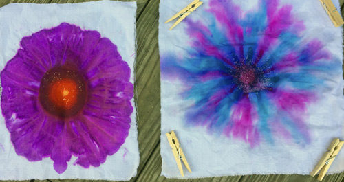
Here they are drying. The left one, below, is the same one shown on the left above.

Dying with Sharpies and Alcohol Part One. Ellen Lindner, AdventureQuilter.com/blog

It’s that easy!

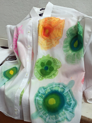
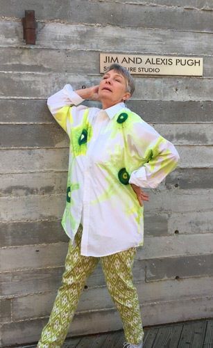
Here’s our teacher, Cathy Heeter, “showing off” a shirt she had made with this technique.  She matched the colors to this pair of pants.
Dying with Sharpies and Alcohol Part One. Ellen Lindner, AdventureQuilter.com/blog

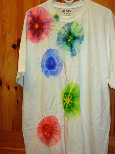
Once home, I decided to play with this on my own, on a t-shirt.

Dying with Sharpies and Alcohol Part One. Ellen Lindner, AdventureQuilter.com/blog

However, they didn’t bleed quite to my liking, so I sprayed them some more.  That did the trick. Can you see the additional bleeding below?

Dying with Sharpies and Alcohol Part One. Ellen Lindner, AdventureQuilter.com/blog

These were my results.
Dying with Sharpies and Alcohol Part One. Ellen Lindner, AdventureQuilter.com/blog

Dying with Sharpies and Alcohol. Ellen Lindner, AdventureQuilter.com

Dying with Sharpies and Alcohol Part One. Ellen Lindner, AdventureQuilter.com/blog

I was very happy with them.  After the shirt dried I threw it in the dryer for 20 minutes of heat setting.

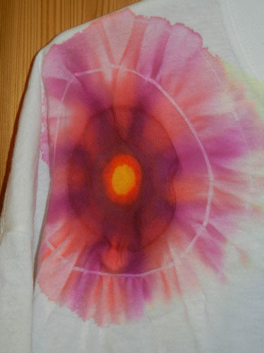
Later, I added some definition by drawing an outline with a thin Sharpie.  (Not diluted this time.)  This is purely optional, but I like the effect.

Dying with Sharpies and Alcohol Part One. Ellen Lindner, AdventureQuilter.com/blog

BTW, I put the glass containers inside the shirt, so I was working with the front only.  I’ll bet you could do it either way.

In Part Two I show you how to make the small flowers and other details.
Ellen Lindner


20

Quilting and Cording

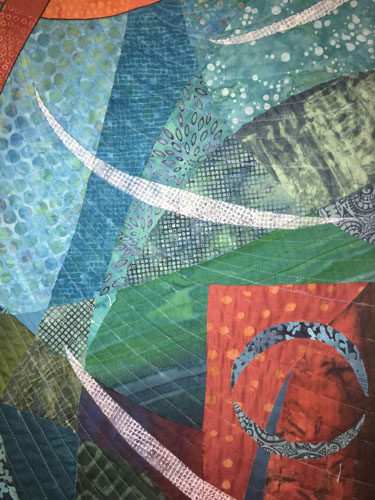
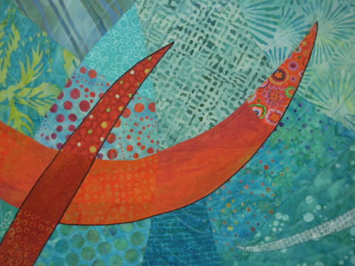
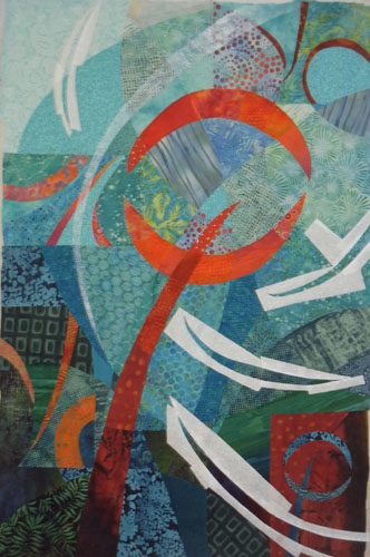
When quilting my latest piece I decided to mimic the swirls/curves in the background.
Quilting and Cording. Ellen Lindner, AdventureQuilter.com/blog

Quilting and Cording. Ellen Lindner, AdventureQuilter.com/blog

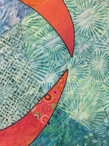
In addition to machine quilting, I also added some hand stitching around several of the curved shapes.

Quilting and Cording. Ellen Lindner, AdventureQuilter.com/blog

My main reason for doing so was to add contrast to the white curves in the light areas. I intended to stitch around all the curved shapes, but the effect was so subtle I changed my mind and used it only in the lightest areas.

Next, I turned my attention to the main motif.  I thought it needed to be set off from the background somewhat.  I considered:
– Lightening the background around the motif with colored pencils, chalk, etc.
– Using tulle to add a dark shadow around parts of the motif.
– Adding a dark line around the motif, by adding cording.

I was leaning toward the cording idea, since I had used it previously. I did some auditioning and started in.  I hand stitched a black cord in place.  That is, I used a cording stitch to capture the cord and secure it to the top of the quilt.  I did not pierce the fabric with the cord.

Here you can see the effect before and after the cording.

Quilting and Cording. Ellen Lindner, AdventureQuilter.com/blog

I think it set it off perfectly.

Quilting and Cording. Ellen Lindner, AdventureQuilter.com/blog

Quilting and Cording. Ellen Lindner, AdventureQuilter.com/blog

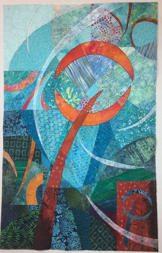
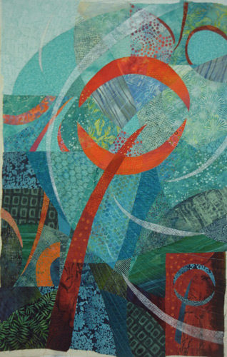
And here’s the entire quilt, ready for facing.  Almost finished!

Quilting and Cording. Ellen Lindner, AdventureQuilter.com/blog

Have you got any suggestions for a name?  I’ve got one in mind, but am still slightly undecided.

Ellen Lindner
P.S. Here’s what a hard/precise tulle shadow looks like.  It’s very effective in adding definition, but only if you want to show the top element just slightly above the background.  I wanted this motif to float, so it wasn’t appropriate here.

12

Holding My Mouth Just Right

I recently added paint to a quilt!  Gulp!  This is something I’ve only done once or twice, so I definitely had to get my courage up.

It helped that I had done a bunch of painted exercises a few months ago.  So, I did some practice samples, held my mouth just right and gave it a go.

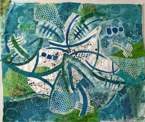
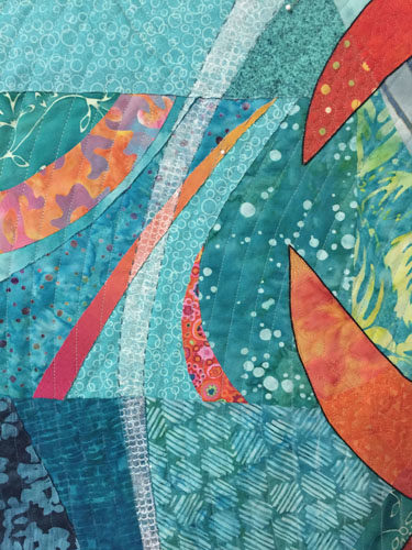
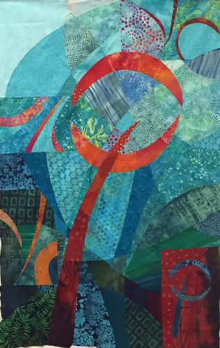
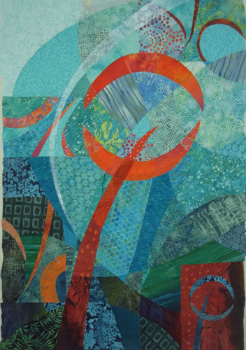
I had started this quilt at Quilting by the Lake, back in July, and had completed the fabric composition.  After putting the quilt away for a few months, this is where I picked it  up.  I wanted to add some sheer swirling elements to the background.  With paint.  Gulp again.

Translating Sketches to Color. Ellen Lindner, AdventureQuilter.com/blog

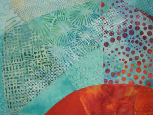
I had previously done some experimenting about how to best add a sheer layer with monoprinting. From that I knew that a certain scrap of shelf liner worked well.  Like this.  I thought it looked quite good.

Painting on a quilt: GULP. Ellen Lindner, AdventureQuilter.com/blog

But, it pretty much disappeared in the lighter patterned areas.  Clearly, I’d need to beef it up some how.  Back to experimenting.

Painting on a quilt: GULP. Ellen Lindner, AdventureQuilter.com/blog

I figured out I could stencil on another light coat of paint to get my desired effect.  Like this.

Painting on a quilt: GULP. Ellen Lindner, AdventureQuilter.com/blog

I used freezer paper to mask out the quilt areas that I wanted to stay paint free.

Painting on a quilt: GULP. Ellen Lindner, AdventureQuilter.com/blog

And this was the result. I was happy with it.

Painting on fabric. Gulp! Ellen Lindner, AdventureQuilter.com/blog

At this point, it was time to start thinking about the quilting design.  I’ll show you what I did in the next post, plus something a little unexpected.

Ellen Lindner

8

Making a Mobile

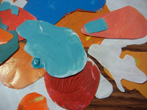
A few months ago I was playing around with paint quite a bit and using a lot of palette paper.  You’re probably familiar with it.  It’s sorta waxy, so it can handle a lot of moisture.

Often, the paint dried in interesting ways, so I decided to save the papers.  (Yep, I did it again: saved something I had no idea how I’d ever use.)

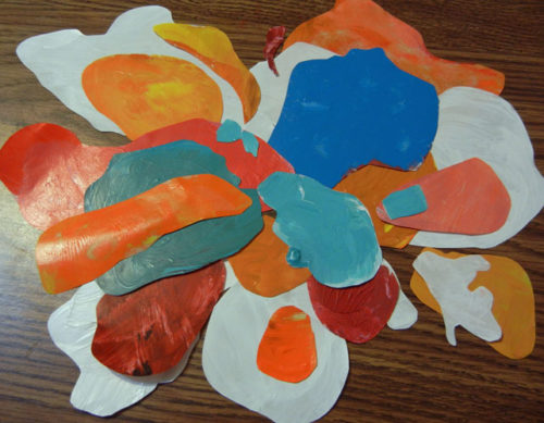
This week I had some down time, so I cut out the paint blobs.

Making a mobile with paint blobs. Ellen Lindner, AdventureQuilter.com/blog

See what I mean about them being interesting?

Making a mobile with paint blobs. Ellen Lindner, AdventureQuilter.com/blog

I thought maybe I could make them into a mobile.  All white or with color?  I decided on a mixture.

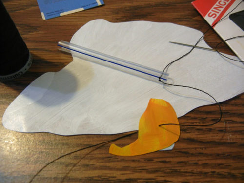
At some point I had heard that you should build a mobile from the bottom up and that was good advice. I used button twist (heavy thread) and started knotting and threading shapes on. I let the bottom shapes dangle, but I wanted the others to hang semi parallel to the floor.  With that in mind I tried to puncture each piece at the center of gravity.  (One of my aviation terms, simply meaning balance point.)  This sometimes took more than one try.

Making a mobile with paint blobs. Ellen Lindner, AdventureQuilter.com/blog

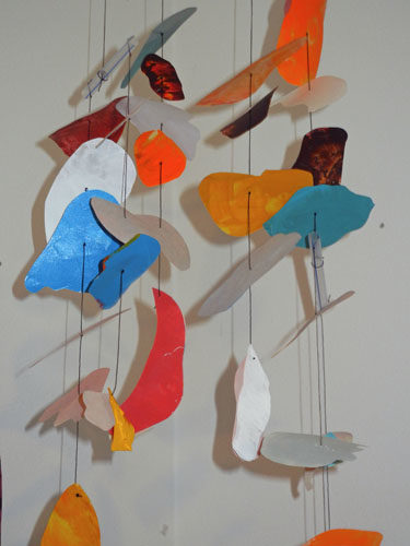
After adding a piece, I’d make a small knot a little ways down the thread an add the next shape.  I kept the colorful side facing down, since I knew it would be viewed from below.  ( I did a lot of lifting to look up at my progress.)

I used short pieces of plastic straws as my cross structures, again finding the center of gravity for each one before adding it to item above.

Making a mobile with paint blobs. Ellen Lindner, AdventureQuilter.com/blog

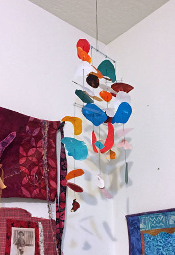
I think it turned out pretty cool.

Making a mobile with paint blobs. Ellen Lindner, AdventureQuilter.com/blog

One thing I didn’t anticipate was the mobile moving.  And that’s the best part!  It’s sorta like visual wind chimes.  (Only better.)

What experimenting have you tried lately?

Ellen Lindner


8