You readers are really great! When I posted my quilt at this stage several of you had good suggestions about how I might improve it.
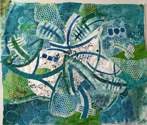
The most common suggestion was to add some orange back in. Something I had considered but rejected. Another tip was to break up the white and to extend the “splashing” out toward the edges more. Since I had mentally given this quilt a “7,” I knew it needed something and I decided to give these ideas a try.
First, I added some white “splashes” closer to the edges and put some of the orange stripes back. I also tapered the ends of many of the motifs.
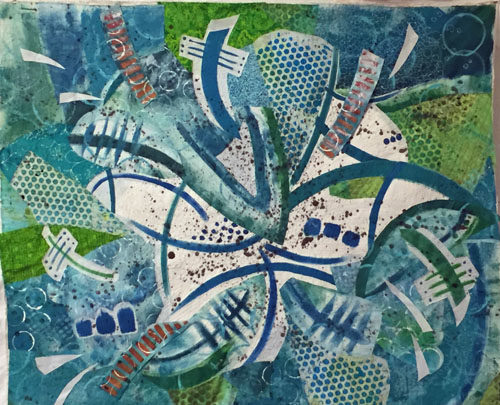
Clearly, the orange needed to be more dramatic. So, I tried a few little splashes, (which look red in this photo.) Yes! I could see that this would add the drama the quilt needed.
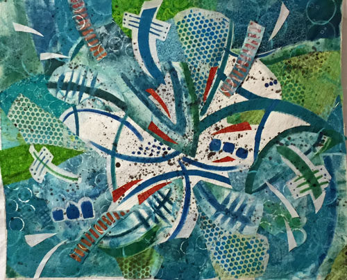
I added more.
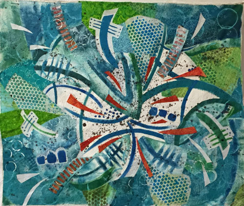
Yeah, that was working pretty well. My brain said, “Let’s add more!” And I obliged.
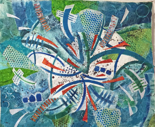
But, wait a second. This was beginning to look like I had added the kitchen sink! Some editing was needed. I removed the white splashes and auditioned changes to the orange stripes. (Below, those fabrics are folded, rather than cut, for audition purposes.)
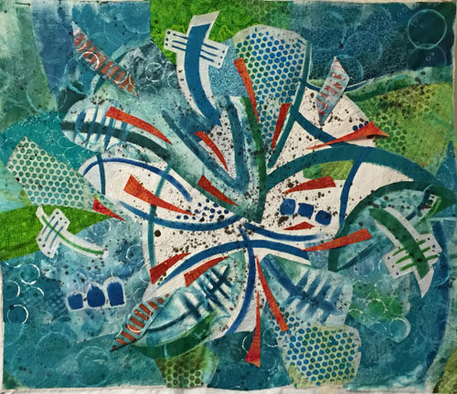
And this is where I ended up. As you can see I completely removed the orange stripes.
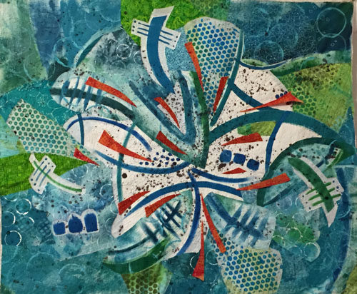
Have you heard the saying that goes, “If your composition is not working, remove your favorite thing?” I think that sort of applied here. At this point, I thought it was a solid 8.5 and I was quite happy with it. On to quilting.
(Did you remember that this piece is composed of painted fabric, some of which is stiff? That may be an issue for the quilting.)
Ellen Lindner

Love the orange. That’s what I thought it needed to. Use a jeans needle if necessary to quilt.
Thanks, Rebecca. I’ve started quilting it, using a microtex (sharp) needle. So far, no problems.
That was going to be my next suggestion lol
“Great minds.” 🙂
Much improved with the changes. Looks great now.
Yes, much better. Thanks for the advice.
Much more “Ellen” now…! Did you intentd to flip it (see first and last photo)? Or can it be hung in any direction? I think a good composition, esp abstract, is “supposed” to “work” regardless of orientation…
Good eye. The top photo is upside down from the way I’ve been looking at it. But, I actually think it could go in any orientation.
I definitely want to read a report about sewing on painted fabric. I’ve been wondering about that from the start.
You got it right now!
Thanks, Barb! It’s sometimes a long route for me. But I don’t mind, because that’s part of the fun.
It’s quite possible that I didn’t use the appropriate tricks when painting, Lif. But, I did use fabric paint, or acrylic with fabric medium added. However, I used very little water because I wanted clear, sharp edges. That amount of fabric thickened the fabric quite significantly.
I’ve now started quilting it and I can sew through it with no problems. However, I’m wondering if I’ll have problems with blocking and rolling for shipping. I’ll let you know.
I really like it probably because I see a Hibiscus flower!
Thanks, Ingrid!
I like the “upside down” presentation. The addition of the red-orange gave it the pizzazz it needed. Can’t wait to see the quilting.
Thanks, Karen. I like it upside down too – or any orientation, actually. I’ll have to decide which way it goes.
Thanks for the vicarious adventure through your auditioning! Very helpful to follow the process. My favorite spot is that blue t shape at upper center…the art deco feel has been strong throughout.
Oh, I had noticed the art deco feel, Eleanor. But, I think you’re right. (And I like it.) Thanks for following along!
It looks great, Ellen! Love the orange splashes!
Thanks, Kristin!