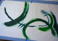
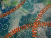
Well, after painting those (challenging) fabrics I had to figure out what to do with them.
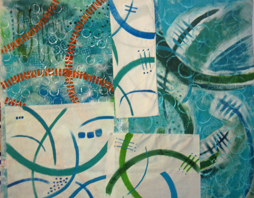
Since I wasn’t crazy about some of them, I knew I’d need to cut isolated portions and motifs for use. I had NO IDEA what my composition might look like, but I started cutting out sections and MINDLESSLY sticking them up on my design wall.
Apparently my brain likes order because I soon found myself adding each piece so that it filled the space left by previous pieces. Soon, a design was emerging.
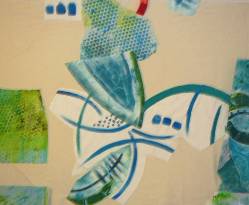
I did make one very conscious decision at this point: I decided to place the pieces with the white background near center, since I knew these high contrast pieces would attract attention.
And so it went. I had found a dotted piece of blue and green and added it to the mix. It worked well and expanded the color palette.
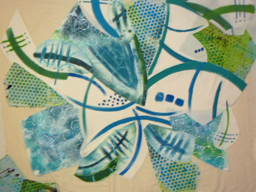
I threw in a little of the orange, too, of course. It was looking wild and I was trying hard not to over think it!
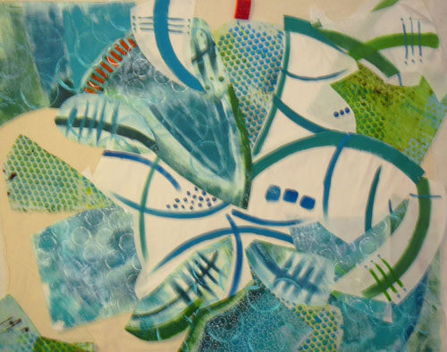
I had some gaps and auditioned commercial fabrics to fill in.
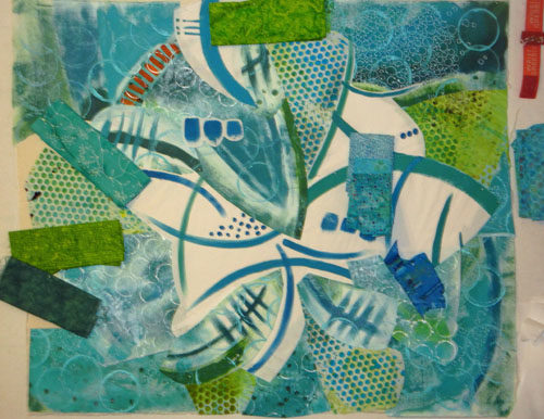
Before long I had the base muslin fabric covered. Now, it was time to examine what I had with a very critical eye. Was this wacky combination heading in a usable direction? Should I start all over with something calmer? If I continued, I knew some editing/deleting would be in order.
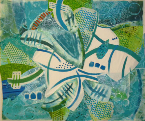
I removed (temporarily???) the orange, replaced the too bright blue lower left, and moved things a little. I felt like I was getting close.
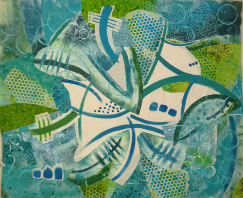
Future questions:
– The white areas seem so blank. Should I add something small scale in that area?
– Does it need something lower right?
– I’d like to add the orange back, but how can I best do that?
– Does it need something darker? Black, even?
About this time I decided on a tentative name, “Splash.” That would certainly affect some future decisions.
Thanks for joining me on this wild ride!
Ellen Lindner

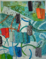
What a transformation, I see that little bit of orange in there somewhere. Great adventure! And wonderful ideas.
Hi Valerie. Yes, this one has been wild!
Everyone wants me to add the orange back and I’m missing it too. I’ll have to find a way to add it.
Ellen, I liked the broken orange line that appeared and then disappeared. I missed it. I also like the blue just below that orange that extended into the center. It subsequently back off a bit. Try more of that orange (or darker) near the center or lower right corner.
Thanks for the suggestions, Mom. Everyone wants the orange back, so I’ll have to work on that.
(To my readers, my mom is a talented painter and we love to talk art!)
Love the whites…don’t lose them! When you decided on “Splash” it all came together. My only composition comment would be to repeat some of the white in one of the four corners…for the eye to enter and, of course, because splashes are rarely contained. Love it. Guess it wouldn’t be “Ellen” with an orange somewhere but put the black away. (IMHO, as they say…)
Thanks for the suggestions, Cindy. I may audition some more white.
Too late on the black. I added it and love it. Wait till you see.
I want the orange/blue piece back! I’d even throw in a little more of it in a way that will move your eye around within the piece– maybe three places total? I would not throw in black, only because ti will overpower some the the subtler contrasts you have set up (blue/white). My two cents.
I’m missing the orange, too, Candy. I may find a way to add it back in near the end.
But, too late on the black. Wait till you see!
Ellen, I can’t tell you how much I enjoy your process postings! Thank you!
Thanks, Joyce. This one has been WILD!
I love watching you work. How about some stitching in the white spaces. Could even be with some orange threads!
Hi Gini,
And, as you suggested, I’m considering some hand stitching with orange thread at the very end. More to do before then. It’s progressing (into slightly unexpected areas.)
Hi, Ellen, I have been subscribed for several months now, and I am learning much from your processes. You are very generous to share them.
I have to say, on this one, I like picture #6 better than picture #7 – on my screen, #6 seemed to have more depth. The brightish blue, lower left, might be darker. The orange dotted line could show up at other sites in the “background” (like that lower right you wanted to alter).
I have a feeling you’re light years beyond this already; I’ll be eager to see how you take your next steps.
Thanks again.
Thanks for your suggestions, Ann. As you’ve guessed, I’ve already implemented some of them. Lots more experimenting to do, so stay tuned.
I like your piece and I like the orange in it. It does seem to have too much white in the center – maybe add subtle ‘splashes’ of color there?
You read my mind, Kristin. I’ve added those splashes and you’ll see them soon.