As I worked on my two-colored “beet” quilt, it became obvious that composition was going to be SUPER important in creating a successful piece.
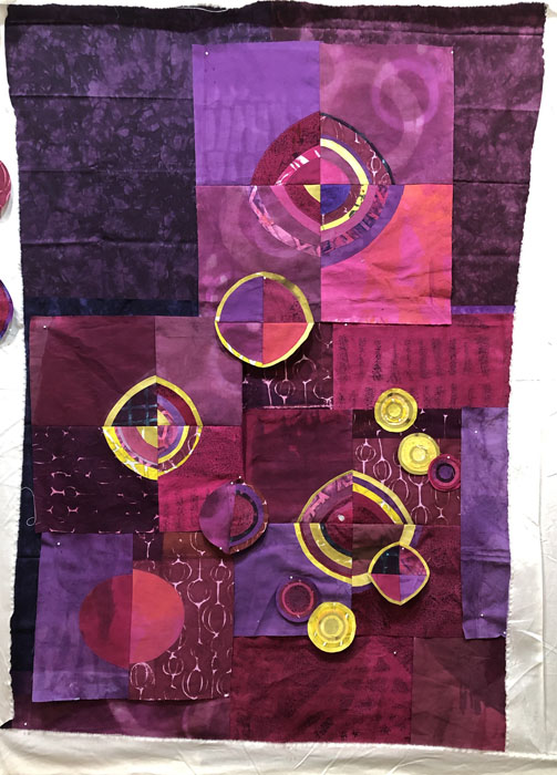
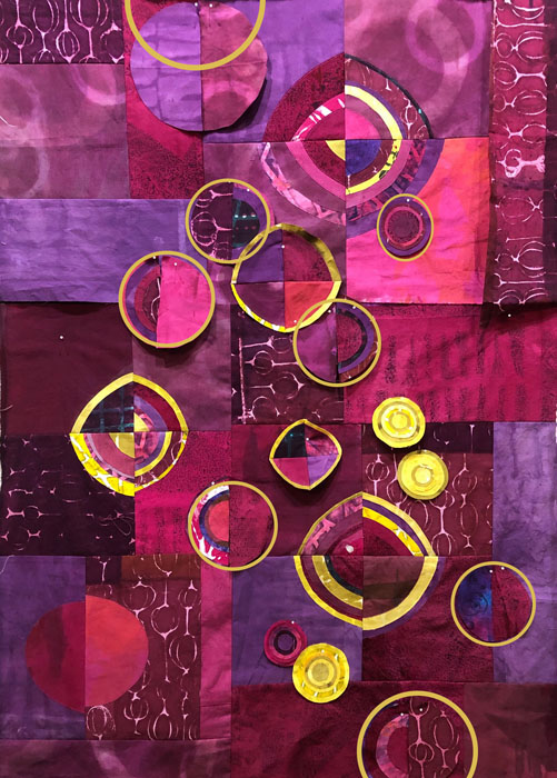
Because the yellow showed up so sharply against the reds and purples I knew the yellow circles would form the focal point of the piece and they’d need to be arranged just so. With that in mind, I arranged them first, even before all the background decisions had been made.
In the shot above, I’ve used a variety of commercial fabrics as place holders for the background (hand-dyed) fabrics I actually plan to use. It was just easier to compose against these dark colors than the white of my design wall.
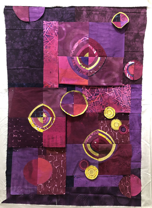
Then I began to replace the initial background fabrics with my hand dyed ones. Still with just a bare bones composition.
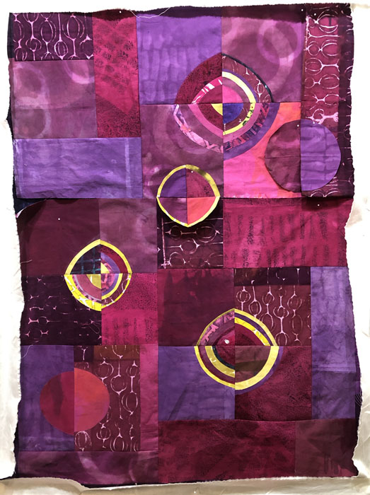
In the shot below, I’ve settled upon the new background fabrics and they’re mostly sewn together.
Time to add some low-contrast beet-colored circles to the background. I knew they’d add interest, and they did.
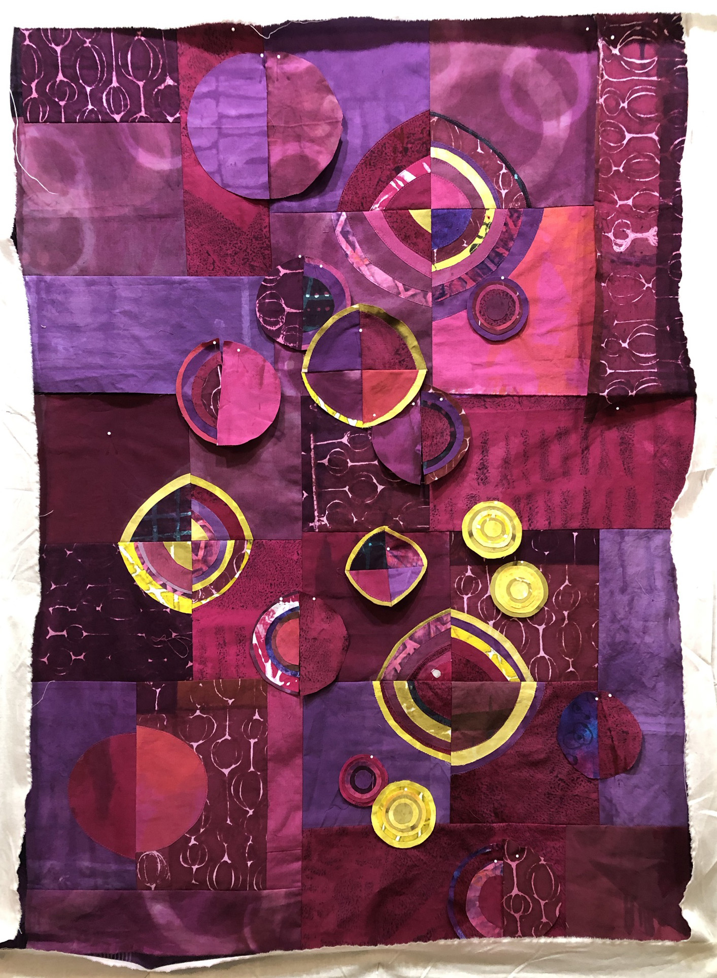
But, I began to think the space just wasn’t filled enough. Did I need more circles? Or more YELLOW circles – for contrast? I played with this idea on my computer.
Hmm, that certainly filled the space more. Time to consider.
Either way, I’ll add some more low contract background circles.
Ellen Lindner



No comments yet.