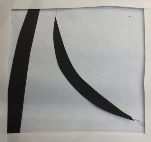
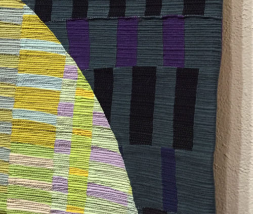
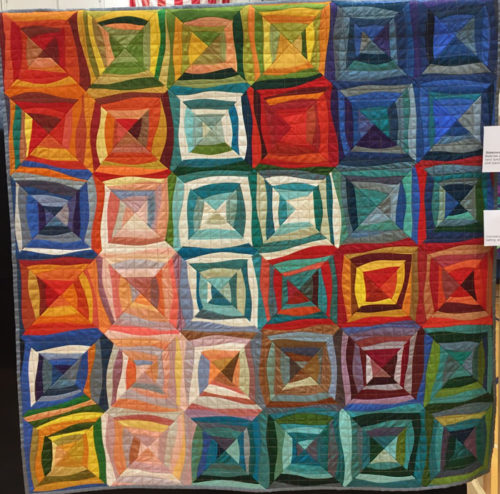
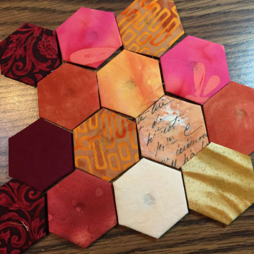
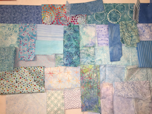
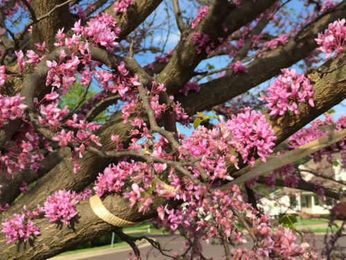
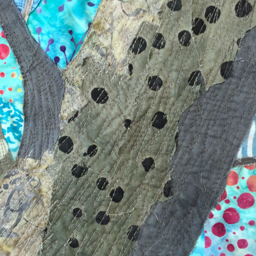
I’m really happy with the way the background of my Red Bud quilt is turning out. Here it is before quilting.
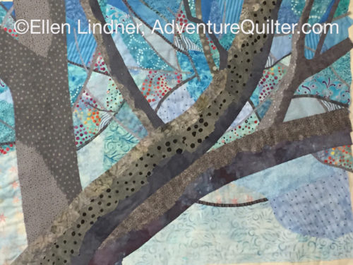
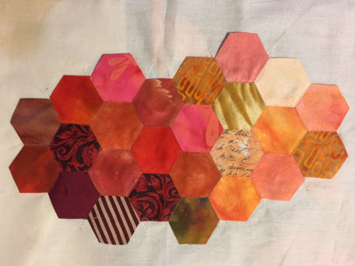
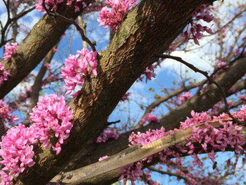
This image shows the heavy quilting I did on the tree trunks.
But, about the time I finished quilting the background I had a sort of disturbing thought. That is “would it look better if it were more abstract?” Hmm. Making something abstract isn’t disturbing at all to me. But, doing so this far into a quilt seemed daunting.
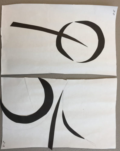
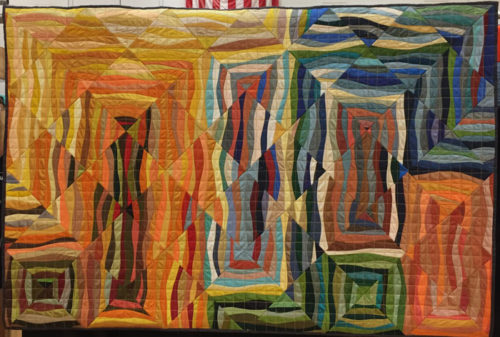
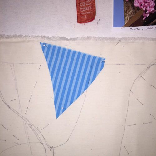
Still, I began to sketch options on my computer. First option: what if I cut the background into three pieces and added to each of those to complete three different quilts. The idea was intriguing, but the work load was not. (You may remember that I’ve done a bit of this lately on a smaller scale.)
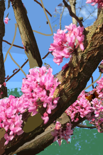
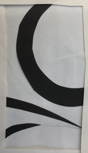
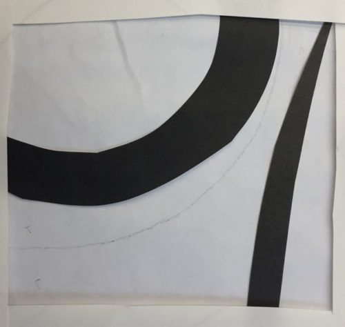
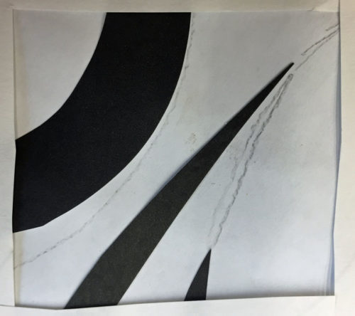
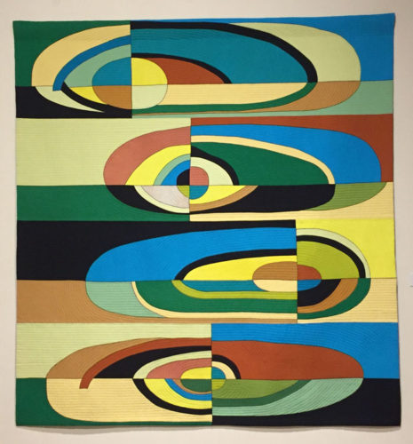
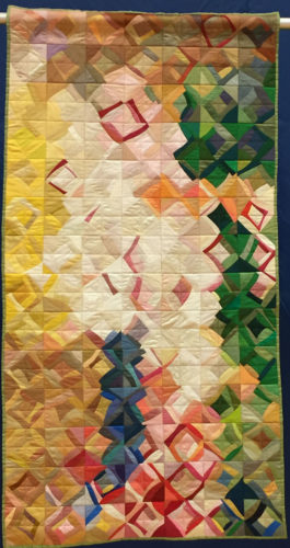
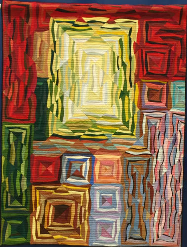
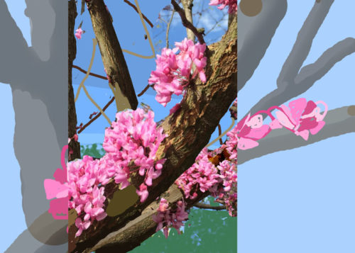
Next thought: what about leaving the center as is, but changing the two sides dramatically. Maybe painting over them and continuing.
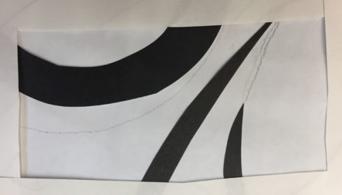
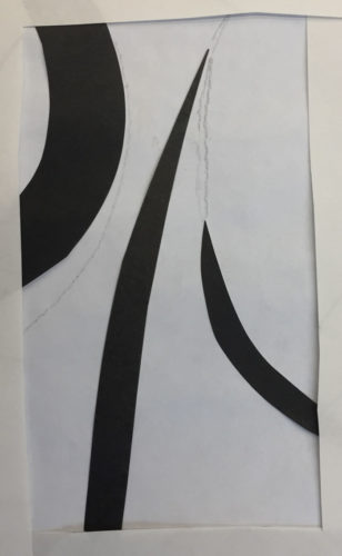
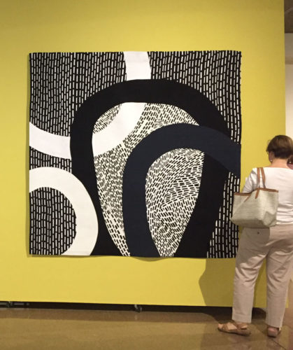
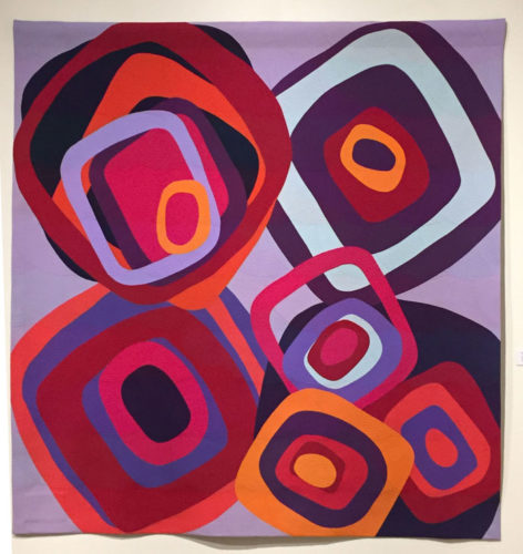
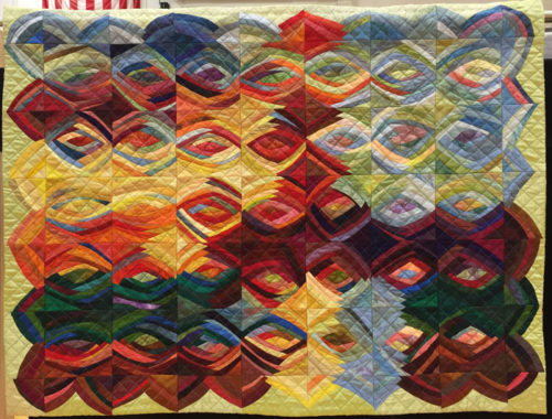
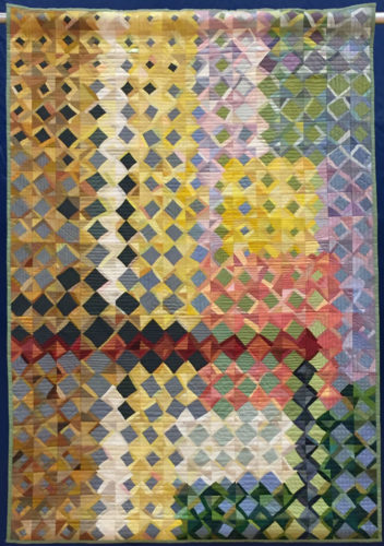
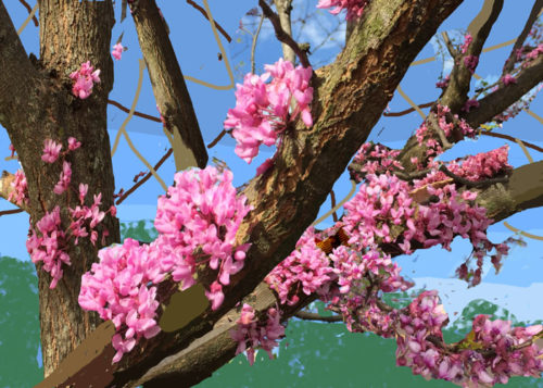
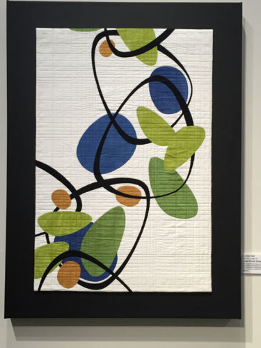
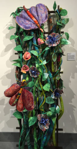
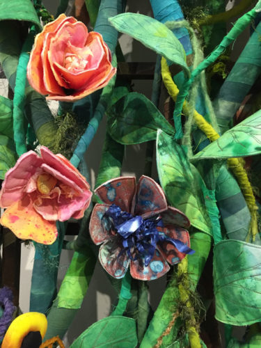
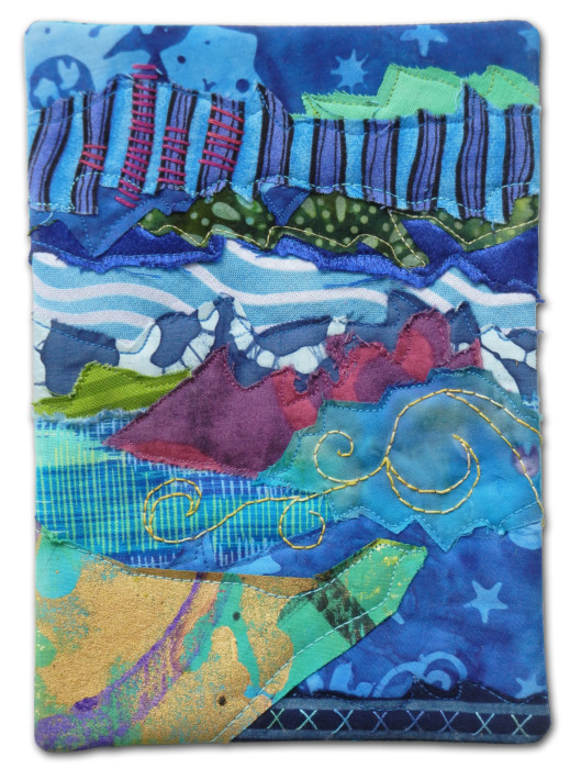
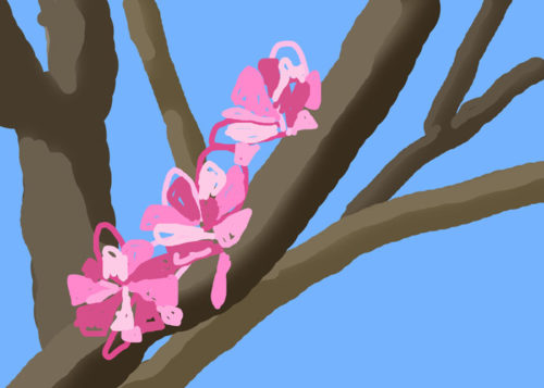
Or maybe I should just leave the background as it is and do all the abstraction with the flowers. Since I had no idea how I was going to make the flowers, anyway, this was pretty appealing. Maybe something like this.
For now, I’m going to experiment with this last idea. I really like the idea of abstracting the flowers. The question is whether the background will need something, too.
Have you noticed that I take a lot of detours? It would definitely be faster is I just went from point A to point B. But where’s the fun in that?
Ellen Lindner
P.S. UPDATE – Shirley asked “I am interested in how you use your computer to play with your designed especially in abstraction. What program do you use? I would love to see/hear how you so it.” In case you’re also interested, here’s my response.
I use Photoshop Elements for photo editing. It gives me the ability to work in layers. That way I can use different techniques on different layers, showing and hiding them as I choose. For instance, look above at the image with the clear center but the faded sides. The sides are a different layer, below the one with the in-focus center. I reduced the opacity of the side ones to give a painted-over look.
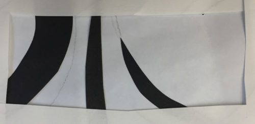
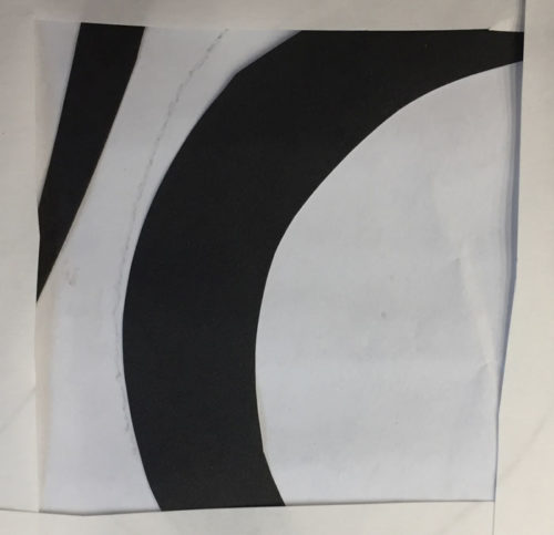
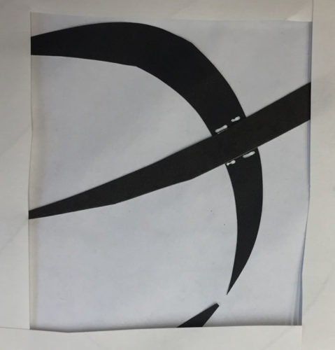
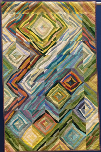
The bottom image is completely (and quickly/sloppily) drawn. It was easy to do. I created a new (invisible layer) on top of the full image. I kept the full image layer visible. Then, I used the brush tool, picked the color from the original photo, and drew on the new layer, right over the original image still visible below. The paint didn’t “stick” to that layer, since I was painting on the invisible layer above it. As though I was painting on glass with the photo underneath. I hope that makes sense.
I don’t have a great deal of “go to” tricks when it comes to abstracting, but I generally try some version of simplifying the image. In this case, I used the same painting technique described above, using a very fat brush. This kept me from focusing on details and about all I could do was depict the direction of the petals.
But before drawing the petals as described above, I first used a skinnier brush to draw some big open loop/petals. Just because I thought they’d look cool. I used them a few months ago and liked them, so I guess they were still in my head. See this post.
PSE is great software and commonly used. However, there’s a definite learning curve involved. If you want to try it, I suggest a good tutorial book or online class. I highly recommend the “Teach Yourself Visually” series for any new software purchase. At $30, these books are awesome!
Good luck with it!
Ellen Lindner