More photos from my students’ awesome work during “Design Your Own Nature Quilt,” in St. Augustine.
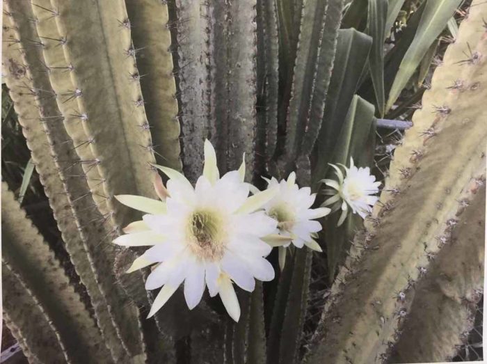
I know you love the see the students’ inspiration photos as well as where they take them. This was Victoria’s starting photo. She planned to really play up the blossoms.
And ended up with this.
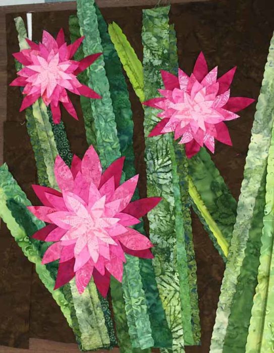
This is a wonderful example of our class motto:
Be inspired by your photo, not owned by it.
Victoria did an excellent job of keeping what she liked, exaggerating it, and altering the other elements. She also resisted the temptation to make the background so dramatic that it competed with the blossoms. As a matter of fact, that dark brown really sets off the bright blossoms beautifully, doesn’t it? That’s what contrast will do for you.
Both Kathy and Mary selected white flowers as their inspirations. These can be quite challenging, since it’s hard to show depth and shadows. However, they came prepared with very good fabric selections for shadows.
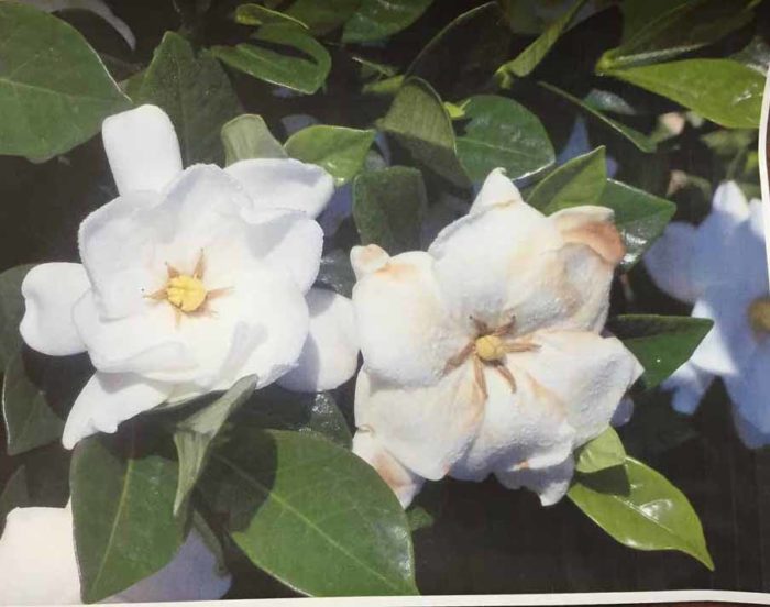
Here’s Kathy’s inspiration photo of gardenias.
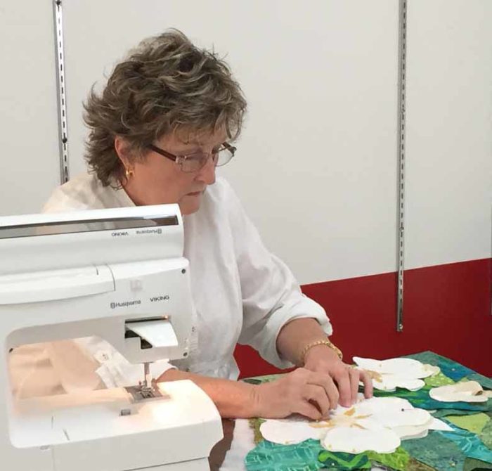
Here she is, at work.
And her quilt, nearly complete.
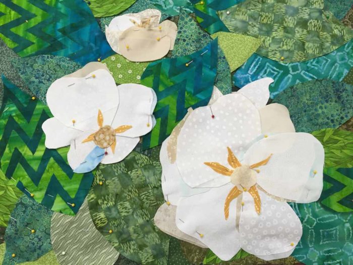
Don’t you think her composition is better? And she used tiny slivers of tans and pale blue to create shadows. Nice work!
Mary used a magnolia blossom as her inspiration.
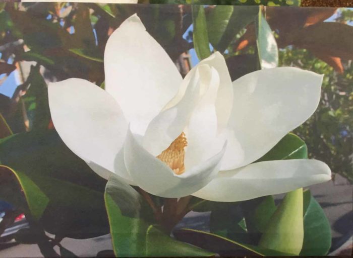
She worked the background very loosely, but kept the flower very close to her photo. Here it is, well along.
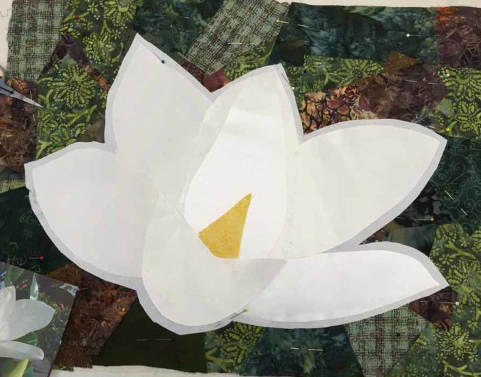
Mary used white satin fabric for her flower. The petals do look a little different, due to the grain of the fabric and the way the light hits it. She’s also got some pale gray tulle she’ll add for shadows.
Mary often hand stitches her pieces down using a ladder stitch. She plans to do this for the background and maybe the flower as well. If so, it will add a great amount of definition to the petals.
Laura used a photo of – hmm, I don’t know – some type of blue/purple mountain flower.
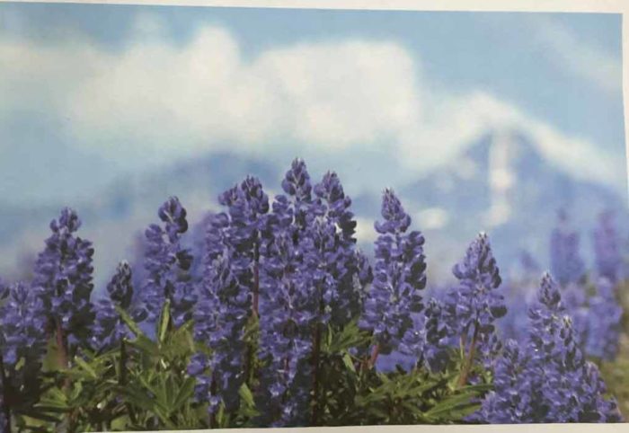
As with Rosemary, we discussed the challenge of ALL THOSE little flower clusters. She decided she would edit the number of flowers in order to keep the details manageable.
The mountain in the background was important to Laura, so she spent a good bit of time getting it and the foreground grasses just right. This was time well spent.
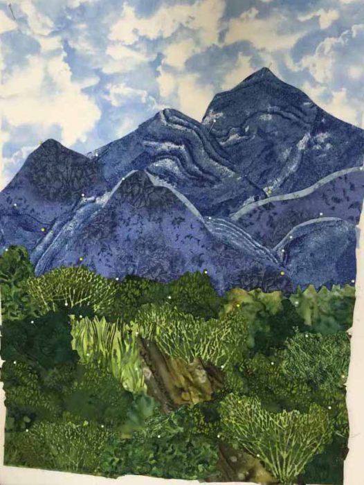
For her flowers, she cut a background shape, but then sprinkled on little contrasting bits of other values. Although she has a bit more fine tuning to do, this is going to work beautifully.
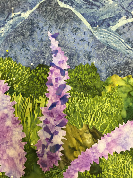
Yes, she edited her flowers down to only three. It’s a great composition, but I forgot to get a photo.
By the end of day two, most everyone had shed their name tags. I was mock complaining since I often photograph the work, and then the student’s “chest”/name tag, so I’ll remember what belongs to whom. Laura asked, “Oh, you want my name of my chest?” and did this.
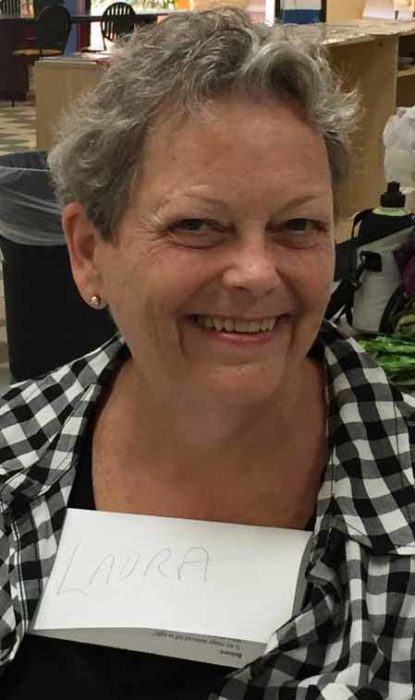
Just one example of the fun we had.
Would you like to schedule this two day class for your group? You’ll find a full description here.
Ellen Lindner


I am so inspired by these photos and love your mtto. As someone who is just starting to use my photography as a starting place, I love how the greens etc are pieced from different fabrics,which makes the fabric art so much more interesting. Love your blog!
Beautiful quilts! You’re inspiring me to go back to the drawing board with my nature quilt!
Yes, Sharon, they did great work, and I’d love to see YOURS!