Gee, I haven’t shown you a new quilt in a while. But, in the midst of teaching, exhibits, and TV shows, I’ve still been able to (intermittently) work on my latest abstract quilt. When I last showed it to you, the background was complete and I had decided to add some white squares. I auditioned that idea with some computer sketching.
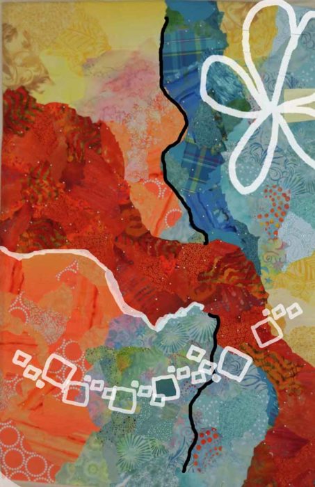
And then I began to add the white squares.
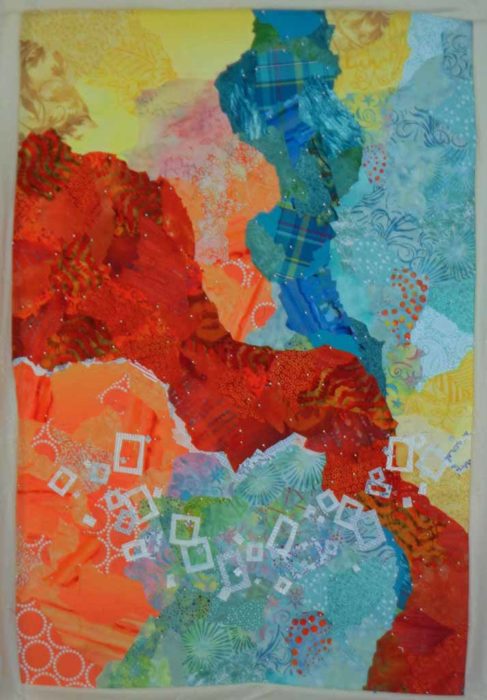
Hmm. They didn’t show up that well. Would blue-green be better?
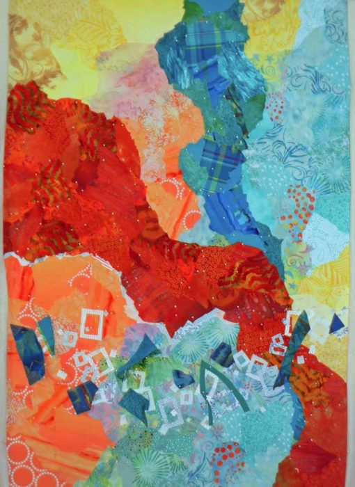
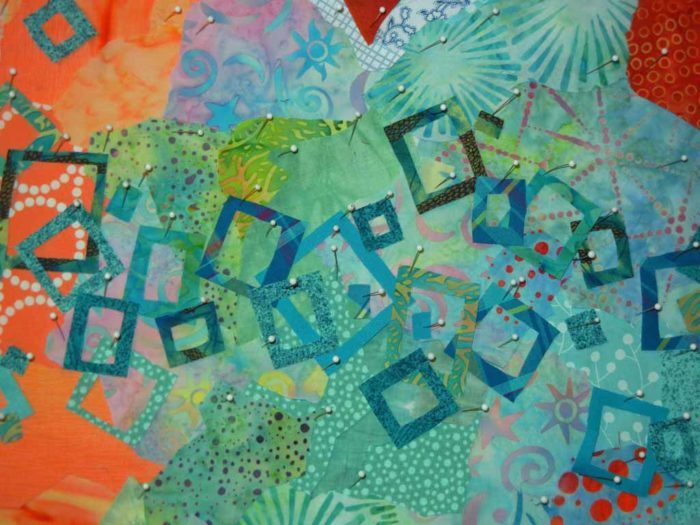
I tried it out with fabric scraps and decided this was the way to go.
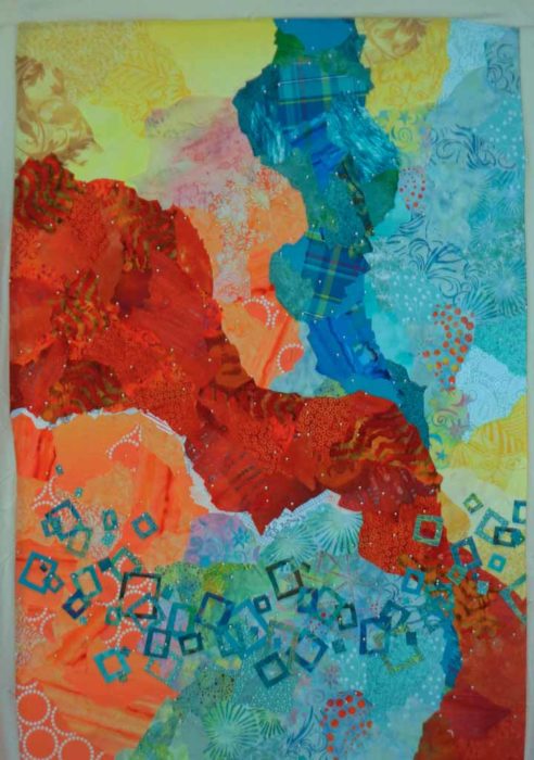
Yes, much better. That took A LOT of pins.
I began to consider where to add the large flower.
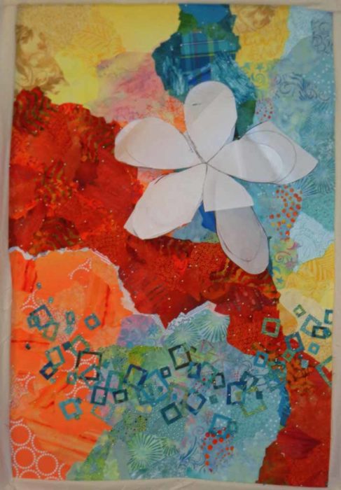
Maybe something like this.
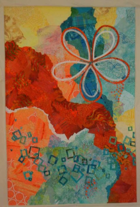
I made some marks, but then lifted it in order to add some other things.
What about a ghost flower? (Top left.) It didn’t show up very well, so the jury was still out.
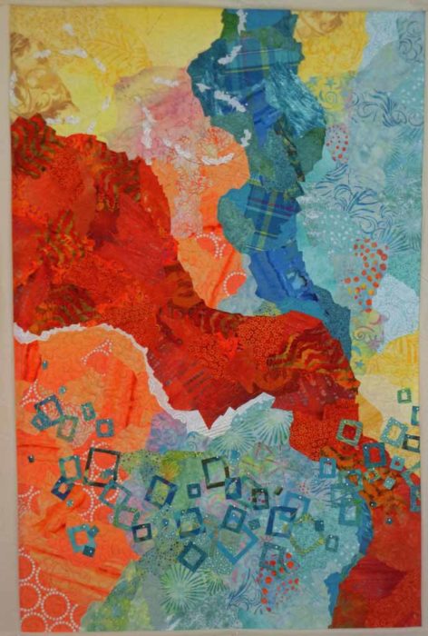
I added a navy line for contrast. I think it helped a lot.
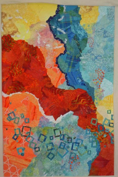
I put the flower back (in a slightly new location,) removed the ghost flower, and made a few final additions. Among them, I added subtle squares in the background, and subtle X shapes in the large rust/orange shape. Just a little repetition, texture, and interest.
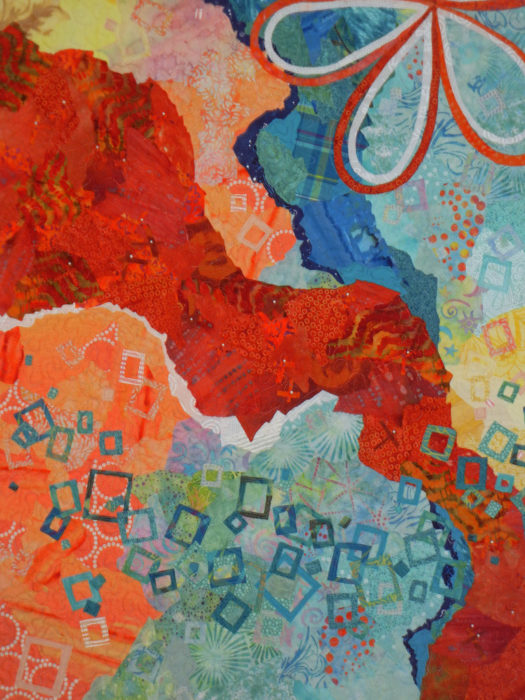
Finally, I trimmed it, and began to prep the facing fabric.
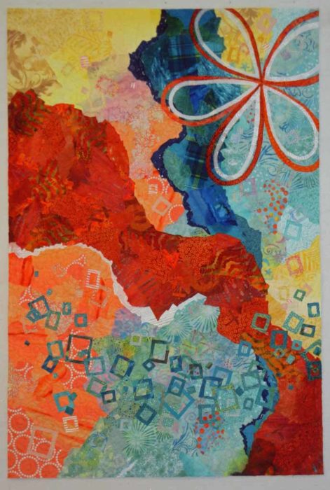
But wait. How would this look upside down?
Ellen Lindner


that dark blue “line” made the whole thing come alive, good call!
Thanks, Cindy. Yes, it needed some contrast.
I’m with you all the way–but my brain freaked out when you said turning it upside down. It looks SO RIGHT with all those little squares weighting down the bottom. The blue/orange is a winning combination.
I’m chuckling, Martha, because that’s the way my brain works: “This looks good…that looks good…I’m happy with it…BUT WAIT!” If I get an idea I just have to play with it!
I love blue and orange together. Especially blue-green and orange (or orange-red even.)
Love viewing your thinking process,thanks for sharing.
Thanks for reading, Cari! It’s fun to share my process.