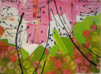
After doing LOTS of trial and error on my current quilt, I finally decided to cut it into pieces and to reassemble it. My goal was to add some skinny or small pieces of black, to move the black around the piece more, and to add interest to the composition.
Of course, I could cut the piece into equal panels, but I decided to audition more radical solutions first. (As you may have guessed, my experimentation was done on the computer.)
What if I cut it into curved shapes and then rejoined them?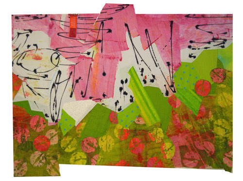
And added black between the pieces.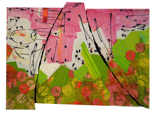
Interesting, but sorta…hmm, awkward.
What if I cut it into angled shapes and reassembled them?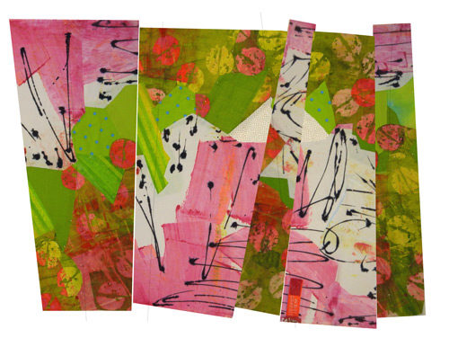
This time (above) I also rotated some of the pieces 180 degrees and I rearranged the position of the panels. That added a lot of energy, I thought.
Next, I added black between.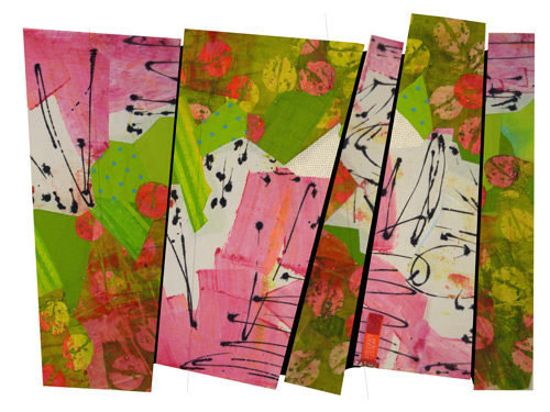
I was pretty happy with this. But, it was time to also consider more predictable arrangements. Here, I’ve “cut” my composition into 4 panels.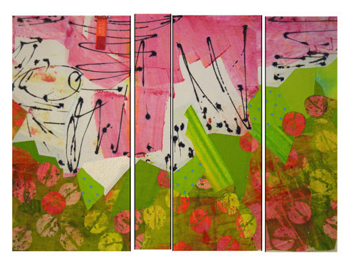 It looked a little boring after some of the earlier arrangements. What if I flipped some of the panels?
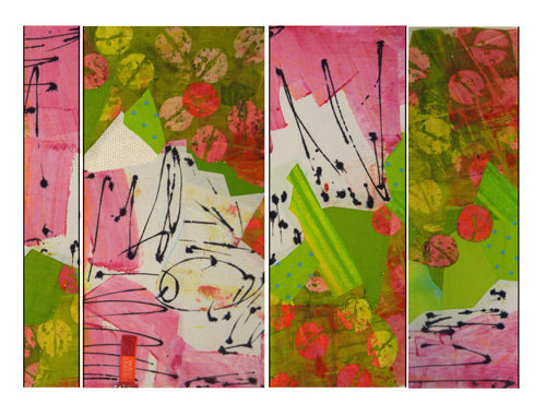
Ah, yes. This has much more energy. Should I move the panels around? And maybe scoot things out of alignment a bit?
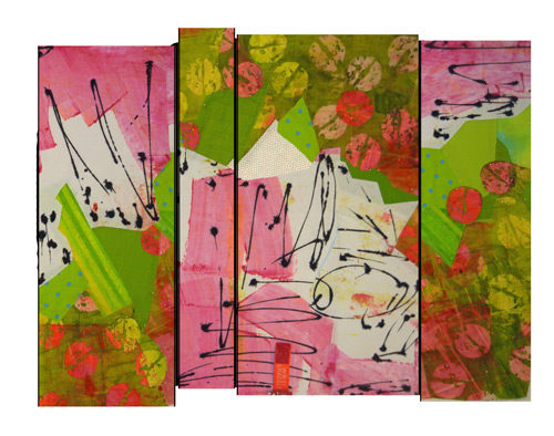
That’s pretty cool. But, I eventually decided the irregular shape didn’t really add to the composition.
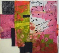
So, here it is: my final plan.
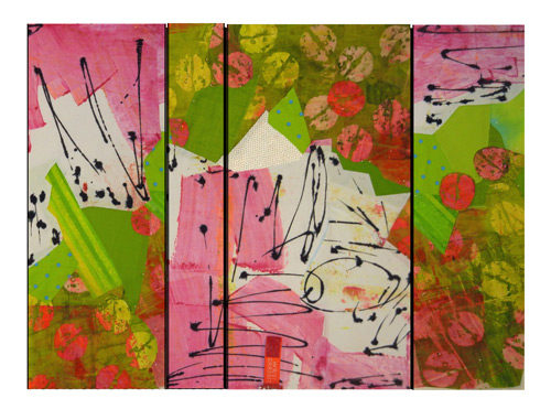
I’m kinda in love with it. To me, it has the right amount of energy and the black lines help pull it all together. Time to quilt!
Oh yeah, have you got any ideas about a title for this piece? I’d love to hear your suggestions.
Ellen Lindner
P.S. THANKS to so many readers who offered their thoughts and suggestions on my earlier post. I had more comments than almost any other post. I hope you’ll also chime in on this one!

For me I really like to uneven pieces flipped around with the uneven edges….I think that’s the way I would have done it.
Thanks for all your inspiration and teachings. I saw you recently in Port Saint Lucie, Florida and really enjoyed your
Lecture.
Those jagged edges ARE very appealing, Valerie. Maybe I’ll revisit that idea. (Even though it’s technically challenging.)
I’m glad you enjoyed the lecture last week. I had so much fun there!
It reminds me of sitting in a nice lady’s beautiful flower garden — as a kid — eating watermelon. The most fun is spitting the seeds. i’m not saying the piece looks like spitting, just that it captures the sheer delight of it all. LOVE the fabrics! I kind of liked the wonky rearrangement2, as well, but it does not give the feel of a garden as much. I think the “formal” panels contribute to that juxtaposition of carefully manicured garden with carefree childhood watermelon. See… you created a story you didn’t even know was there!
Candy, I love your interpretation. A very nice story. Several other people have also mentioned that this piece made them think of watermelon.
I absolutely LOVE your work Ellen, to be a fly on your wall…Keep creating beautiful and inspiring art!!
Thanks so much Michele!
I like the one you call awkward but would cut the tails off. I love the curving black lines and might add one more and call it done.
Hi Susan. Thanks for your comment. The awkward one DOES have some merit. Maybe I’ll explore that idea more the next time I’m doing this sort of experiment.
Again, I love seeing all the variations on this. I love your final composition. What software do you use for the digital rearranging? A name did pop into my head when you asked for a suggestion – Summer Dalliance.
Hi Kristin,
I like that name a lot.
I’m using Photoshop Elements for all this manipulating. It worked well for the straight cuts but actual print and cut would have been easier for the curvy one.
Agree with Susan Sawatzky…I like the curved, awkward one best. The weight of the pink and green are more visually balanced to my eye, and you still have that sense of energy.
Thanks for commenting, Michelle. That arrangement does have a lot of energy. Perhaps something for me to revisit.
I love it. I absolutely love it!!!
Title? “Eat Your Heart Out, Lily!”
Thanks, Nancy!
I always enjoy seeing another person’s design process- thank you for sharing. Just about any of the compositions could have gone somewhere, but there is only one “you” making the final decisions. Can’t wait to see what happens next.
I do the same types of things— I’m not so adept at doing it on computer, so I’ll print photos and cut those up. If it’s complicated, I try to remember to take notes so I can do it again In Real Life. For my latest quilt, I printed out photos in grayscale in “fast” mode (to save ink), so I could try different quilting patterns. It’s not to scale and it’ll be different on the real quilt, but it gave me good ideas for what not to do—- and what I liked.
Thanks again for sharing.
Wendy, you’re so smart. I should have definitely done the print and cut method for that curvy one. It was rather cumbersome to do on the computer, (at least with my skill level.) I’ll try to remember this tip for next time.
At first I really liked #4. But your choice has really grown on me. To me it just screams Florida. Beautiful work (and Photoshop skills!).
Thanks, Deb. I’m having fun with it!