As usual, my current quilt started with a high contrast piece of hand dyed fabric. This is all I had of it.
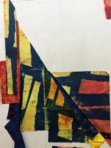
What could I do to best show it off?
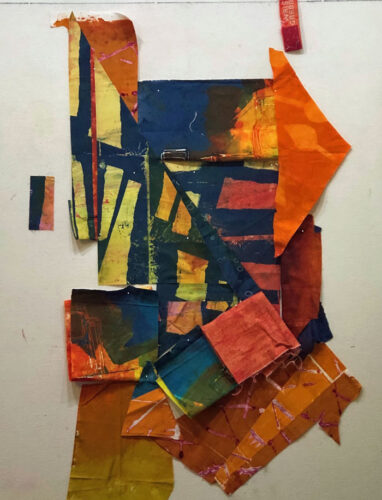
The additional fabrics added above provided interest, but the original fabric swatch still seemed rather straight forward.
It was kinda hard to judge against white. I knew I wanted a blue background, so I added some to the design wall to help me judge the overall look.
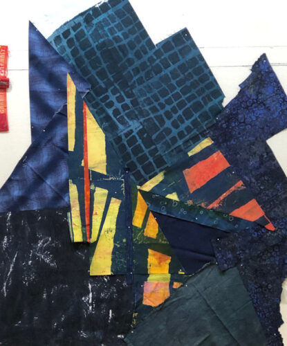
I split the featured print and splayed it apart. I thought this added energy, plus some interesting negative blue space.
I began to audition additional colors and fabrics. What about a mass of orange on the right and across the bottom? I placed folded fabrics to consider options.
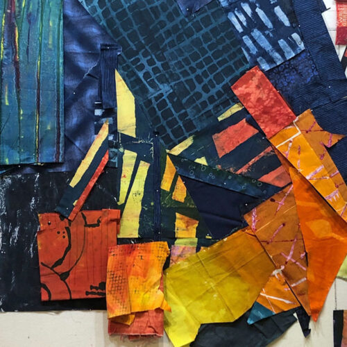
My orange fabric was limited and I knew I’d have to work with the shapes I had: sharp triangles.
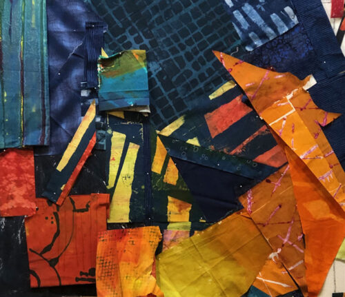
That didn’t seem objectionable. However, I did get rid of the vertical yellow point near the center.
As you might imagine, there was some fiddly stitching on this one. It was actually easier than I expected and I’ll show you some about how I did it in the next post.
My next question: what to do with the lower left.
Ellen Lindner


This is going to be an exciting piece, given the sharp angles and (my favorite) color combinations. Thanks for sharing your process steps—I wish I were there!
Thanks, Martha! I’m having fun watching it evolve.