Tag Archives | Design

Should I Make it More Abstract?

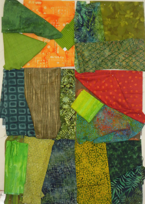
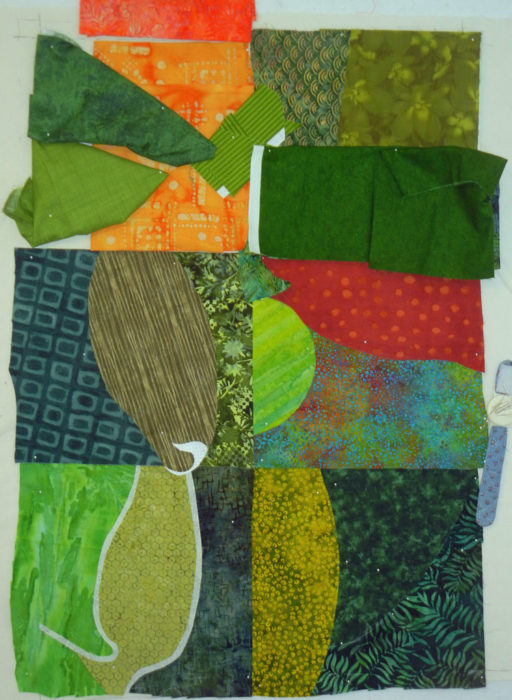
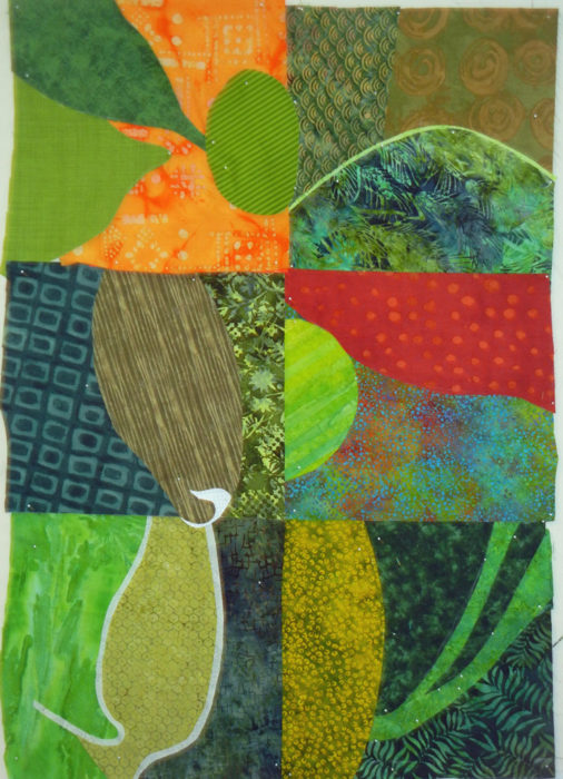
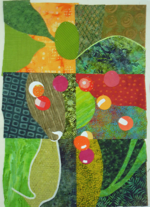
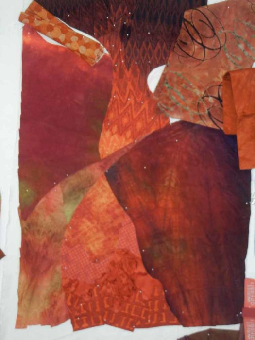
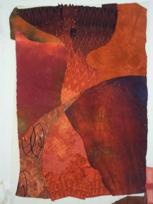
I’m really happy with the way the background of my Red Bud quilt is turning out.  Here it is before quilting.
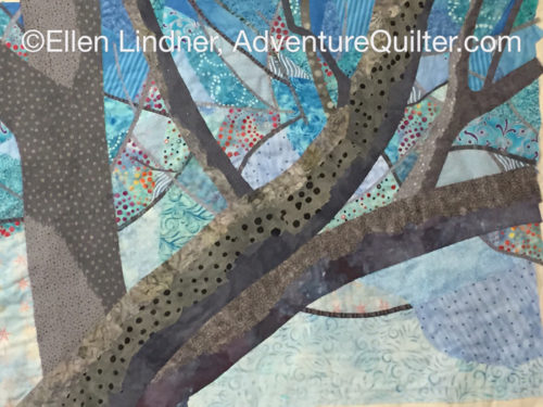
Should I Make it More Abstract? Ellen Lindner, AdventureQuilter.com/blog

This image shows the heavy quilting I did on the tree trunks.
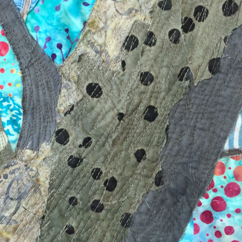
Should I Make it More Abstract? Ellen Lindner, AdventureQuilter.com/blog

But, about the time I finished quilting the background I had a sort of disturbing thought.  That is “would it look better if it were more abstract?”  Hmm.  Making something abstract isn’t disturbing at all to me.  But, doing so this far into a quilt seemed daunting.

Still, I began to sketch options on my computer. First option: what if I cut the background into three pieces and added to each of those to complete three different quilts.  The idea was intriguing, but the work load was not.  (You may remember that I’ve done a bit of this lately on a smaller scale.)
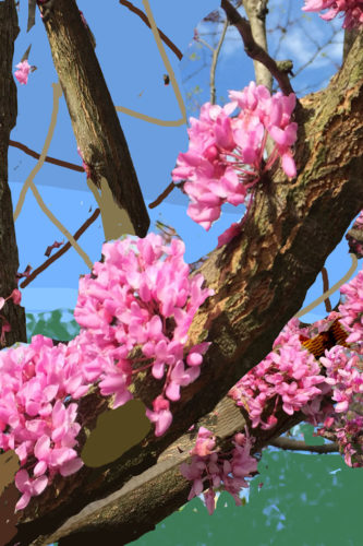
Should I Make it More Abstract? Ellen Lindner, AdventureQuilter.com/blog

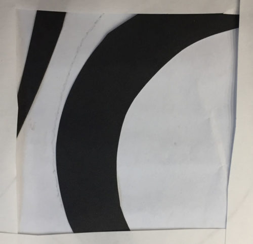
Next thought: what about leaving the center as is, but changing the two sides dramatically.  Maybe painting over them and continuing.
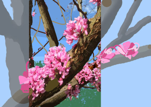
Should I Make it More Abstract? Ellen Lindner, AdventureQuilter.com/blog

Or maybe I should just leave the background as it is and do all the abstraction with the flowers.  Since I had no idea how I was going to make the flowers, anyway, this was pretty appealing.  Maybe something like this.
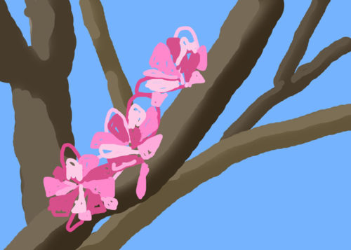
Should I Make it More Abstract? Ellen Lindner, AdventureQuilter.com/blog

For now, I’m going to experiment with this last idea.  I really like the idea of abstracting the flowers. The question is whether the background will need something, too.

Have you noticed that I take a lot of detours?  It would definitely be faster is I just went from point A to point B.  But where’s the fun in that?

Ellen Lindner
P.S. UPDATE – Shirley asked “I am interested in how you use your computer to play with your designed especially in abstraction. What program do you use? I would love to see/hear how you so it.” In case you’re also interested, here’s my response.

I use Photoshop Elements for photo editing.  It gives me the ability to work in layers.  That way I can use different techniques on different layers, showing and hiding them as I choose.  For instance, look above at the image with the clear center but the faded sides.  The sides are a different layer, below the one with the in-focus center.  I reduced the opacity of the side ones to give a painted-over  look.

The bottom image is completely (and quickly/sloppily) drawn.  It was easy to do.  I created a new (invisible layer) on top of the full image.  I kept the full image layer visible.  Then, I used the brush tool, picked the color from the original photo, and drew on the new layer, right over the original image still visible  below.  The paint didn’t “stick” to that layer, since I was painting on the invisible layer above it.  As though I was painting on glass with the photo underneath.  I hope that makes sense.

I don’t have a great deal of “go to” tricks when it comes to abstracting, but I generally try some version of simplifying the image.  In this case, I used the same painting technique described above, using a very fat brush.  This kept me from focusing on details and about all I could do was depict the direction of the petals.

But before drawing the petals as described above, I first used a skinnier brush to draw some big open loop/petals.  Just because I thought they’d look cool.  I used them a few months ago and liked them, so I guess they were still in my head.  See this post.

PSE is great software and commonly used. However, there’s a definite learning curve involved.  If you want to try it, I suggest a good tutorial book or online class.  I highly recommend the “Teach Yourself Visually” series for any new software purchase.  At $30, these books are awesome!

Good luck with it!
Ellen Lindner
7

Designing a Red Bud Quilt

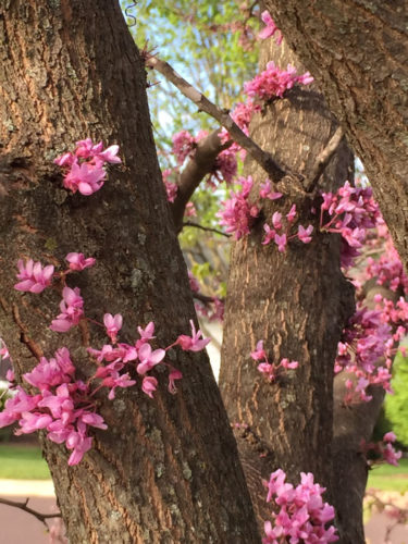
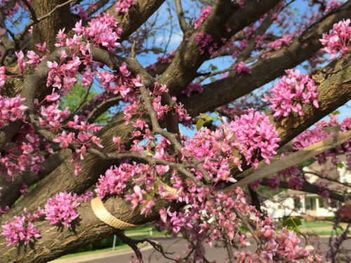
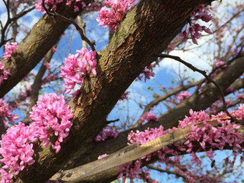
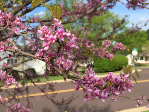
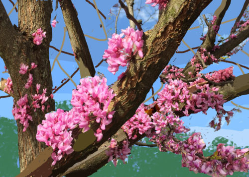
After viewing blooming Red Buds in Virginia in April, I was inspired to make a quilt.  I thought I’d have a difficult time depicting them from a distance, so I decided to feature their blossoms close up.  To that end, I took a bunch of photos.

Designing a Red Bud Quilt. Ellen Lindner, AdventureQuilter.com/blog

Gorgeous, right?

Designing a Red Bud Quilt. Ellen Lindner, AdventureQuilter.com/blog

Designing a Red Bud Quilt. Ellen Lindner, AdventureQuilter.com/blog

Designing a Red Bud Quilt. Ellen Lindner, AdventureQuilter.com/blog

Designing a Red Bud Quilt. Ellen Lindner, AdventureQuilter.com/blog

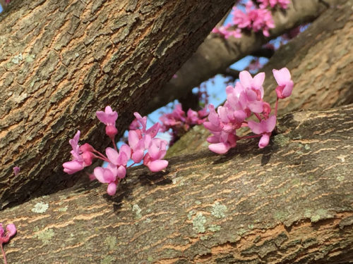
I think it’s so interesting the way the blossoms pop directly out of the bark.

I spent quite a bit of time merging and resizing photos on the computer and finally came up with this as a sketch.

Designing a Red Bud Quilt. Ellen Lindner, AdventureQuilter.com/blog

The sky and branches should be pretty straight forward, but what about those blossoms?  I think some experimenting will be in order.

Ellen Lindner
P.S. Check out some of the other flowers I’ve created in this gallery.

2

Project Resurrected

Remember the “project that wasn’t?”  After sketching it I decided not to proceed with it.  My issue was that it looked too jumbled, and therefore didn’t accurately depict the plant that inspired me.

My inspiration photo:The Project that Wasn't. Ellen Lindner, AdventureQuilter.com/blog

The initial sketch:

The Project that Wasn't. Ellen Lindner, AdventureQuilter.com/blog

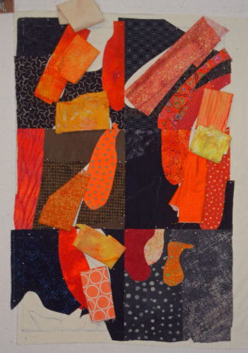
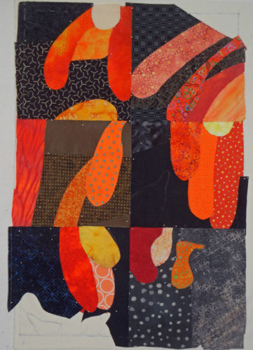
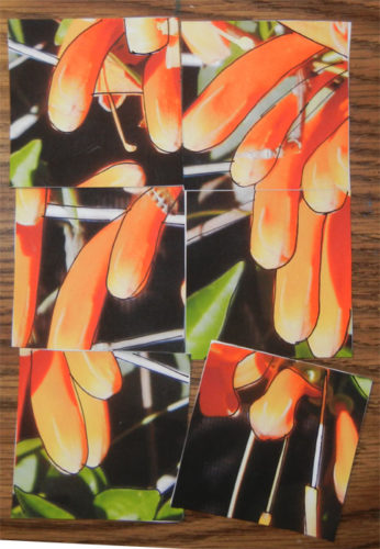
However, I was slow to put the sketch away so it lived on my design wall for a while.  That gave me time to consider it further and I thought, “Why work so hard at making it just an abstract design?  Why not let it look more like the subject?” So, I rearranged my six squares a good bit and came up with this.

Project Resurrected. Ellen Lindner, AdventureQuilter.com/blog

There. That was more like it.  Definitely abstracted, but with the nice curve and drape of a few flower petals.  I was happy enough to continue.

Next came a computer sketch.

Project Resurrected. Ellen Lindner, AdventureQuilter.com/blog

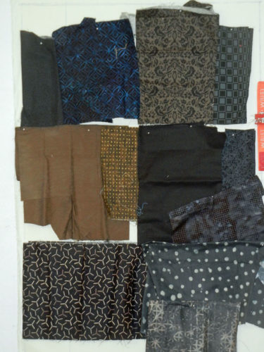
Still happy.  Time to audition fabrics.  Starting with “black” for the six backgrounds.

Project Resurrected. Ellen Lindner, AdventureQuilter.com/blog

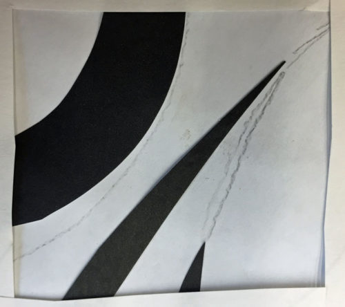
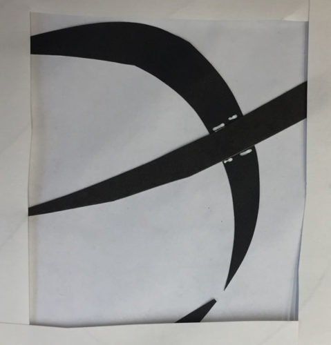
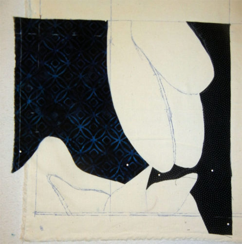
I constructed this piece in a very non-standard way using reverse applique.  That is, I cut the black fabric to the needed shapes, so other fabrics could be tucked underneath. Like this first block, bottom left.

Project Resurrected. Ellen Lindner, AdventureQuilter.com/blog

Why use this technique?  One reason: to avoid the black fabric from shadowing through the lighter ones.  Putting black on top got rid of this issue.

From a technical standpoint this worked well.  The only issue is that it was difficult to change my mind, since the first version would be cut before I realized I wanted a change.  Thankfully, my design explorations meant that I needed only a couple of very minor changes.  Whew!

Project Resurrected. Ellen Lindner, AdventureQuilter.com/blog

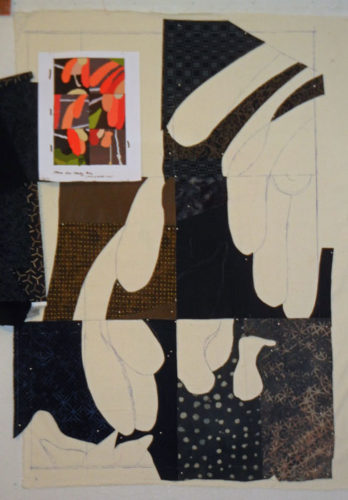
Above, most of the black cuts were done.  Time to audition petal fabrics.

Project Resurrected. Ellen Lindner, AdventureQuilter.com/blog

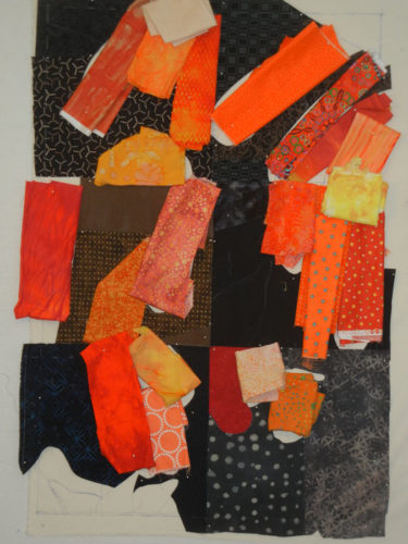
Auditioning is extremely important.  I always tell my students “everything affects every other.”  Which means you can’t make a decision in isolation.  You have to see how each fabric, item, or placement will work with those around it.  For instance, look at the middle two fabrics above, in the left center block.  Can you see that they blend together a little bit?  So, I changed one of them, which you can see below.

Project Resurrected. Ellen Lindner, AdventureQuilter.com/blog

The photo above shows the flower petals partially complete.  They were pretty easy to do, since most of the shaping had already been done with the black fabric.

Here the flowers are, complete.

Project Resurrected. Ellen Lindner, AdventureQuilter.com/blog

Green leaves and other details would happen soon.  I’ll show you next time.

Ellen Lindner


6

Welcome to Provence

Every so often my small art quilt group, Dirty Dozen Fiber Artists, likes to have a group challenge.  Frequently, we use a photograph as our starting point.  We select something with lots going on so different people can respond to different elements.

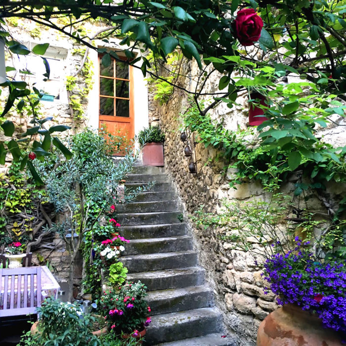
This is the photo we selected for our recent challenge, “Welcome to Provence.”

Welcome to Provence inspiration photo. Ellen Lindner, AdventureQuilter.com/blog

As you can see, it provides a lot to work with.  I was intrigued by the worn spots in the centers of each step.  I decided to feature them and to include lots of foliage, as well.

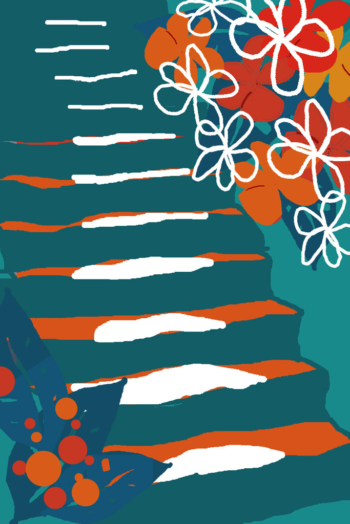
Of course, I couldn’t do it in realistic colors!  The gray and tan just didn’t excite me, so I changed things up.  This was my computer sketch.

Welcome to Provence. Ellen Lindner, AdventureQuilter.com/blog

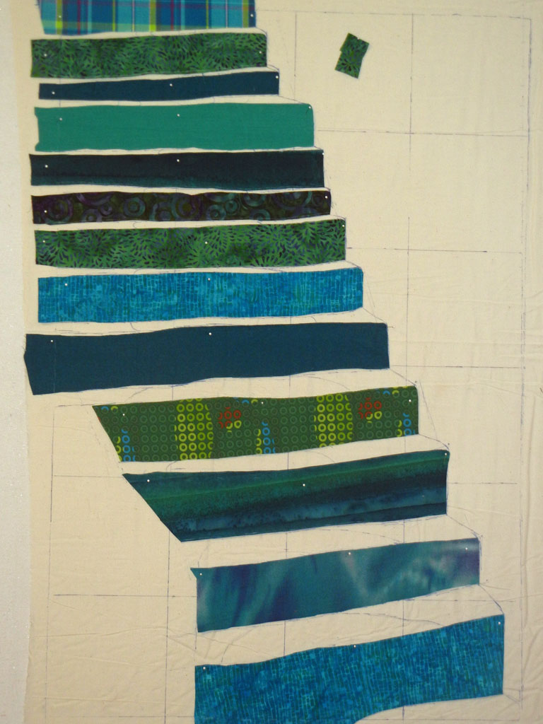
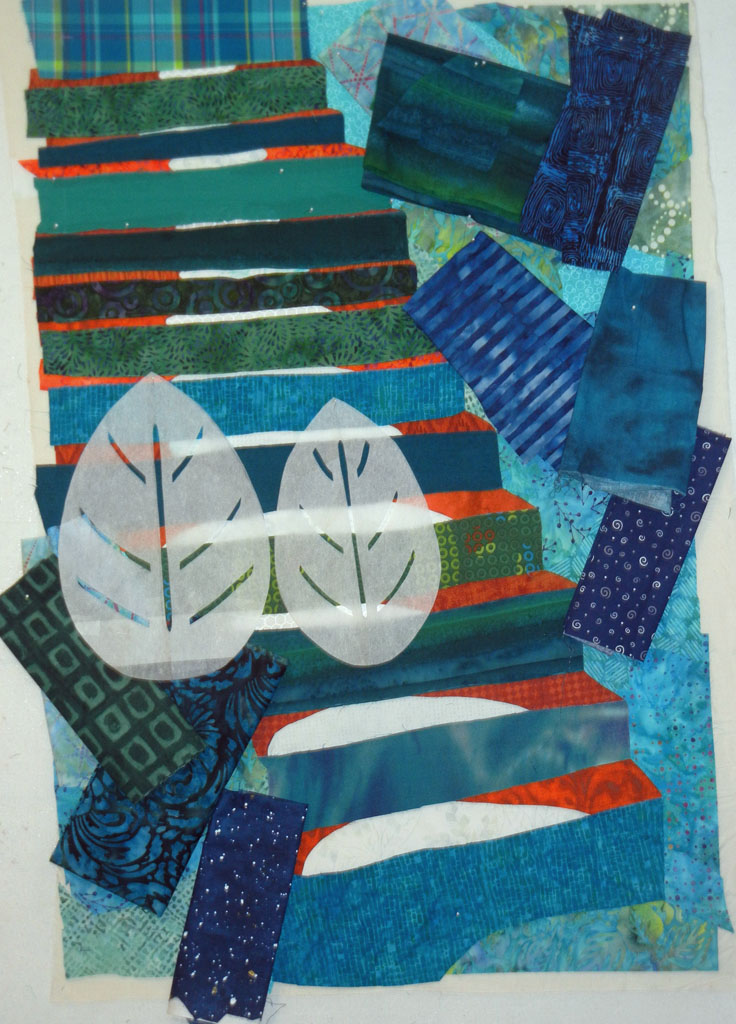
I got to work on the steps.

Welcome to Provence. Ellen Lindner, AdventureQuilter.com/blog

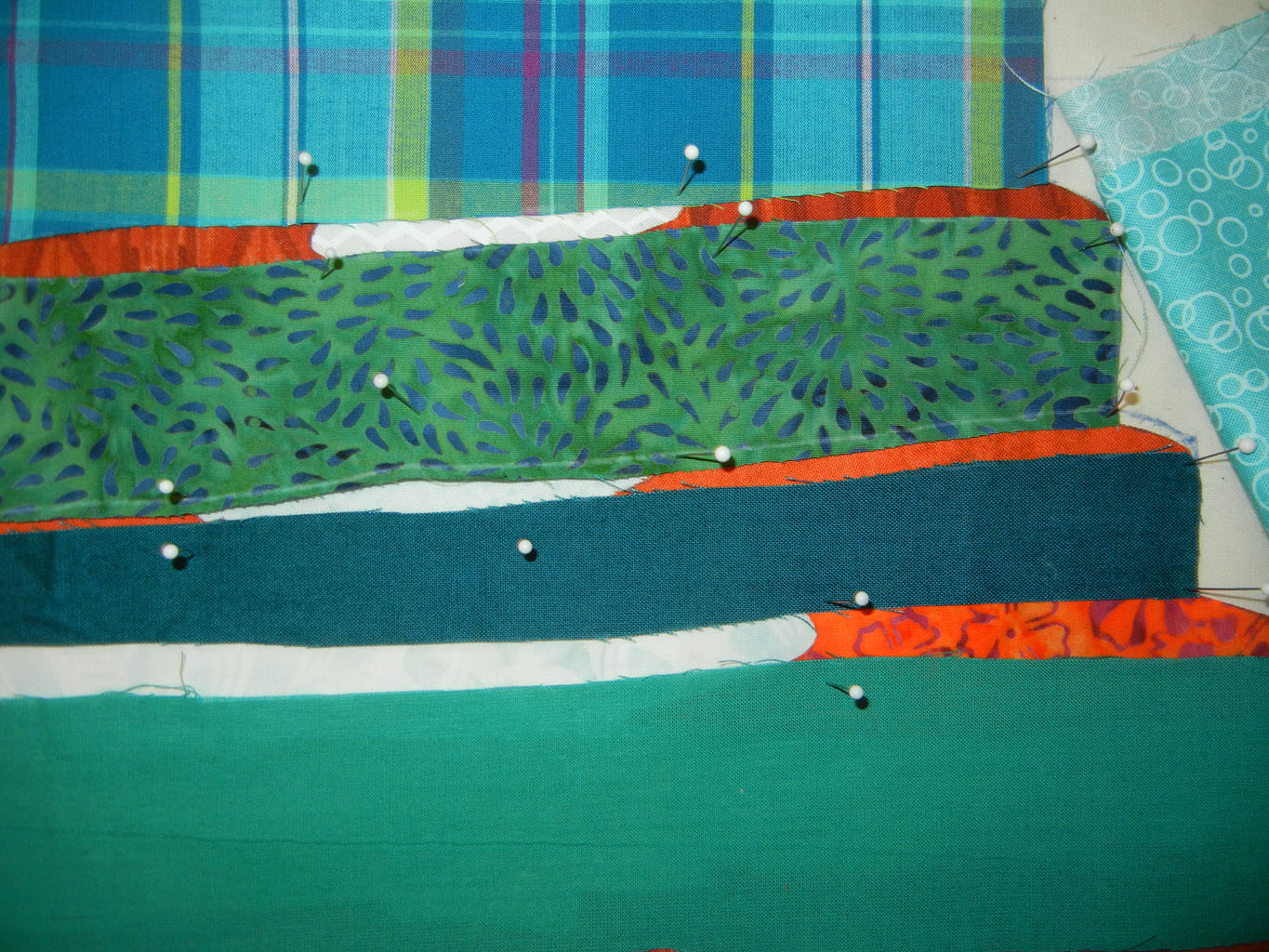
There were lots of pins involved.

Welcome to Provence. Ellen Lindner, AdventureQuilter.com/blog

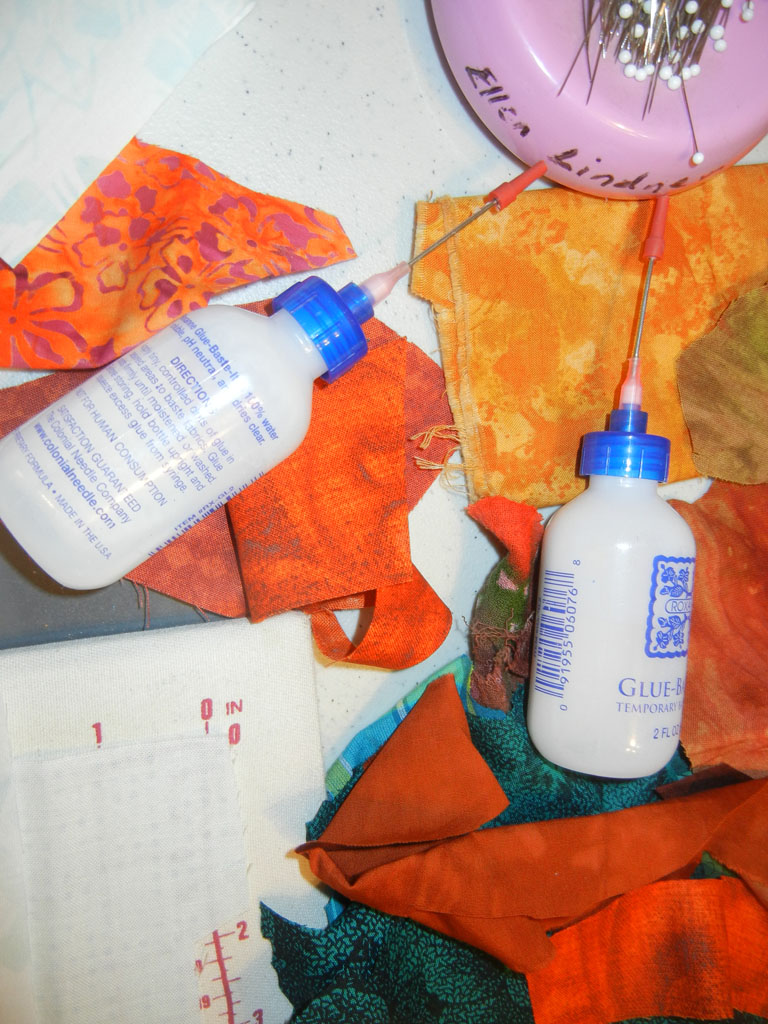
And, eventually, glue.

Welcome to Provence. Ellen Lindner, AdventureQuilter.com/blog

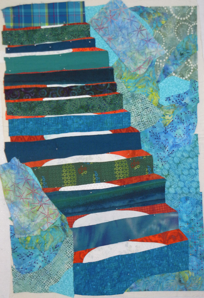
Next came the background, in-progress below.

Welcome to Provence. Ellen Lindner, AdventureQuilter.com/blog

Once the background was complete, I quilted the entire piece.  This avoided lots of stopping and starting with the quilting later, since I knew some places would be largely covered with yet-to-be-added items.

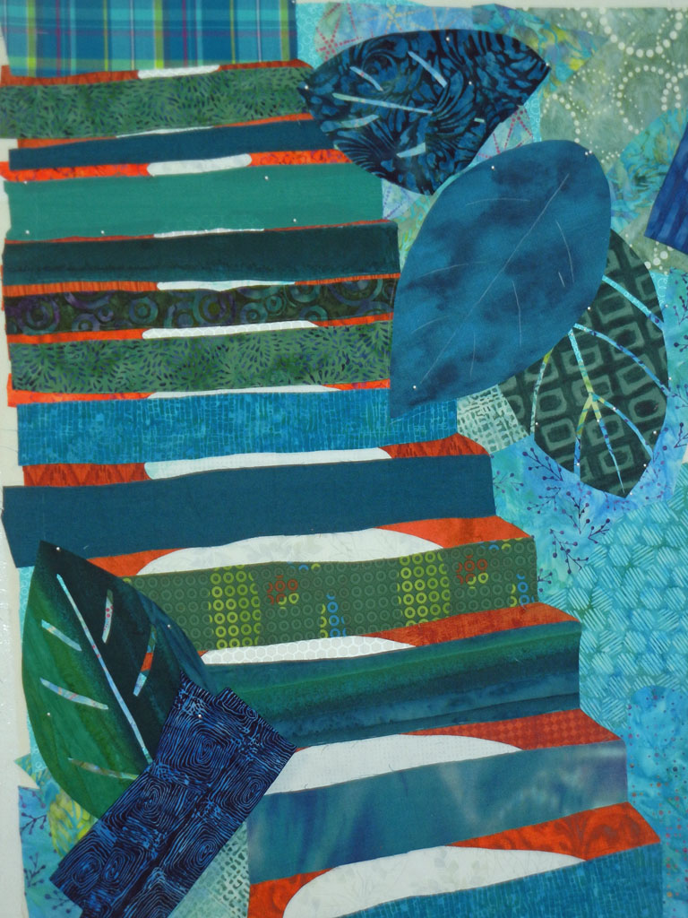
Next, it was time to audition fabrics and shapes for the large leaves.

Welcome to Provence. Ellen Lindner, AdventureQuilter.com/blog

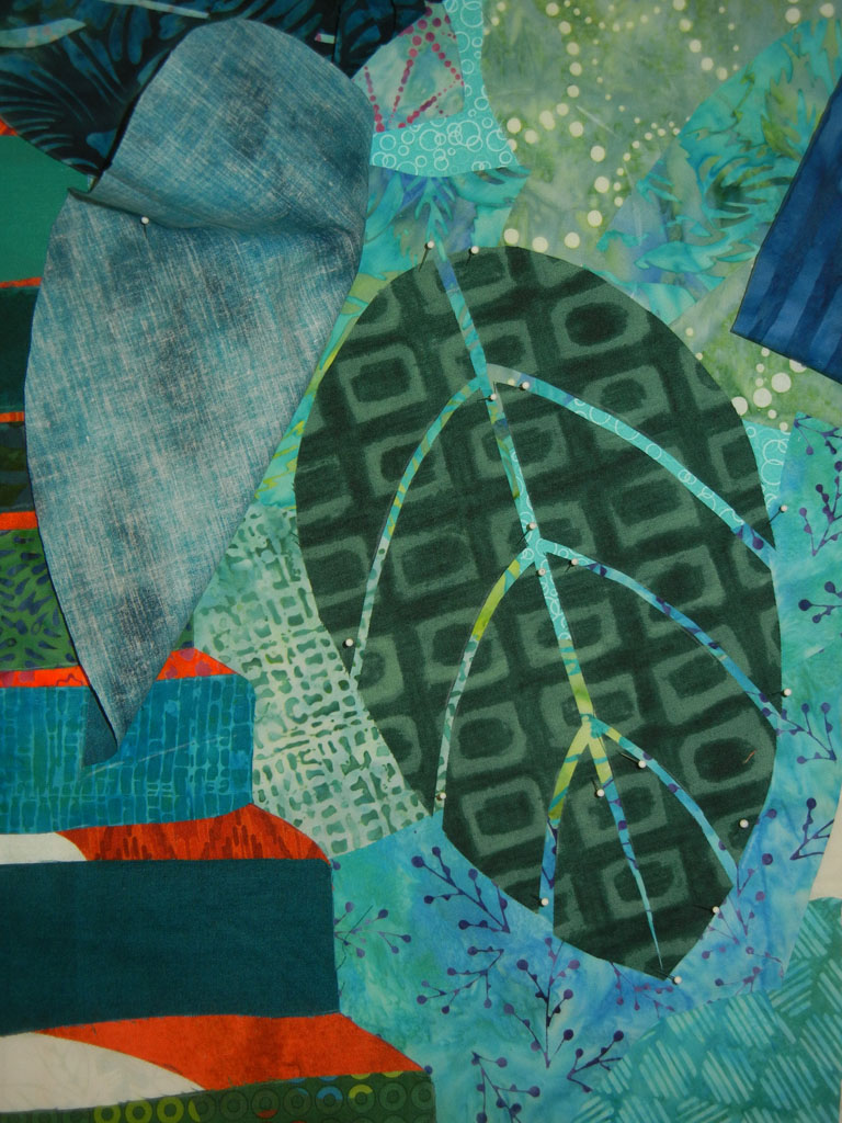
I was happy with the veining technique I used on the leaves: simply cutting the leaves into sections.  The gaps served as veins.

Welcome to Provence. Ellen Lindner, AdventureQuilter.com/blog

Welcome to Provence. Ellen Lindner, AdventureQuilter.com/blog

Soon, the background and leaves were complete and it was time to tackle flowers.  I’ll show you that in the next post.

Ellen Lindner


4

The Project that Wasn’t

Have you ever lost steam on a project part way through?  This happened to me recently, only I lost interest before I even got started.

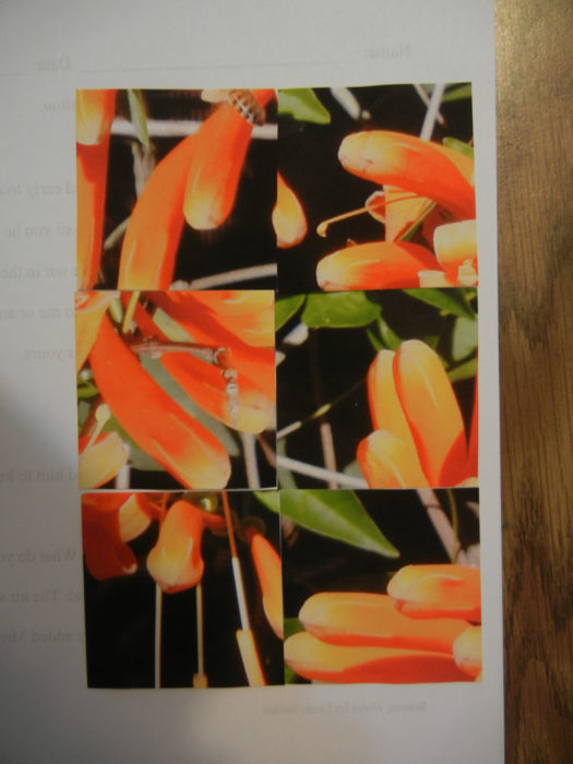
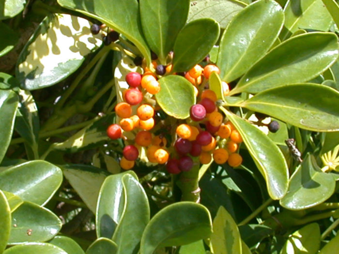
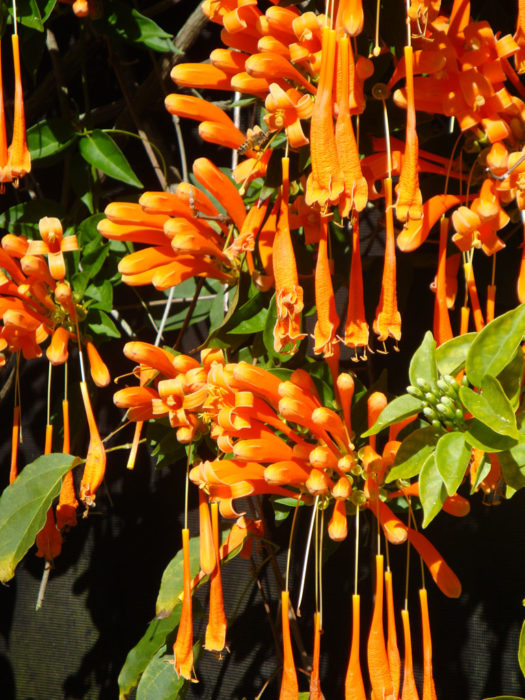
After the FUN and success of Bush Berries, I was excited to try another “cut and paste” design.  I started with this photo of a Flame Vine.

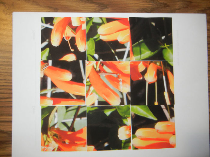
Pretty awesome, right?  I decided to cut it into squares, as I had done before and to rearrange the sections.  9 pieces, perhaps?

The Project that Wasn't. Ellen Lindner, AdventureQuilter.com/blog

Or, maybe just six.

The Project that Wasn't. Ellen Lindner, AdventureQuilter.com/blog

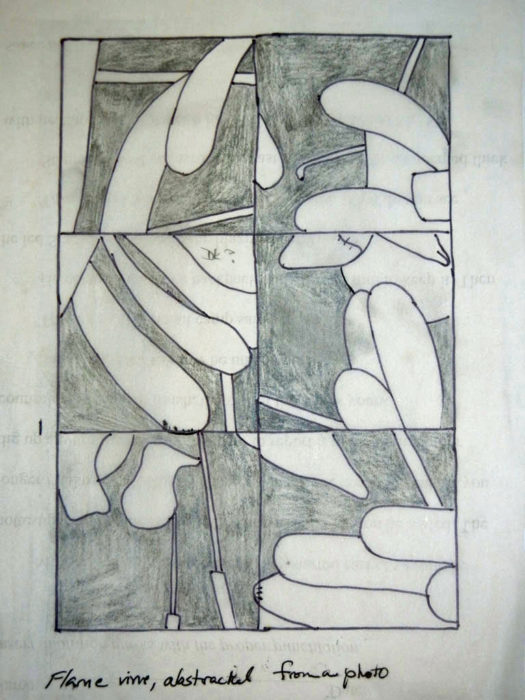
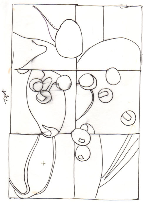
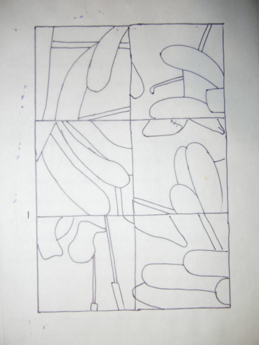
I preferred the six-block option and traced the main lines to get a pattern.

The Project that Wasn't. Ellen Lindner, AdventureQuilter.com/blog

The Project that Wasn't. Ellen Lindner, AdventureQuilter.com/blog

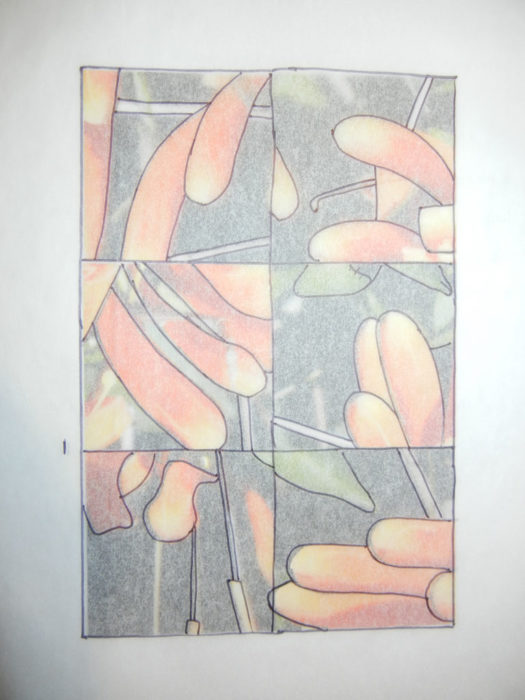
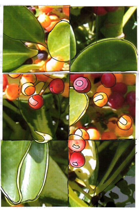
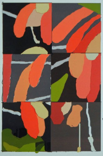
It looked a little hodge-podge at this point, so I colored in the values, to see if it looked better.

The Project that Wasn't. Ellen Lindner, AdventureQuilter.com/blog

And, indeed, it did.  As a matter of fact, I thought it looked like a pretty good abstract design.  But, I realized that it no longer depicted the heavy hanging blossoms of the original photo.  And I missed that.

So, I’ve put it aside in lieu of the next thing.
Did I waste my time?  Absolutely not!

As a matter of fact, this time spent designing will help me to be more creative the next time.  And besides, it was fun.  It’s quite possible that I’ll revisit this sketch one day.  Or maybe start again with the same photo and go in a different direction.  No worries.  It’s all part of experimenting.

Have you ever stalled out mid-project?  What are your thoughts on it?  Did you learn something anyway?  (I’ll bet you did.)

Ellen Lindner

2

Abstract Piece In-Progress

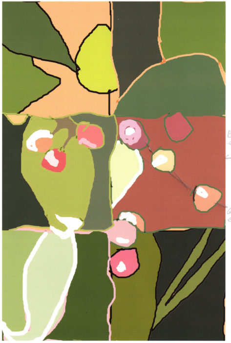
In my last post, I showed you how I abstracted a photo to create a new design.  This was my computer-colored sketch, although I knew I’d kick up the colors a good bit.

Photo to Abstract. Ellen Lindner, AdventureQuilter.com/blog

Soon, I was on to fabric selection.  I spent a good bit of time on this, since I knew the value contrasts would be important.

Abstract Piece In-Progress. Ellen Lindner, AdventureQuilter.com/blog

Next, it was time for background construction.

I changed a few fabrics along the way.

When I first finished the background, above, the white curve leaf tip on the left was too attention getting.  However, I knew I’d be adding white with the berries and hoped that they’d all balance out.

On to berries.

Abstract Piece In-Progress. Ellen Lindner, AdventureQuilter.com/blog

Yes, the white spots balanced out and I was crazy about those colors!

Time to glue everything together and take it to the machine.  On to quilting!

Ellen Lindner
4

From Photo to Abstract

I’ve been having SO MUCH FUN working on my current quilt!  It’s an abstracted design, which always pushes me outside of my comfort zone.  But, I love the way it’s coming together.

First, I needed a design.  I took my cues from a Quilting Arts TV segment featuring Pat Pauly.  She suggested cutting up a photo and rearranging it in order to create shapes and lines for an abstract design.

Okay, then.  This is the photo I chose.

Photo to Abstract. Ellen Lindner, AdventureQuilter.com/blog

I cropped it to 7.5″ x 10″ and then cut it into 12 – 2.5″ squares.  I selected my six favorite squares and created a composition with them.  (Thanks to the square shape, the pieces can be easily rotated and still fit together nicely.)

Photo to Abstract. Ellen Lindner, AdventureQuilter.com/blog

Gee, I was really loving this!  Next, I outlined the major shapes and traced them.

Photo to Abstract. Ellen Lindner, AdventureQuilter.com/blog

Voila: an abstract design which can be worked in any values or colors.  I decided to create it in colors similar to the original photo and I did a little coloring on the computer.
(As you can see, I changed my mind about the orientation.)

Photo to Abstract. Ellen Lindner, AdventureQuilter.com/blog

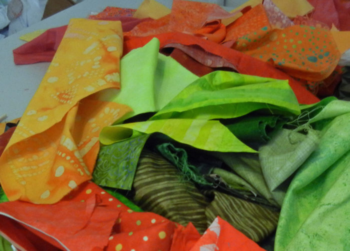
However, I had leftover “hot” fabric from my last quilt and decided to kick it up with vibrant colors.  Like these.

Photo to Abstract. Ellen Lindner, AdventureQuilter.com/blog

On to the fabric selection!  I can’t wait to show you my progress.  Check back soon.

Ellen Lindner
P.S.  Since I did this design step a while ago, I have an earlier post with a little more info.


0

Dirty Dozen Challenges

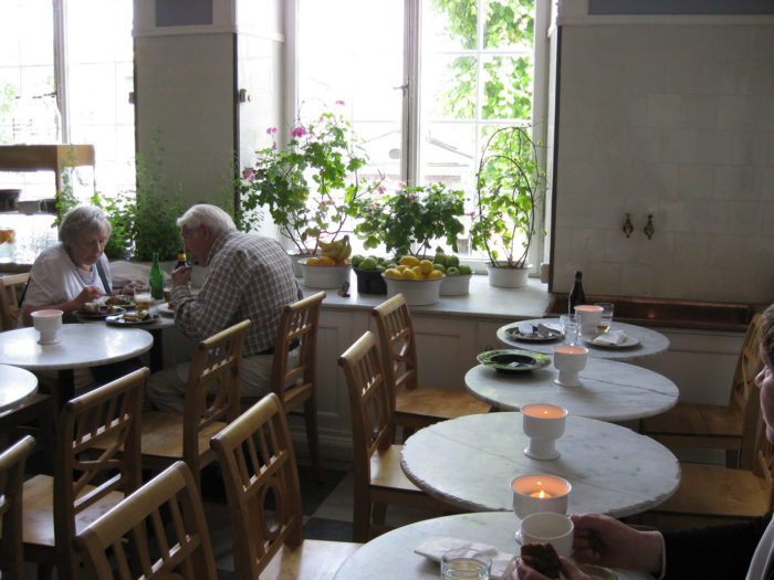
As I mentioned in the last post, my art quilt group, Dirty Dozen Fiber Artists, often has group challenges based on drawing inspiration from a particular photo.  This was the photo we selected for our 2009 challenge.

Group Challenges. Ellen Lindner, AdventureQuilter.com/blogPhoto credit: Martha Wolfe

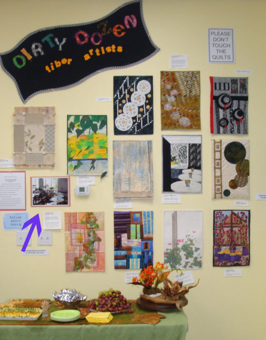
We decided on a vertical orientation, with measurements of 18″ x 12″.  Here’s the group display.  Very different, right?

Group Challenges. Ellen Lindner, AdventureQuilter.com/blog

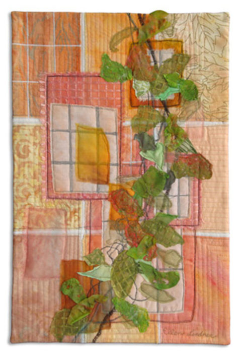
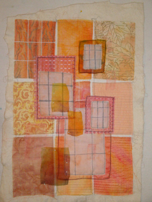
This was my piece, Northern Light.Group Challenges. Ellen Lindner, AdventureQuilter.com/blogI never really cared for this quilt, I think maybe because of the color combination.  Whenever I’m disappointed with a quilt I like to examine it and think about what worked and what didn’t.  These are some things I think I did well:
– Used the soft peach glow of the candles as the predominant color.
–  Mimiced the grid lines of the windows as design elements.
– Created interesting leaves, inspired by the foliage in the windows.

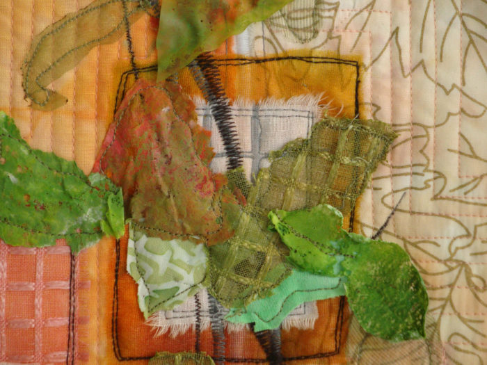
Here are those leaves up close.  Some are stitched sheers.  Others are painted and melted plastics.  I like the way they curl and buckle, lifting away from the quilt surface.  That might be something to try again on a future quilt.

Group Challenges. Ellen Lindner, AdventureQuilter.com/blog

However, I think the combination of peach and yellow-green just doesn’t work.  And maybe the whole foliage thing is a little heavy handed.  To test that theory, check out the in-progress background, below.  I think it was better before I added the leaves.

Group Challenges. Ellen Lindner, AdventureQuilter.com/blog

If I were doing this quilt again, I think I’d keep the background about the same.  Then, I’d add a FEW leaves in maybe a rust color.  NOT green, something sorta monochromatic.

So, remembering to be inspired by the photo and not controlled by it, I’ve started on a new challenge.  This is the inspiration photo.  Photo credit Kathryn Robinson

Group Challenges. Ellen Lindner, AdventureQuilter.com/blog

This photo was taken in southern France.  We selected it  because it has a lot of different components, which gives us many options for working with it.

What would you want to mimic from this photo?  Colors, shapes, foliage, flowers, steps, the door, the bench?  Oh yeah, we’re using a vertical orientation:  36 x 24.  Would that influence your decision?

I can guarantee all the resulting quilts will be very different!  Mine is nearly complete, but I’m not allowed to show it until the March unveiling.  (That’s hard for me!)  Of course, you’ll be the first to see it, after the DDFA gals, that is.

Ellen Lindner
5

Rust with Turquoise Abstract

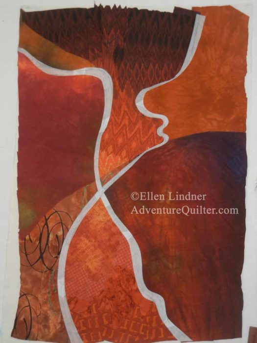
My latest abstract piece is progressing nicely.  After creating the sketch and selecting fabrics, I began to compose the background on my design wall.

Abstract art quilt in progress. Ellen Lindner, AdventureQuilter.com/blog

Here it is, completed.

Abstract art quilt in progress. Ellen Lindner, AdventureQuilter.com/blog

Next, I made tracing paper patterns of the two undulating lines I wanted to add.

Abstract art quilt in progress. Ellen Lindner, AdventureQuilter.com/blog

It’s coming along, don’t you think?  I was happy with this design and began to select fabrics for the undulating lines. As usual, I wanted several fabrics for each shape.

Here they are, finished.

Abstract #4 in-progress. Ellen Lindner, AdventureQuilter.com/blog

Next, I auditioned the idea of adding skinny undulating lines.  Should they be teal or rust?  I tried out both.

Abstract art quilt in progress. Ellen Lindner, AdventureQuilter.com/blog

I drew sketches in the computer and that settled it.

Abstract art quilt in progress. Ellen Lindner, AdventureQuilter.com/blog

Not teal.

So, I cut some skinny strips of hand dyed rust and set to work.

Ellen Lindner
P.S. Right now I’m calling this “Abstract #4.”  I definitely need a different way of thinking of this piece, but titles often come to me last.

8

Designing with Elizabeth Barton: Part Two

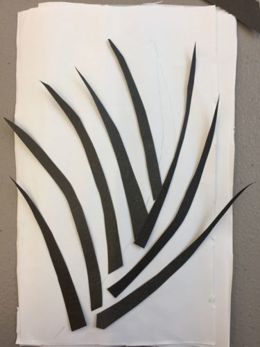
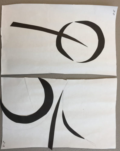
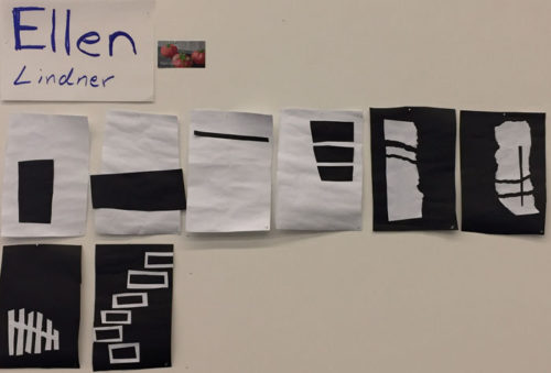
After coming up with a design, Elizabeth likes to audition a wide variety of value options.  To do this, she had us stack paper in 3 values and then use a utility/craft knife to cut the design through all three.  Finally, you glue them together in various combinations.

Here’s my dark-on-light version.

Designing with Elizabeth Barton. Ellen Lindner, AdventureQuilter.com/blog

I also made a light-on-dark version.  But, I still had brown cutouts and a bunch of unused black and white pieces.

Designing with Elizabeth Barton. Ellen Lindner, AdventureQuilter.com/blog

As I was about to address those Elizabeth stopped by and said something brilliant.  “These little skinny lines are the most intersecting of all.”  She was looking at the little gaps showing in my stack of cut shapes, above.  And she was right!  That immediately sent me in the direction of adding little skinny lines.  I was excited!

This was my next iteration.  MUCH more interesting, right?  The little skinny white lines are intentional gaps between the shapes.  The black lines are drawn in to highlight the overlapping shadowy spots.

Designing with Elizabeth Barton. Ellen Lindner, AdventureQuilter.com/blog

I was very happy with this!  Still, it was time to crop and to look for even more interesting compositions.  I did this on a black/grey/white copied version.

Designing with Elizabeth Barton. Ellen Lindner, AdventureQuilter.com/blog

Designing with Elizabeth Barton. Ellen Lindner, AdventureQuilter.com/blog

Designing with Elizabeth Barton. Ellen Lindner, AdventureQuilter.com/blog

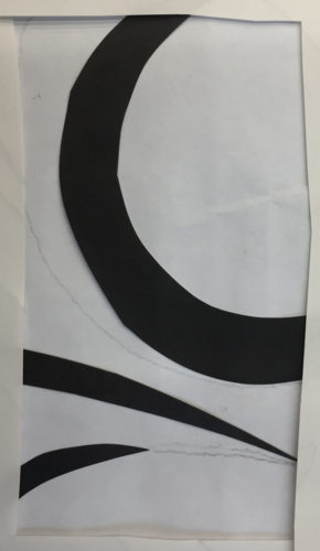
I found several interesting options, but I liked this next one the best.

Designing with Elizabeth Barton. Ellen Lindner, AdventureQuilter.com/blog

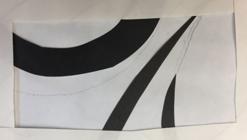
 So, what did I do?  I, once again, cut 3 different value shapes from this design and glued up 3 different versions.

Designing with Elizabeth Barton. Ellen Lindner, AdventureQuilter.com/blog

But wait, there’s more!  The day wasn’t over, yet.  So, instead of reaching for fabric I went back to some of my earlier sketching ideas.  Elizabeth had suggested something that sounded like great fun: randomly throwing a scattering of berries/squares onto paper and them connecting them.

A nice splattering of “dots.”

Designing with Elizabeth Barton. Ellen Lindner, AdventureQuilter.com/blog

I couldn’t really connect them easily because they kept wanting to lift off.  Instead, I thought I’d draw around each one, then remove it.  Then later connect the draw shapes.

What a disappointing hodge-podge.  Maybe some cropping would help.

Designing with Elizabeth Barton. Ellen Lindner, AdventureQuilter.com/blog

Designing with Elizabeth Barton. Ellen Lindner, AdventureQuilter.com/blog

Well, it did help, but I think it will be a LONG time before I feel like revisiting this idea.  And when I do, will the shapes become round berries or stay as small squares???

What a FULL day of sketching!  I won’t run out of ideas any time soon.

Ellen Lindner
4