Tag Archives | Design

Designing with Elizabeth Barton: Part One

This past week I went to a wonderful 3-day workshop with Elizabeth Barton.  I’ve long admired her ability to simplify a design and to then interpret it in dramatic, high-contrast, colors.

Our class supply list included several inspiration photos.  I was familiar enough with Elizabeth’s work to know that a landscape image would work well.  But, that’s just not what was speaking to me.  I perused by Pinterest boards for things that seemed intriguing.  Ignoring subjects, I just looked for things that were appealing.  These are the images I came up with.  (I don’t have permission to use the images, so I’m just describing them.  However, if you go to my Pinterest board “Nature Photography” you’ll see them.)

A twig with red leaves stretching over a sparkling stream,

A twig with lots of berries, with everything encased in ice,

A twig with tiny droplets of water,

Terraced and flooded rice fields.  The fields connect with undulating walls of vegetation.

All of these had a sort of “rivulet” quality to them: twigs branching off, or the walls of rice patties creating a similar pattern.  This is what I wanted to focus on.

Elizabeth showed us a variety of ways to create sketches.  These included tracing, simplifying, collaging with paper, or combinations of these techniques.  Her goal was for us to spend and ENTIRE day creating sketches!  That sounded rather lengthy at first, but I quickly got into it and was thrilled with all the variations I created.  Elizabeth wanted us to have 12 sketches by the end of the day and I’m sure I exceeded that.

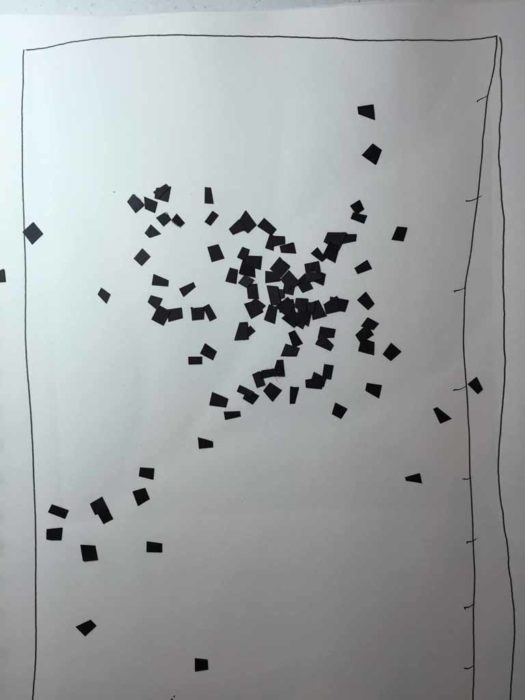
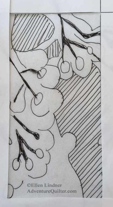
First, I traced the image that most intrigued me, the iced berries.  (Tracing automatically simplifies a design, since you can’t see all the details.)  My sketch surprised me by being very boring.

Designing with Elizabeth Barton. Ellen Lindner, AdventureQuilter.com/blog

It wasn’t too hard to figure out why.  Elizabeth stressed the importance of value contrast and this one just didn’t have enough of that.

But, what if I cropped it?  Like me, Elizabeth is big on this and she had us make paper “L shapes”  as cropping tools.  (I do the same in the design classes I teach.)

The cropped versions were better and are, perhaps, worth further consideration.  I think this first one would look good if turned 90 degrees to the right.

Designing with Elizabeth Barton. Ellen Lindner, AdventureQuilter.com/blog

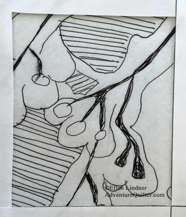
And I like this square one even better.

Designing with Elizabeth Barton. Ellen Lindner, AdventureQuilter.com/blog

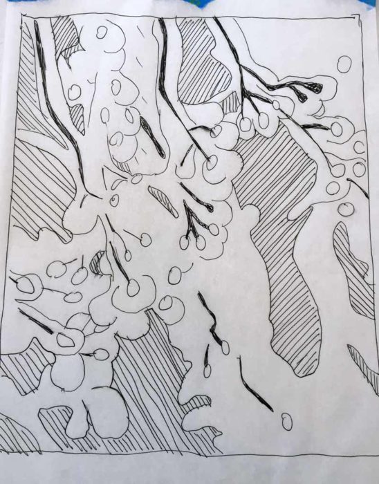
At this point, Elizabeth suggested a new approach for me.  First, she had me copy all 4 inspiration photos in a grey scale.  This way I could focus on values without being distracted by color.  Definitely true.

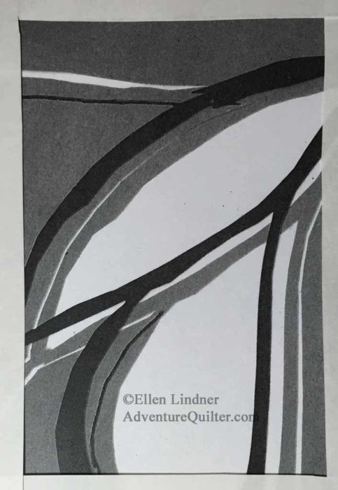
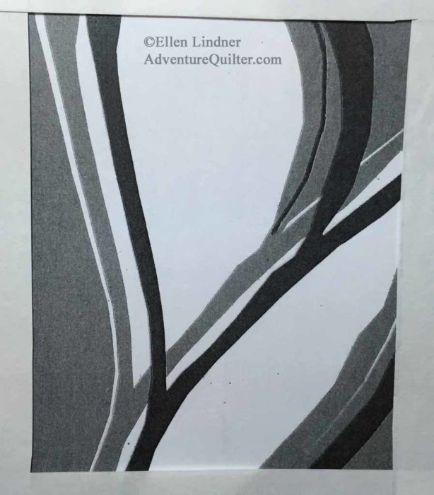
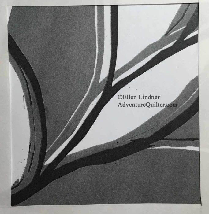
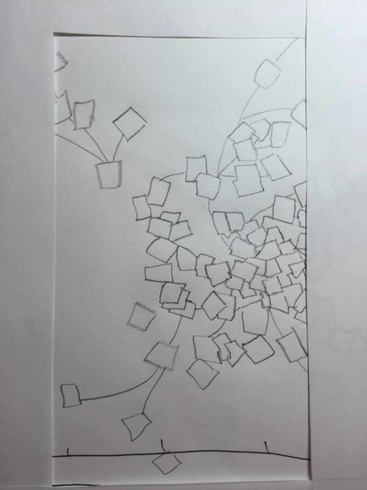
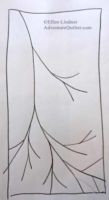
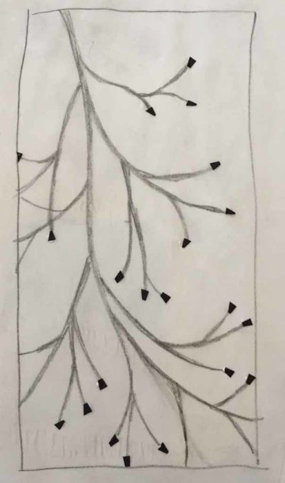
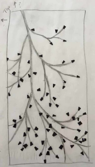
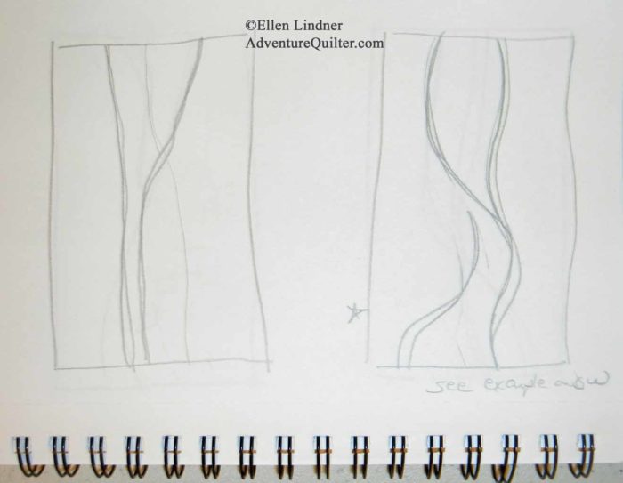
 Then, she asked me to study the 4 images, put them away, and sketch multiple sketches from my impressions.  First, I focused on the twig idea.

Designing with Elizabeth Barton. Ellen Lindner, AdventureQuilter.com/blog

Designing with Elizabeth Barton. Ellen Lindner, AdventureQuilter.com/blog

Designing with Elizabeth Barton. Ellen Lindner, AdventureQuilter.com/blog

I like that top one pretty well, but the next two don’t excite me.  Again, what if they were turned into a horizontal orientation?

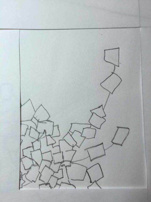
The main image that was stuck in my head was that of the terraced rice patties.  So, I began to play with that.  First, a busy sketch that’s most similar to the inspiration photo.

Designing with Elizabeth Barton. Ellen Lindner, AdventureQuilter.com/blog

Then, a simplified version.

Designing with Elizabeth Barton. Ellen Lindner, AdventureQuilter.com/blog

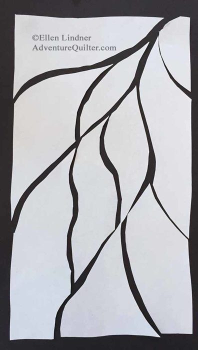
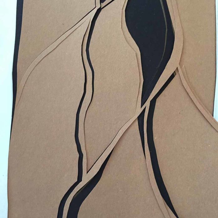
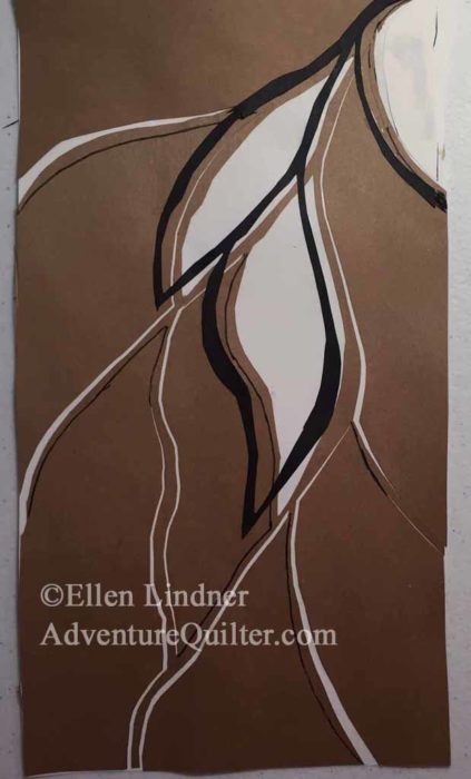
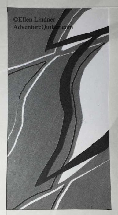
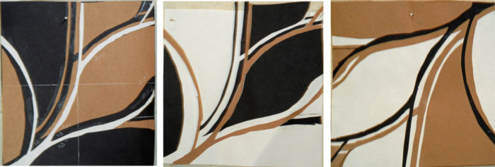
I liked that pretty well and decided to move forward with it. Next, she asked us to create our sketches in 3 different value combinations, using cut paper.  That yielded some surprising results, which I’ll show you in the next post.

Ellen Lindner
P.S. See a related post about sketching barns.

2

Smooth Undulating Lines

I’ve been working on a series of quilts in the same size, colors, and motifs.  One of the hallmarks of the first three quilts was undulating lines with jagged edges.  But, when I’m in creative mode I always allow myself to take detours.  So, when I got the idea to use some smoother undulating lines, I had no misgivings about changing course.

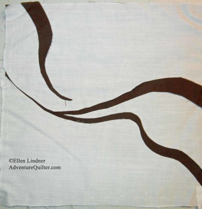
In 2006 I took a wonderful class, at Arrowmont School of Arts and Crafts, with Emily Richardson.  One of our exercises was to create small compositions with just two colors of fabric.  I generally hate that sort of thing, but this time I had good luck.  I liked it so much that I stuck it on my design wall when I got home and it’s been living in that low corner for TEN years!

Planning a new art quilt with Ellen Lindner. AdventureQuilter.com/blog

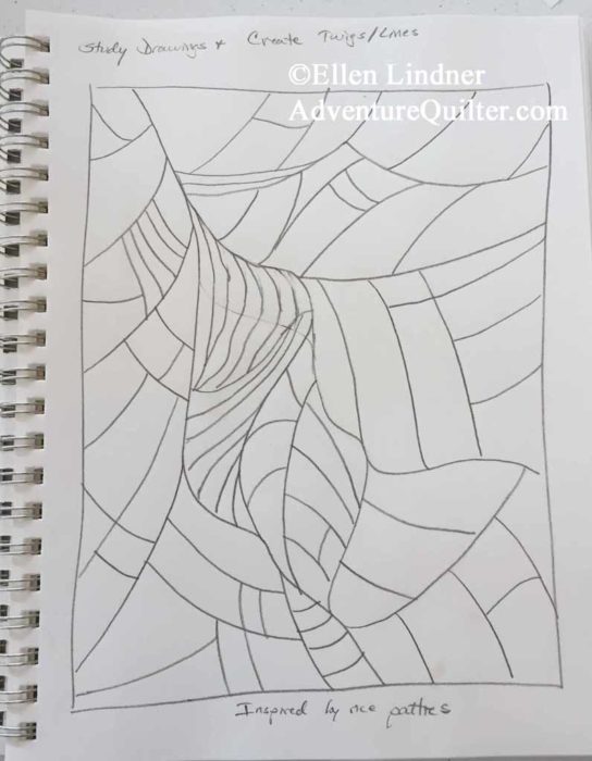
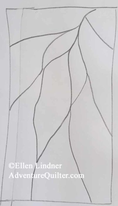
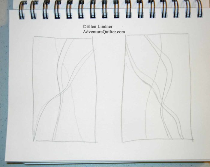
When I started thinking about undulating lines, this was the obvious spot for me to begin.  I grabbed my sketchbook and had a go at some designs.  Can you see that the one below right was inspired by the fabric composition above?  (You have to turn one of them to see the connection.)

Planning a new art quilt with Ellen Lindner. AdventureQuilter.com/blog

Planning a new art quilt with Ellen Lindner. AdventureQuilter.com/blog

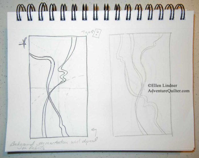
I decided I really liked the one on the left, below.

Planning a new art quilt with Ellen Lindner. AdventureQuilter.com/blog

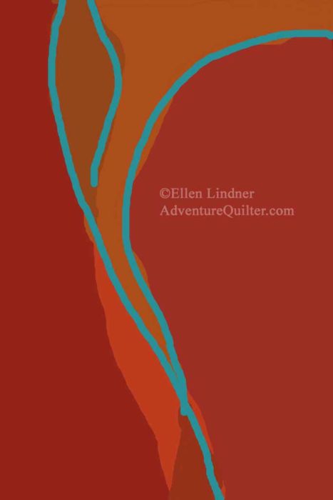
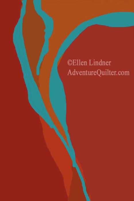
Meanwhile, I’d also done some playing on the computer.  This time I was focusing more on color.

Planning a new art quilt with Ellen Lindner. AdventureQuilter.com/blog

I started on the computer with lines of one width.  But then I decided to make their shapes vary.  Much more interesting, I think.

Planning a new art quilt with Ellen Lindner. AdventureQuilter.com/blog

At this point, I had a design and a general color plan.  Time to audition some fabrics.

Ellen Lindner
4

Finally, a Quilt

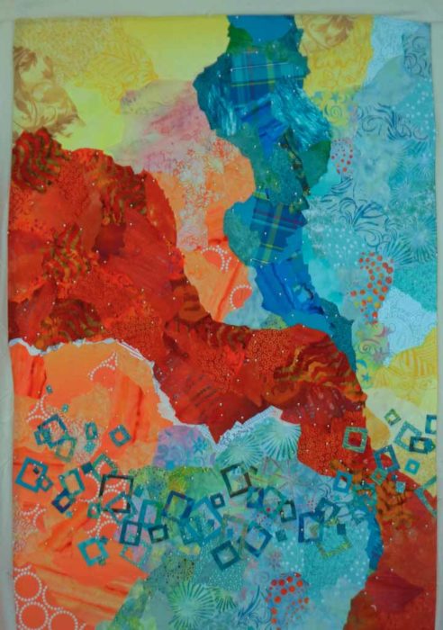
Gee, I haven’t shown you a new quilt in a while.  But, in the midst of teaching, exhibits, and TV shows, I’ve still been able to (intermittently) work on my latest abstract quilt.  When I last showed it to you, the background was complete and I had decided to add some white squares.  I auditioned that idea with some computer sketching.

An abstract art quilt in-progress. Ellen Lindner, AdventureQuilter.com/blog

And then I began to add the white squares.

An abstract quilt by Ellen Lindner in-progress. AdventureQuilter.com/blog
Hmm.  They didn’t show up that well.  Would blue-green be better?

An abstract quilt by Ellen Lindner in-progress. AdventureQuilter.com/blog
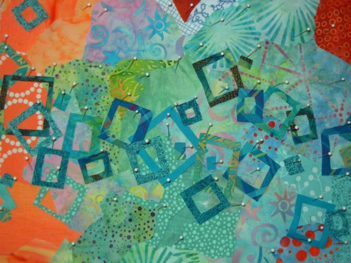
I tried it out with fabric scraps and decided this was the way to go.

An abstract quilt by Ellen Lindner in-progress. AdventureQuilter.com/blog
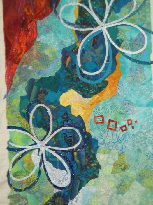
Yes, much better.  That took A LOT of pins.

An abstract quilt by Ellen Lindner in-progress. AdventureQuilter.com/blog
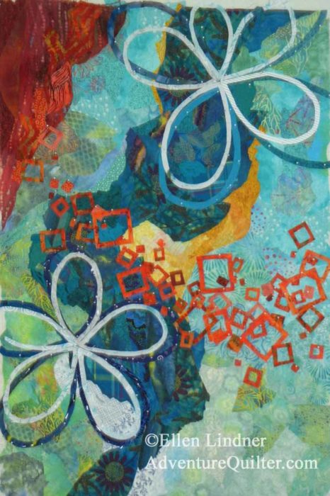
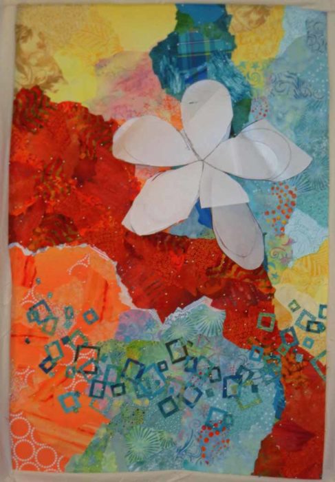
I began to consider where to add the large flower.

An abstract quilt by Ellen Lindner in-progress. AdventureQuilter.com/blog
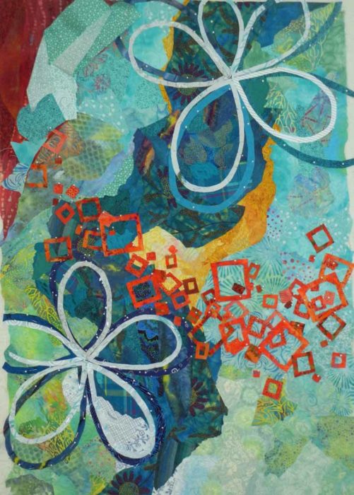
Maybe something like this.

An abstract quilt by Ellen Lindner in-progress. AdventureQuilter.com/blog
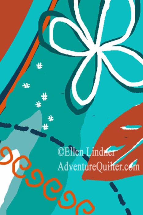
I made some marks, but then lifted it in order to add some other things.

What about a ghost flower?  (Top left.)  It didn’t show up very well, so the jury was still out.

An abstract quilt by Ellen Lindner in-progress. AdventureQuilter.com/blog
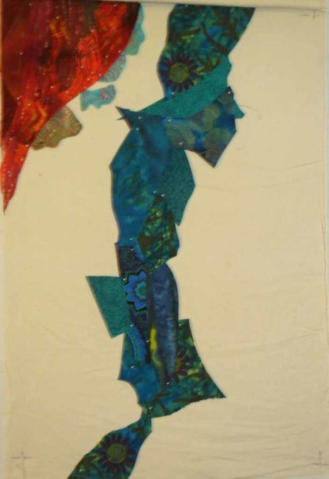
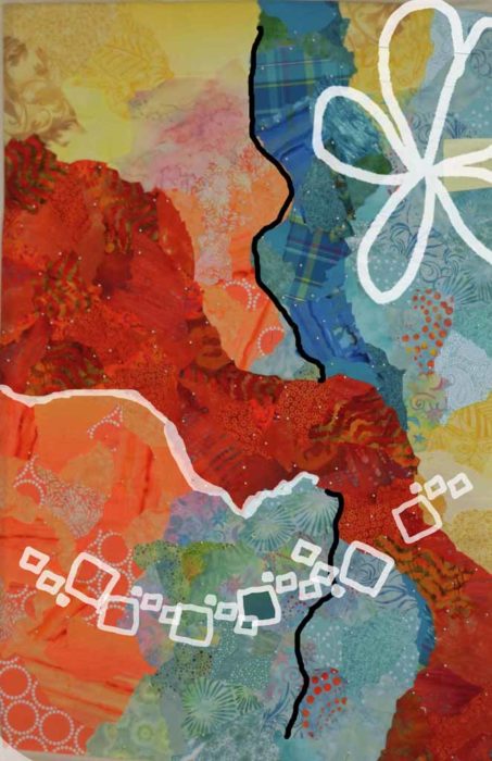
I added a navy line for contrast.  I think it helped a lot.

An abstract quilt by Ellen Lindner in-progress. AdventureQuilter.com/blog
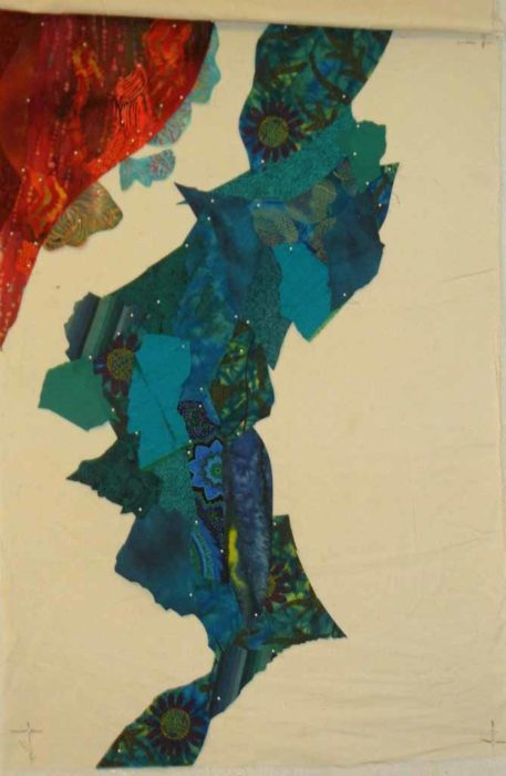
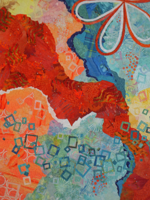
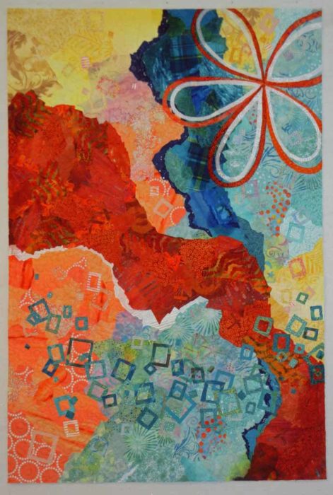
I put the flower back (in a slightly new location,) removed the ghost flower, and made a few final additions.  Among them, I added subtle squares in the background, and subtle X shapes in the large rust/orange shape.  Just a little repetition, texture, and interest.

An abstract quilt by Ellen Lindner in-progress. AdventureQuilter.com/blog
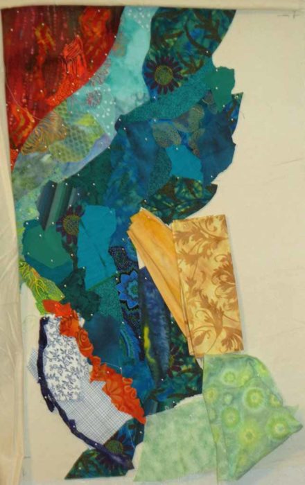
Finally, I trimmed it, and began to prep the facing fabric.

An abstract quilt by Ellen Lindner in-progress. AdventureQuilter.com/blog
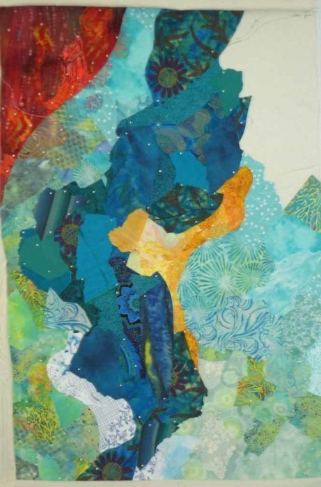
But wait.  How would this look upside down?

Ellen Lindner
 

6

Exploration and Detours

I guess it’s a good thing making a quilt takes a while because I find that I often get new ideas while implementing the previous ones.  Such has been the case with my current abstract quilt.

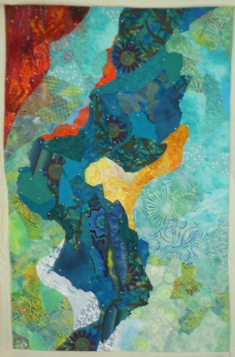
I left a large orange/rust shape in the top left corner, planning to balance it with something large and orange in the lower right.  Maybe something like this.
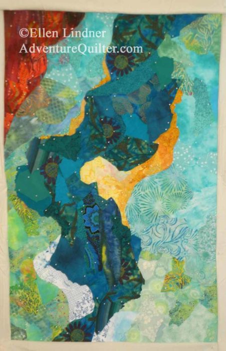
An abstract art quilt under way, by Ellen Lindner, AdventureQuilter.com/blog
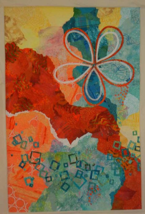
But first, I wanted to get my flowers into place.  I had planned to use one large open flower, but that turned into two.  In the photo below, I was putting them in place.

Explorations and Detours. Ellen Lindner, AdventureQuilter.com/blog

They blend in with the background more than I had hoped, so I’ll add some orange outline stitching, or something along those lines.

While working on the flowers, however, I had time to think about that big orange shape and I thought I could do something more interesting.

I’d been noticing that I really liked paintings with lots of tiny squiggles and shapes in them.  I wondered how I could get that effect with fabric.  I decided I could just cut shapes and sprinkle them about.  So, I tried a few to get the effect.

Explorations and Detours. Ellen Lindner, AdventureQuilter.com/blog

I really liked that, so I went for broke.

Explorations and Detours. Ellen Lindner, AdventureQuilter.com/blog

Oh yes!  I love it!

But, this definitely doesn’t balance the big corner blob.  I’ll have to do something about that.

Will I need to completely remove that big rust shape, or can I just shrink it? I auditioned the latter in this next photo.

Explorations and Detours. Ellen Lindner, AdventureQuilter.com/blog

I’m not sure yet.  But, I’m having fun exploring options and taking detours!

Ellen Lindner

16

New Abstract Under Way

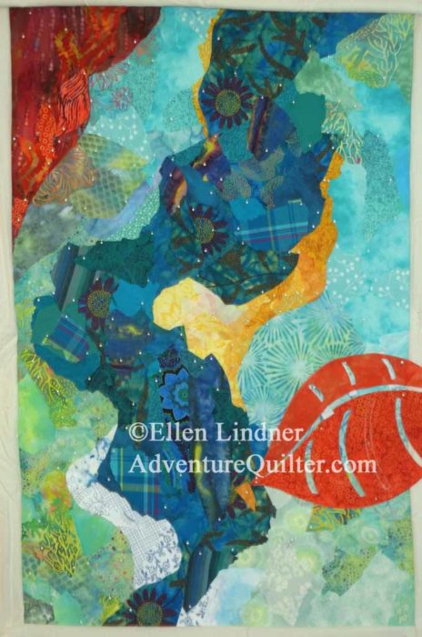
After having so much fun on the last abstract quilt, I’ve started on another one.  I’m allowing the first to inspire the second, but making LOTS of changes.

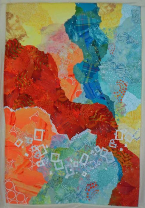
This was my starting sketch.

Ellen Lindner's color experiments. AdventureQuilter.com/blog

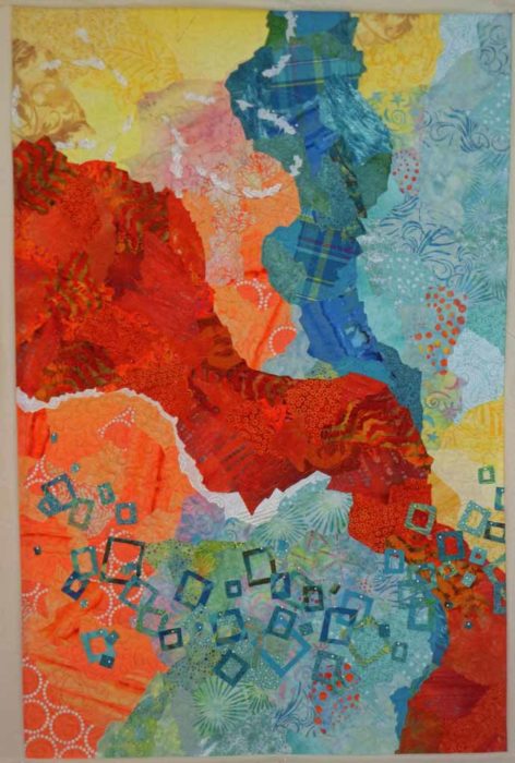
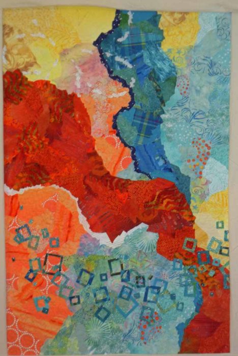
I thought I’d probably ROUGHLY copy the background, but with plenty of alterations as they occurred to me.  Right off the bat, I knew I wanted to add some undulation to the central vertical shape, and I also thought it would benefit from the addition of some yellow.  I spent  a little time studying the background, then I put the sketch away.  After all, I didn’t want to copy it!

I started construction by using scraps to create the central shape.  I left all the odd points in place, thinking they’d help me decide where to take the undulation.

An abstract art quilt under way. Ellen Lindner, AdventureQuilter.com/blog

That was just the start.  Next, I added more fabrics – this time very purposefully – to create the undulation I wanted.

An abstract art quilt under way. Ellen Lindner, AdventureQuilter.com/blog

MUCH more interesting, don’t you think?

Next, came the left background.  I used a couple of print fabrics to create a sort of soft/fuzzy edge where the two orange/rust and blue-green met.  (Sorry for the pathetic focus.)

An abstract art quilt under way. Ellen Lindner, AdventureQuilter.com/blog

After making progress on the left side, above, I auditioned some additional elements as well as color placement for  the background.  The skinny navy line and the orange squiggle near it did not make the cut!  I was doubtful that they would, but you have to make visual decisions visually.  You HAVE to do some trial and error!

I added white and yellow and worked on the background on the right side.  It was coming along nicely.

An abstract art quilt under way. Ellen Lindner, AdventureQuilter.com/blog

I finished the background, but wanted to add some little squiggles of color.

An abstract art quilt under way. Ellen Lindner, AdventureQuilter.com/blog

However, the orange above took over.  Not a good choice.

How about yellow?

An abstract art quilt under way, by Ellen Lindner, AdventureQuilter.com/blog

Ah, yes.  That’s much better!
Did you notice that I changed the shape of the yellow on the right, too?

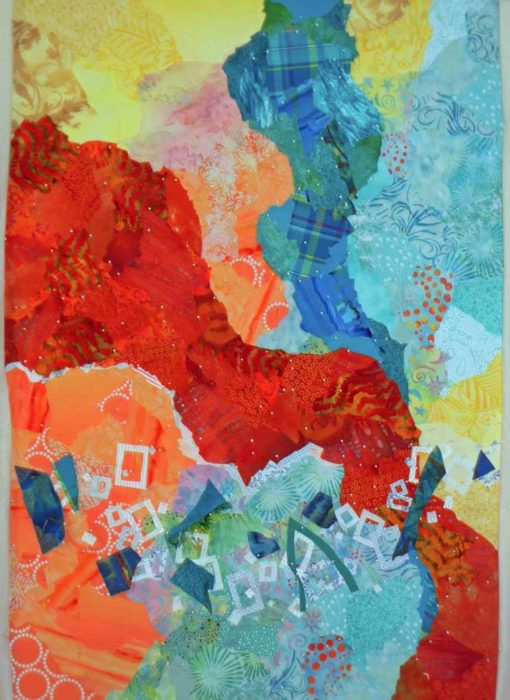
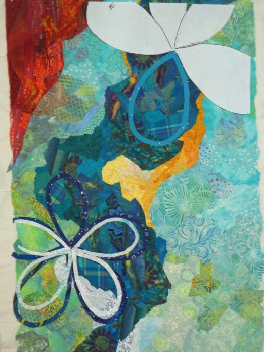
At this point I considered the background complete.  It was time to consider the design elements.  Clearly, I’d need to repeat the white and orange.  Per the sketch, I thought I’d need a good bit of orange in the bottom right corner, to balance that in the opposing corner.

Ellen Lindner
P.S. Just for kicks, scroll back to the top of this post to see how much I deviated from the sketch.  But, that’s FINE!  As a matter of fact, it was my plan.  The sketch – especially with abstract designs – is meant to be the starting point only.  All of this is very fun.

6

“Tomato Encore”

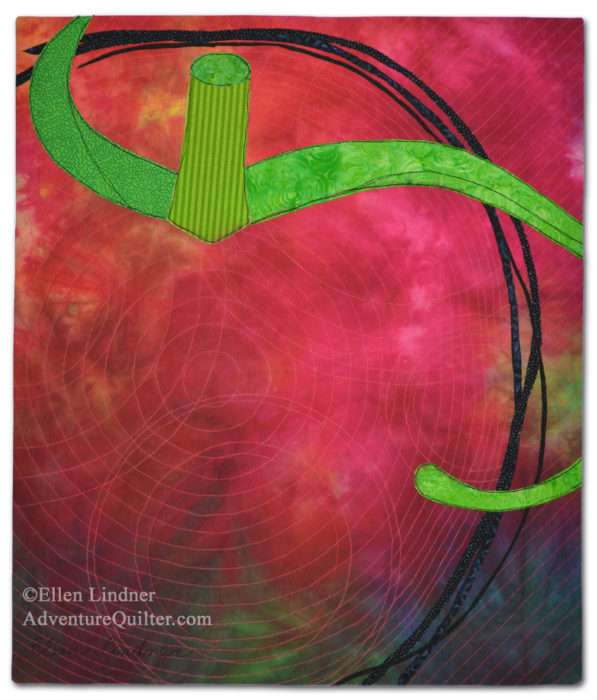
Well, I did it!  I managed to push my brain into abstraction territory and I created this tomato.

Tomato Encore, an art quilt by Ellen Lindner. AdventureQuilter.com/blog

It’s called Tomato Encore.  

I kinda love it.  Partly because of the imagery, and partly because I’m proud of myself for FINALLY working loosely!

Here’s a detail shot.

Tomato Encore - detail, an art quilt by Ellen Lindner. AdventureQuilter.com/blog

I’m continuing to work on some loose experiments, in hopes of shifting into a somewhat more abstract process of creating my quilts.  At the very least, the journey is fun!

Ellen Lindner
P.S.  You might enjoy some of the related posts about this whole tomato/abstraction journey.

2

Design Class in St. Augustine – Part Two

More photos from my students’ awesome work during “Design Your Own Nature Quilt,” in St. Augustine.

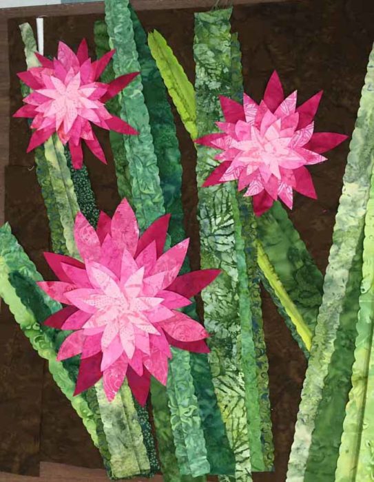
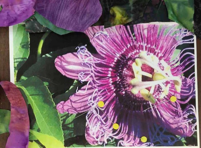
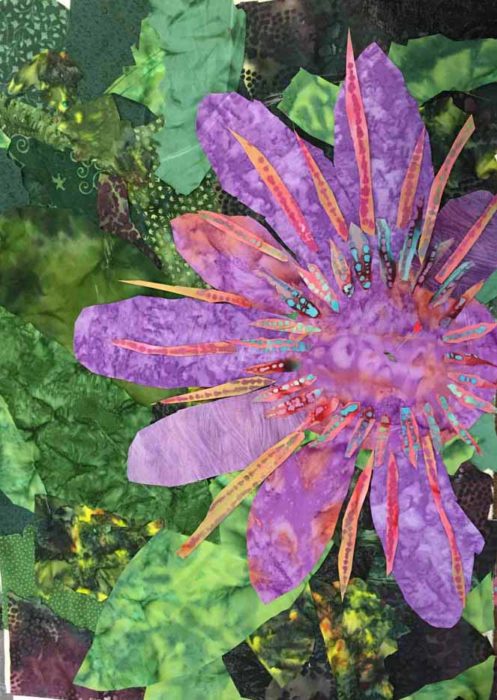
I know you love the see the students’ inspiration photos as well as where they take them.  This was Victoria’s starting photo.  She planned to really play up the blossoms.

http://adventurequilter.com/old-blog/2013/03/design-in-destin/

And ended up with this.

Design Your Own Nature Qullt class, with Ellen LIndner. AdventureQuilter.com/blog

This is a wonderful example of our class motto:
Be inspired by your photo, not owned by it.

Victoria did an excellent job of keeping what she liked, exaggerating it, and altering the other elements.  She also resisted the temptation to make the background so dramatic that it competed with the blossoms.  As a matter of fact, that dark brown really sets off the bright blossoms beautifully, doesn’t it?  That’s what contrast will do for you.

Both Kathy and Mary selected white flowers as their inspirations.  These can be quite challenging, since it’s hard to show depth and shadows.  However, they came prepared with very good fabric selections for shadows.

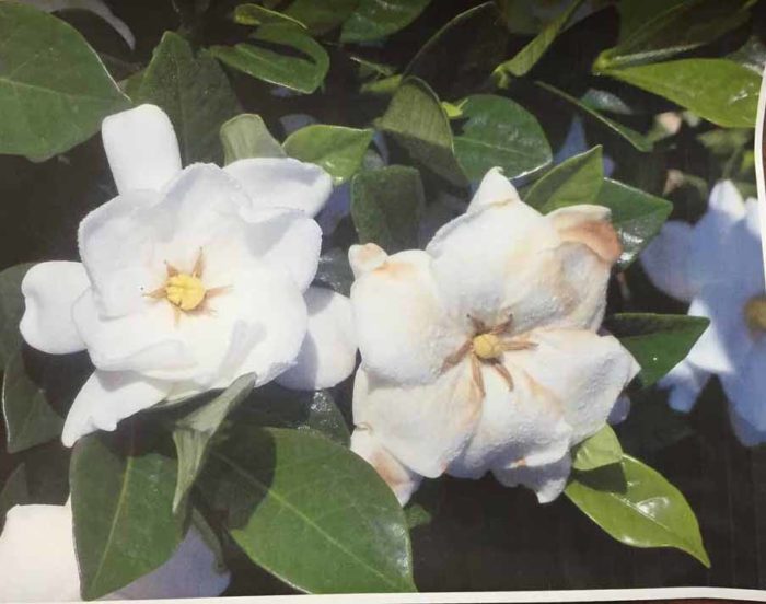
Here’s Kathy’s inspiration photo of gardenias.

Design Your Own Nature Qullt class, with Ellen LIndner. AdventureQuilter.com/blog

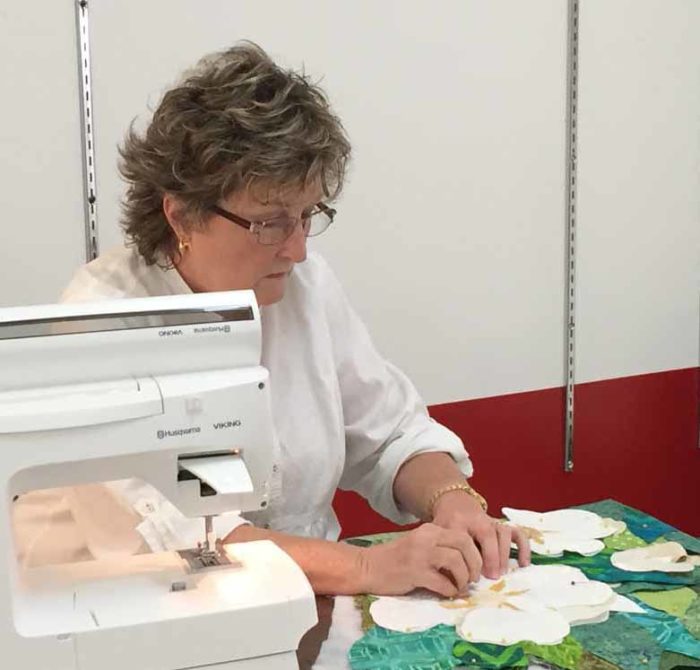
Here she is, at work.

WEB - Kathy at work

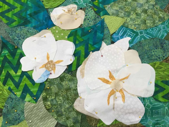
And her quilt, nearly complete.

Design Your Own Nature Qullt class, with Ellen LIndner. AdventureQuilter.com/blog

Don’t you think her composition is better?  And she used tiny slivers of tans and pale blue to create shadows.  Nice work!

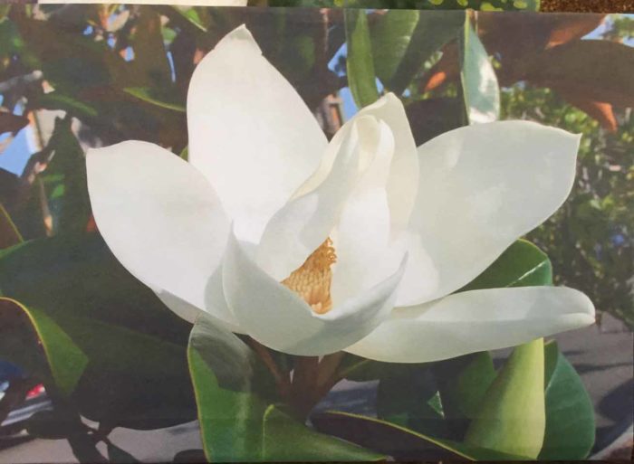
Mary used a magnolia blossom as her inspiration.

Design Your Own Nature Qullt class, with Ellen LIndner. AdventureQuilter.com/blog

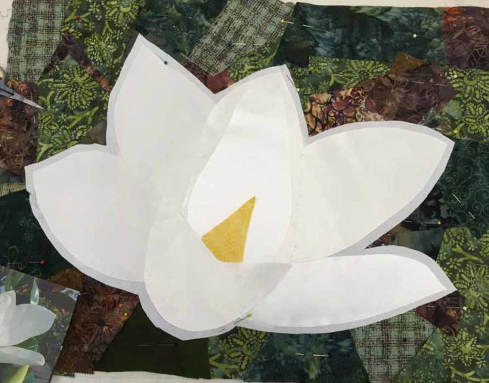
She worked the background very loosely, but kept the flower very close to her photo.  Here it is, well along.

Design Your Own Nature Qullt class, with Ellen LIndner. AdventureQuilter.com/blog

Mary used white satin fabric for her flower.  The petals do look a little different, due to the grain of the fabric and the way the light hits it.  She’s also got some pale gray tulle she’ll add for shadows.

Mary often hand stitches her pieces down using a ladder stitch.  She plans to do this for the background and maybe the flower as well.  If so, it will add a great amount of definition to the petals.

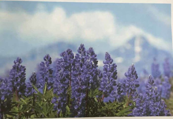
Laura used a photo of – hmm, I don’t know – some type of blue/purple mountain flower.

Design Your Own Nature Qullt class, with Ellen LIndner. AdventureQuilter.com/blog

As with Rosemary, we discussed the challenge of ALL THOSE little flower clusters.  She decided she would edit the number of flowers in order to keep the details manageable.

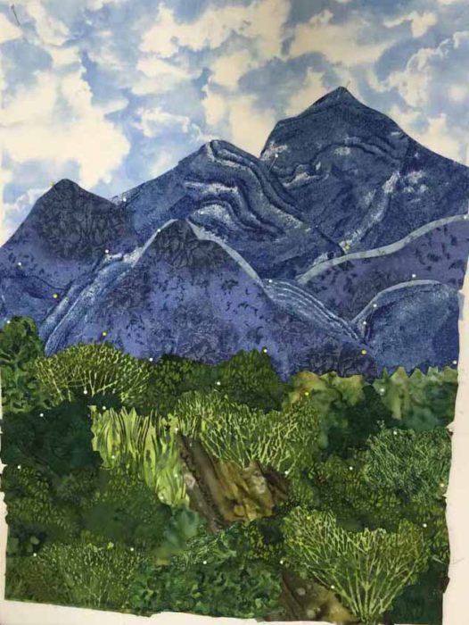
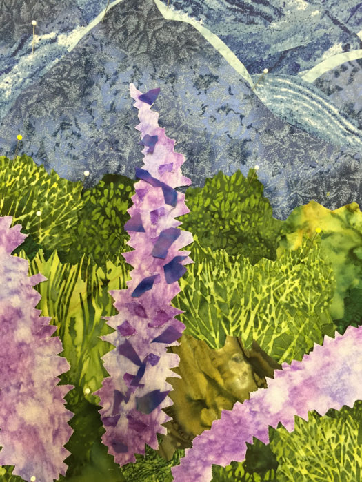
The mountain in the background was important to Laura, so she spent a good bit of time getting it and the foreground grasses just right.  This was time well spent.

As with Rosemary, we discussed the challenge of ALL THOSE little flower clusters.  She decided she would edit the number of flowers in order to keep the details manageable.

For her flowers, she cut a background shape, but then sprinkled on little contrasting bits of other values.  Although she has a bit more fine tuning to do, this is going to work beautifully.

Design Your Own Nature Qullt class, with Ellen LIndner. AdventureQuilter.com/blog

Yes, she edited her flowers down to only three.  It’s a great composition, but I forgot to get a photo.

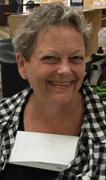
By the end of day two, most everyone had shed their name tags.  I was mock complaining since I often photograph the work, and then the student’s “chest”/name tag, so I’ll remember what belongs to whom.  Laura asked, “Oh, you want my name of my chest?” and did this.

Design Your Own Nature Qullt class, with Ellen LIndner. AdventureQuilter.com/blog

Just one example of the fun we had.

Would you like to schedule this two day class for your group?  You’ll find a full description here.

Ellen Lindner

3

Design Class in St. Augustine

“What do key lime pie and beautiful quilts have in common?”  Answer:  It’s the COMBINATION of ingredients that make it work.  This is just one of the concepts students learn in my “Design Your Own Nature Quilt” class.  The supply list for this class includes “artistic courage.”  And my St. Augustine students definitely packed theirs.

After a morning learning about design, they sketched designs inspired by their own photos.  Since they learned that nearly every photo can be improved, there were lots of changes and tweaks considered.  Finally, it was time to bring out the fabric and their compositions began to emerge.

Here’s Karen’s inspiration photo.

Design Your Own Nature Qullt class, with Ellen LIndner. AdventureQuilter.com/blog

And her quilt, nearly complete (except for the quilting.)

Design Your Own Nature Qullt class, with Ellen LIndner. AdventureQuilter.com/blog

Isn’t it great?  She wisely moved the focal point off-center for more interest.  And the addition of orange and purple add a wonderful spark.

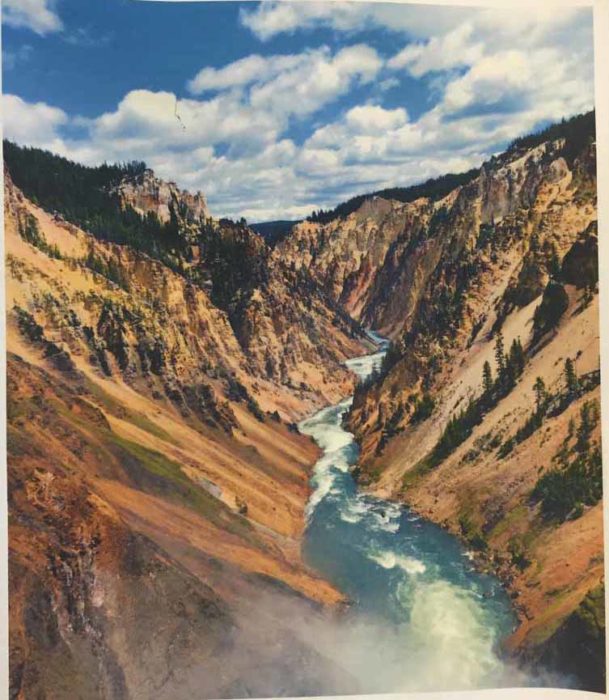
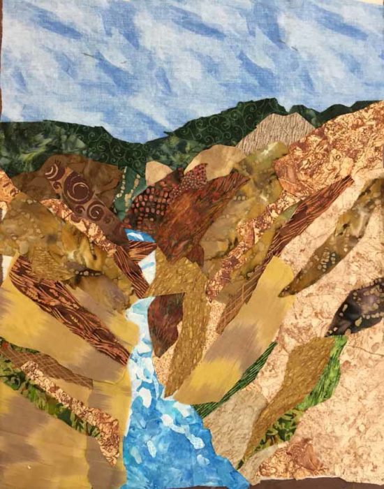
Sharon brought a photo of a favorite view in Yellowstone National Park.

Design Your Own Nature Qullt class, with Ellen LIndner. AdventureQuilter.com/blog

She did an excellent job capturing the scale and drama of the scene.

Design Your Own Nature Qullt class, with Ellen LIndner. AdventureQuilter.com/blog

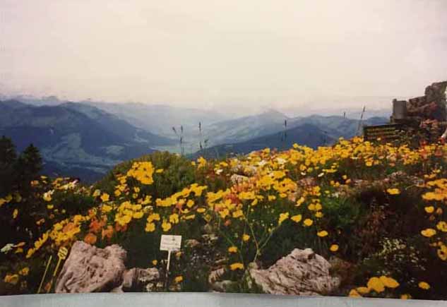
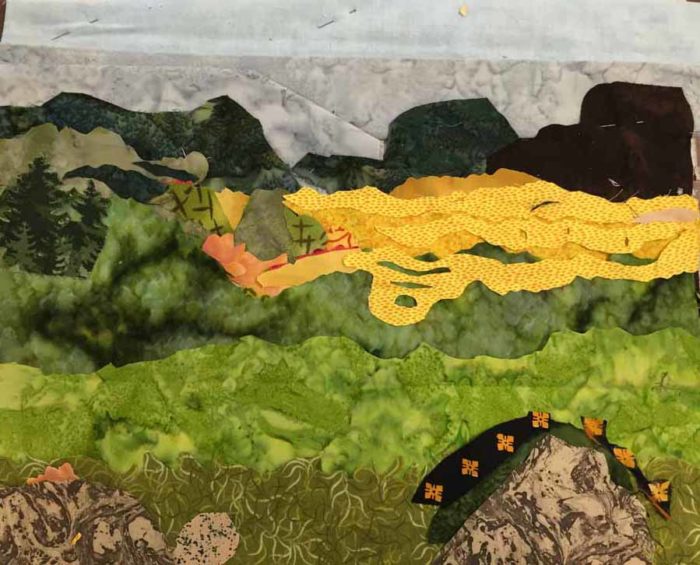
Celeste chose a challenging photo, due to the multitude of flower shapes.

Design Your Own Nature Qullt class, with Ellen LIndner. AdventureQuilter.com/blog

However, she edited her sketch to include only her favorite parts and got to work.

Design Your Own Nature Qullt class, with Ellen LIndner. AdventureQuilter.com/blog

She made good progress by the end of the class.  (She wasn’t crazy about the sky fabrics and intended to switch them out once she got home.)

Joanne worked with a great photo which needed very little editing.  I neglected to get a shot of her inspiration photo, but you can see a glimpse of it on her table.

Design Your Own Nature Qullt class, with Ellen LIndner. AdventureQuilter.com/blog

The photo below shows her quilt after her first little bit of quilting.

Design Your Own Nature Qullt class, with Ellen LIndner. AdventureQuilter.com/blog

Joanne will add petal definition to her flowers with the addition of black stitching.  (Yes, she’ll need her artistic courage for that, but she can practice first on a sample.)

I really tried to disuade Rosemary from using the photo below as her inspiration.  Just because of ALL THOSE LITTLE curly doohickies!  (What is the plural of doohicky, anyway?)  However, after discussing it, she decided she was willing to spend the time it would take to manage all those tiny shapes.

Design Your Own Nature Qullt class, with Ellen LIndner. AdventureQuilter.com/blog

It was looking really great by the end of the second day.

Design Your Own Nature Qullt class, with Ellen LIndner. AdventureQuilter.com/blog

She’ll experiment with ways to work the little curly tendrils.  Maybe couched thread, bent wire, or some other invented technique.  She’s willing to put in the time to do the needed trial and error.  And, of course, she’ll add some pale twisted yellow (?) curly-Qs in the center.  I think it’s going to be pretty spectacular.

I do so love teaching this class!  And, if you’re interested, I have an online version going on right now.  We’re about half way through part one, the design portion, with two and a half weeks remaining.

Ellen Lindner
Related posts:  Cropping as a design feature. And more cropping  (Both of these are quick reads, and worth checking out.)

0