Tag Archives | Design

Super Cool UGLY Exercise

Yep, that’s right: ugly.

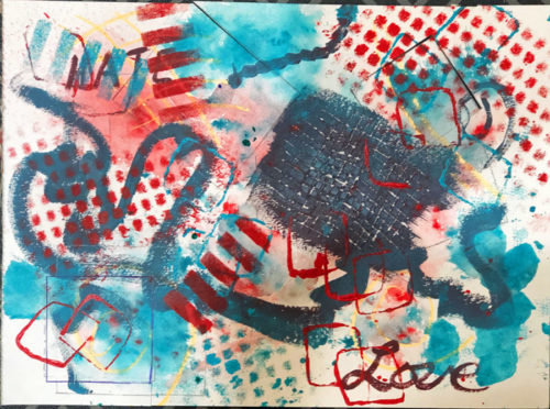
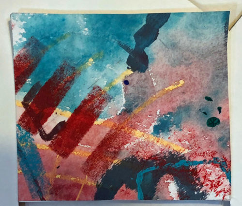
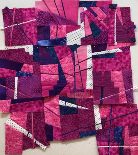
I recently did this cool exercise with my local fiber art buddies, the Dirty Dozen Fiber Artists. We used a book called “Paint Mojo” for prompts about making an UGLY painting.

The prompts included things like using a dark neutral in certain ways, painting words, using crayons as a resist, dripping paint, adding stamps, and more. Just let me say, we all achieved ugly! Just as desired.

This was mine.

Super Cool UGLY Exercise. Ellen Lindner, AdventureQuilter.com/blog

See what I mean? UG. LEE!

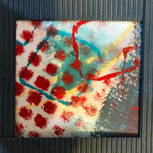
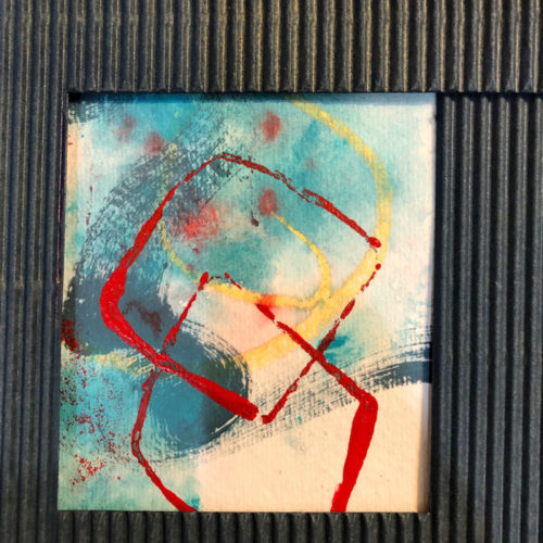
But then, you pull out your little L-shaped pieces of cardboard and start to search for pleasing compositions.

Super Cool UGLY Exercise. Ellen Lindner, AdventureQuilter.com/blog

Low and behold, when you zoom in tightly like this you actually find them!

And they’re kinda amazing.

Super Cool UGLY Exercise. Ellen Lindner, AdventureQuilter.com/blog

Our plan is for each of us to choose a little cropped view as inspiration for a square art quilt. (I’m not sure the other artists were as enamored with this process as I was, so we’ll see how many still want to do it.)

Isn’t this wacky? It was great fun and the results are totally usable.

Ellen Lindner
P.S. For more fun, follow the three links below to see how this worked it out when I first tried it, six years ago.


0

My Episode on “The Quilt Show”

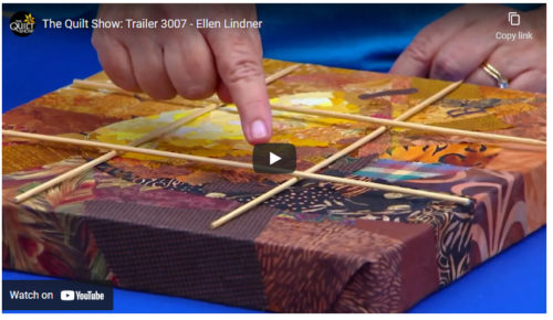
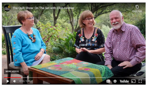
I have to admit: it’s pretty exhilarating to be on an episode of The Quilt Show! It went live a few days ago and I’m really happy with the results!

Check out the trailer:
Ellen Lindner on The Quilt Show. AdventureQuilter.com/blog

In this episode I teach three different segments.
1 – Drawing inspiration from a photo. (But not reproducing it perfectly.)
2 – Design basics: focal point and balance
3 – A glued collage technique I call “Sticky Fingers.” It uses fabric, but there’s no stitching. Super easy!

The Quilt Show has an online membership format. If you’re a member you can view all the videos and other content at any time. If you’re not already a member you can sign up for a free 7 day trial. Either option will get you access to the episode.

Watching the episode I was reminded of how much fun we had that day. I hope you’ll get to enjoy it!

Ellen Lindner


2

Dirty Dozen Fiber Artists: “In the Style of…”

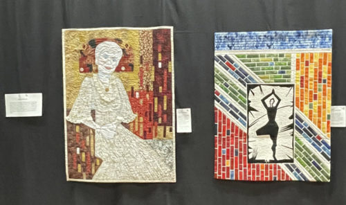
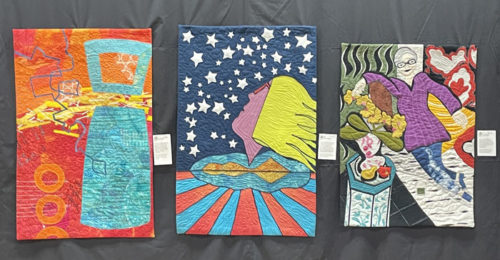
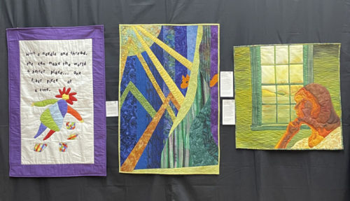
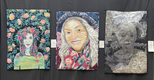
For our second self-portrait challenge, the Dirty Dozen Fiber Artists made quilts in the style of their favorite artists. These included abstract, pop, impressionist, and whimsical styles, to name a few.

These were made by Marilyn Seibring and Andrea Luliak.

Dirty Dozen Fiber Artists: Live and On Stage - In the Style of..., Ellen Lindner, AdventureQuilter.com/blog

These were made by me, (Ellen Lindner,) Sandy Shenker, and Becky Stack.

Dirty Dozen Fiber Artists: Live and On Stage - In the Style of..., Ellen Lindner, AdventureQuilter.com/blog

Jill Brown, Dij Pacarro, and Laura Ruiz created these quilts.

Dirty Dozen Fiber Artists: Live and On Stage - In the Style of..., Ellen Lindner, AdventureQuilter.com/blog

Gabriele DiTota, Kathryn Robinson, and Ruth Anne Parker made these pieces.

Dirty Dozen Fiber Artists: Live and On Stage - In the Style of..., Ellen Lindner, AdventureQuilter.com/blog

Can you find pieces inspired by “Whistler’s Mother,” the work of Peter Max, and Andrew Wyeth?

Ellen Lindner
P.S. See the associated posts about our other self-portrait challenges.

0

Going Back and Making Changes

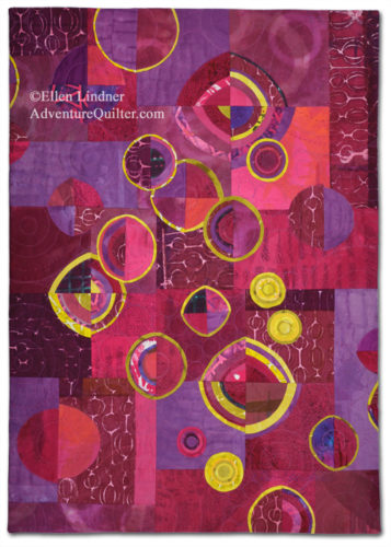
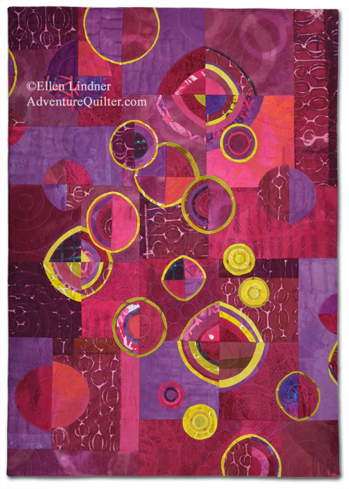
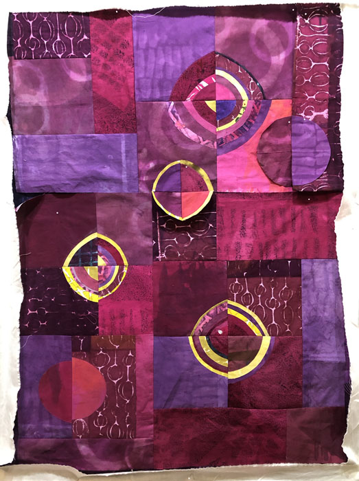
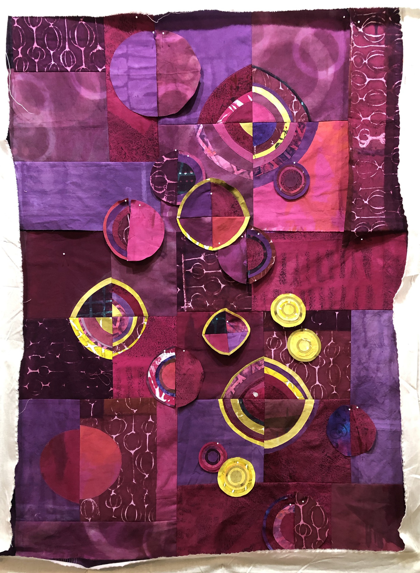
Last summer, I made a quilt called Beet Salad. I put a lot of work into it, including dyeing all the fabrics especially with this quilt in mind. This was the final result.

Beet Salad, an art quilt by Ellen Lindner. AdventureQuilter.com

Beet Salad

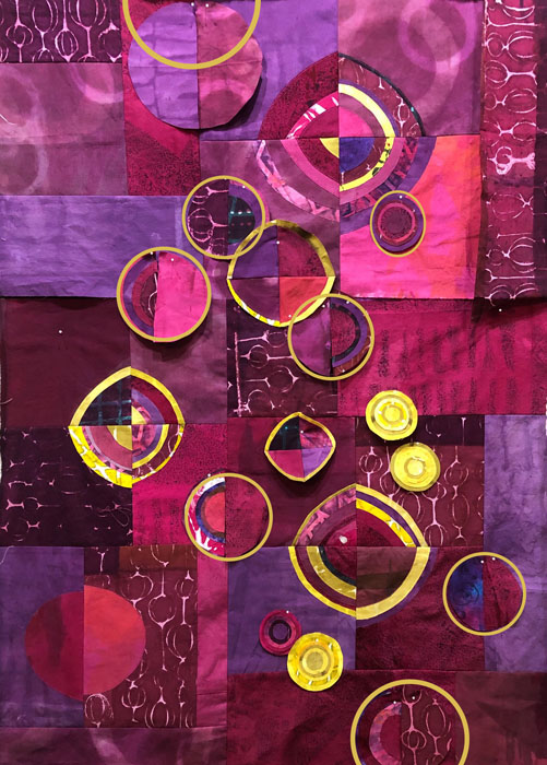
Although I liked it, somehow it didn’t quite meet my vision. I wasn’t sure what it needed. Recently, (when I finally put it away,) I studied it again and decided the color contrast was just too harsh. Especially with those yellow circles.

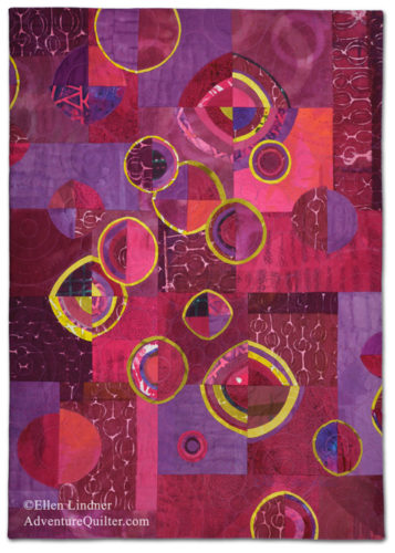
So, I removed them, and this is the new rendition.

Beet Salad, an art quilt by Ellen Lindner. AdventureQuilter.com

Beet Salad

I like it SO much better! It was a little bit of a technical challenge to remove the yellow circles, but I think it was worth it.

What do you think? Do you like it better?

Ellen Lindner
P.S. Have you ever changed something after it’s completely finished?

0

If You Never Fail You’re Not Experimenting Enough

I’m not sure where I heard that quote, but I agree with it. And, I’ve been doing plenty of experimenting lately. Yes, you guessed it: I created a big failure rough draft.

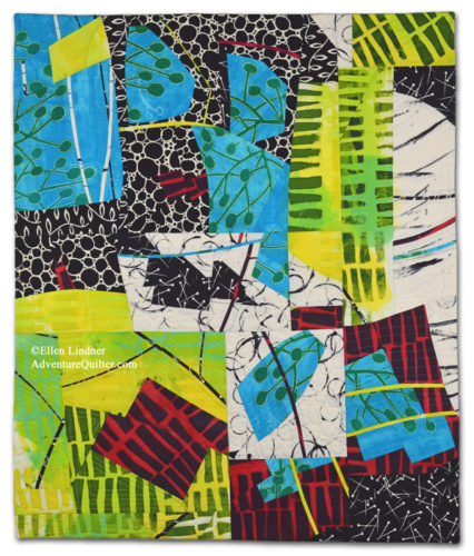
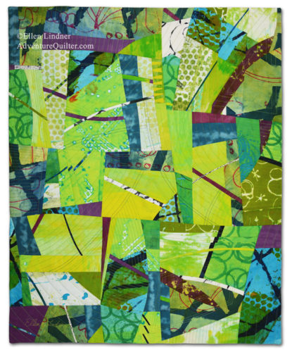
I’ve been doing quite a few abstract quilts in a style I call “Slice and Dice.” As the name implies, I slice into fabrics and rearrange them back together in different – and hopefully more interesting – arrangements.

Like this:
A Little Bit Tart, an art quilt by Ellen Lindner, AdventureQuilter.com

A Little Bit Tart

And this:

On the Road to Home, an art quilt by Ellen Lindner. Adventurequilter.com

On the Road to Home

The fabrics I’ve used have been hand dyed, which definitely add to the design of these busy quilts. So, when friends suggested that I teach the technique I thought I wouldn’t be able to do it because of the unique nature of my fabric selections.
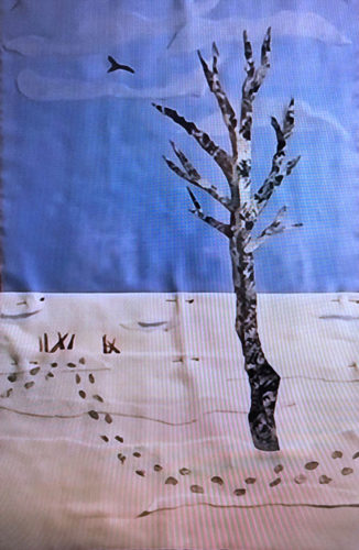
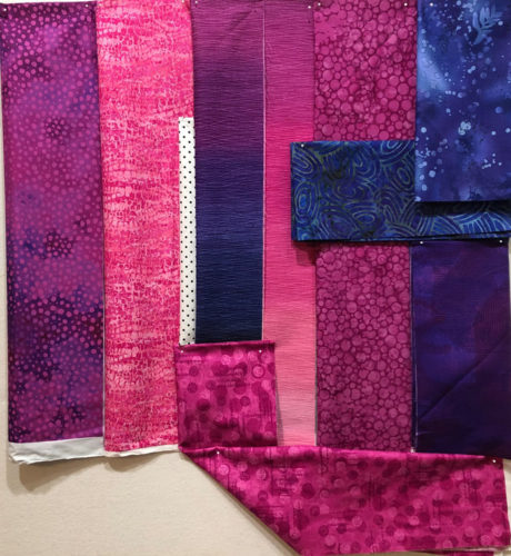
Still, I decided to give it a shot. I bought an ombre fabric with several colors in it and fabrics in all the colors. This was my starting point.

Can commercial fabrics be used for a "Slice and Dice" quilt? Ellen Lindner, AdventureQuilter.com/blog

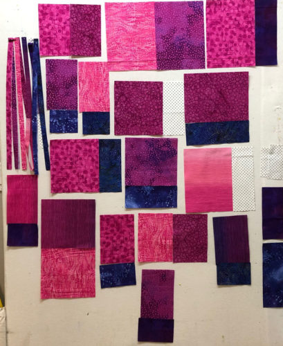
I cut each fabric in predetermined sizes and joined them in pairs. I took meticulous notes so I’d be able to teach exactly what to do.

Can commercial fabrics be used for a "Slice and Dice" quilt? Ellen Lindner, AdventureQuilter.com/blog

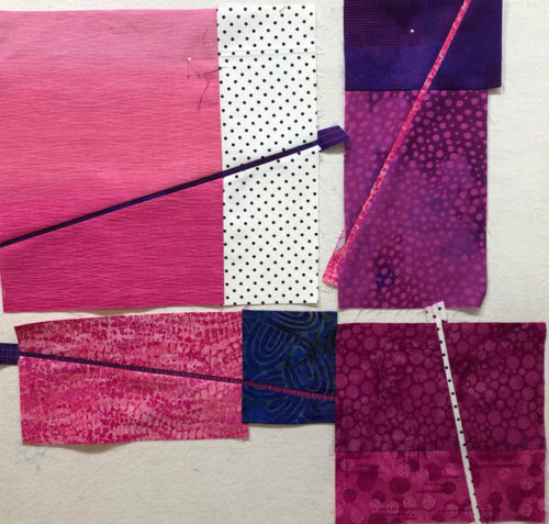
Each pair was then altered, either by adding a skinny pieced line, or by cutting and rearranging the pieces.

Can commercial fabrics be used for a "Slice and Dice" quilt? Ellen Lindner, AdventureQuilter.com/blog

Can commercial fabrics be used for a "Slice and Dice" quilt? Ellen Lindner, AdventureQuilter.com/blog

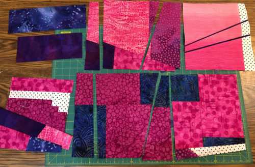
I did that OVER and OVER. And OVER and OVER. After a while I realized that no student would want to spend this long altering the blocks. I didn’t enjoy it either. So much for teaching it.

But, I thought I could at least make it into a good sample in case I figured out the teaching angle down the road. I worked and worked, but the white fabric and the dark colors just stood out too much. I sliced into them repeatedly, trying to whittle them down to what I considered the correct proportion. But, eventually, I had such an abundance of bulky seam allowances that the whole thing was barely sewable.

I decided to cut my losses.

Can commercial fabrics be used for a "Slice and Dice" quilt? Ellen Lindner, AdventureQuilter.com/blog

This is where I ended up. It was taking a lot of time and it wasn’t getting better. I just stopped.

Do I have angst or regret about tackling this project? No, just the opposite, actually. I had a question and I needed to work it through to find the answer. Now I know the answer. Plus, I recognize the time I spent problem solving and trying new things will make me more creative in the future. I didn’t waste my time and I didn’t waste my fabric. The fabric served a useful purpose, even though it wasn’t the one I imagined.

I feel strongly about the importance of experimentation, which is why I call myself the Adventure Quilter.

Have you “failed” at anything lately? (Actually, I don’t call them failures. They’re “rough drafts,” or “experiments.”) Any recent rough drafts?

Ellen Lindner
P.S. Click the title of this blog to see it without the rest of the blog posts. This will reveal several links  below which will take you to several other posts showing high levels of experimentation on my part. Beware: rabbit holes ahead!

4

“Design Your Own Nature Quilt” near Chicago – Part Two

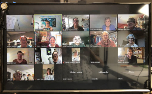
My Chicago area “Design Your Own Nature Quilt” students brought their artistic courage to class, and made some really great work. (These photos were showing on my computer when photographed. The quality is sometimes low, but you’ll get the idea.)

"Design Your Own Nature Quilt" near Chicago. A class with Ellen Lindner, AdventureQuilter.com

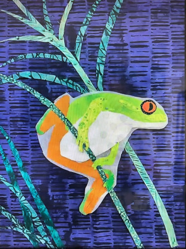
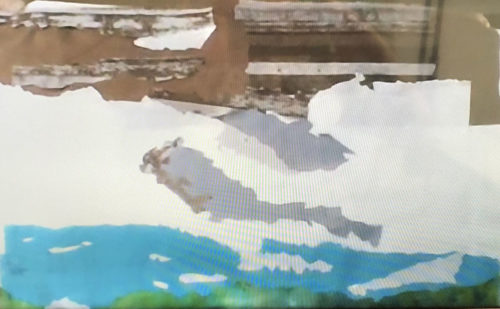
Sue did a great job with her tree frog. She constructed him with fusible web on some release paper. (See the white outline?) Once she removes that he’ll be a little slimmer.


"Design Your Own Nature Quilt" near Chicago. A class with Ellen Lindner, AdventureQuilter.com

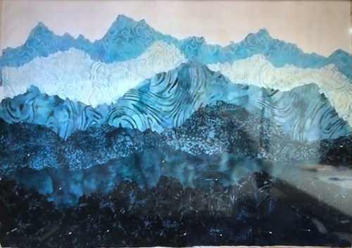
If I remember correctly Terre had never made an art quilt before. But, didn’t she do a great job? She fully embraced “jagged cutting” the mountain tops, which worked beautifully.


"Design Your Own Nature Quilt" near Chicago. A class with Ellen Lindner, AdventureQuilter.com

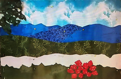
Deborah had never made any sort of quilt before! However, she bravely embraced fusible web, jagged cutting, and abstracted rhododendron flowers. (Don’t they look better than some perfect fussy cut version?)


"Design Your Own Nature Quilt" near Chicago. A class with Ellen Lindner, AdventureQuilter.com

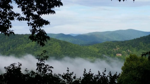
Deborah’s inspiration photo.


"Design Your Own Nature Quilt" near Chicago. A class with Ellen Lindner, AdventureQuilter.com

This photo of Susan’s work doesn’t begin to do it justice. She’s working on a rock face, snow with shadows, a lake, and – the missing items – tall evergreen trees. It’s going to be a lovely composition.


"Design Your Own Nature Quilt" near Chicago. A class with Ellen Lindner, AdventureQuilter.com

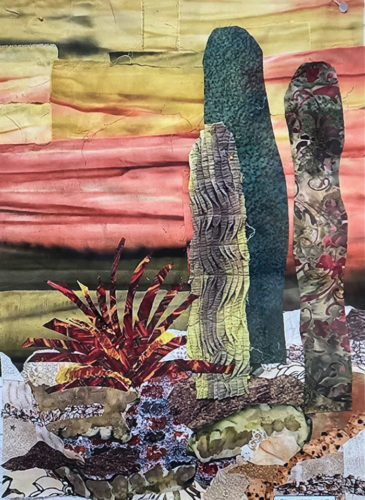
Beth took a lot of artistic license with her cactus grouping, which worked really well. She had a pleated scrap that made great texture for one of the plants. See her finished piece in the “Design Your Own Nature” gallery. (Link at bottom of post.)


"Design Your Own Nature Quilt" near Chicago. A class with Ellen Lindner, AdventureQuilter.com

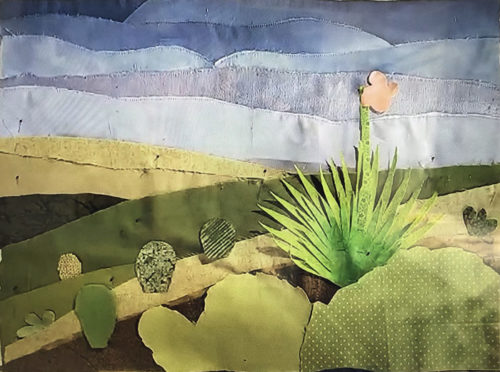
Cindy also worked on a desert scene. She used mostly solids to capture the austere beauty. She’ll use fusible web to secure the spiky plant. Won’t it be great?


"Design Your Own Nature Quilt" near Chicago. A class with Ellen Lindner, AdventureQuilter.com

Although Frances’ image was simple in composition, it wasn’t simple to construct. She did an excellent job capturing the subtleties of variation in the sky and snow.

My students always do an awesome job and these were no different. It sure makes it fun for me!

Ellen Lindner
P.S. See Beth’s finished piece, and others, in the Design Your Own Nature Quilt gallery.

0

“Design Your Own Nature Quilt” near Chicago

Last month I got to spend two and half days with members of the North Suburban Needle Arts Guild when I conducted my class, Design Your Own Nature Quilt. Because this group includes many non-quilters there was quite a mix of skill levels in the class. About half had never made an art quilt and several had never made a quilt of any sort! But, they all bravely dove in and they achieved EXCELLENT results.

In this class, each student brings their own inspiration photo, which means we’ve got 15 DIFFERENT projects going all the time. It keeps me on my toes, but I love it. They learn so much in this class!

"Design Your Own Nature Quilt" near Chicago. A class with Ellen Lindner, AdventureQuilter.com

I wish I had thought to photograph their inspiration photos, rather than just their resulting quilts. (These photos were showing on my computer when photographed. The quality is sometimes low, but you’ll get the idea.)

"Design Your Own Nature Quilt" near Chicago. A class with Ellen Lindner, AdventureQuilter.com

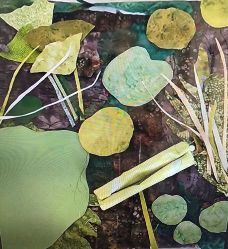
Gretchen was inspired by a photo of water lilies. She changed the nearly black water to a dark plum, which worked beautifully. She’ll use fusible web to add the skinny little grasses, and she’ll stiffen some of the leaves to make them 3D. It will be great!


"Design Your Own Nature Quilt" near Chicago. A class with Ellen Lindner, AdventureQuilter.com

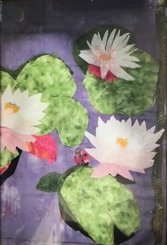
Ronna also worked with water lilies, and also switched to purple water. This complementary color really adds drama and contrast. And check out how effective those black shadows are. Nice!


"Design Your Own Nature Quilt" near Chicago. A class with Ellen Lindner, AdventureQuilter.com

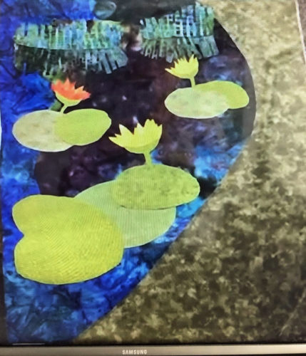
Val’s lily pads are coming along nicely. She’ll add some shadows to add dimension. Check out her water grasses and their reflection near the top. She spent a lot of time on them and I think they’re very effective.


"Design Your Own Nature Quilt" near Chicago. A class with Ellen Lindner, AdventureQuilter.com

This photo doesn’t do Barbara’s work justice. Her photo had three delicate flowers against a complex shadow. She had to work at providing contrast with value. Her later progress showed that she was moving in the right direction.


"Design Your Own Nature Quilt" near Chicago. A class with Ellen Lindner, AdventureQuilter.com

Nancy cut loose in a really wonderful way. She started working with solids, but needed some dappled light. As we searched her print fabrics she realized that she had quite a big selection of them, so she switched gears. This brought a lot of energy to her scene. She’ll add some thread-painted grasses in the foreground.

See Nancy’s completed quilt in the student gallery.

"Design Your Own Nature Quilt" near Chicago. A class with Ellen Lindner, AdventureQuilter.com

Nancy’s inspiration photo

These ladies really embraced our class motto: Be inspired by your photo, not controlled by it. Way to go ladies!

Look for more examples in my next post.

Ellen Lindner

0

“Beet Salad” Complete

Whew! After LOTS of rearranging and trial and error, I’ve finally finished this piece. And I’m quite happy with it.

The finished piece is 36″ x 26″. It’s available for $695.

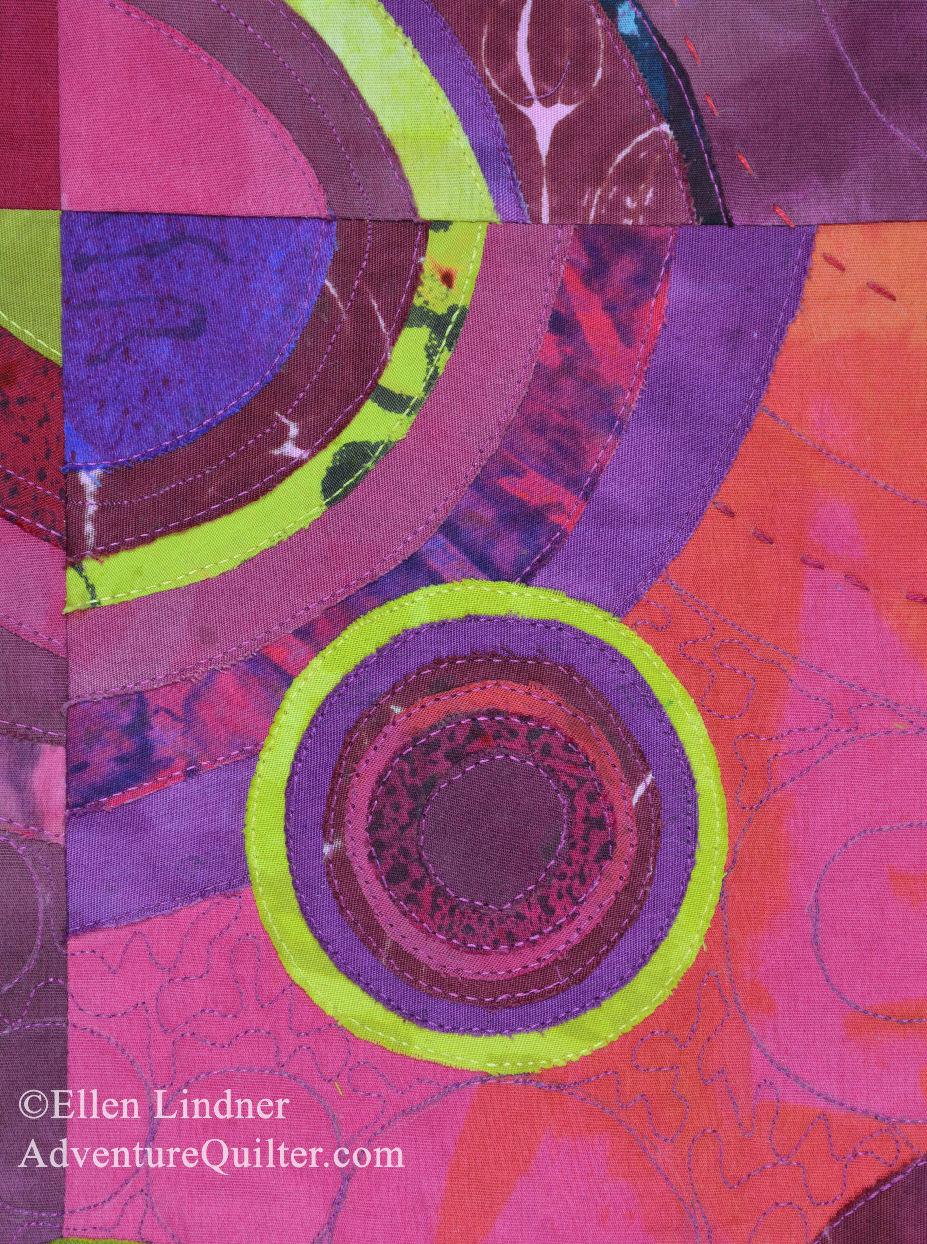
The yellow in this detail shot looks a little yellow-green, but it will show you the circular quilting pattern, done both on the machine  and  by  hand.

I think it’s well named, don’t you?

Ellen Lindner
P.S. See recent posts about how I dyed the fabric for this, and in-progress construction photos.

14

An Exercise in Composition

As I worked on my two-colored “beet” quilt, it became obvious that composition was going to be SUPER important in creating a successful piece.

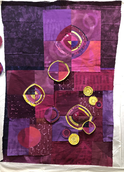
Because the yellow showed up so sharply against the reds and purples I knew the yellow circles would form the focal point of the piece and they’d need to be arranged just so. With that in mind, I arranged them first, even before all the background decisions had been made.

An Exercise in Composition. Ellen Lindner, AdventureQuilter.com/blog

In the shot above, I’ve used a variety of commercial fabrics as place holders for the background (hand-dyed) fabrics I actually plan to use. It was just easier to compose against these dark colors than the white of my design wall.

Then I began to replace the initial background fabrics with my hand dyed ones. Still with just a bare bones composition.

An Exercise in Composition. Ellen Lindner, AdventureQuilter.com/blog

In the shot below, I’ve settled upon the new background fabrics and they’re mostly sewn together.

An Exercise in Composition. Ellen Lindner, AdventureQuilter.com/blog

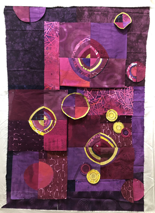
Time to add some low-contrast beet-colored circles to the background. I knew they’d add interest, and they did.

An Exercise in Composition. Ellen Lindner, AdventureQuilter.com/blog

But, I began to think the space just wasn’t filled enough. Did I need more circles? Or more YELLOW circles – for contrast? I played with this idea on my computer.

An Exercise in Composition. Ellen Lindner, AdventureQuilter.com/blog

Hmm, that certainly filled the space more. Time to consider.

Either way, I’ll add some more low contract background circles.

Ellen Lindner

0

Quilt Design and Composition: Wonky or Not?

I’ve been having fun making units for my current quilt. It features the colors of red and yellow beets, represented by wonky circles. Follow along with my quilt design decisions.
This was an early start.

Quilt Design: Playing with those fabrics. Ellen Lindner, AdventureQuilter.com/blog
Initially, I made all the circles very imperfect.
Quilt Design: Playing with those fabrics. Ellen Lindner, AdventureQuilter.com/blog

But, as I began to play with composition I began to question this decision. The yellow parts showed up SO MUCH, and I wasn’t sure I liked the off-kilter look.

Like this:

So, I did some experimenting, leaving the interior of the circles wonky, but aligning the outer yellow rings more accurately. Like this.

Beets: Composition and Fine Tuning. Ellen Lindner, AdventureQuilter.com/blog

I think it’s an improvement (even though the color of this photo is off.)

Next, comes composition. Some questions I’m tossing around:
– Is the composition tight enough? Do I need to bring things more  to center?
– Should they overlap more? (My working title is “Beet Salad,” so I’m thinking yes.)
– Do I need more circles?
– Do the circles show up well enough? Will I need to add yellow rims to some of them?

I’m moving ahead with this and happy with my progress.

Ellen Lindner

0