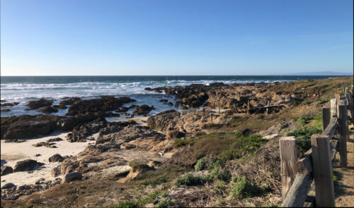
I’m just back from teaching Design Your Own Nature Quilt at Empty Spools Seminar, in Pacific Grove, CA. It was fabulous!!! The beach side setting was lovely, complete with historical architecture, wind-swept trees, and the sound of the surf.
But, of course, the real excitement was occurring in the classrooms. I had nine fantastic students who followed the supply list and packed their artistic courage. They worked outside their comfort zones and created very dynamic quilts. Each student brought one or more inspiration photos from which she designed her quilt. We often reminded one another of the class motto, “Be inspired by your photo, not controlled by it.” Wait till you see what they did.
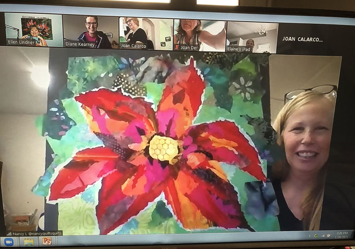
Carol had a dramatic photo of a red flower. Single color flowers are often tricky, but Carol was able to work loosely, which helped immensely.
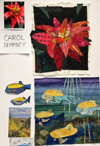
For her second quilt, (yes, several students made TWO,) Carol chose an image of what we think are box fish. In her inspiration photo the two fish were on a black background. As you can see, she improved upon that quite dramatically, and energized the composition with more fish.
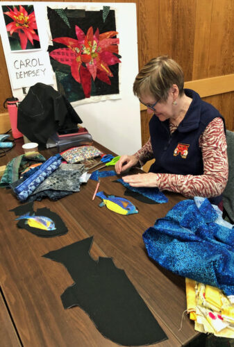
Scaling up from the sketch to the quilt is a little bit of a hurdle at first. Carol spent time making mock up fish shapes to help her get it right.
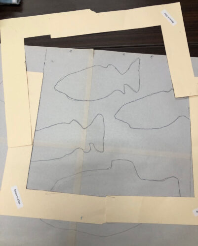
Students used cardboard L shapes to help them decide on cropping.
One day the students toured around the classrooms to see the various projects. Most of my photos will be the display boards from that event.
Larsja had a great tulip photo to start with. She wisely omitted several flowers and leaves to better show off the remaining ones. And to make the background (negative space) more interesting. And then check out that border! Don’t you love the “drawn” black tulips?
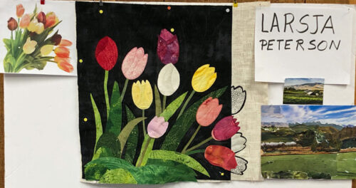
Larsja really wanted to make just one quilt so she could get is mostly done. Sure enough, it’s almost completely quilted.
Like Carol, Larsja did a collage exercise with magazine pages. I’ll show you those images more clearly in a later post.
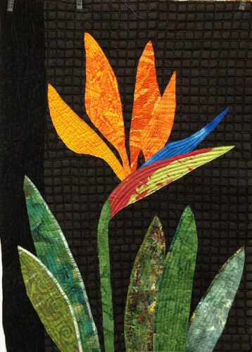
Barb used a photo of a Bird of Paradise blossom as her starting point. It was actually a double blossom, which made the distinction between petals hard to make out. Like Larsja, she omitted quite a few blossoms and did the same with the leaves. (She just scribbled over them on her photo.) She also cropped her inspiration photo quite a bit. (It’s folded on her board.)
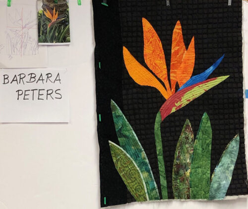
She finished quilting it in class. Isn’t it striking?
It was all very exciting! More photos in the next few posts.
Ellen Lindner


 This exhibit features work made by the Florida members of