Great Progress Made in Design-Nature Class!
The students in my recent “Design Your Own Nature Quilt” class brought their artistic courage to class and bravely jumped into unknown territory. It was exciting!
Most students found that their compositions were improved when they cropped their inspiration photos rather dramatically.
Kathy was an example, and you can see her cropped photo below, at left. She was able to easily complete the composition (and pinning) stage of her small quilt, below. She’ll add some of the tiny details with fusing. Great contrast and drama, right?
Click any image for a larger view.
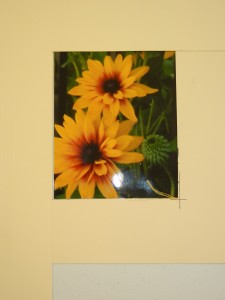
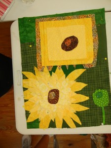
Kristy selected a photo with lots of yellow flowers, but cropped the composition down to just two. This was very effective.
She made good progress on her lower flower in class (and later did the same with the top one.) She’ll add red/brown shading with colored pencils to add definition to the petals. That will make those petals pop.
I often photograph my work in progress, and look at the camera image to give me a sense of distance and perspective. When Kristy and I looked at this image, we immediately realized that her bottom flower looked a little square: something neither of us had noticed earlier. She rounded it out with a few tweaks.
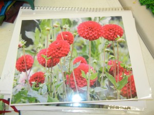
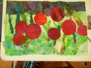
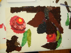
Bev’s photo had a wonderful composition and contrast. She decided to follow the image very closely, just cropping the bottom a little.
When translating a design from a sketch to an actual fabric composition, properly judging the size of items is often a challenge. For instance, in Bev’s sketch, the red flowers were about 2″ wide. But, the fabric ones needed to be more like 4″ wide. After a little encouragement, she took the plunge and it paid off. Isn’t it going to be great?
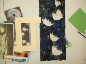
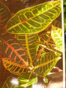
Mary took on quite a challenge in selecting a photo of croton leaves. Lots of details! The photo below approximates her cropped version.
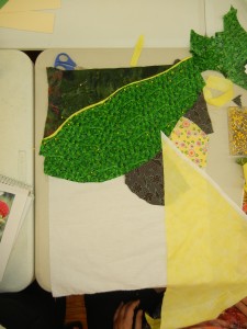
The first large leaf is in place in Mary’s composition: a large green one near the top. She’s added the yellow rim at the top, which adds great definition. Mary knows a technique for adding the little yellow bits throughout, so she plans to lay the yellow lines in place once she’s home. Won’t that be effective?
On the right, (above) she’s auditioning fabrics for the bases of the next two leaves.
As is often the case with yellow fabrics, Mary discovered that hers were a little transparent. She’ll handle this by adding a second layer of fabric and cutting both layers together.
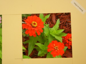
Carma’s crop, below, added intrigue by having part of her subject run off the edge. That engages the viewer and adds a lot of interest.
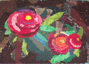
Carma is off to an excellent start with her quilt. She incorporated purple, burgundy, and gray in the mulch area. Much better than just browns!
She’s building up her flowers layer by layer. As with others in the room, she found quite a discrepancy between the flower size on her drawing and the one she needed for her quilt. But, when she realized the top left flower occupied nearly one quarter of the composition, she began to increase its size. This concept was so important to Carma that she decided to name her quilt Think Big.
Update – After a couple of days, Carma sent me this photo of her finished composition:
Isn’t it great? She did a fantastic job of working loosely! Way to go, Carma!
It was a very successful class. The ladies learned a lot about design, which they were immediately able to implement into their quilts. I can’t wait to see the finished products!
Ellen Lindner
P.S. Want to take a class with me? Check out my schedule for both online and in person classes. Or, go to LearnWithEllen.com for more options.
Thanks for the great class…there were lots of great tips, but my favorite was using the ‘L’s’ to mask off various areas of the photo to find a good ‘piece’ to use. I think I knew this trick from somewhere but never thought of applying it to this!
Hi Kristy. I’m glad you enjoyed the class. You’re right that the L shapes are very useful. Almost every photo can benefit from some cropping!
[…] Isn’t this a wonderful quilt? It was made by Bev O’Connell and it’s called Button Zinnias. You can read more about Bev’s design process on this blog post. […]
[…] started with her own photo, decided on the best composition, created a simple sketch, and began to cut and place […]