Mapping a Design
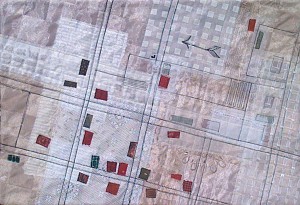
Inspired by an old map, I’ve been working on this little quilt for a while. I wanted to experiment with sheer fabrics, so the background is loaded with a wide variety of them. The list includes cheesecloth, lots of decorator fabrics, and even an embroidered sheer fabric from Mood Fabrics (of Project Runway fame.) I’ve also used paper and loosely woven craft ribbon.
Click any image for a larger view
The little rectangular patches very roughly mimic the locations of buildings on the map. Rows of stitching indicate fields.
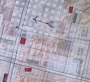
The lower left focal portion of the quilt has the building fabrics as the top layer. In the “outskirts” of town, many of the shapes are trapped under one or more layers of sheers. Black outline stitching helps them show up. (Detail below)
As I was making this quilt, (only 18 x 12,) I realized it needed a border. I tackled that in a rather unique way. See my next post.
What I’ve learned:
– Layers of sheers add interest. Especially when used to mute colors.
– Adding layer upon layer of these fabrics takes a while. For me, the effect is probably not worth it. I’m glad I tried it, but I don’t think I’ll use this technique again.
What techniques have you tried but then decided not to use?
Ellen Lindner

