Selecting a Background Color
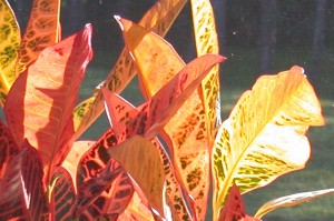
This is the photo I’m using as inspiration for my next quilt. These vibrant colors really excite me.
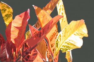
But, I wasn’t too keen on the green/black background. To audition options, I used my computer to isolate the foreground elements and tried a variety of background colors. First, dark green.
Well, it matches my photo. And it coordinates with the green found in these leaves. But, it’s just not exciting me.
To help show off the colorful leaves, I know I want a background color that is both dull and dark. (Thus making the foreground attract attention with it’s lighter and brighter colors.) What about black?
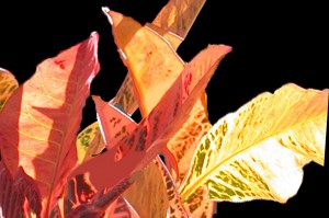
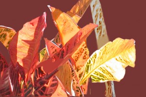
That’s certainly dramatic! But, it doesn’t relate to the leaves at all. Maybe I should go for an analagous (similar) color scheme. Maybe a dark rust/burgundy.
Interesting. Definitely viable, but not as much constrast as I’d like. Finally, I auditioned the tried and true, a complementary color: blue.
Wow, that’s a lot more dramatic than the previous one, isn’t it? I kinda love this. But, the black is pretty awesome, too. Maybe I’ll use darker blues. Still deciding.
None of these are right are wrong. It’s all personal preference. Which one is your favorite?
Ellen Lindner
P.S. I have lots of articles on my website about color (and other topics.)
P.P.S. You may have noticed that the compositions of the above images are slightly different. I’m still playing with that, too.


Wow! This is a hard decision. It’s difficult because the background photos are flat, meaning just one piece. How are you going to construct it? I’d be leaning toward the rust one, but a close second for me would be the black. Looking forward to seeing what you decide on.
You’re right, Sally. Using a variety of print fabrics will make the background MUCH more interesting than the current solid color.
I’ll construct everything in my usual fashion: raw edge collage. This gives me a lot of design flexibility.
I’m going with dark blue. Watch the blog for progress photos.