But What About That Blue?
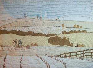
In an earlier post I showed you the blue-green embroidery I added to try to better integrate the blue sky into the tan and cream color palette. But, doggone it, that blue sky just still seemed too bright. Can you tell from this photograph?
No? How about this one?
Definitely too bright, right? I decided I needed to do something about it. Maybe changing out the fabric to white, or over laying tulle, or – the scariest option – over painting it. Since that last option was the easiest, I decided to give it a go. I knew I could always lay a new fabric on top, if it didn’t work out.
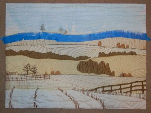
I’ve done this before with other quilts. The trick is to use an almost dry brush. This keeps the paint from flowing into undesired areas. So, here it is, in progress:
If you click on the photo above, you can see the brush strokes on the blue painter’s tape. The same level of white was also added to the sky.
And here’s the result:
Definitely better, right? (Scroll up to those first two photos for a comparison.)
But wait, there’s more! After looking at this for a few days, it still seemed too bright. So, I over painted with a light grey. (No photos.) Finally, I was happy with it and finished it up: facing, label, and a hanging sleeve.
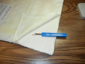
But then I STILL didn’t like it! OMG! Now what? After a lot of consideration, I did this:
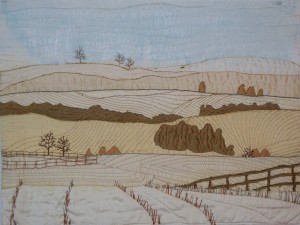
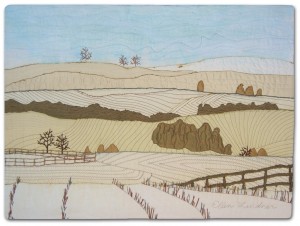
Yep. I took it apart! This time, I added several layers of sheer white organza to the sky and was finally happy with the quilt. Then, I added the facing and sleeve back and here’s the finished quilt, “Winter Hills.”
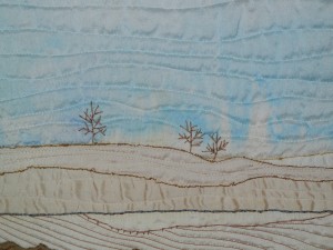
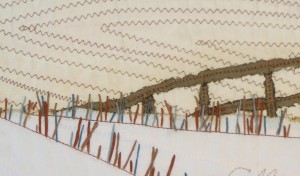
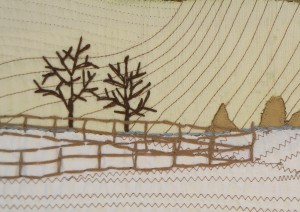
That was painful, but necessary, I think. And here are some detail shots:
Ellen Lindner
P.S. This quilt has already sold!
