The Power of Color
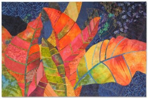
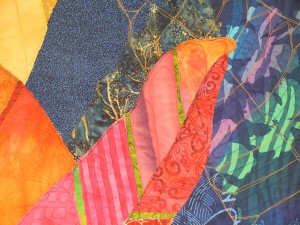
I think color is really important in artwork. So, I was super happy when my quilt, “Crotons,” won the Best Use of Color award at the World Quilt Show – Florida! How nice!
Click any image for a larger view
I often use complementary, or opposite, colors. The background above sorta falls into that category. Blue is the complementary color of orange. And although the croton leaves aren’t all orange, I felt like it was approximately the mid-color. Colors that are such opposites automatically create contrast and drama. Love that!
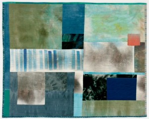
Jette Clover’s “Late Afternoon by the Sea,” a lovely soft palette with just a hint of the complementary color. UPDATE: She sent a photo.
P.S. I’ve got several free articles about color on my website. As well as a down-loadable ebook.
P.P.S. See a thumbnail gallery of my own quilts. (Yes, most of them employ bright colors.)

I think I have always been drawn to your work because of the complimentary colors in them. Of course I like brights too, but some quilts are just gaudy and yours glow. Thanks for the links to other examples.
Congratulations Ellen, that is a thrill! And I see this quilt is in Portfolio 19 too.
Hey Wanda,
I do like me some complementary colors. Did you know that, when viewed side by side, the eye jumps back and forth between them, making them appear to vibrate? Now, that’s drama!
Sue, I had forgotten about Portfolio 19. I haven’t seen it yet, so I need to get a copy!
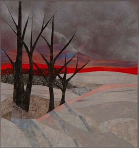
Thanks for including “In The Bleak Midwinter”! I enjoy your blog.
You’re welcome, Ruth. Thanks for sending the photo. It’s a great quilt!