Thorny Palm Underway
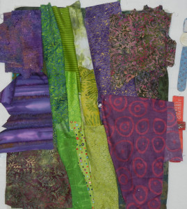
After sketching the design for the thorny palm quilt, I was ready to audition fabric combinations. Purple background or green?
Click any image for a larger view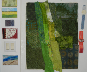
Since the purple background provides such a nice contrast, I selected it.
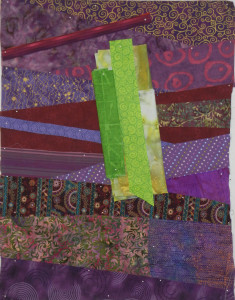
I wanted the background fabric shapes to hint at the horizontal thorns I’d be adding. You can see how I achived that in the photo below. Also in this photo, I was beginning to consider the challenge of making the stalks look 3D.
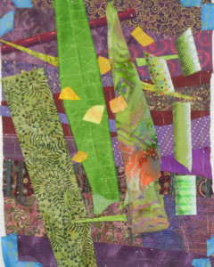
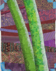
I experimented with creating a 3D effect with paint. See my experiments below, on the right.
Hmm, that seemed to work, so I committed to it.
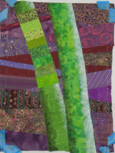
But the result was not to my liking. I mean, it DID look 3D. But, not quite right somehow. And it seemed pretty boring to only have 2 fabrics on the stalks. So, I went back to my usual technique of collaging multiple fabrics. I left the painted stalks in place as my patterns.
Better.
Much better.
Next up, thorns and berries. I had several things to consider.
– How fat should the thorns be? I wanted them to show up, but to still look very sharp.
– And what color should the berries be? They’d almost surely create a high contrast with the background. Would they take over?
I love these artistic puzzles! SO much more fun than a pattern with all the answers already provided.
Ellen Lindner
P.S. Check out that top photo again. I’ve purposely shown you a wide shot so you can see all the lovely fabric postcards and artists’ trading cards I’ve received. Click the photo to get a better view. From top to bottom, they were made by Linda Matthews, Holly Knott, Rosemary Claus-Gray, Dale Anne Potter, and Andrea Luliak. Aren’t I a lucky girl?
Ellen Lindner
Wow, Ellen, coming along nicely! Thank you so much for sharing your journey. You are inspiring me to be more creative….now I need to find the time! 🙂
Time is always the challenge, isn’t it, Patty?
Thanks for your kind comments. It is SO fun to work on open-ended projects like this! I hope you’ll find the time to do so soon.