Starting the Farm Quilt
Are you familiar with the paintings of Ton Schulten? He creates vivid color-blocked landscapes, often with darker panels on the sides.

Summer Impressions, by Ton Schulten
Awesome, right? I thought I’d also like to use darker colors on the sides of my farm quilt, but I didn’t want to copy his format. Could I make it darker without a vertical line? I wanted to try it.
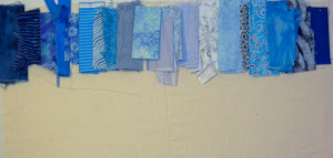
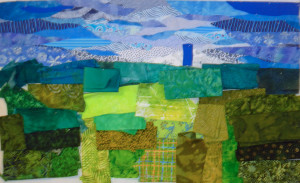
I pinned my blue fabrics onto the design wall with the lighter ones in the center and set to work.
Click any image for a larger view
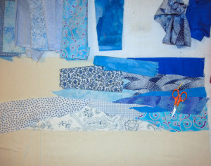
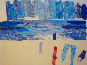
Since I was making a sky and didn’t want blunt edges, it was tricky merging the values together. Lots of points seemed to work.
I’m pretty happy with the result, although I think some tweaking will be in order. I want the blue silo to be the focal point, so I’ve placed it as a temporary reference. The sky behind it will need to be very pale in order to create enough contrast.
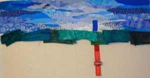
Next came the distant trees. Since things in the distance tend to have a bluish cast, I thought perhaps I could use blue-green fabrics for the trees.
I liked the tree fabrics, but before I could decide on them, I really needed to know how they’d work with the entire color palette. So, I did some more auditioning, this time paying attention to not only fabric colors, but values.
I was starting to like this idea.
Ellen Lindner
P.S. See my design sketch in my previous post.
P.S.S. DO follow the link and check out Ton Schulten’s magnificent work!
I love your quilt design and thanks for sharing info about this artist! His use of color is amazing!
Go, Girl!
I like the way the sky and the top half is coming together……..as you work down towards the bottom I think you should tweak the colors a little…………………..for the most part they look really good but a few of the color choices don’t seem to make the composition flow. Of course, sometimes the more you add and tweak, the more things pull together. I’m excited to see the finished piece! That being said, I love to watch your compositions come together and really enjoy your work!!!!
Oh, Chris, I have made SO many fabric changes to this quilt! I feel like I’ve changed nearly every one of them! Sometimes I get a little frustrated with that, but mostly I’m glad that I can audition changes so easily. And I remember that everything affects every other. So one change may require another. It sure keeps my brain engaged!
Yes, Sharon, isn’t his work amazing? I love it too!
I particularly like the sky – your piecing is amazing! The finished work will be gorgeous, I’m certain!
Hi Maeve,
I’m glad you like the sky, but you’re giving me WAY too much credit, because it’s not pieced. It’s just raw edge applique. I’ll take a detail shot and include it in an upcoming post.