Depicting Trees, Part Two
In my previous post I showed you several examples of trees I’ve created over the years. Now, we’ll take a look at tree trunks. Again, there is no formula for this. Just a consideration of what’s important about the trunks in question.
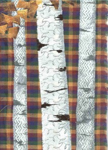
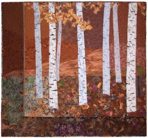
Here’s an early art quilt, Autumn Breeze. Since it depicts Aspen trees, I took great care in selecting the fabrics. (Click the image for a better view.) Not only did I need the fabrics to help with the striations of the bark, but I also wanted them to create a sense of depth. That meant the front trees would be the brightest and have the most contrast.
Click any image for a larger view.
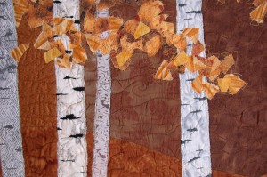
I did some experimenting to determine the best way to add marks to the trunks. And auditioned some loose, chunky leaves.
Perhaps you can tell from the photo below that my experiments paid off. I ended up using both the chunky foliage, and the stitching for the tree marks. I think you can also see that the fabrics used on the farthest trees were not over stitched. They had enough wiggly dark marks to read as Aspen bark. Cool! (BTW, there’s a tiger print as part of those leaves!)
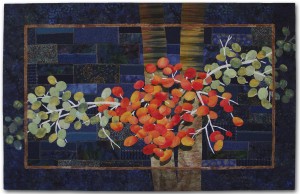
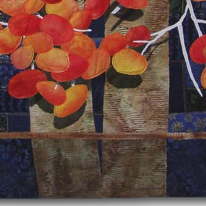
With my quilt, Ripening, the trunk served as the background for the vivid berries. In that capacity, it just need to be fairly plain and not too attention getting. (Same for the background, btw.)
I wanted the edges of the trunks – where they reach into the border – to be darker. To achieve that, I overlaid and stitched two layers of tulle in those areas. Very effective, don’t you think? Oh yeah, I forgot to mention that I did the same thing for the entire border of Autumn Breeze.
Sometimes there’s a tree in my inspiration photo that ends up in my quilt composition, but it’s so abstracted that I’m the only who knows it’s there. Such is the case with Snap Dragons, below. 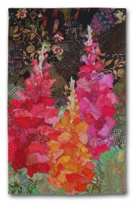
What, you don’t see the “tree?”) It’s the dark, busy background. In the original photo, the Snap Dragons were in front of a huge oak tree, which had little gaps of light showing through. In my close up shots, the tree shape didn’t show. It just looked like a big black mass with small light spots. I thought that was the perfect backdrop for the bright flowers, so I incorporated it – loosely. I love “going out on a limb” like that, and I’m really pleased with the effect!
Ellen Lindner
