Palm Frond Quilt Progressing
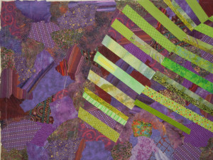
In a recent post, I showed you the early stages of my palm frond quilt, as I auditioned the width of the spikes. Although they looked good skinny, I decided to fatten them up, since this was more consistent with my sketch. Here’s the first frond underway with the new wider spokes. I was definitely liking the contrast between the spikes and the background.
Click any image for a larger view

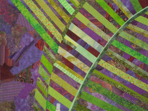
The second frond looks like only half of one. In my inspiration photo, the second side of it pointed reward so that it wasn’t really visible. I decided to go with that. The spikes were the same width, but perhaps you can see that there’s less space between each one.

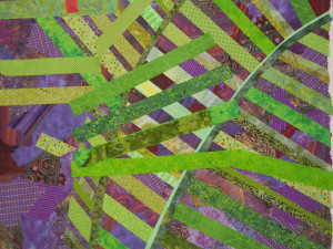
On to the third frond. This is the one I was really looking forward to, since it would overlap the others and provide the interesting desgin I had liked so much in the photo. First, a little planning:

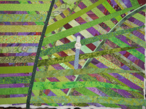
And then the additional spikes and stem. Gotta love the crisscross effect!
I’m not sure about that last stem, though. Maybe it needs to be lighter.
BTW, did you notice my wrist pincushion hanging from my design wall? It’s an easy way to keep my pins close at hand.
Ellen Lindner


Looking good, Ellen. I like the fattened up spikes. I thought they were too thin before.
Chris
I like this newest work very much. It is always fun to watch your work come alive.
Thanks, Ruth Anne!